Josanclick has an interactive HTML photo gallery template.
The gallery page in this template uses the cursor path direction and shows the texts accordingly. For example, if you move the cursor from left to right, the text appears from the left. This animation looks fluid on a gallery template with multiple rows and columns. The creator has skillfully maintained elegance and visual aesthetics in this template, ensuring that your photographs are not disrupted by the animations. This is the best option if you want an intelligent personal Photography website template.
MyPhotography has a bright and modish-looking Bootstrap photo gallery design.
On the dark theme layout, the images look vibrant and lively. Plus, the creator has used a text overlay layer with a contrasting color. All the colors and animations make this photo gallery template stand out from the other HTML and CSS photo gallery templates in this list. Since this template uses the latest CSS3 script, you can try any modern color and gradient scheme on this template without any issues. Apart from the gallery page design, this one is a complete photography website template that you can use for both personal and business websites.
Boto is a free gallery template with a horizontal gallery design. The creator has added a scrollable function to the homepage gallery, allowing the audience to easily interact with it. The main gallery page features a regular grid-style design with optimally sized image thumbnails. Full-page lightbox gallery page design is also in this template to let the audience fully enjoy your photographs and can easily access the resume from the page they were on. Since it is an HTML5 website template, you can even add multimedia and video content into this template without any hitch.
This photo gallery template gives you a professional-looking gallery design. Category options are right above the gallery so the audience can quickly filter and see the photographs they want. Smooth hover effects are used smartly to show the image details, such as the heading and category. Since the creator made the homepage a whole gallery page, you don’t get any separate gallery pages in this template pack. If you want a gallery-centric website template for your personal website or studio website, this photography website template will be a good choice.
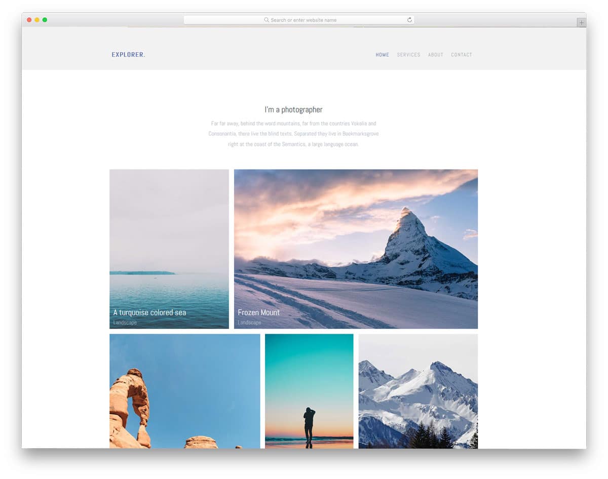
Explorer is a pure personal website template for photographers and graphic designers. With the minimal design, this template helps you to create a content-focused website. No distraction elements are given in this template, and even the visual effects are mild. On the homepage, you can add welcome text at the top and the photo gallery in the main area. Footer space is completed within one line, where you can add social media profile links. Apart from the homepage, this template also gives you other pages like services, about, and contact. This template doesn’t give a separate gallery page in its package. If you are a freelancer, the services page will be of great use to you. The services page has line icons and lots of text to explain your services in detail to the users.
Aside is a food website template. This template is the best choice if you are a traveler and share your journey with great images. This template serves two purposes: a blog and a gallery template. Most of the page space is reserved for the images, even in the single blog page. To use the full-width design of this template, the navigation menu options are kept on the left sidebar. Visual effects are vital in this template, and they are not overused. On the homepage, you only have space to add images; image holders for portrait and landscape orientation are given in this template.
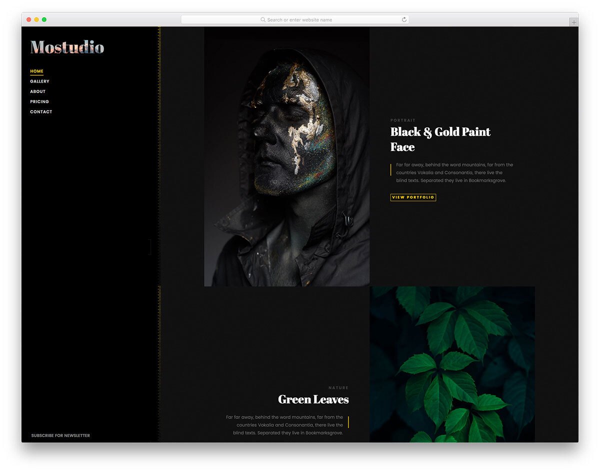
Mostudio is a classy photo gallery template. If you want a rich-looking photography website that takes your work and the website to the next level, free photo gallery templates like Mostudio will be the best option. On the dark theme layout, images look crisp, and the creator has used stylish fonts to make the experience even richer. It is a multi-page website template, so you get all the basic pages pre-designed. The finesse of this template will leave your audience amazed, which makes this template a perfect option for professional photographers and studios.
Photographer is a straightforward interactive website template for professional photographers. On the homepage, you have space to add only a small photo gallery to give a sneak peek of your portfolio and an about section with an animated skill bar. The image gallery on the homepage is treated as an animated image slider, and the thumbnail sizes are reasonably big for you to show the image clearly to the audience. The creator has provided us with three additional gallery layouts, in addition to the homepage gallery section. All three gallery layouts have a filter option at the top to easily find the category you want. Since the creator has used a minimal design in this template, the animation effects are very limited. Free photo gallery templates like this will help you display your work in an elegant manner to your audience.
If you want free photo gallery templates with a one-page design, this template is for you. Though it is a one-page template, the creator has given you all the necessary features and sections to make a proper business website. The whole template is treated as a vertical slider. On the right-hand side, you have pagination dots with tooltips to clearly indicate which section you are in. The creator has used a dark theme layout in this template, which gives the template a rich look and makes the content neat and clear on the website. Like most other free photo gallery templates in this list, this one is also an HTML5 based website template, hence you can add videos easily to this gallery template.
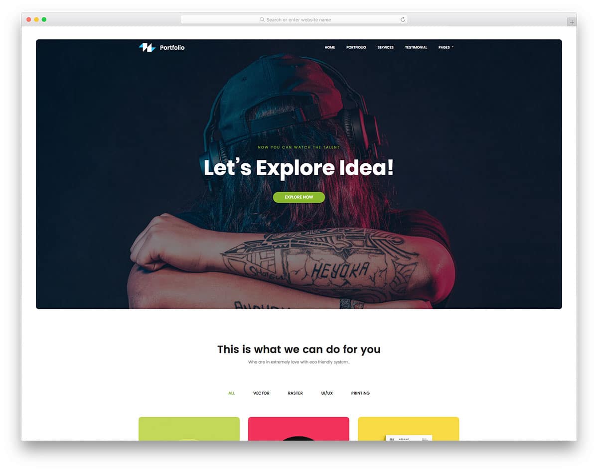
Tulen is a portfolio-centric website template. On the homepage, you get a full-page interactive accordion gallery design to shock the audience when they land on your website. The addition gallery works smoothly, plus, you have more than enough space to add project excerpts and call-to-action buttons. The hamburger-style side navigation bar gives more screen real estate for your content. Your audience will enjoy your works fully on this template. If you are a professional photographer, free photo gallery templates like this will help you elegantly showcase your work and improve your chances of getting new projects.
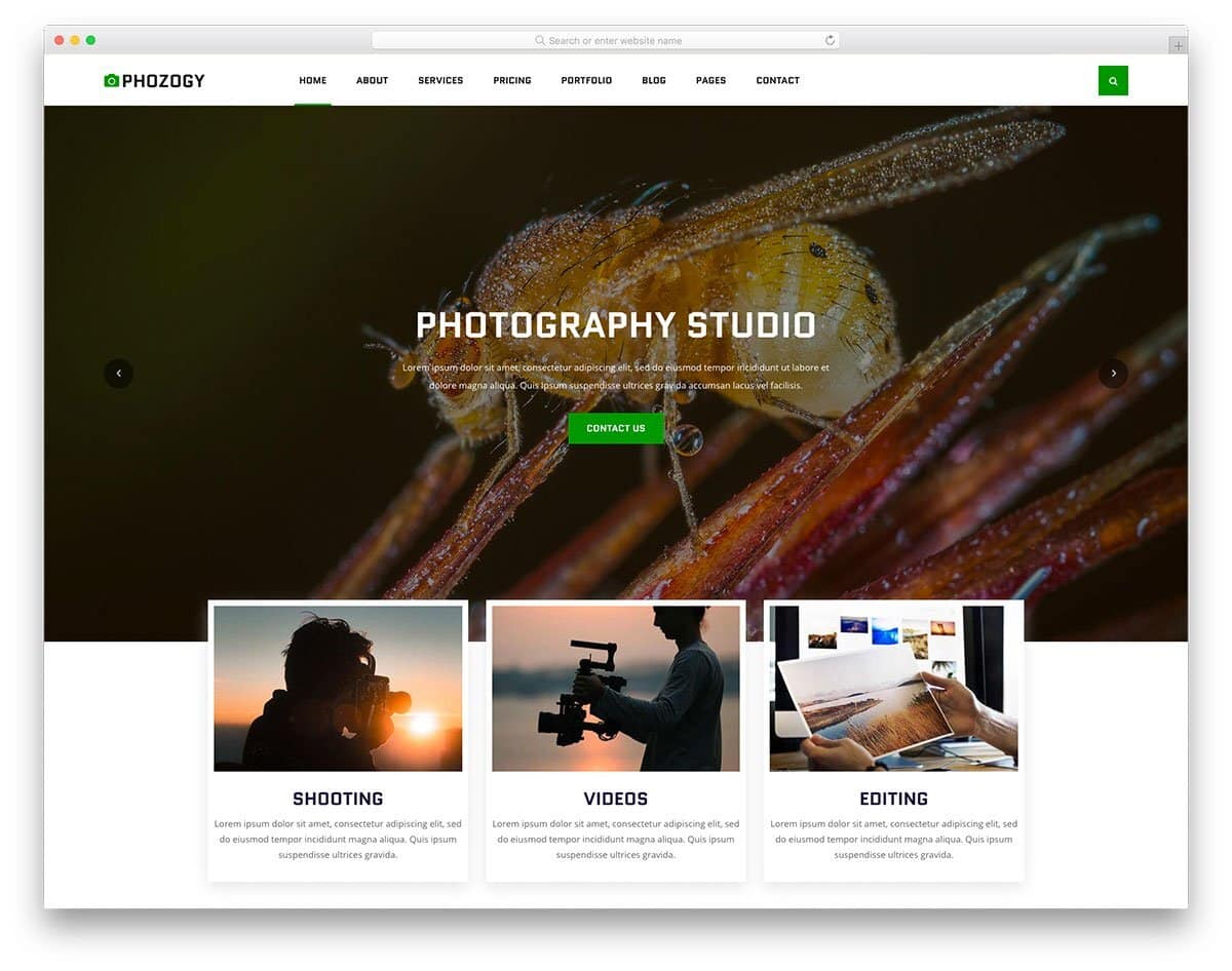
Phozogy is purely designed by keeping images at the core. The creator has smartly balanced the images and business elements throughout this template. As a result, you get a website that will satisfy the needs of both the users and the site owners. If you are a professional photographer or videographer, templates like this will boost the rate of conversions. This template handles White spaces elegantly to add richness to the website and make the images look crisp. Since it is a mobile-responsive website template, the white spaces will make the interactions easier on the small-screen devices.
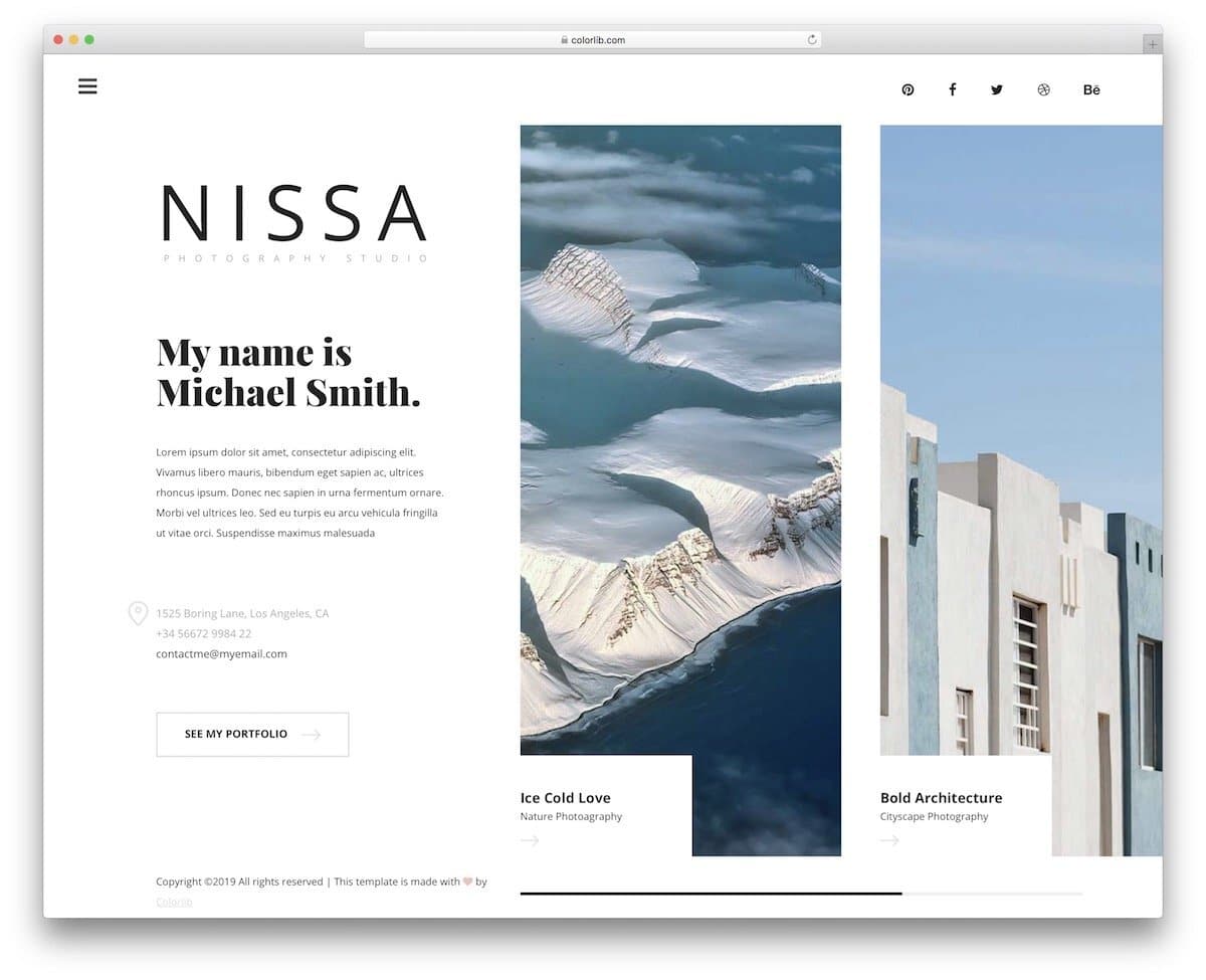
Nissa utilizes a minimalist creative layout that enhances your personal branding. The unique design of this template has a static left section and an image carousel on the right side of the screen. You can use the static section to add a welcome message and say a few words about yourself and your projects. Since the static section is scrollable, you don’t have to worry about the content length. The creator has maintained a consistent layout throughout the website; therefore, users can easily navigate and interact with it. The creative layout is used only on the desktop version. On the mobile version, the creator has kept the layout simple because of the limited screen real estate.
If you are not into creative stuff like in the Nissa template mentioned above, but want the template’s simplicity, the Halen will impress you. The creator has maintained a regular website design in this template. Hence, you can use this template for both personal and business websites. On the gallery page, you can add a group of photographs as albums and let the user see the album images on a separate page. If you like to make the gallery page even more engaging, take a look at our Bootstrap image gallery collection. As this template uses the latest Bootstrap framework, it can handle all modern elements and animations easily.
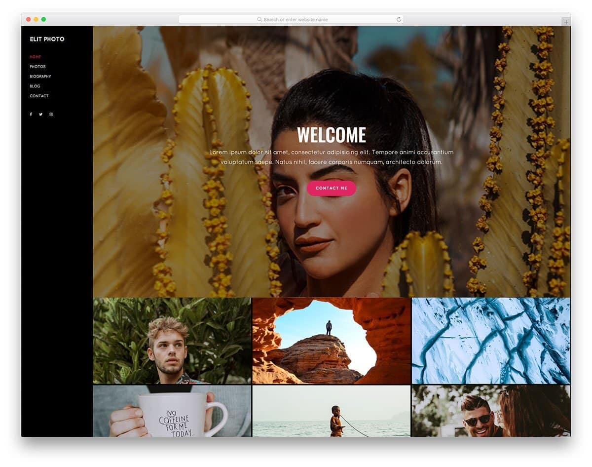
The Elit is the best option for those who want a website template that is easy to maintain and don’t want to skip any features. Elit is a one-page website template by default. In the header section, you have a big hero image with white space to add texts and call-to-action buttons. You have the photo gallery section below the header to showcase your best shots. Though it is a one-page website template, the creator has included a blog post layout in this template. If you would like to share your experience with your audience now and then, this blog post layout will come in handy for you.
Capture 2 website template is designed for wedding photographers. This template’s neat, professional design helps you elegantly present your content, photographs, and promote your services. The header section is used smartly on all the web pages to promote your services. Thoughtfully designed free photo gallery templates like this will help you get more customers. The creator has used light and dark color schemes effectively in this template, allowing you to elegantly highlight important sections and content on the webpage. In this photo gallery template, the creator has given us a full-page photo gallery viewer to see the photos and videos.
If you want free photo gallery templates with an interactive project style design, this template will impress you. This photo gallery template helps you to explain the project and share the story behind the photos. Lots of white space is used in this template to help you present the content neatly to the audience. The given layout is unique and neat but the creator hasn’t used any animations on the elements. Like most other free photo gallery templates in this list, this one is also made using the latest CSS3 and Bootstrap framework. Hence, it can handle all modern animation and hover effects.
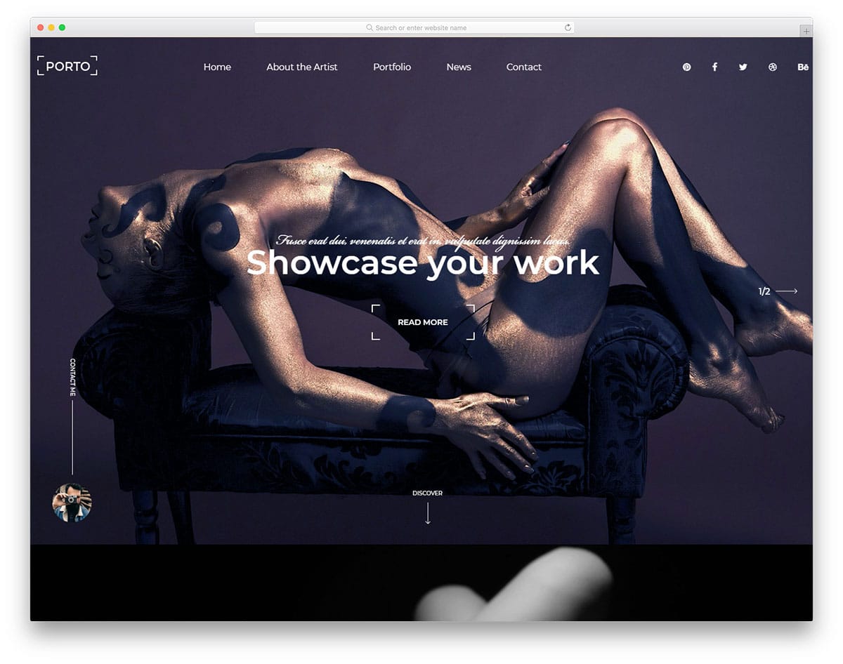
The Porto template is designed for studio and agency websites. Since this template is designed from a business perspective, you get promotional elements and the gallery layout. Like a few other free photo gallery templates in this list, this one also uses a black theme. The advantage of using a black theme on a photography website is that your photographs will look more vibrant and clean. To explain the photograph project clearly, the creator has given you a single project page. A promotional banner is placed near the footer section, increasing the chances of converting the visitors into leads/customers.
Although you have a separate gallery page in the Capture website template, the homepage is also treated as a gallery page. If you are a freelance photographer, free photo gallery templates like this will help you showcase your best shots and impress the audience when they land on the website. All the navigation options are put on the sticky sidebar to keep your photographs undisturbed. The about page of this template gives a quick intro about you and your services. In the gallery, all the images are placed one after another without any gap to effectively fill the screen space.
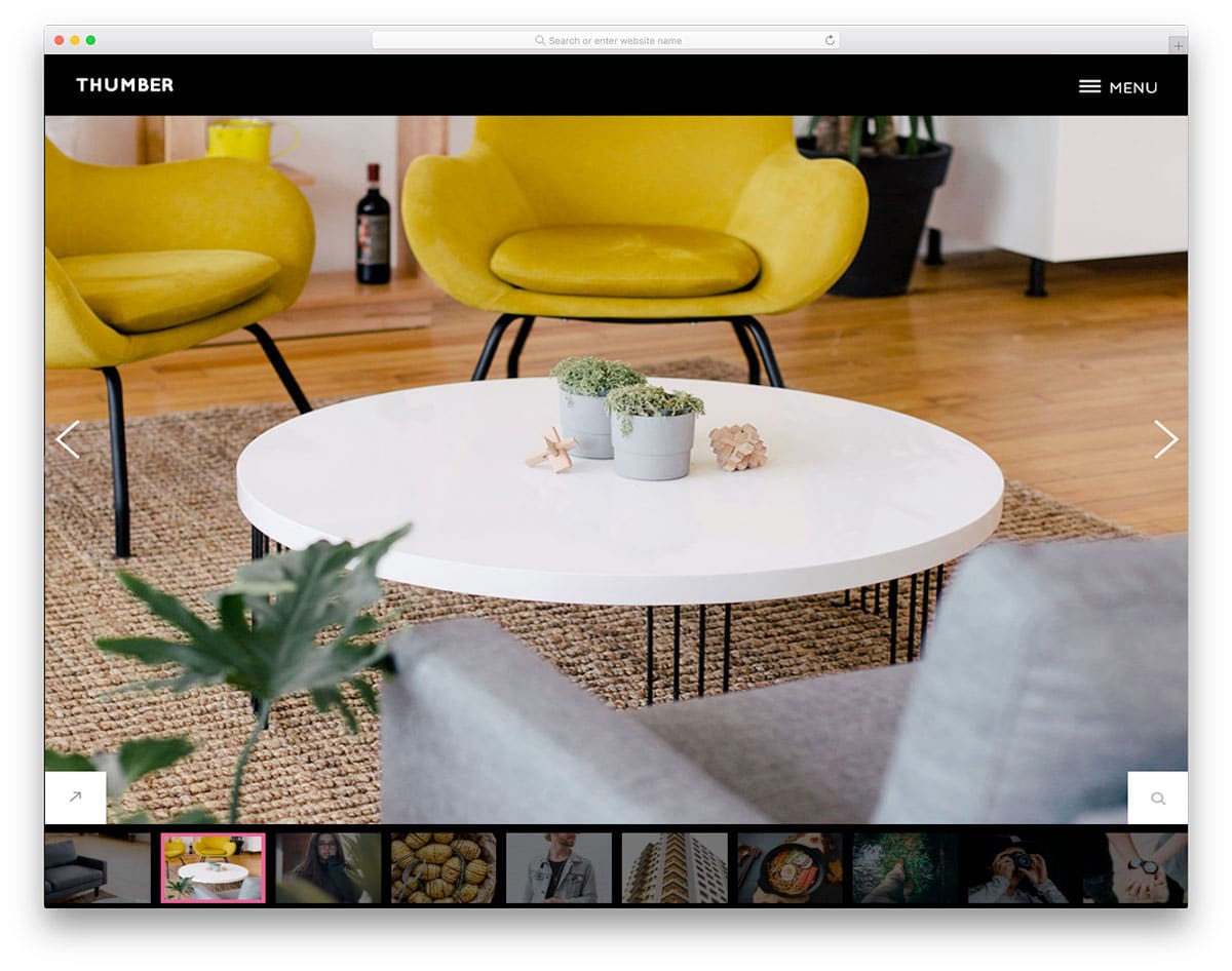
Thumber is a unique website template made purely for photography websites. This template not only helps you showcase the design but also allows you to present it engagingly using slide show animation. We have made a separate post to help you make impressive slideshow presentations. In this template, the developer has used the latest HTML5, CSS3, and Bootstrap framework. Hence, you get a lively website that loads faster on all devices. The default design of the template makes it a good fit for personal websites. Apart from the big homepage image slider, you also get a separate gallery page to list all your photographs in one place.
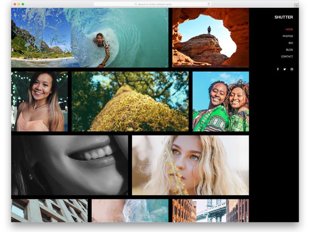
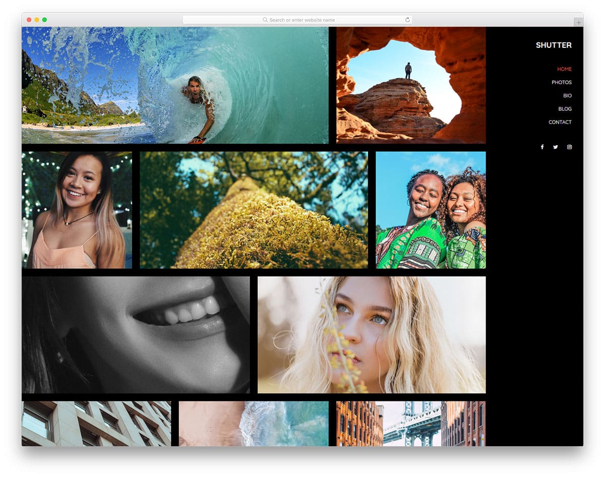
Shutter is a perfect website template for professional photographer websites. The whole website design revolves around the photograph. You have only a gallery section on the homepage to curate your users. If you are using this template for business purposes, add some space for texts to give a quick intro to your service. Like most other free photo gallery templates in this list, this one is also made using the latest web development frameworks, so customizing this template will be easy.
Smooth scroll effects and hover effects are used to present the contents engagingly to the users. The sticky sidebar design lets the user access the navigation options easily. On the dark theme neat layout, the photographs look lively and engaging.
The PhotoGallery website template lets you share the story along with the photographs. The creator has given you enough text space to let you add a few lines about the photographs. If you are a professional freelance photographer, you can use this text space to explain the project. The designer used white space smartly to merge and differentiate sections and other elements. In the photo gallery page, you get a category filter at the top to easily narrow down the search, plus, you also get a search option at the top right corner. If you want user-friendly, free photo gallery templates, this template will impress you.
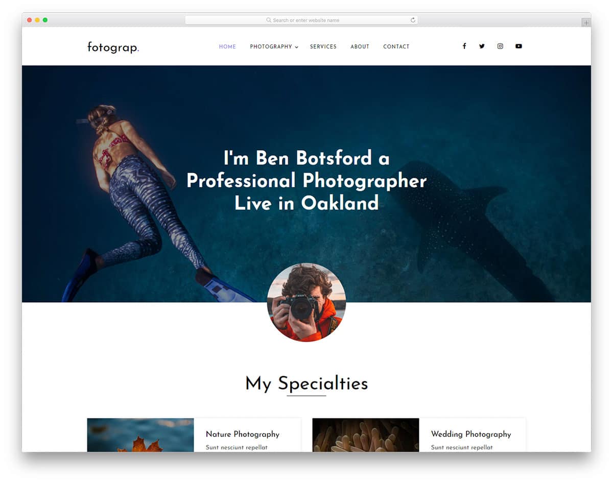
Fotograp website template is designed from a business perspective. The template’s homepage is designed to promote your services and increase the chances of getting a project. The uniqueness of the gallery page in this template is that you can group all your photographs as an album. So when a user clicks a photo, they will see all the photos related to that event. You can use this template as a base to create your own custom template. Adding new features and options will be an easy job with this template. The creator of this template has used the latest HTML5, CSS3, and Bootstrap framework, so you can easily integrate any modern tool with this template.
Flash is a creative gallery website template for photography websites. Rather than just showing your work, this template adds life to your photographs. The creator of this template has used creative shapes for image holders to make this template stand unique from the rest of the free gallery templates. If you are offering a special service for photography, this template is the best option. The designer of this template has given you enough space for text content. For example, if you worked in a special candid photography project you can explain the details and your role.
The creative design helps you present the contents engagingly; this design will be of great use for creative studios. Visual effects are kept almost nil in this template so that the user can experience your photographs as such without any disturbance. A bright red color scheme is used for the web elements, which looks attractive on the clean white background. Near the footer section, you have a widget for Instagram. Using free photo gallery templates like this will reduce your work.
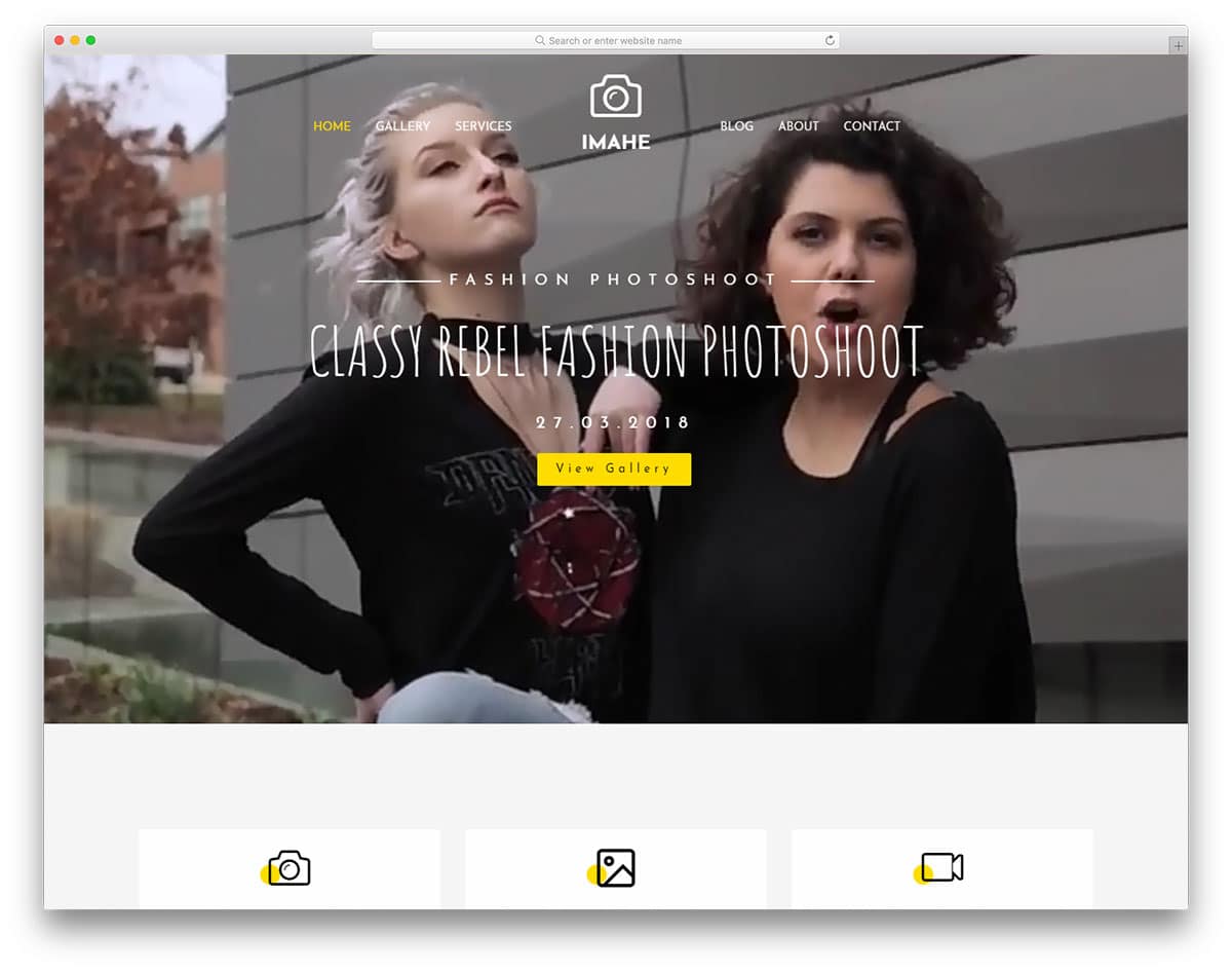
Imahe is the best website template for photographers and videographers. This template can be used for both personal and business websites. The homepage of this template is treated like a corporate website, where you can clearly explain your services. For the gallery, you have space on the homepage and on a separate page. Mostly portrait orientations are used in the gallery sections; if you need a landscape orientation, you have to make adjustments yourself. In all the images, you have space to add tags to group the contents easily. Users can also easily filter and see the photographs they like.
It is a multi-page template, in all the subpages, you have a big image section in the header to add a hero image. You can use the image header sections to show related images. A bright yellow color scheme is used in the template for the web elements, which looks attractive on the clean white layout. Like the Flash template, this one also has a full-width Instagram widget near the footer. As this template uses the latest HTML5 and CSS3 framework, you can easily integrate this template with other tools.
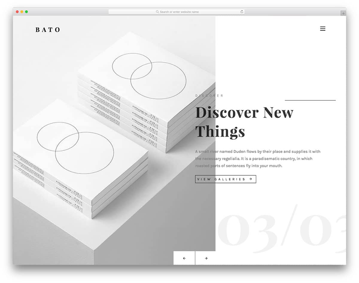
Bato is a minimal-looking website template for photography and creative agency websites. The homepage of this template is solely reserved for the image showcase. You only have an image slider on the homepage with a split-screen style design. Image transition effects are kept mild to match the minimal design of the template. You also have space to add a call-to-action button in the image slider to take the users directly to the corresponding page. It is a multi-page template, so you can use an entire page to explain your project in detail to the users.
The gallery page of this template is almost similar to the Flash template mentioned above. A listing style is followed, showing an excerpt of the project detail. Texts are also treated as a part of the design, giving the template a lively feel. All the navigation options are hidden behind the hamburger menu. On the clean white background, the colorful images look vibrant and attractive. In the footer, you have space to add contact details, social media profile links, and a newsletter subscription form. If you are planning to run an active email campaign, take a look at our well-optimized email template collection witha trendy design.
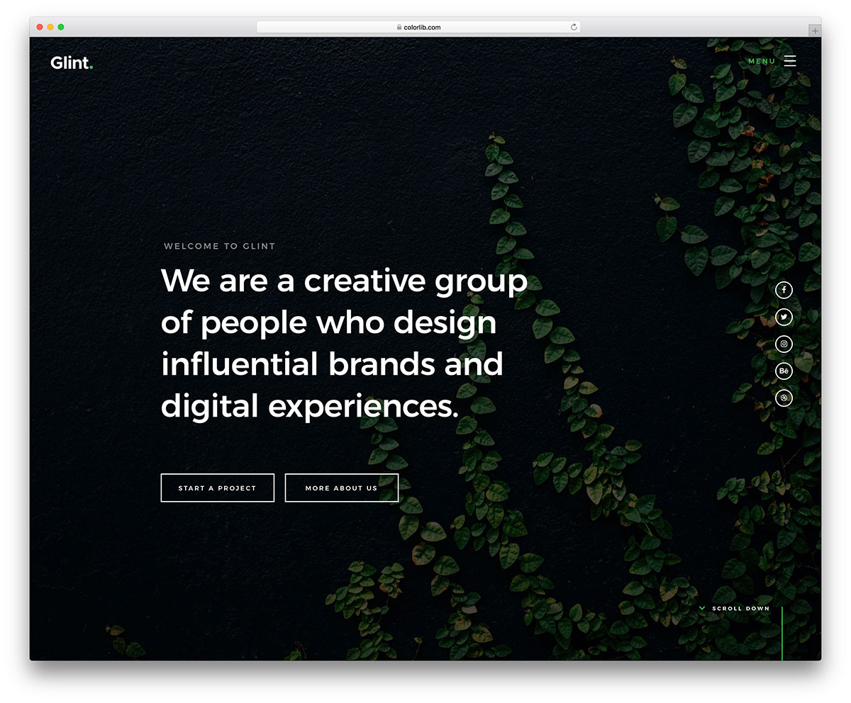
Glint is an interactive website template. The whole template is treated like a photo album. Visual effects are combined with this creative design to give life to your photograph. Each section is treated like a slide, where you can put all the related content in one place. So, the users do not need to scroll to see the next content. It is a one-page template, suitable only for use as a portfolio template or a simple template for freelancers. You can mention your services, other features, and work in this template. To give you more screen space ,this template puts all the control and navigation options in the hamburger menu.
In the homepage itself, you have space to add social media profile links and call-to-action buttons to let new visitors know that you are open to new projects. Since each section is treated as a slide, you have plenty of space to add all your images. You can even add video content in this template. Overall, Glint is a potential website template with unlimited possibilities to create your own unique website template.
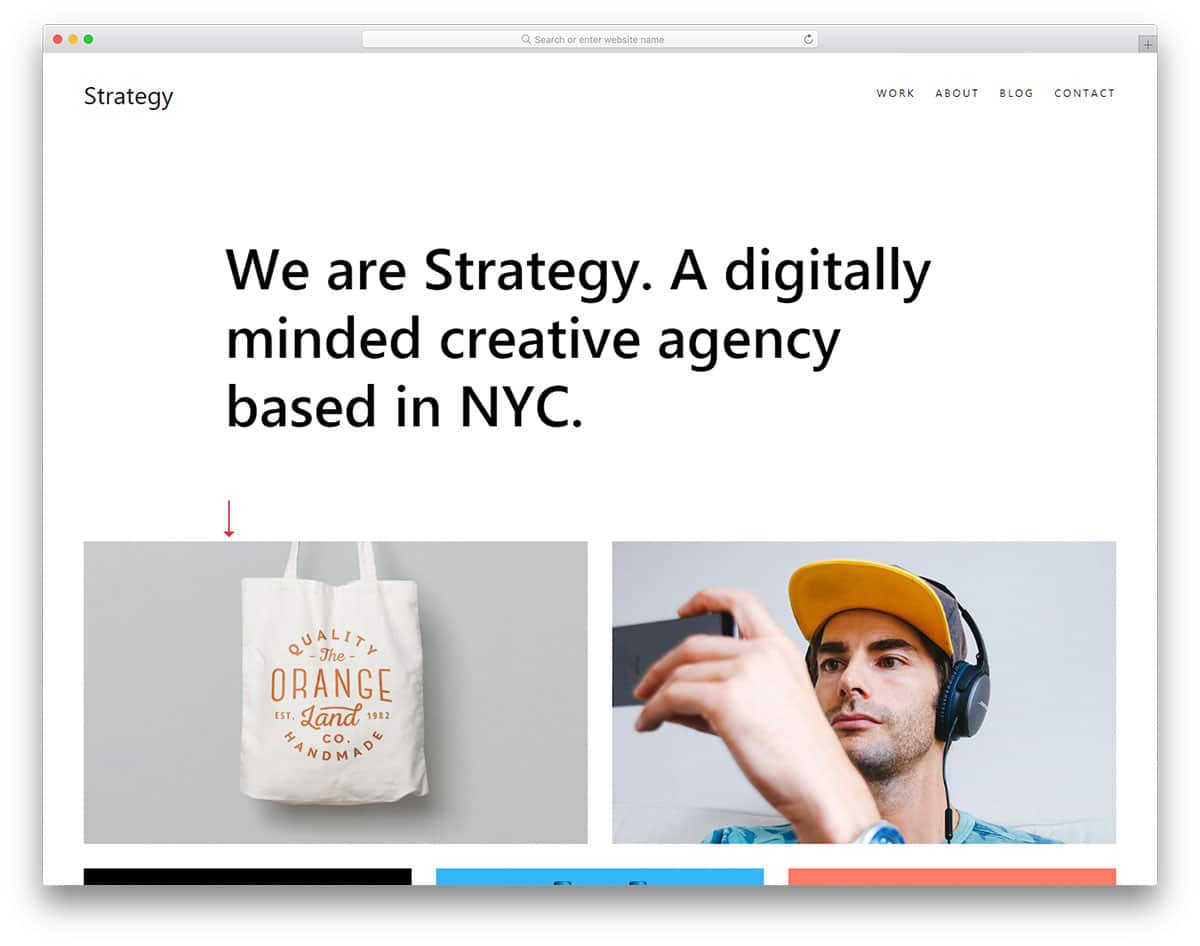
Strategy is a perfect website template for freelancers and small business websites. The template’s homepage gives you enough room to explain your services and showcase your creative works. The first thing the users see on your website is the big, bold welcome message and your portfolio. The rest of the sections, like services and blog posts, are added in the latter part of the homepage. In all the subpages you have a smart bar near the footer section to show you are open for new projects.
The top navigation bar gives you space to add navigation links. Smooth scroll effects and hover effects are used to present the contents engagingly to the users. Apart from the homepage, you also have a separate page to add your portfolio. Image holders of all sizes and orientations are given in this template so you can add any type of image without any issue. Since this template is designed for personal use, you have space to add only social media profile links in the footer section.
Bitmap is primarily a photography website template. The pixel-perfect design of this template makes it a perfect fit for studios and personal websites. From the header to the footer most of the space is reserved for the images. Image holders of all sizes are given in this template, so you can add images of any size and orientation. In the header, you have a full-stretched, big image background with a parallax effect. You also have a content box in the header to add a few lines about your site and a call-to-action button to take the user to the portfolio section.
It is a multi-page template, so you get a separate page for the gallery and a section on the homepage. The gallery section and the page have almost the same grid design with equal spacing. In the default design, four columns are given to organize the images. At the top of the gallery, you have the category tab to switch between different categories easily. The images open in a full-screen lightbox to get a better view of your photographs.
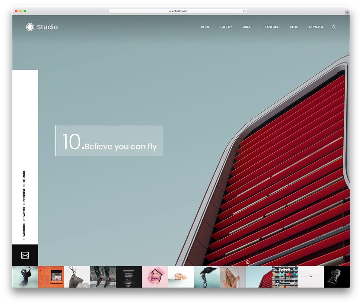
Studio, as the name implies this template is created by keeping the studio’s needs in mind. This template will be a great choice if you are a freelance photographer. We have made a complete list of templates for freelancers take a look at it for a better idea. Images are the core element of this template design. On the homepage, you get only an image slider that shows the images in full view. All the images in the queue are shown as image thumbs below the image slider. Blinking dot is used to show the current image, apart from the homepage you also get a separate page for the gallery.
The gallery page features a masonry-style grid with image holders of varying sizes, making it easy to add images of any orientation. This gallery also runs on an Ajax-based design; as the page loads, your next set of images appears. If you need to add pagination to the gallery page, you can do it by editing a few lines of coding. This template uses the HTML5, CSS3, and Bootstrap frameworks.
Sonar is the most creative free photography template in this list. The template designer created a premium quality homepage design. If you want to make a website unique from your fellow competitors, this is the template for you. The homepage ticks all the major points of modern web design. Patterns and texts are used well, along with the overall design of the template. Your work, your photographs, is put to the core of this template design. In the header, you have an image slider with portrait orientation. Some of your images may be cropped out because of this portrait orientation.
Visual effects add extra elegance to the creative design of this template. The navigation menu options are hidden behind the hamburger menu icon to give your image more space. The gallery page also follows the creative design. In the gallery header, you have a split screen design to add an image and say a few lines about your work. The category options are also placed in the header of the gallery page itself.
Archiro is a premium class website template you get for free. As a package, this template gives you three homepage variations and all other subpages pre-designed for you. Though this template is designed for architects and construction websites, the primary design of the template gives lots of space for images. Since architects need to showcase their design and explain it to the users, both text and image contents are given equal importance. This business website template gives you lots of promotional and interactive elements. Creative design of this template is combined with creative effects to bring the template to life. Along with the homepage variations, five blog page templates are also given in this template. As a developer, you will find this template extremely useful for your projects.
Connect is another minimal design-based website template. The full-width layout of this template is effectively utilized through large content blocks and image holders. Again, the default homepage design makes it a perfect option for personal use only. The portfolio page is designed just like the homepage with split screen design. Alternate image zoom in effect while the user scroll will amaze the first time, visitors. The designer of this temple has given importance to the texts to make them more readable. The template utilizes a lot of white space, which helps the colorful images appear more vibrant and attractive. The clean design makes this template the best fit for both designers and photographers. By keeping this template as a base, you can create your own custom photo gallery template. Like most modern HTML templates, this one also uses the latest HTML5, CSS3, and Bootstrap framework.
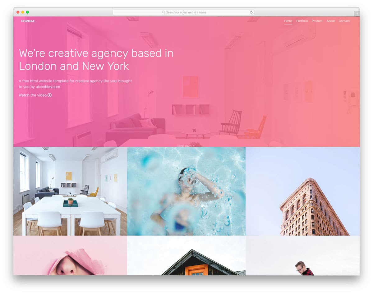
Format is a multipurpose business website template. A mild color scheme and properly structured gallery help you display your images in an elegant manner. The gallery section on the homepage is right below the header section in a 2×3 grid. Zoom in effect is used when the user hovers over the images. Since it is a multi-page template, a separate page for the gallery is also given in this template. The gallery page has flexible rows and a three-column design. The gallery is designed as a continuous grid with no space between each cell. In all the subpages, you have a space to add a video in the head and a contact form call-to-action button in the footer. For more creative contact form design inspirations, look at your contact form template collection.
Foto is also designed like the Studio template mentioned above. But the designer of this template took a completely different design approach compared to the Studio template. The overall design of this template follows a photo album-like design. In the homepage, you have a heavily bordered image slider. The white borders add a logo, navigation links, and other footer links. Transition effects in the image slider are smooth and gentle; it is designed like a premium image slider WordPress plugin, like Revolution slider. You get only one transition effect since it is a free HTML website template. In all the image slides, you have space to add a heading of the image and a tagline.
The creator of this template gave us two gallery designs. One of the gallery designs helps you display fewer images on a page, but they are shown clearly to users. The second design, however, purely depends on the quantity; you can display all your images as small thumbnails. In the footer you have the option to add show thumbnail option when the user sees a set of images in full screen, you can use this space to show the thumbnails of the next images.
Photography is a simple one-page template for photography studios. If you are about to take your business online, this single-page website template will help you. Although it is a one-page template, the designer has made it long enough to accommodate all sections. In the default design, lots of space is reserved for the image contents. The advantage of a one-page template is that you can maintain the website easily. At the same time, you can make a content-focused website. Even if you can change this one-page template into a complete business website template with a few more pages, the developer of this template made the coding flexible enough to customize it easily.
With the full-width layout, the Cocoon template gives you a perfect design to showcase your photographs. The creative studio-style design puts your projects at the core of the template design. On the homepage, you have a masonry grid-style gallery with cells of different sizes. The cells of different sizes allow you to add images of any size and orientation without any worries. To give a contrast look, the sticky navigation menu bar remains black, and the main content area remains white. The filter options are given in the sidebar, and the content area is solely dedicated to photographs and other types of content. Not only are the homepage and gallery page given importance, but other subpages are also given equal importance. Based on the type of page, the web elements are added perfectly.
Droppler is an album style website template. Each section on the homepage is treated as a slide. This slide design provides the entire screen space to display your images or videos elegantly to users. Since it is an HTML5 website template, you can add videos easily. Texts are made bold and bigger, which makes readability easier. Visual effects are used throughout the template, but they are used in the right proportion. You can engage users visually and present content interactively to them.
Because of the slides ‘ full-screen design, the navigation menu options are kept behind the hamburger menu icon. In the hamburger menu, you get a full-stretched search bar at the bottom to help users easily find the website content. The gallery page is designed like a masonry grid; the dimensions for each cell are given for your reference. With this design, you can even promote your affiliate brands. For example, if you take a look at some applications that use a slide-like design, you will put a promotional slide in between the slides to improve the chances of visibility.
Sun is a portfolio website template for professionals. With its minimalist design, this template places greater emphasis on the website’s content. The user can enjoy your work without any distractions. On the homepage, you can add an image gallery and a few lines of a welcome message. If you have a big logo for your site, this template has reserved the correct space for you. The top left corner is the apt place and size reserved, which gives your logo better visibility. This template is a brand-focused template; even for the page loader, this template uses your logo. Which makes this template a best fit for both business and personal use. If you are an upcoming brand, elements like this help you to get brand visibility among the site visitors. To match the minimal design, the visual effects are also kept simple.
Portfolio, as the name implies, this template is designed specifically to showcase your work. This template is the best choice for photographers, artists, and graphic designers. Though this template uses a full-width layout, important sections are designed to be a block. Being a one-page template, each section is made big enough to handle all images and web elements. The designer of this template gave us the elements we would normally require in a website. Even if you wish to make this template into a multi-page template, you have the base to start one easily. Animation effects and visual effects are almost nil in this template, but worry not, this template uses the latest HTML5, CSS3, and Bootstrap framework, and you can customize it easily to the coolest look you want.
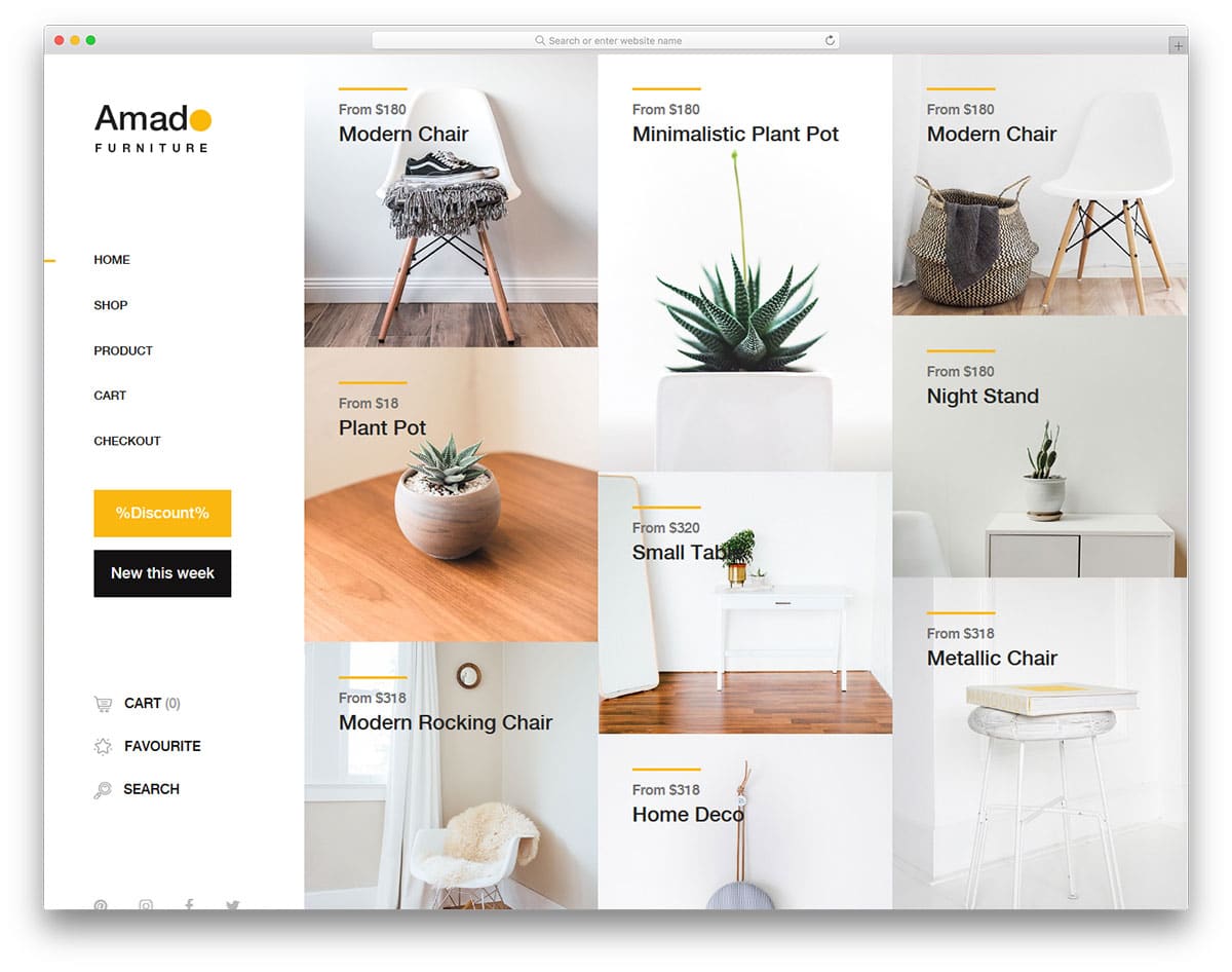
Amado is a minimal website template for an eCommerce store. This template is designed for small brand stores. The core design of this template will help you create a beautiful-looking gallery template. Being an e-commerce store template, you have plenty of space to add images, and you also get filter options. Both the homepage and the shop page give you the gallery design. In the gallery page, right beside the left navigation menu, you have the filter option.
Each image holder is large and has sufficient space between them to present the images elegantly to the users. If you are into pagination design, this template has just what you want. In all the pages just above the footer, you have the space to add a promotional banner and an email subscription box. You also get a separate discount page, but you must manually configure it.
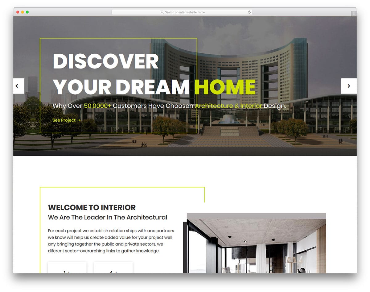
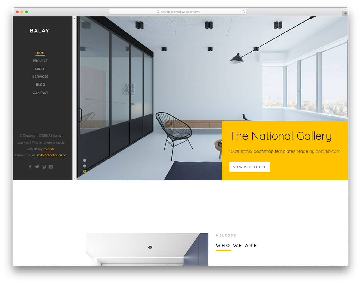
Balay is another website template for architects and interior designers, but you get only one homepage design with this template. To satisfy the creative professionals, this template is also designed creatively. Lots of spaces are reserved for the images in this design. You are not restricted to adding your photographs to the gallery page alone. Since this template is designed for business use, you get plenty of promotional elements. Other useful elements of this template are an animated countdown, neat line icons, and call-to-action buttons. The sticky left sidebar gives you space to add your logo, navigation menu bar, and social media profile links. The gallery page in this template also features visual effects that bring life to the photographs. Instead of using Ajax-based loading, this template uses pagination.
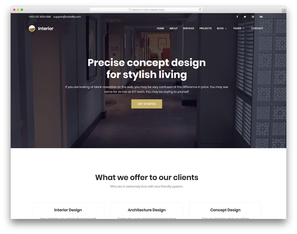
Interior, as the name implies, is also an interior design and construction website template. It is a complete business website package, and the creator of this template gave us all the options we need to create an effective website. Image holders are made with blunt edges to fit in well with the overall modern design of this template. The sticky top bar is made semi-transparent to give a glass-like look while the user scrolls down. At the top bar, you can add contact details and social media profile links. To increase the credibility of your business, the designer of this template has given testimonial carousels in all the pages.
Pemodule is a simple base website template. You can use this template to create your custom website template. This boxed-width website template helps you to make a simple website to showcase your project. Since the color scheme of the template and the background color are similar, most users won’t feel the boxed design. Parallax images between the sections give a lively feel as the user scrolls down the page. To help you use the given space effectively, the navigation menu options are hidden behind the hamburger menu. This template uses the latest HTML5, CSS3, and Bootstrap frameworks with industrial code standards. So, the developers will find it easy to work with this template.
Suppablog is a creative full-page website template that has a perfect design for photography websites. The gallery page in this template is designed like a horizontal scroller with portrait orientation. Hover effects are used to show the texts related to the images; you also have the option to add a corresponding full post link. It is a multi-page template; all the subpages follow the same simple design with a creative layout. Based on the type of page, the layout changes a bit. For example, you have a full-page design without sidebars on the About page. If you are building a website for an influencer or a leader in an industry, this template is the best option. You can use this template without making any changes.
Wedding, as the name implies, is the best one-page website template for event organizers and wedding photographers. This simple website template has many colorful web elements and image holders. The gallery section in this template is designed like a fully stretched horizontal carousel with portrait orientation. In the default version, you cannot open the image in full view. For professional use, you can add the full view option. Like most free photo gallery templates, this colorful website template uses properly handled HTML5, CSS3, and the latest Bootstrap frameworks. Hence, customizations can be done easily in this template.
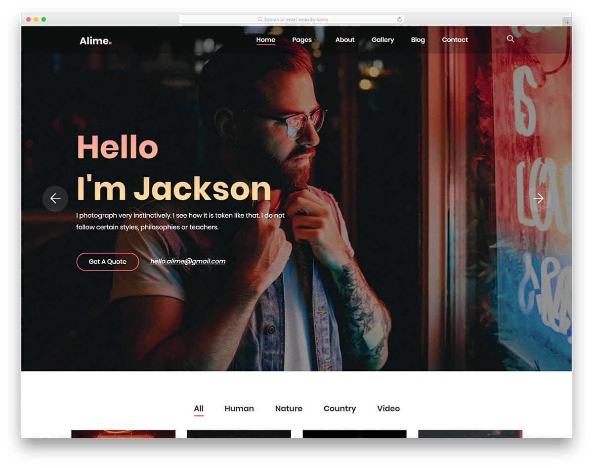
Alime is a spectacularly designed gallery website template designed by Colorlib. To help you and your project skyrocket while maintaining an engaging feel on your website. It is ideal for all niches of photography and gallery websites, whether for professional or personal purpose. And for an excellent visual, it is entirely responsive, retina-ready, and pixel-perfect. With pre-built homes and inner pages dedicated to blog, gallery, and more, you get a head start. All of these are entirely responsive, retina-ready, and pixel-perfect, to say the least. Not only this, but the template also fully relies on the advanced Bootstrap framework, offering a secure and reliable performance.
This template is also cross-browser compatible and super fast loading. Another great thing is that it is designed to be SEO- and RTL-ready. To achieve that engaging visual effect, it also features elements such as a full-width Instagram feed, various social media icons, smooth animations, effects, and more. The image banner is the highlight here. You can use this for promotional content to keep your users hooked onto the site.
Perfect for photographers and those who are creative and unique, Pentax is a professional gallery website template to get you started. With a simple, efficient interface that makes it easy to showcase your work to the audience, this is a great addition to our list today. With a huge image header that grabs your users’ attention, every little detail here is amazing. From the fonts to the icons and even the overall styling, all of these rely on the advanced Bootstrap framework. Not only do these perfectly complement the structure, but they are also reliable and up to date with all the latest web standards. It is ideal for even beginners and novices as the creators, Colorlib, have provided super user-friendly options.
Getting into the details, the focus here, of course, is the amazing gallery. It is stylish and super engaging. And to make it easier for your users, it also supports filters. The template also adds amazing hover effects and animations to the visuals. Not only this, but there are plenty of other useful components that are ideal for you to get a functional online gallery ready. This includes options for testimonials, social media icons, a contact form, and newsletter subscriptions. Another great thing here is the pricing plans, which let you start selling your artworks. The whole template is fully responsive, retina-ready, and pixel-perfect.
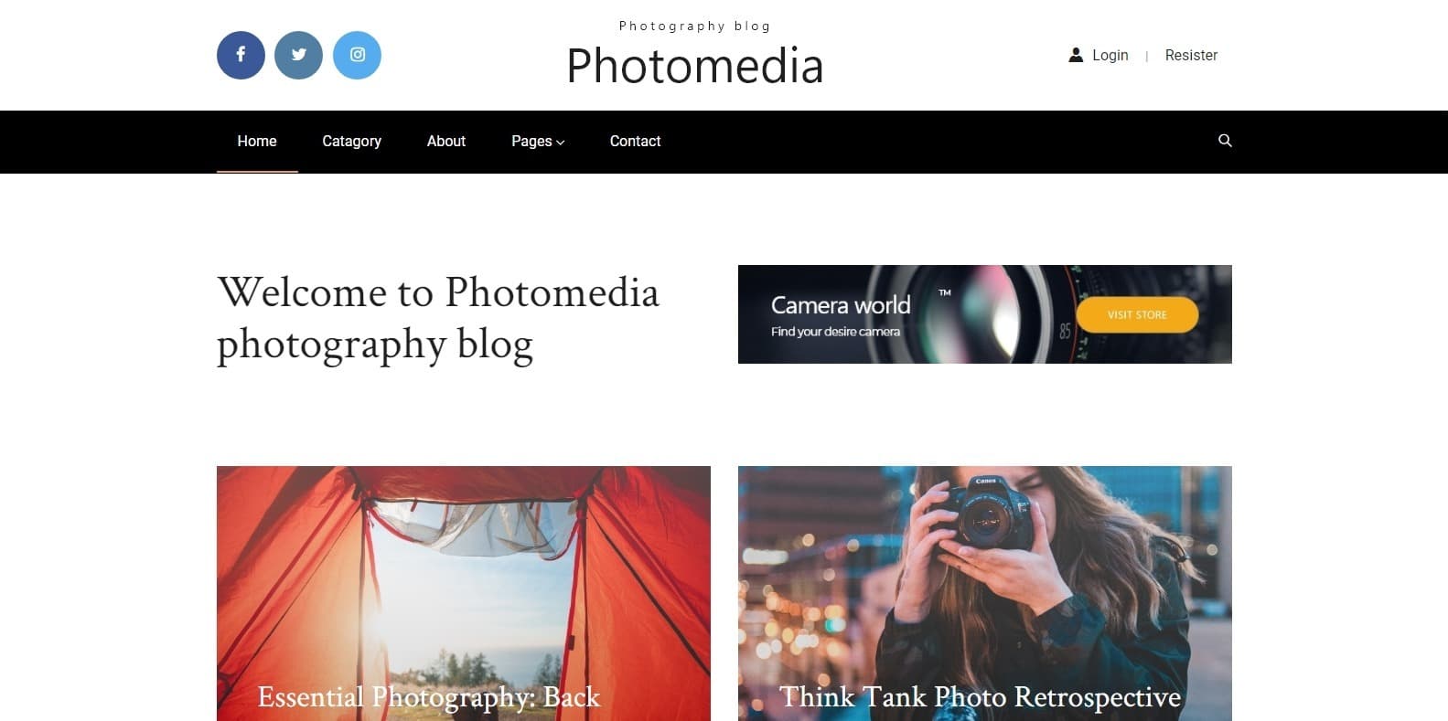
Photomedia is another great gallery website template designed for photographers, creative illustrators, designers, and similar professionals. This template offers all the features you need and is a perfect way to get that custom feel without spending time and effort creating it. It is also designed to be a blogging template so that whatever you showcase can be more detailed and informative. As with other templates mentioned here, this too is powered by the Bootstrap framework. This ensures that the interface is highly flexible and developer-friendly. The visuals are also fully responsive and look amazing on any screen.
It is also compatible with all the major web browsers, so you get a flawless performance. To mention a few components, Photomedia offers a sticky navigation, drop-down menu, social media integration and even contact forms. This not only improves a site’s efficiency but also makes it more approachable to your users. Thanks to the CSS coding, you also get amazing hover effects, animations, and page transitions to keep things interesting. The whole structure is easy to work with and can be personalized to your preferences. All in all, it packs all of the essentials and more to get you started right away, and that is all for FREE!
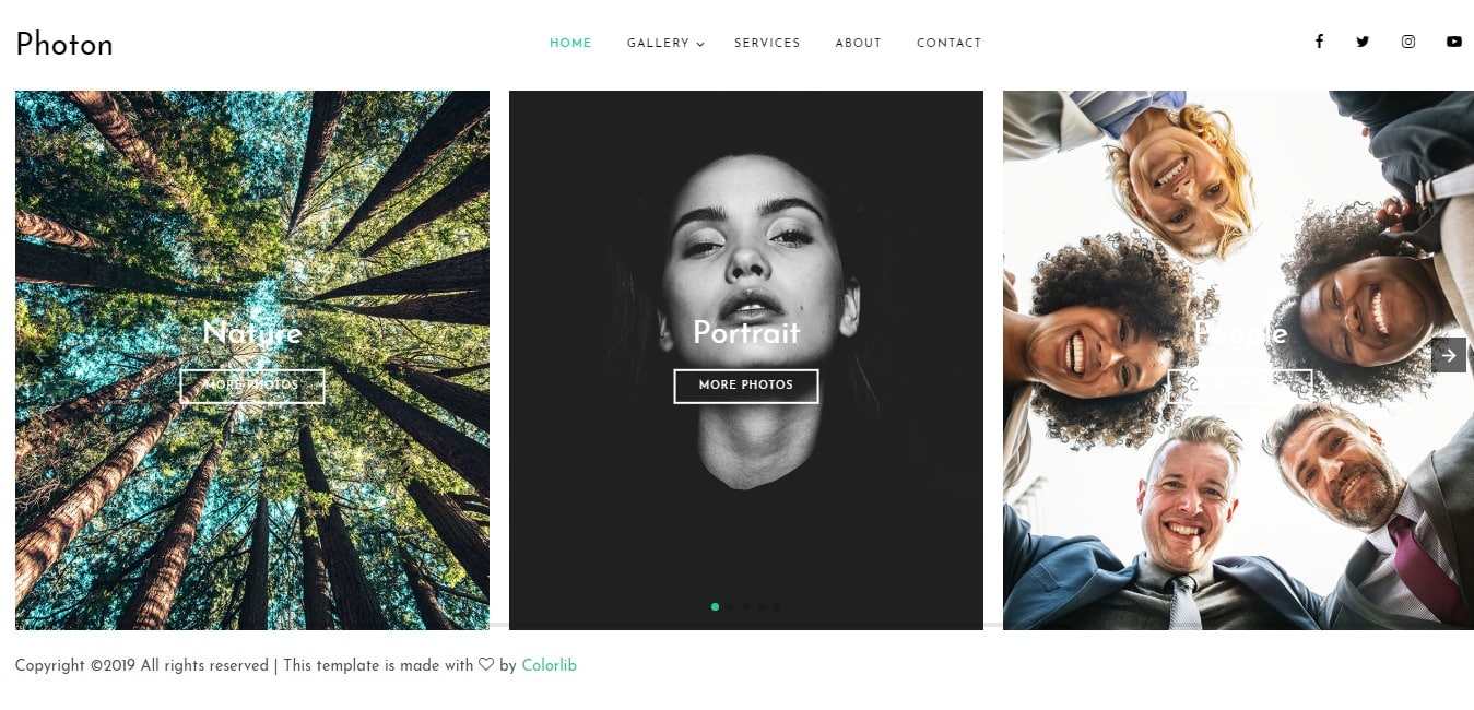
Now, another free gallery website template we have for you is Photon. With a simple, clean, and elegant layout, the template effortlessly focuses on the major parts. It is ideal for artistic and innovative people to share their ideas of creation. And because every detail is created with beginners in mind, it is super user-friendly. The template is also well-documented, so you have no issues getting started. In addition, the template is responsive and loads easily on every device screen. It is adaptable on laptops, desktops, mobiles, and tablets. Perfect for those thinking out of the box, leave a lasting impression on anyone who lands on your site. It also features an easy-to-work-with CSS and HTML coding structure.
Getting into the details, the template is based on the powerful Bootstrap framework, which is both powerful and flexible. For easier navigation, this template also includes a sidebar. Not only this, but it guarantees a first-class performance with amazing speed. Cross-browser compatible, SEO-friendly, and perfect for getting a site ready, Photon is amazing. Mix and match the various typography and font options to match your preference. Not only this, but connecting to your social sites is also a breeze thanks to the various social media icons available. Minimal, beautiful, and neat, each image also executes a stunning transition on click and a smooth hover effect. The vertical slider-based gallery template is surely what you need.
Yet another amazing free gallery website template ideal for showcasing you and your brand is Pixels. A fully responsive Bootstrap-based gallery website template that is sure to win your hearts. The vibrant color schemes are the first things that capture your visitors’ attention. But the second thing is surely the stunning galleries featuring your works of art, which will make them stay. Whether you want to launch an online gallery, build a portfolio, or create a creative agency website, this template is flexible enough to meet all your needs. Furthermore, the template uses clean, valid HTML and CSS that are easily customizable.
In addition to being cross-browser compatible, this template is also SEO-friendly. This ensures that no matter which device or SERP you are on, your site always ranks higher. It is clean, moder,n and unique to look at. You also get amazing Sliders and Carousels to add a touch of creativity. Furthermore, the CSS animation also gives away the option to add smooth animation and scrolling effects. With so many options, many of which are free, Pixels is surely a great option if you are looking for a gallery website template!
Aigars Silkalns is a Latvian entrepreneur and web developer who founded Colorlib, a hub for distinctive WordPress themes. Trained in technology and design, he began as a freelancer and launched Colorlib in 2013, earning acclaim for user-friendly, modern, responsive themes. A champion of open source, Silkalns shares insights on web trends and entrepreneurship. His mission is to make web design simple and accessible, empowering people worldwide to build professional sites with ease.


