
Slideshows are originally used to make impressive presentations. By jotting down important points on the screen with engaging designs, you can draw the audience’s attention. The best example of the effective use of a slideshow is Apple’s keynote event; they are the pioneers of product-launch keynote events. If you don’t speak about the product and the little, little stories behind the making of the product or the services you provide, then who will speak about it? Using slide shows on your website is a clever way to highlight the most important and recent news or features of your product. We have selected some of the best CSS slideshow designs from this list, featuring cool transition effects.

Useful CSS Slideshow Animation Examples
A collection of interactive CSS slideshow designs that grab the user’s attention and deliver the message clearly to the audience.
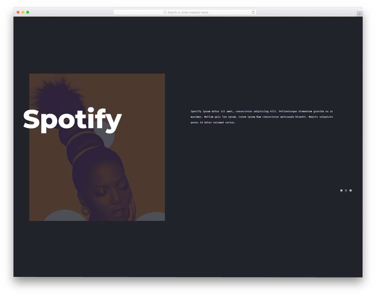
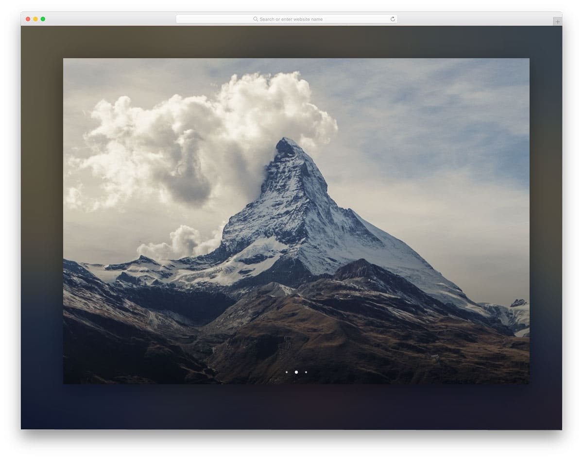
CSS Carousel V20

The V20 has a unique CSS slideshow animation. This one is an automatic CSS image slider by default—only the images in the geometric shape element change when the slider is used.
If you want an interactive CSS slideshow animation for your product page, this one will be a good choice. The text remains the same and includes a call-to-action button that takes the user to the desired pages. Images smoothly slide down as they change. The whole concept has a modish look, so you can use it on modern websites without any worries.
CSS Carousel Slider V08

The V08 has a neat and straightforward CSS slideshow animation. In fact, the creator has combined two animations in this template to deliver a visually stunning carousel CSS design.
When the slides move, one slider gently slides down, and the next slide flips a little as it appears. Both animations are perfectly timed, so the whole design feels like a single piece. The entire HTML and CSS code used to create this design is available for download. Hence, you can use the code effectively in your projects.
Simple CSS Carousel Slider V03
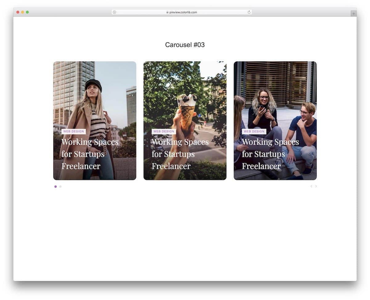
This CSS slideshow animation design uses card elements. If you want to display multiple images in a single place, this card-style CSS slideshow design is a good choice. Each card is big and has more than enough space to show the images & text clearly to the audience. The slideshow animation is kept simple so that users can see more cards without getting annoyed. But still, you can add your own custom animations to up the design a little. Please take a look at our CSS card flip animation examples for fresh design ideas.
CSS Slideshow V10

This slideshow has neat thumbnails right below it to give the audience an idea of the images and let them easily jump to the image they want. Shadow and depth effects elegantly highlight the thumbnails. The transition effect is kept simple in the original design to quickly show the images to the audience. If you are looking for a CSS slideshow for a corporate or business website, this one is a good choice. Since the code script is simple, you can use this template even on your existing website without any issues.
Jellyfish
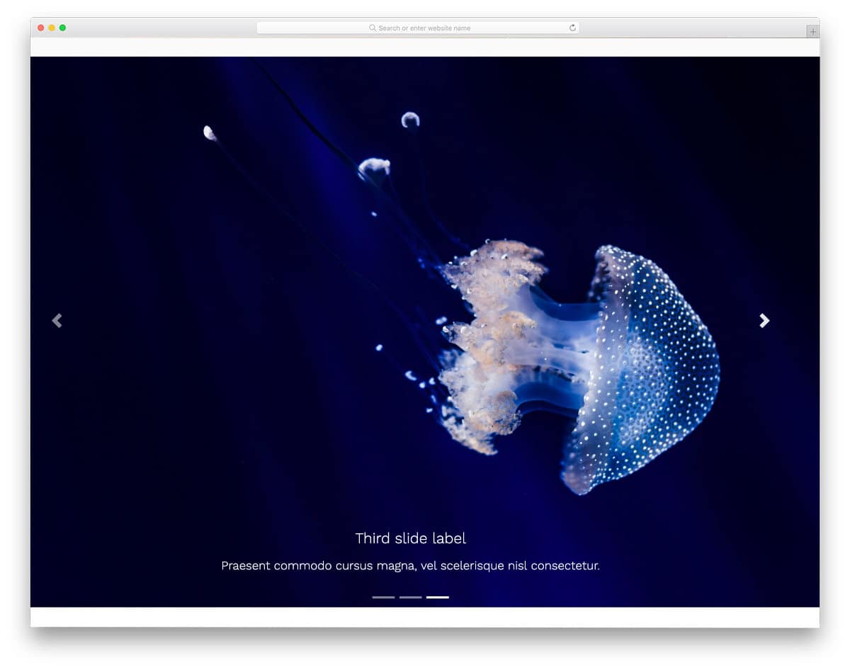
Jellyfish is a free Bootstrap UI kit. The creator has included plenty of pre-designed UI elements in this pack. All elements are properly designed and are optimized for mobile responsiveness. The default CSS slideshow in this pack lets you add a large image and text at the bottom. Navigation arrows are given on either side to easily jump to the previous and the next slides. As mentioned before, the creator has handled all optimization and equipped the elements with basic features to make interactions easier. If you are a professional developer, UI kits like this save you lots of time.
Bootstrap Carousel FadeIn & Fadeout
As the name implies, this concept uses a fade-in and fade-out animation for the images. The code script of this design is clean and simple, just like its design. Hence, developers can utilize the code to create a stunning custom slideshow design in no time. The default design itself has plenty of space for images in its full-page layout. If you like, you can add arrow animations to the navigation arrows and spice up the design. Take a look at our CSS arrow design collection for more interactive arrow designs and fresh animation concepts.
Apple Devices Slideshow

This CSS slideshow design is specifically designed to showcase Apple device lineups. If you run a website or store related to Apple devices, this slideshow concept might come in handy. The device transitions are fluid, which most users will love. For example, when you move from iPhone to iMac, the earpiece line and the dots smoothly transform into a webcam dot and a power button on the iMac. Though it is a concept model, attention to detail is very neat in this design. Hence, you can use this code on your website straight away if you want.
Layer Motion Slideshow
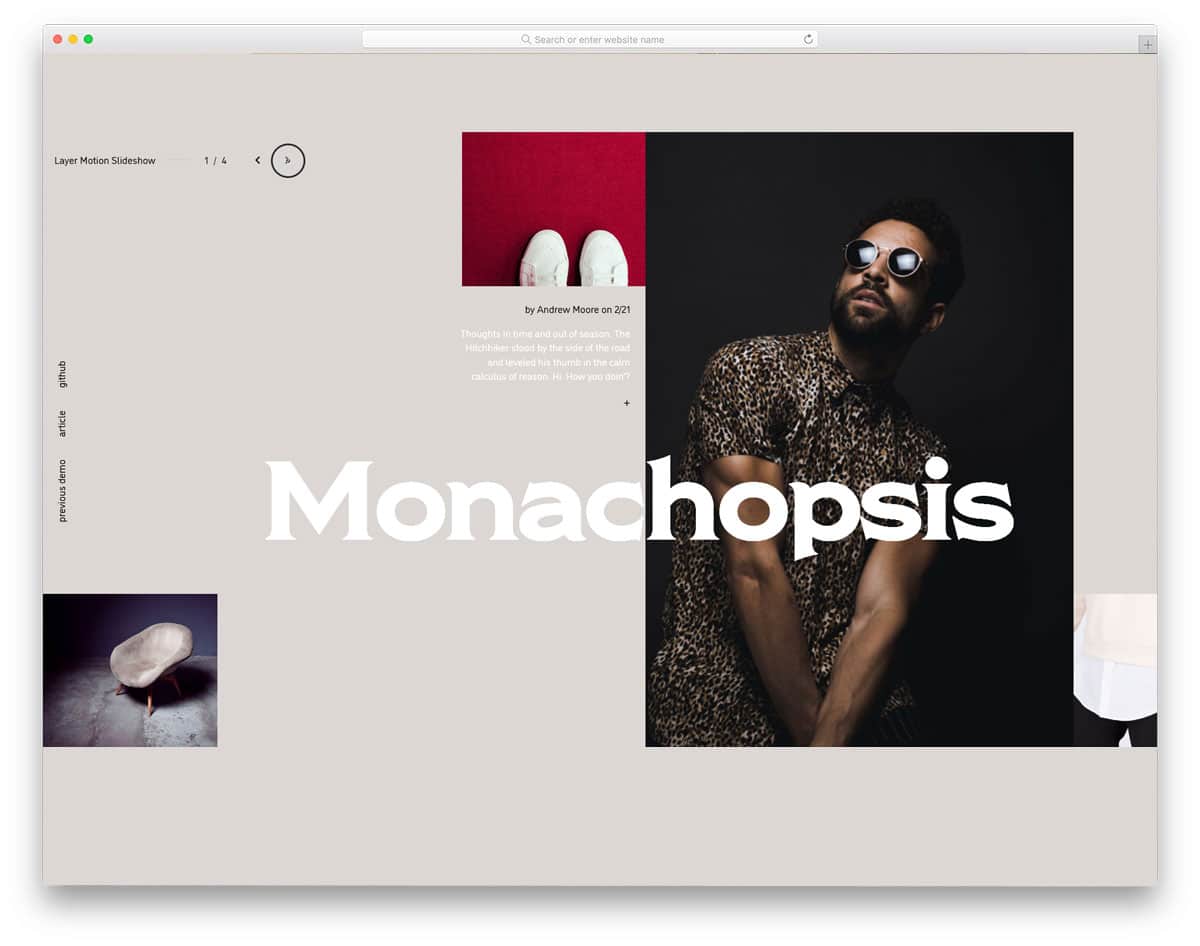
In this example, the creator has combined a grid-style design with a parallax-like animation effect to create an interactive CSS slideshow. Since it is a full-page design, the creator has used the space effectively to display the images and text clearly. You also have space to add text links in this slider. If you are looking for interactive CSS slideshow designs for your portfolio, this design would be a perfect option. Along with the creative slider design, you also get a well-calibrated mouse pointer that dynamically changes size when you hover over an interactive element.
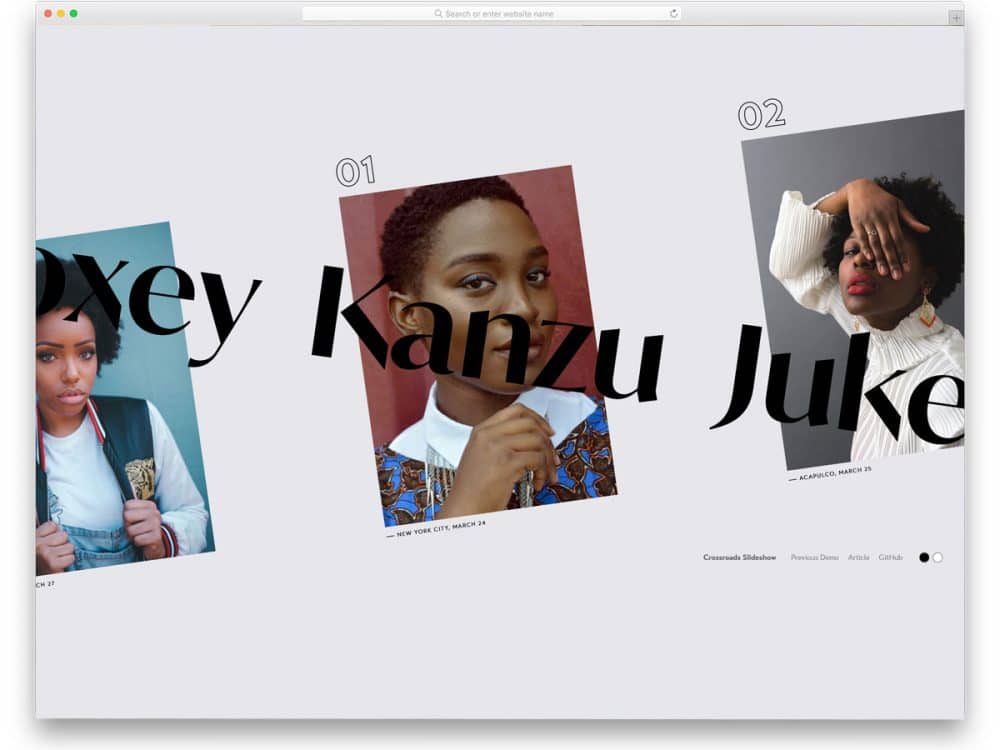
Crossroads Slideshow

Just as the crossroads name suggests, the creator has used the crossroads concept in this CSS slideshow design. As you click through the slider, the background images and the texts in the front cross each other. If you are designing a model or photography studio website, slideshows like this will not only enhance the user experience but also help your brand gain greater visibility. Just as in the Layer motion slider mentioned above, the creator has used the mouse pointer cleverly to provide a fluid user experience. This CSS slideshow concept is a fully working model, so you can use the code in your design.
Motion Reveal Slideshow

This is another motion based CSS slideshow design. In this example, you get a more practical and familiar interface design. The next and previous buttons are used for slider transitions, and no fancy mouse pointers are used in this example. To learn more about the slide, simply click the down arrow at the bottom. Or for more natural interaction, you can add a scroll action to see the information about a particular slider. The professionally handled code script will make your customization job easy. In the default design, there are some ergonomic quirks; fix them, and this CSS slideshow design will impress your users.
React Slider with Hover Effect

From the name itself, you can get that this design uses React JavaScript. Interactive hover effects and the compact, responsive design, make this slider unique from CSS slideshow designs. This design includes a dynamic cursor and traditional navigation arrows to make it easily accessible to both mobile and desktop users. Call to action buttons, and big texts are given on the sliders so that you can take the users to the corresponding page easily. The default design makes it a perfect option for project carousels and product carousels. By making a few code changes, you can use this design on your website/application.
Triple Panel Reveal Slideshow

This one is a full-page slideshow design. As the name implies, this one has a three-panel design and uses a reveal animation effect. Because of the three-panel design, users can easily see the previous and the next slides on the full-screen layout. Everything about this design is almost perfect; the only thing they missed is the navigation arrow. At least a dynamic arrow design would be nice so that new users can get a clear idea of how to interact with your website. The code script for the entire design is given as a downloadable file. Hence, developers can easily use the design in their projects.
Split Slick Slideshow

As the name implies, this one uses a split-screen animation for the slideshow. By default, this example uses scroll actions to handle the slideshow, which is intuitive and complements the split-screen animation. Since the entire design is built with the latest web development frameworks, it is reasonably secure out of the box. By making a few changes to the code, you can use this code snippet on your website or landing page.
Distorted Gallery
The default design makes a perfect option for full page gallery design. If you want to create an interactive slideshow for a photography website, this design might be helpful. The only thing you might need to fix is the animation timing, because transition animations take a little extra time than usual. Other than that, this design will help you elegantly showcase your photographs to users. Plus, it is a full-page gallery slideshow design, so you can show both portrait and landscape images without any worries.
Animated Fragment Slideshow
If you are not satisfied with the regular slideshow design and want to liven it up, this animated slideshow design might impress you. As the name implies, the creator has used fragment animation. To give you a buttery-smooth, realistic animation effect, the creator has used the anime.js script along with the CSS script. If you don’t want the animation, you can make the whole design with the CSS script alone. The entire code used to create this design is available for download. You can easily edit the code and add the features you want to make this CSS slideshow concept fit in your design.
Diagonal Slideshow
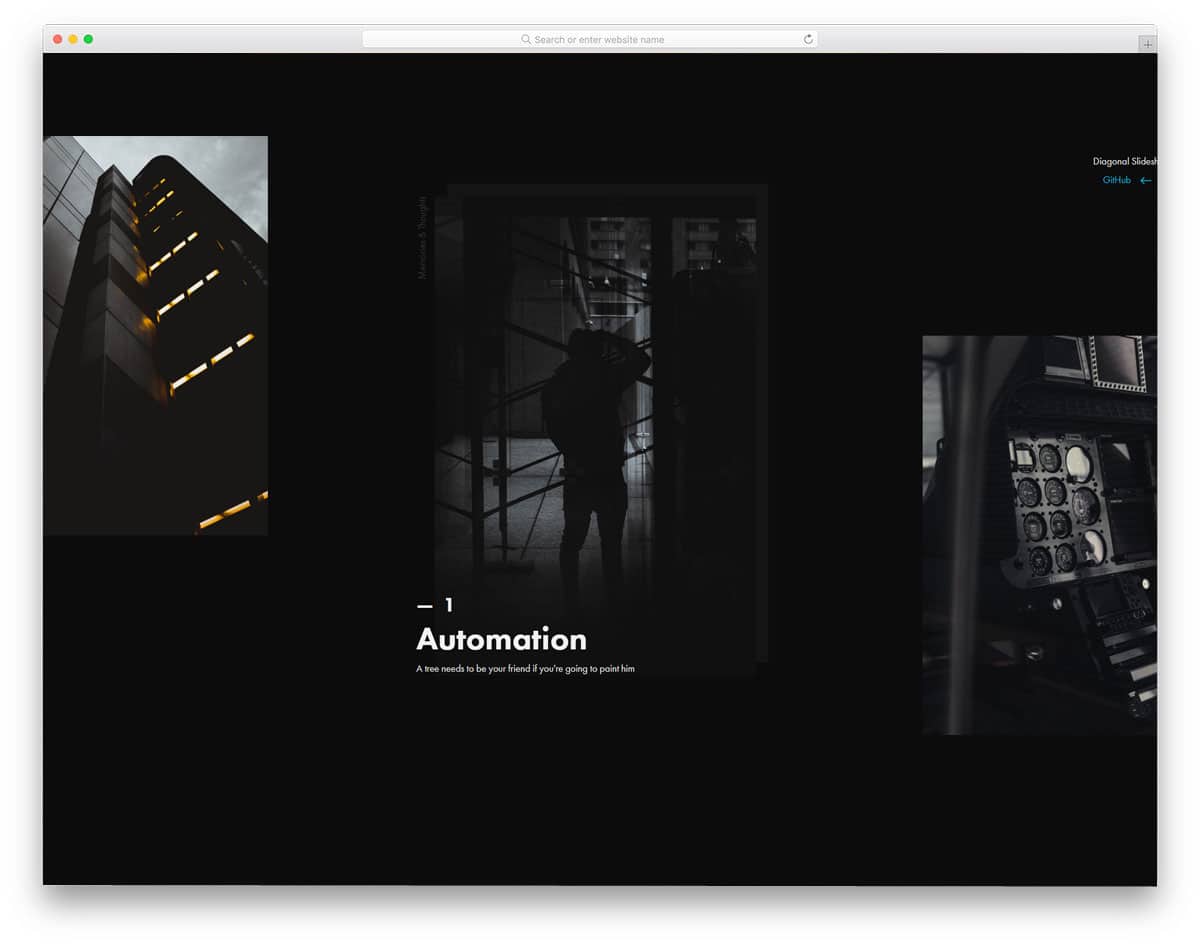
Instead of using the same old left-to-right slider transition, the creator has used diagonals for the slider transition. Even the slider navigation arrows are placed diagonally to give a slight sense of how the diagonal slider works. Like the few other creative full-page CSS slideshow design concepts, this one is also designed for portfolios. The user can click the image to view information about the slider. The only thing you have to keep in mind while using this CSS slideshow concept is the slideshow images will only be shown in portrait orientation. So some of your landscape images might be cropped. Apart from that, this is an interesting slideshow concept that can be used on any website or application.
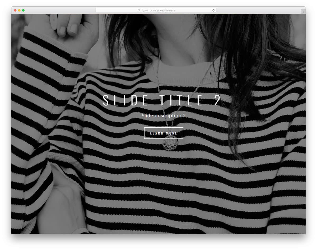
Slideshow
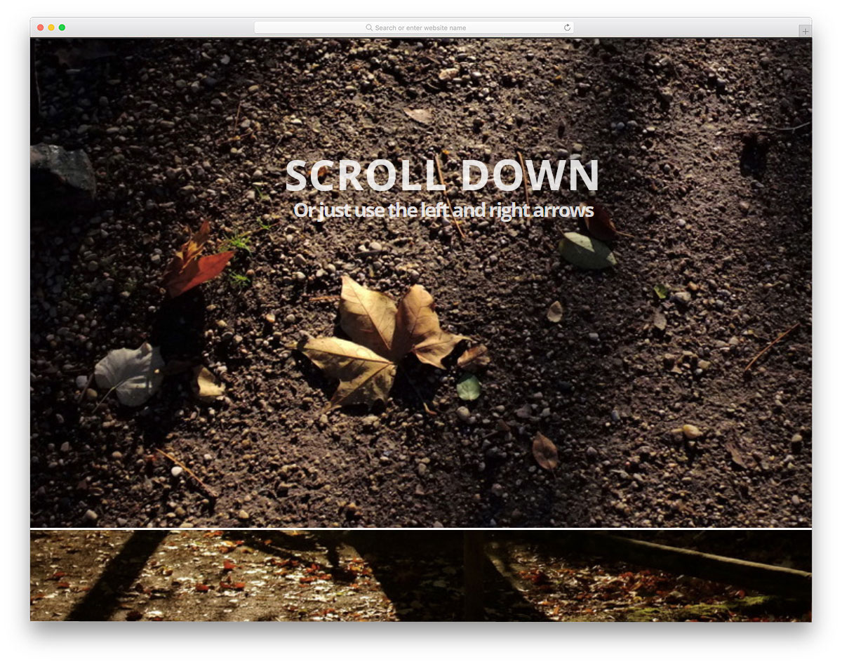
Slideshows are used as a part of the webpage design on certain websites. For example, on photography websites and in some digital agencies, images play a major role. This type of full-page scroll-down animation will be more appropriate for websites that place greater value on images. The full-page design lets the user clearly see your images, and you can add text to explain them. Mostly HTML and CSS are used in this design, so you can incorporate it into your existing projects. This design has lots of room for improvement, by keeping this as inspiration you can even develop a website.
Slicebox – 3D Image Slider
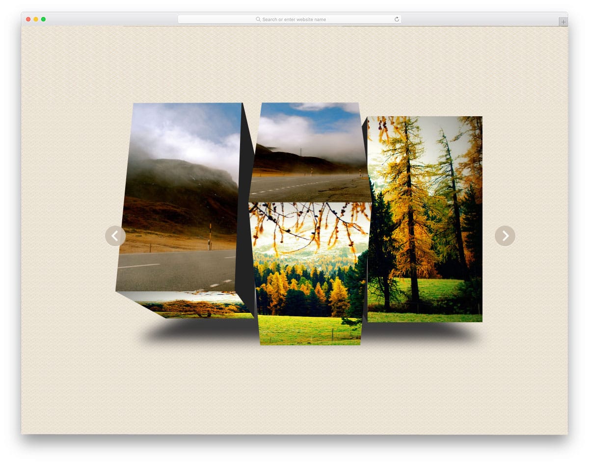
Slicebox gives you an attractive 3D slicing effect for image slider transitions. All the animation effects take place within the image space, so you don’t need to adjust other elements on the web page. The shadow effect is used to neatly highlight the image slider from the rest of the elements. The slicing effect is smooth and looks natural, thanks to the latest CSS3 and a few lines of JavaScript frameworks used in this design. Different types of slicing effects are used to spice up the design and also avoid a boring look.
Slider Transitions
It is a professional slider transition that you can use for both image and product sliders. The alternate parallel scrolling effect gives the slider a unique look. To make navigation between slides easier, the developer has enabled mouse scrolling. The split-screen design gives you ample space for both image and text content. Though the images serve as backgrounds for the text, the fonts are larger and brighter, so the text is legible and easy to read. Mostly HTML5 and CSS3 are used in this design, but to achieve the desired effects, the developer has added a few lines of JavaScript.
Popout Slider

Popout Slider is a creative slider with an artistic look. You can use this design for full-screen image sliders. The default animation effect is simple, but the proper handling of elements has made this slider stand out in this list. The fonts used in this slider also give it a rich look. If you are looking for a slideshow design for your photography website, this is the best option. To fill the page, a zoomed-out image in the slider is used in the background. An ample amount of space is provided on the slider for you to add other elements and links.
Fullscreen Drag-slider With Parallax

This is another slideshow design with space for text content. You can use this slideshow to showcase your project and provide a brief overview. Space is given at the bottom text area to add a text link. If you are using a separate page to explain your project, this text link space will be useful. The developer has given you several options for interacting with the slider: you can use mouse scrolling, arrows, or cursor drag. To make this smart slider, the developer has used HTML5, CSS3, and a JavaScript framework.
Responsive Blog Card Slider
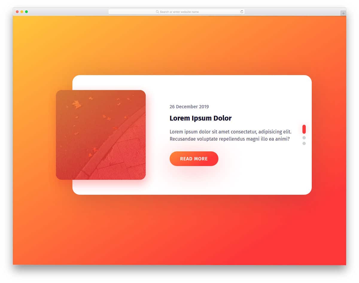
As the name implies, it is a regular-sized widget slider for blogs. Since this slider is designed for blogs, text contents are prioritized over image content. A small image holder is placed at the corner to show the related image. The elements and color scheme look trendy and work well with today’s blog and magazine website templates. By making a few code adjustments, you can use this slider in your design.
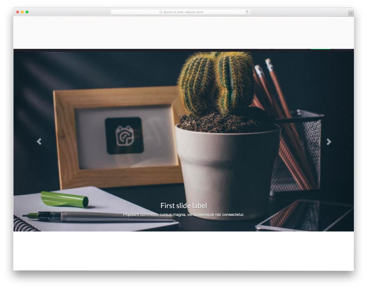
CSS3 Fullscreen Background Slideshow
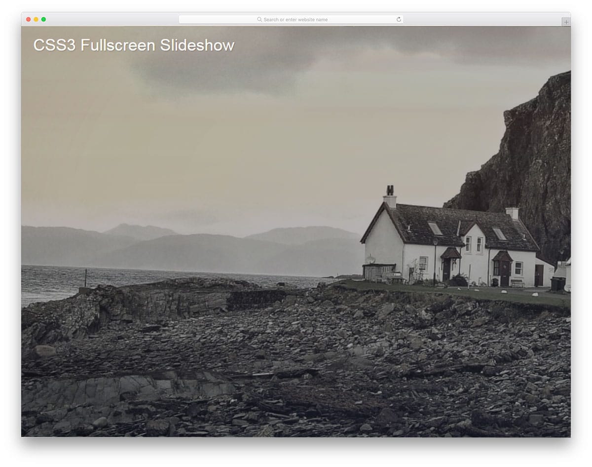
CSS3 Fullscreen Background Slideshow is a pleasant looking slideshow effect. The slow animation gives your images a soothing effect. If you use this effect on a holiday or nature photography website, it will impress your audience. Except for the intro text on the first slide, everything looks neat. But you needn’t worry about the text animation; you can easily fix it by making a few adjustments. Since the creator has shared the code they used, you can easily customize it however you want. Another advantage of this slideshow effect is that it is implemented entirely with the latest CSS3 features. You can expect a fluid, responsive animation effect with this one.
Automatic / Manual Slideshow

If you are expecting a minimal, easy-to-add slideshow widget for your website, this design might be a good fit. As the name implies, this slider has both automatic and manual slide-changing options. Providing a manual option gives the user complete control over the slider. The transition effects are clean and minimal, so your images are clearly visible. At the same time, the developer has kept the effects sleek so that the user does not need to wait for the next image to appear. If you wish to give users the option to view images in a full window, you can modify the code to add this option. The creator of this slideshow used HTML, CSS, and a few lines of JavaScript to achieve a smooth effect. Since the effects are very minimal, you can make this slideshow widget purely using a CSS3 framework.
Geometrical Birds – Slideshow

Geometrical shapes are a part of the modern web design trends. With improvements to web design frameworks, you can add life to shapes. The developer of this slideshow has used the latest web development framework to give an impressive slideshow. From the name alone, you can infer that this slideshow features birds designed with geometric shapes. But you can add your own concept images to this slideshow by making a few code adjustments. In this slideshow, you not only have space to add images but also have space for text content. This slideshow design can be used for product showcasing and gives a short intro to the product. For navigation, the developer has provided mouse, arrow key, and number key controls. It is a well-thought-out slideshow design for modern websites.
Tweenmax Slideshow

Tweenmax Slideshow is a unique slideshow. This one is built purely using the HTML5 framework. We all know that HTML5 offers many core features for modern web design. The developer of this slideshow has used the features to the fullest. Slide transition effects are smooth and fluid, as you would have seen in many Slideshow plugins. Pixel-perfect design and proper coding make this slideshow element a perfect fit for all professional use cases. All you have to do is make the changes you need, add the element you want, and use it on your website.
Untitled Slider
Untitled Slider is a colorful contemporary style slider with cool effects. This slideshow effect can be used in homepage header sections and in eCommerce website’s product page sections. All the transitions in this slider are automatic. If you need you can give navigation arrow options to help the user easily jump between slides. With this slider, you also get space for texts and call-to-action buttons. Since all the basic components are provided in the slider, you can use it as is in your design. Creative transition effects with big image banners will make this slider the best option for entertainment websites as well.
Parallax Slideshow
Parallax Slideshow is almost similar to the Slideshow Presentation design mentioned above. But this one has a slightly different animation effect. From the name alone, you can infer that the design uses a parallax-style transition effect. Not only the slide transitions but also the hover effects are done with precision in this design. Large background images let you display your high-quality images neatly. Bold fonts are used to make the text on the slider easier to read. The developer has used HTML, CSS, and JavaScript to make this interactive slideshow. Check out the info link for more details on the code script used.
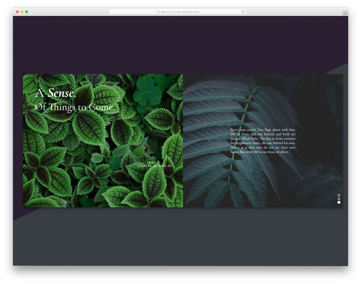
Nautilus Slideshow

Nautilus Slideshow is a conceptual slider animation. Instead of using a traditional vertical and horizontal slider, the creator of this one has tried something different. When the user clicks on the highlighted sidebar, the images on the slider change. As the creator has given you space for both landscape and portrait images, you can use any type of image on this one. The split-screen design lets you show images on one side and text on the other. Overall, it is an interesting concept, but you will need to make a few customizations before using it in your project or website design.
A Simple DIY Responsive Slideshow
As the name implies, it is a simple slideshow for beginners. The developer of this slideshow has used a full-page design so you can showcase your photograph without any issues. Coding-wise, this slideshow needs a bit of tuning for professional use. Arrow keys are used for image navigation. If you want, you can add a scroll input to switch between images. The entire code structure is shared with you directly. On the CodePen editor, you can customize and visualize the content simultaneously. Overall, this slideshow is a common one that you can easily use in any type of website.
Slideshow Vanilla JS
From the name alone, you can tell this slideshow uses JavaScript. For a buttery-smooth result, the developer has used HTML5, CSS3, and JavaScript. But as always, you can edit the code to your requirements. Effects and design-wise, this is a more complex and working version of the Slideshow Presentation design mentioned above. The option to add brief texts and images made it a perfect element that could be added to any part of the website. Except for the timing, everything in this slider design is done properly. Giving an extra bit of time for transition will allow readers to read the content.
Dual Slideshow Demo

Dual Slideshow Demo is a perfect minimal slideshow for simple websites. The developer of this slideshow has given equal importance to slide transitions and interactive hover effects. The to-and-fro slide-changing effect on the opposite side gives the slideshow a cool look. Plus, the developer has given you the option to show the full image when the user hovers over the images. On the clean white background, the images and the ink-black texts look attractive. Both arrow-key and click transmissions are shown in this slideshow.
Split-Screen Slideshow

This slideshow has a split-screen effect for slide transitions. The slide transition controls and slider marks are located in the bottom-left corner for easier navigation. By default, you get a full-page slider. But you can scale it to the size you want and can use it easily anywhere on your website. The creator even gave you the option to add text to the slider, and the best part is that the effects are extended for the text as well. The entire code structure for this split-screen slideshow is available in the CodePen editor. You can customize and visualize the results in the editor before using it on your website.
Slideshow Parallax With TweenMax
Slideshow Parallax is a simple and practically applicable slideshow design. The simple design of this makes it easily applicable to all types of websites. All the necessary slider elements you would normally need in a commercial website are given in this one. Hence, you can easily use this on your website. Hover effects are given for the call-to-action buttons to let the user know before interacting with them. It automatically changes slides, but you can also use the arrows at the corners of the screen to easily switch between slides. A slide count indicator is also provided at the bottom so the user can jump to the exact slide rather than just clicking the arrows.
Greensock Animated Slideshow

Greensock animated slideshow is the best option for travel and hotel website template. The option to add text makes it even better for travel blogs. When designing a blog, using too much animation can overshadow your content. Using subtle animation effects and proper design to promote content will give a better result to your blog engagement rate. In this slider, you can see the upcoming images on the sides, which indicates to the user that there is still more to explore. The transition effects are kept sleek and short so the user can easily see the next piece of content.
Bubble Slideshow Component

If you want something unique for your slide transition effect, this design might impress you. As the name implies, a bubble-like circular effect is used for the slide transitions. The unique thing is you can click anywhere on the image to see the next image. This effect is not only suitable for computer version design but also for mobile version design. You have enough screen space to show your image clearly to the audience. By making a few optimizations, you can use this one in your design.
A Slideshow With A Blind Transition
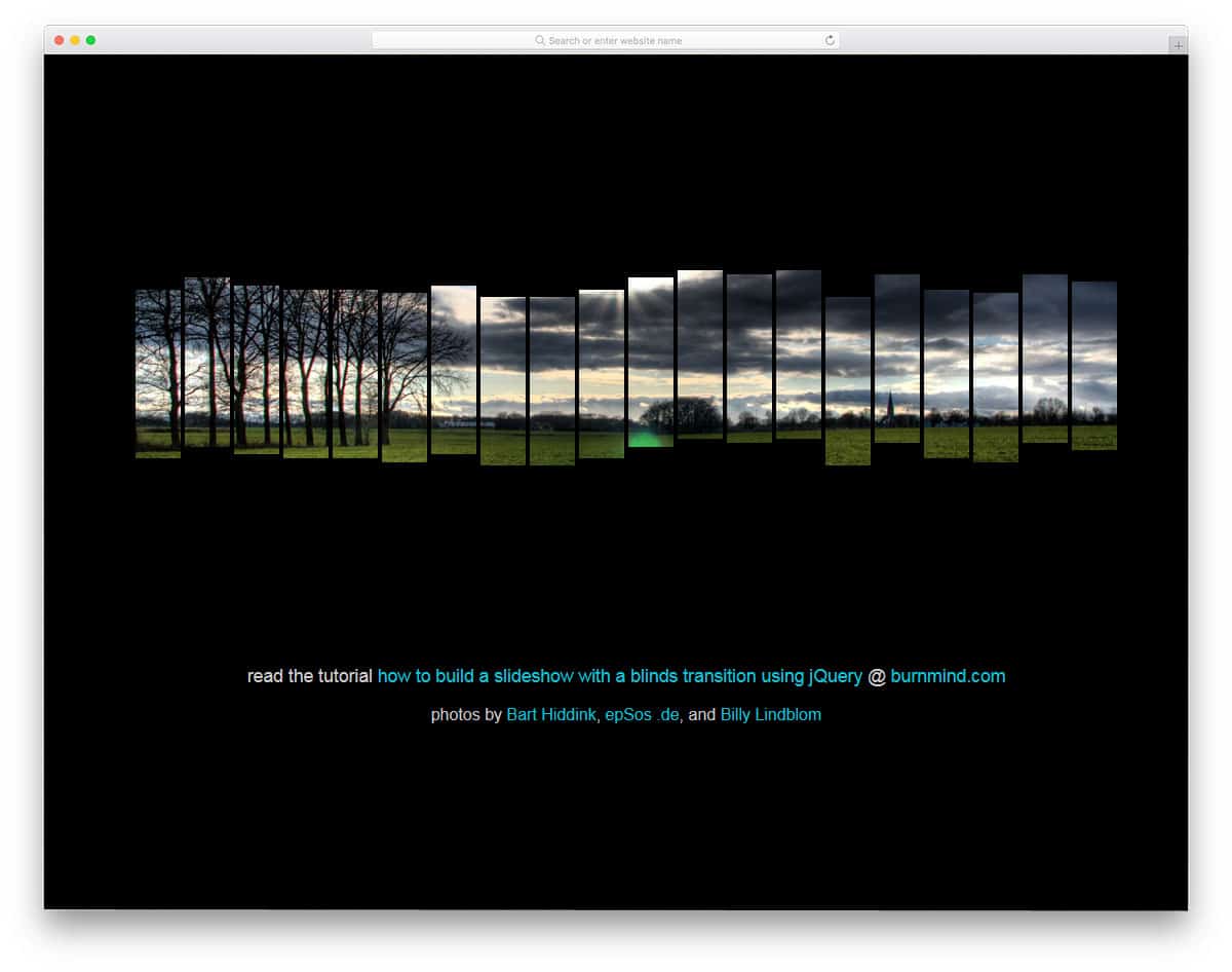
In this slideshow, you can’t show the image completely. The image is treated like a shredded paper and each piece animates separately. This design won’t work for websites that place greater emphasis on images and photographs. Instead, you can use this effect to give a sneak peek of your upcoming product or album. Elements like this will get user attention in the landing and under-construction pages. Speaking of under-construction pages, take a look at our collection of coming-soon templates for more cool designs with a slideshow. Using this element with other web elements will make it an attractive piece.
Silhouette Zoom Slideshow
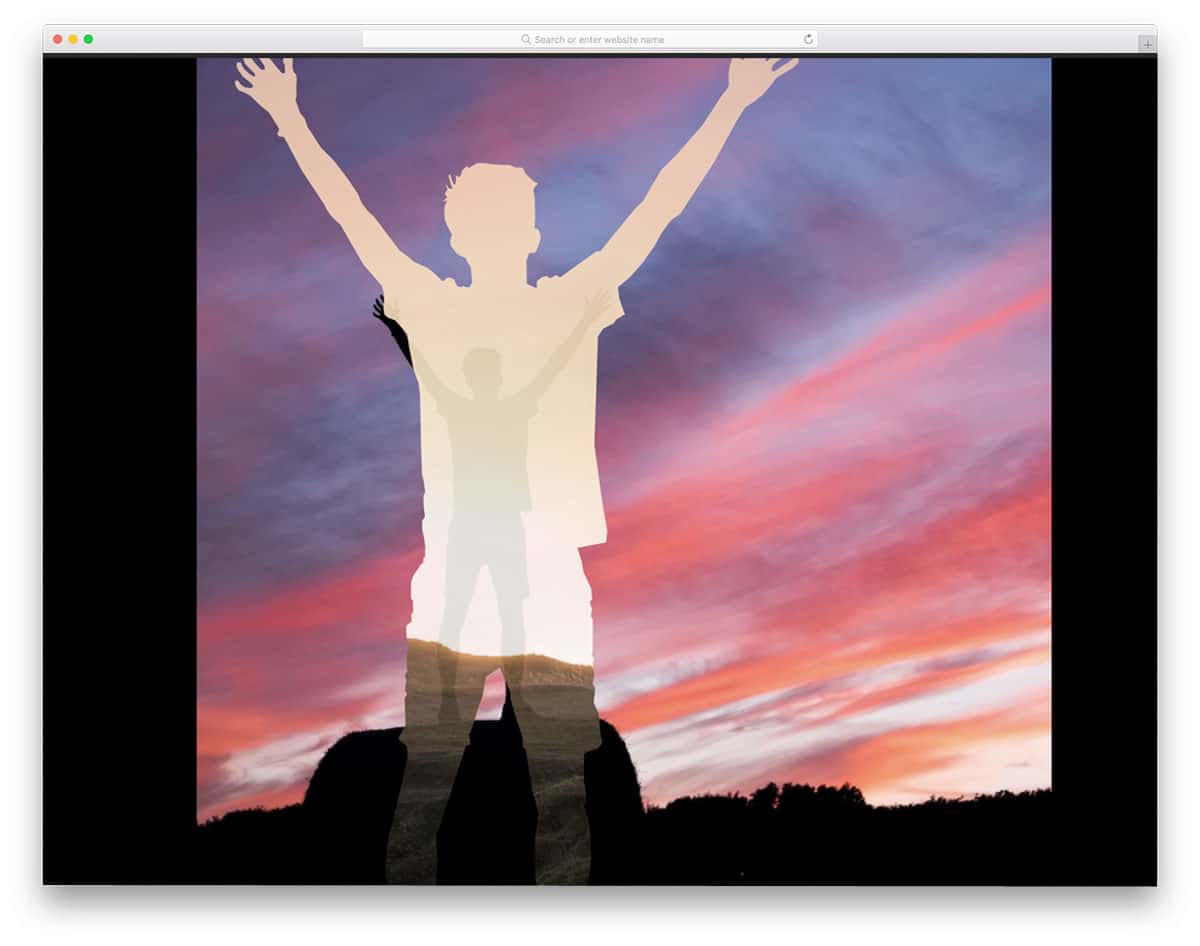
If you love to capture the place or city you live and people living in it, this CSS slideshow effect will be a valuable addition to your website. This effect is not only perfect for photography websites, but also for the artist websites. In most of the photos, only one silhouette is used. You have to experiment on your own with multiple silhouette images. From the demo, you can see that the transition is quick and clean. The entire code structure used to make this beautiful slideshow concept is shared with you by the developer. Play with the shared code to ensure that this design fits your needs.
Slick Slideshow With Blur Effect
In this slideshow, you get a blurred background of the current image in the slider. Based on your requirements, you can adjust the amount of background blur you need. Without the background blur effect, you can use the slider as a widget on your website. Slider count indicators are given at the bottom; other than that, you don’t have any navigation options. You may need to implement the slider navigation option if you are allowing the user to switch slides manually. To build this one, the developer has handled the HTML, CSS, and JavaScript smartly. Based on the code structure you follow, you can customize it to integrate it into your project. By making a few changes, you can turn this design into one of the best CSS slideshow designs.
Full Page Slideshow
Full Page Slideshow is a simple full-page slideshow. This one is similar to the screensaver options on your computer. You don’t have any control over the image sliders; they change automatically. Transitions are simple and sleek, with no delay. If you’re looking for a simpler slideshow for your website or application, this one will fit the bill. Transitions this quick can even be used on the deconstruction or maintenance page, so you can keep your audience engaged for a few minutes until you get online.