About this set
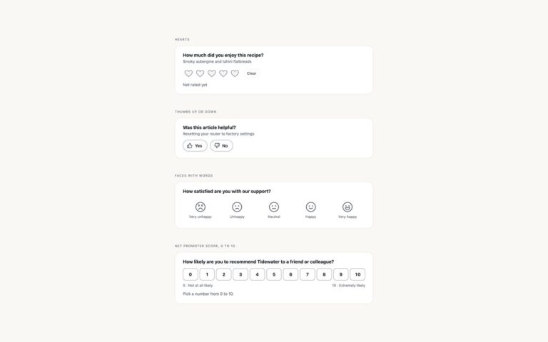
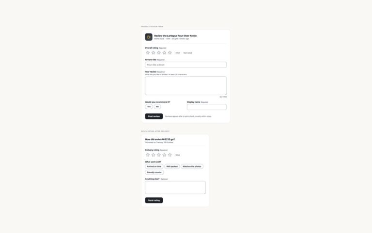
Star rating inputs built on native radio buttons, with no JavaScript. Five stars, clearable asks how a stay at a lodge was, shows the chosen value as text such as 3 of 5 and Good, and has a Clear button. Half-star steps rates a film in ten steps from half a star to five, with each star made of two labels that each show half of the same SVG. A word under every star rates a delivery and prints Poor, Fair, Good, Very good and Excellent beneath the stars. The radios stay in their natural 1 to 5 order, so the arrow keys move the way the stars look, instead of using the common reversed-order trick that makes the keys run backwards. The first radio is the Clear option and starts checked; every star is gold by default and the stars after the checked radio turn grey, so plain sibling selectors draw the fill. Hover previews the same way: the row lights up and the stars after the hovered one go grey. The chosen star also gets a bar under it, so the choice is not shown by colour alone.
What’s included
- Native radio group in a fieldset with a legend
- Natural 1 to 5 order, so arrow keys match the stars
- Clear option that is part of the radio group
- Half-star input with ten steps
- Hover preview and selected value written as text
- No JavaScript and no :has()
Accessibility
Each group is a fieldset with a legend, and every radio has a name such as 3 stars or 2.5 stars. Tab moves into the group and the arrow keys change the rating in the order the stars appear. The visible star carries a 3px focus outline and the chosen star gets a bar underneath, so focus and selection do not rely on colour. Transitions and the hover zoom stop under prefers-reduced-motion.
Customise it
Set --si-on, --si-on-edge, --si-off, --si-off-edge and --si-focus on .si for colours and --si-size for the star size. Bootstrap uses the same variables with .btn-check radios; in Tailwind change the si colours in @theme and the --si-size class on the wrapper.