Open demo

CSS code

HTML
<div class="duo iso">
  <div><span class="lbl">Card stack that fans out</span>
  <div class="iso-stage">
    <ul class="iso-stack">
      <li style="--i:2"><div class="iso-card" style="--c:#2563eb"><h3><i aria-hidden="true"></i>Inbox</h3><p>14 unread, 3 flagged from Halden Freight.</p><a href="#">Open Inbox</a></div></li>
      <li style="--i:1"><div class="iso-card" style="--c:#ea580c"><h3><i aria-hidden="true"></i>Calendar</h3><p>Design review at 14:30 in Room 4.</p><a href="#">Open Calendar</a></div></li>
      <li style="--i:0"><div class="iso-card iso-notes" style="--c:#ca8a04"><h3><i aria-hidden="true"></i>Notes</h3><p>Order more oat milk. Renew the domain.</p><a href="#">Open Notes</a></div></li>
    </ul>
  </div></div>

  <div><span class="lbl">Isometric status illustration</span>
  <div class="iso-infra">
    <div class="iso-art" role="img" aria-label="Three server towers on a floor plate, the tallest one marked amber">
      <div class="iso-floor">
        <div class="iso-tw" style="--h:70px;left:18px;top:18px"><i class="iso-tw-top"></i><i class="iso-tw-s"></i><i class="iso-tw-w"></i></div>
        <div class="iso-tw iso-tw-hot" style="--h:112px;left:72px;top:72px"><i class="iso-tw-top"></i><i class="iso-tw-s"></i><i class="iso-tw-w"></i></div>
        <div class="iso-tw" style="--h:84px;left:126px;top:126px"><i class="iso-tw-top"></i><i class="iso-tw-s"></i><i class="iso-tw-w"></i></div>
      </div>
    </div>
    <div>
      <p class="iso-k">Cluster</p>
      <h3>eu-west-2</h3>
      <dl><dt>Nodes</dt><dd>3 of 3 healthy</dd><dt>Uptime</dt><dd>99.98 per cent</dd><dt>Load</dt><dd><b>Node 2 at 86 per cent</b></dd></dl>
      <a href="#">View cluster metrics</a>
    </div>
  </div></div>
</div>

<div class="iso"><span class="lbl">Raised tiles that lift on hover and focus</span>
<ul class="iso-tiles">
  <li><a class="iso-tile" href="#"><svg viewBox="0 0 24 24" fill="none" stroke="currentColor" stroke-width="2" stroke-linecap="round" stroke-linejoin="round" aria-hidden="true" focusable="false"><path d="M4 20V10M10 20V4M16 20v-7M22 20H2"/></svg><strong>Analytics</strong><span>12 dashboards</span></a></li>
  <li><a class="iso-tile iso-teal" href="#"><svg viewBox="0 0 24 24" fill="none" stroke="currentColor" stroke-width="2" stroke-linecap="round" stroke-linejoin="round" aria-hidden="true" focusable="false"><rect x="2.5" y="5" width="19" height="14" rx="2.5"/><path d="M2.5 10h19M6.5 15h4"/></svg><strong>Billing</strong><span>Next run 1 May</span></a></li>
  <li><a class="iso-tile iso-rose" href="#"><svg viewBox="0 0 24 24" fill="none" stroke="currentColor" stroke-width="2" stroke-linecap="round" stroke-linejoin="round" aria-hidden="true" focusable="false"><circle cx="9" cy="8" r="3.5"/><path d="M2.5 20c.6-3.6 3.2-5.5 6.5-5.5s5.9 1.9 6.5 5.5M16 4.8a3.5 3.5 0 0 1 0 6.4M18.5 14.8c1.7.8 2.7 2.5 3 5.2"/></svg><strong>Team</strong><span>9 members</span></a></li>
</ul></div>
CSS
/* Isometric UI. Every piece sits on a plane turned with rotateX(55deg) rotateZ(-45deg) and no perspective, so parallel
   edges stay parallel. Depth comes from translateZ (card stack, towers) or from stacked box-shadows (tiles). */
.iso{--iso:rotateX(55deg) rotateZ(-45deg);--iso-focus:#1d4ed8;color:#0f172a}
.iso :where(ul,ol,p,h3,dl,dd){margin:0;padding:0;list-style:none}
.iso a:focus-visible{outline:3px solid var(--iso-focus);outline-offset:3px}

/* A. card stack that fans out on hover and keyboard focus */
.iso-stage{display:grid;place-items:center;height:340px}
.iso-stack{position:relative;width:210px;height:150px;transform:var(--iso) translate(26px,26px);transform-style:preserve-3d}
.iso-stack > li{position:absolute;inset:0;transform:translateZ(calc(var(--i) * 22px));transition:transform .5s cubic-bezier(.3,.8,.25,1)}
.iso-stack:hover > li,.iso-stack:focus-within > li{transform:translate3d(calc(var(--i) * -18px),calc(var(--i) * -18px),calc(var(--i) * 64px))}
.iso-stack > li:focus-within{transform:translate3d(calc(var(--i) * -18px),calc(var(--i) * -18px),calc(var(--i) * 64px + 24px))}
.iso-card{display:flex;flex-direction:column;height:100%;padding:14px 16px;border-radius:14px;background:#fff;
  box-shadow:0 0 0 1px rgba(15,23,42,.08),10px 10px 20px rgba(15,23,42,.18)}
.iso-card h3{display:flex;align-items:center;gap:8px;font-size:.92rem;font-weight:800}
.iso-card h3 i{width:10px;height:10px;border-radius:3px;background:var(--c)}
.iso-card p{margin-top:6px;font-size:.78rem;color:#475569;line-height:1.4}
.iso-card a{margin-top:auto;align-self:flex-start;font-size:.8rem;font-weight:800;color:#1d4ed8;text-decoration:none}
.iso-card a:hover{text-decoration:underline}
.iso-notes{background:#fef9c3}

/* B. illustration: towers built from three faces each on a floor plate */
.iso-infra{display:grid;grid-template-columns:repeat(auto-fit,minmax(min(100%,240px),1fr));align-items:center;gap:20px;padding:24px;border-radius:22px;background:#fff;box-shadow:0 24px 40px -32px rgba(15,23,42,.5)}
.iso-art{display:grid;place-items:center;height:280px}
.iso-floor{position:relative;width:190px;height:190px;border-radius:14px;transform:var(--iso) translate(0,24px);transform-style:preserve-3d;
  background:linear-gradient(#cbd5e1 1px,transparent 1px) 0 0/38px 38px,linear-gradient(90deg,#cbd5e1 1px,transparent 1px) 0 0/38px 38px,#e2e8f0}
.iso-tw{--s:46px;position:absolute;width:var(--s);height:var(--s);transform-style:preserve-3d}
.iso-tw > i{position:absolute}
.iso-tw-top{inset:0;transform:translateZ(var(--h));background:#f8fafc;box-shadow:inset 0 0 0 1px #cbd5e1}
.iso-tw-s{left:0;bottom:0;width:var(--s);height:var(--h);transform-origin:bottom;transform:rotateX(-90deg);
  background:radial-gradient(circle,#22c55e 0 2px,transparent 2.5px) 8px 0/100% 14px repeat-y,repeating-linear-gradient(180deg,#475569 0 12px,#334155 12px 14px)}
.iso-tw-w{left:0;top:0;width:var(--h);height:var(--s);transform-origin:left;transform:rotateY(-90deg);
  background:repeating-linear-gradient(90deg,#64748b 0 12px,#56657a 12px 14px)}
.iso-tw-hot .iso-tw-s{background:radial-gradient(circle,#f59e0b 0 2px,transparent 2.5px) 8px 0/100% 14px repeat-y,repeating-linear-gradient(180deg,#475569 0 12px,#334155 12px 14px)}
.iso-k{font-size:.72rem;font-weight:800;letter-spacing:.14em;text-transform:uppercase;color:#475569}
.iso-infra h3{margin-top:4px;font-size:1.2rem;font-weight:800}
.iso-infra dl{display:grid;grid-template-columns:auto 1fr;gap:8px 18px;margin-top:16px;font-size:.9rem}
.iso-infra dt{color:#475569}
.iso-infra dd{font-weight:700}
.iso-infra dd b{color:#b45309}
.iso-infra a{display:inline-block;margin-top:18px;font-size:.88rem;font-weight:800;color:#1d4ed8;text-decoration:none}
.iso-infra a:hover{text-decoration:underline}

/* C. raised tiles: the slab edge is a stack of box-shadows on the turned plane; hover or focus lifts the tile */
.iso-tiles{display:flex;flex-wrap:wrap;justify-content:center;gap:10px 18px}
.iso-tiles > li{display:grid;place-items:center;width:220px;height:180px}
.iso-tile{--t:#4f46e5;--t-edge:#3730a3;display:flex;flex-direction:column;justify-content:flex-end;width:140px;height:140px;padding:16px;border-radius:18px;background:var(--t);color:#fff;text-decoration:none;
  transform:var(--iso);box-shadow:1px 1px 0 var(--t-edge),2px 2px 0 var(--t-edge),3px 3px 0 var(--t-edge),4px 4px 0 var(--t-edge),5px 5px 0 var(--t-edge),6px 6px 0 var(--t-edge),14px 14px 18px rgba(15,23,42,.25);
  transition:transform .35s cubic-bezier(.3,.8,.25,1),box-shadow .35s}
.iso-tile:hover,.iso-tile:focus-visible{transform:var(--iso) translate(-8px,-8px);
  box-shadow:1px 1px 0 var(--t-edge),2px 2px 0 var(--t-edge),4px 4px 0 var(--t-edge),6px 6px 0 var(--t-edge),8px 8px 0 var(--t-edge),10px 10px 0 var(--t-edge),12px 12px 0 var(--t-edge),14px 14px 0 var(--t-edge),26px 26px 24px rgba(15,23,42,.22)}
.iso-tile svg{width:28px;height:28px;margin-bottom:auto}
.iso-tile strong{font-size:1rem}
.iso-tile span{font-size:.78rem;opacity:.92}
.iso .iso-tile:focus-visible{outline:3px solid #0f172a;outline-offset:4px}
.iso-teal{--t:#0f766e;--t-edge:#115e59}
.iso-rose{--t:#be123c;--t-edge:#881337}

@media (prefers-reduced-motion:reduce){
  .iso-stack > li,.iso-tile{transition:none}
}

Bootstrap 5 code

Requires: Bootstrap 5.3.8 CSS

HTML
<div class="row row-cols-1 row-cols-md-2 duo iso">
  <div class="col"><span class="lbl">Card stack that fans out</span>
  <div class="iso-stage">
    <ul class="iso-stack list-unstyled mb-0">
      <li style="--i:2"><div class="card iso-card" style="--c:#2563eb"><div class="card-body"><h3><i aria-hidden="true"></i>Inbox</h3><p>14 unread, 3 flagged from Halden Freight.</p><a class="card-link" href="#">Open Inbox</a></div></div></li>
      <li style="--i:1"><div class="card iso-card" style="--c:#ea580c"><div class="card-body"><h3><i aria-hidden="true"></i>Calendar</h3><p>Design review at 14:30 in Room 4.</p><a class="card-link" href="#">Open Calendar</a></div></div></li>
      <li style="--i:0"><div class="card iso-card iso-notes" style="--c:#ca8a04"><div class="card-body"><h3><i aria-hidden="true"></i>Notes</h3><p>Order more oat milk. Renew the domain.</p><a class="card-link" href="#">Open Notes</a></div></div></li>
    </ul>
  </div></div>

  <div class="col"><span class="lbl">Isometric status illustration</span>
  <div class="card iso-infra"><div class="card-body">
    <div class="iso-art" role="img" aria-label="Three server towers on a floor plate, the tallest one marked amber">
      <div class="iso-floor">
        <div class="iso-tw" style="--h:70px;left:18px;top:18px"><i class="iso-tw-top"></i><i class="iso-tw-s"></i><i class="iso-tw-w"></i></div>
        <div class="iso-tw iso-tw-hot" style="--h:112px;left:72px;top:72px"><i class="iso-tw-top"></i><i class="iso-tw-s"></i><i class="iso-tw-w"></i></div>
        <div class="iso-tw" style="--h:84px;left:126px;top:126px"><i class="iso-tw-top"></i><i class="iso-tw-s"></i><i class="iso-tw-w"></i></div>
      </div>
    </div>
    <div>
      <p class="iso-k">Cluster</p>
      <h3>eu-west-2</h3>
      <dl><dt>Nodes</dt><dd>3 of 3 healthy</dd><dt>Uptime</dt><dd>99.98 per cent</dd><dt>Load</dt><dd><b>Node 2 at 86 per cent</b></dd></dl>
      <a href="#">View cluster metrics</a>
    </div>
  </div></div></div>
</div>

<div class="iso"><span class="lbl">Raised tiles that lift on hover and focus</span>
<ul class="iso-tiles list-unstyled mb-0">
  <li><a class="iso-tile" href="#"><svg viewBox="0 0 24 24" fill="none" stroke="currentColor" stroke-width="2" stroke-linecap="round" stroke-linejoin="round" aria-hidden="true" focusable="false"><path d="M4 20V10M10 20V4M16 20v-7M22 20H2"/></svg><strong>Analytics</strong><span>12 dashboards</span></a></li>
  <li><a class="iso-tile iso-teal" href="#"><svg viewBox="0 0 24 24" fill="none" stroke="currentColor" stroke-width="2" stroke-linecap="round" stroke-linejoin="round" aria-hidden="true" focusable="false"><rect x="2.5" y="5" width="19" height="14" rx="2.5"/><path d="M2.5 10h19M6.5 15h4"/></svg><strong>Billing</strong><span>Next run 1 May</span></a></li>
  <li><a class="iso-tile iso-rose" href="#"><svg viewBox="0 0 24 24" fill="none" stroke="currentColor" stroke-width="2" stroke-linecap="round" stroke-linejoin="round" aria-hidden="true" focusable="false"><circle cx="9" cy="8" r="3.5"/><path d="M2.5 20c.6-3.6 3.2-5.5 6.5-5.5s5.9 1.9 6.5 5.5M16 4.8a3.5 3.5 0 0 1 0 6.4M18.5 14.8c1.7.8 2.7 2.5 3 5.2"/></svg><strong>Team</strong><span>9 members</span></a></li>
</ul></div>
CSS
/* Isometric UI on Bootstrap .card and list utilities. Every piece sits on a plane turned with rotateX(55deg) rotateZ(-45deg) and no perspective, so parallel
   edges stay parallel. Depth comes from translateZ (card stack, towers) or from stacked box-shadows (tiles). */
.iso{--iso:rotateX(55deg) rotateZ(-45deg);--iso-focus:#1d4ed8;color:#0f172a}
.iso :where(ul,ol,p,h3,dl,dd,dt){margin:0;padding:0;list-style:none}
.iso a:focus-visible{outline:3px solid var(--iso-focus);outline-offset:3px}

/* A. card stack that fans out on hover and keyboard focus */
.iso-stage{display:grid;place-items:center;height:340px}
.iso-stack{position:relative;width:210px;height:150px;transform:var(--iso) translate(26px,26px);transform-style:preserve-3d}
.iso-stack > li{position:absolute;inset:0;transform:translateZ(calc(var(--i) * 22px));transition:transform .5s cubic-bezier(.3,.8,.25,1)}
.iso-stack:hover > li,.iso-stack:focus-within > li{transform:translate3d(calc(var(--i) * -18px),calc(var(--i) * -18px),calc(var(--i) * 64px))}
.iso-stack > li:focus-within{transform:translate3d(calc(var(--i) * -18px),calc(var(--i) * -18px),calc(var(--i) * 64px + 24px))}
.iso-card{--bs-card-border-width:0;--bs-card-border-radius:14px;--bs-card-spacer-x:16px;--bs-card-spacer-y:14px;height:100%;
  box-shadow:0 0 0 1px rgba(15,23,42,.08),10px 10px 20px rgba(15,23,42,.18)}
.iso-card .card-body{display:flex;flex-direction:column}
.iso-card h3{display:flex;align-items:center;gap:8px;font-size:.92rem;font-weight:800}
.iso-card h3 i{width:10px;height:10px;border-radius:3px;background:var(--c)}
.iso-card p{margin-top:6px;font-size:.78rem;color:#475569;line-height:1.4}
.iso-card a{margin-top:auto;align-self:flex-start;font-size:.8rem;font-weight:800;color:#1d4ed8;text-decoration:none}
.iso-card a:hover{text-decoration:underline}
.iso-notes{--bs-card-bg:#fef9c3}

/* B. illustration: towers built from three faces each on a floor plate */
.iso-infra{--bs-card-border-width:0;--bs-card-border-radius:22px;box-shadow:0 24px 40px -32px rgba(15,23,42,.5)}
.iso-infra .card-body{display:grid;grid-template-columns:repeat(auto-fit,minmax(min(100%,240px),1fr));align-items:center;gap:20px;padding:24px}
.iso-art{display:grid;place-items:center;height:280px}
.iso-floor{position:relative;width:190px;height:190px;border-radius:14px;transform:var(--iso) translate(0,24px);transform-style:preserve-3d;
  background:linear-gradient(#cbd5e1 1px,transparent 1px) 0 0/38px 38px,linear-gradient(90deg,#cbd5e1 1px,transparent 1px) 0 0/38px 38px,#e2e8f0}
.iso-tw{--s:46px;position:absolute;width:var(--s);height:var(--s);transform-style:preserve-3d}
.iso-tw > i{position:absolute}
.iso-tw-top{inset:0;transform:translateZ(var(--h));background:#f8fafc;box-shadow:inset 0 0 0 1px #cbd5e1}
.iso-tw-s{left:0;bottom:0;width:var(--s);height:var(--h);transform-origin:bottom;transform:rotateX(-90deg);
  background:radial-gradient(circle,#22c55e 0 2px,transparent 2.5px) 8px 0/100% 14px repeat-y,repeating-linear-gradient(180deg,#475569 0 12px,#334155 12px 14px)}
.iso-tw-w{left:0;top:0;width:var(--h);height:var(--s);transform-origin:left;transform:rotateY(-90deg);
  background:repeating-linear-gradient(90deg,#64748b 0 12px,#56657a 12px 14px)}
.iso-tw-hot .iso-tw-s{background:radial-gradient(circle,#f59e0b 0 2px,transparent 2.5px) 8px 0/100% 14px repeat-y,repeating-linear-gradient(180deg,#475569 0 12px,#334155 12px 14px)}
.iso-k{font-size:.72rem;font-weight:800;letter-spacing:.14em;text-transform:uppercase;color:#475569}
.iso-infra h3{margin-top:4px;font-size:1.2rem;font-weight:800}
.iso-infra dl{display:grid;grid-template-columns:auto 1fr;gap:8px 18px;margin-top:16px;font-size:.9rem}
.iso-infra dt{color:#475569}
.iso-infra dd{font-weight:700}
.iso-infra dd b{color:#b45309}
.iso-infra a{display:inline-block;margin-top:18px;font-size:.88rem;font-weight:800;color:#1d4ed8;text-decoration:none}
.iso-infra a:hover{text-decoration:underline}

/* C. raised tiles: the slab edge is a stack of box-shadows on the turned plane; hover or focus lifts the tile */
.iso-tiles{display:flex;flex-wrap:wrap;justify-content:center;gap:10px 18px}
.iso-tiles > li{display:grid;place-items:center;width:220px;height:180px}
.iso-tile{--t:#4f46e5;--t-edge:#3730a3;display:flex;flex-direction:column;justify-content:flex-end;width:140px;height:140px;padding:16px;border-radius:18px;background:var(--t);color:#fff;text-decoration:none;
  transform:var(--iso);box-shadow:1px 1px 0 var(--t-edge),2px 2px 0 var(--t-edge),3px 3px 0 var(--t-edge),4px 4px 0 var(--t-edge),5px 5px 0 var(--t-edge),6px 6px 0 var(--t-edge),14px 14px 18px rgba(15,23,42,.25);
  transition:transform .35s cubic-bezier(.3,.8,.25,1),box-shadow .35s}
.iso-tile:hover,.iso-tile:focus-visible{transform:var(--iso) translate(-8px,-8px);
  box-shadow:1px 1px 0 var(--t-edge),2px 2px 0 var(--t-edge),4px 4px 0 var(--t-edge),6px 6px 0 var(--t-edge),8px 8px 0 var(--t-edge),10px 10px 0 var(--t-edge),12px 12px 0 var(--t-edge),14px 14px 0 var(--t-edge),26px 26px 24px rgba(15,23,42,.22)}
.iso-tile svg{width:28px;height:28px;margin-bottom:auto}
.iso-tile strong{font-size:1rem}
.iso-tile span{font-size:.78rem;opacity:.92}
.iso .iso-tile:focus-visible{outline:3px solid #0f172a;outline-offset:4px}
.iso-teal{--t:#0f766e;--t-edge:#115e59}
.iso-rose{--t:#be123c;--t-edge:#881337}

@media (prefers-reduced-motion:reduce){
  .iso-stack > li,.iso-tile{transition:none}
}

Tailwind 4 code

Requires: Tailwind CSS 4

HTML
<div class="grid grid-cols-[repeat(auto-fit,minmax(min(100%,340px),1fr))] gap-12">
  <div><span class="mb-[18px] block text-[.72rem] tracking-[.12em] text-[#475569] uppercase">Card stack that fans out</span>
  <div class="grid h-[340px] place-items-center">
    <ul class="group relative h-[150px] w-[210px] transform-3d [transform:rotateX(55deg)_rotateZ(-45deg)_translate(26px,26px)]">
      <li class="absolute inset-0 [transform:translateZ(calc(var(--i)*22px))] transition-transform duration-500 ease-[cubic-bezier(.3,.8,.25,1)] focus-within:[--lift:24px] group-hover:[transform:translate3d(calc(var(--i)*-18px),calc(var(--i)*-18px),calc(var(--i)*64px_+_var(--lift,0px)))] group-focus-within:[transform:translate3d(calc(var(--i)*-18px),calc(var(--i)*-18px),calc(var(--i)*64px_+_var(--lift,0px)))] motion-reduce:transition-none [--i:2]"><div class="flex h-full flex-col rounded-[14px] px-4 py-3.5 shadow-[0_0_0_1px_rgba(15,23,42,.08),10px_10px_20px_rgba(15,23,42,.18)] bg-white"><h3 class="flex items-center gap-2 text-[.92rem] font-extrabold"><i class="size-2.5 rounded-[3px] bg-[#2563eb]" aria-hidden="true"></i>Inbox</h3><p class="mt-1.5 text-[.78rem] leading-[1.4] text-[#475569]">14 unread, 3 flagged from Halden Freight.</p><a class="mt-auto self-start text-[.8rem] font-extrabold text-[#1d4ed8] no-underline hover:underline focus-visible:outline-3 focus-visible:outline-offset-3 focus-visible:outline-[#1d4ed8]" href="#">Open Inbox</a></div></li>
      <li class="absolute inset-0 [transform:translateZ(calc(var(--i)*22px))] transition-transform duration-500 ease-[cubic-bezier(.3,.8,.25,1)] focus-within:[--lift:24px] group-hover:[transform:translate3d(calc(var(--i)*-18px),calc(var(--i)*-18px),calc(var(--i)*64px_+_var(--lift,0px)))] group-focus-within:[transform:translate3d(calc(var(--i)*-18px),calc(var(--i)*-18px),calc(var(--i)*64px_+_var(--lift,0px)))] motion-reduce:transition-none [--i:1]"><div class="flex h-full flex-col rounded-[14px] px-4 py-3.5 shadow-[0_0_0_1px_rgba(15,23,42,.08),10px_10px_20px_rgba(15,23,42,.18)] bg-white"><h3 class="flex items-center gap-2 text-[.92rem] font-extrabold"><i class="size-2.5 rounded-[3px] bg-[#ea580c]" aria-hidden="true"></i>Calendar</h3><p class="mt-1.5 text-[.78rem] leading-[1.4] text-[#475569]">Design review at 14:30 in Room 4.</p><a class="mt-auto self-start text-[.8rem] font-extrabold text-[#1d4ed8] no-underline hover:underline focus-visible:outline-3 focus-visible:outline-offset-3 focus-visible:outline-[#1d4ed8]" href="#">Open Calendar</a></div></li>
      <li class="absolute inset-0 [transform:translateZ(calc(var(--i)*22px))] transition-transform duration-500 ease-[cubic-bezier(.3,.8,.25,1)] focus-within:[--lift:24px] group-hover:[transform:translate3d(calc(var(--i)*-18px),calc(var(--i)*-18px),calc(var(--i)*64px_+_var(--lift,0px)))] group-focus-within:[transform:translate3d(calc(var(--i)*-18px),calc(var(--i)*-18px),calc(var(--i)*64px_+_var(--lift,0px)))] motion-reduce:transition-none [--i:0]"><div class="flex h-full flex-col rounded-[14px] px-4 py-3.5 shadow-[0_0_0_1px_rgba(15,23,42,.08),10px_10px_20px_rgba(15,23,42,.18)] bg-[#fef9c3]"><h3 class="flex items-center gap-2 text-[.92rem] font-extrabold"><i class="size-2.5 rounded-[3px] bg-[#ca8a04]" aria-hidden="true"></i>Notes</h3><p class="mt-1.5 text-[.78rem] leading-[1.4] text-[#475569]">Order more oat milk. Renew the domain.</p><a class="mt-auto self-start text-[.8rem] font-extrabold text-[#1d4ed8] no-underline hover:underline focus-visible:outline-3 focus-visible:outline-offset-3 focus-visible:outline-[#1d4ed8]" href="#">Open Notes</a></div></li>
    </ul>
  </div></div>

  <div><span class="mb-[18px] block text-[.72rem] tracking-[.12em] text-[#475569] uppercase">Isometric status illustration</span>
  <div class="grid grid-cols-[repeat(auto-fit,minmax(min(100%,240px),1fr))] items-center gap-5 rounded-[22px] bg-white p-6 shadow-[0_24px_40px_-32px_rgba(15,23,42,.5)]">
    <div class="grid h-[280px] place-items-center" role="img" aria-label="Three server towers on a floor plate, the tallest one marked amber">
      <div class="relative size-[190px] rounded-[14px] transform-3d [background:linear-gradient(#cbd5e1_1px,transparent_1px)_0_0/38px_38px,linear-gradient(90deg,#cbd5e1_1px,transparent_1px)_0_0/38px_38px,#e2e8f0] [transform:rotateX(55deg)_rotateZ(-45deg)_translate(0,24px)]">
        <div class="absolute size-(--s) transform-3d [--s:46px] [--h:70px] top-[18px] left-[18px]"><i class="absolute inset-0 bg-[#f8fafc] shadow-[inset_0_0_0_1px_#cbd5e1] [transform:translateZ(var(--h))]"></i><i class="absolute bottom-0 left-0 h-(--h) w-(--s) origin-bottom [background:radial-gradient(circle,#22c55e_0_2px,transparent_2.5px)_8px_0/100%_14px_repeat-y,repeating-linear-gradient(180deg,#475569_0_12px,#334155_12px_14px)] [transform:rotateX(-90deg)]"></i><i class="absolute top-0 left-0 h-(--s) w-(--h) origin-left [background:repeating-linear-gradient(90deg,#64748b_0_12px,#56657a_12px_14px)] [transform:rotateY(-90deg)]"></i></div>
        <div class="absolute size-(--s) transform-3d [--s:46px] [--h:112px] top-[72px] left-[72px]"><i class="absolute inset-0 bg-[#f8fafc] shadow-[inset_0_0_0_1px_#cbd5e1] [transform:translateZ(var(--h))]"></i><i class="absolute bottom-0 left-0 h-(--h) w-(--s) origin-bottom [background:radial-gradient(circle,#f59e0b_0_2px,transparent_2.5px)_8px_0/100%_14px_repeat-y,repeating-linear-gradient(180deg,#475569_0_12px,#334155_12px_14px)] [transform:rotateX(-90deg)]"></i><i class="absolute top-0 left-0 h-(--s) w-(--h) origin-left [background:repeating-linear-gradient(90deg,#64748b_0_12px,#56657a_12px_14px)] [transform:rotateY(-90deg)]"></i></div>
        <div class="absolute size-(--s) transform-3d [--s:46px] [--h:84px] top-[126px] left-[126px]"><i class="absolute inset-0 bg-[#f8fafc] shadow-[inset_0_0_0_1px_#cbd5e1] [transform:translateZ(var(--h))]"></i><i class="absolute bottom-0 left-0 h-(--h) w-(--s) origin-bottom [background:radial-gradient(circle,#22c55e_0_2px,transparent_2.5px)_8px_0/100%_14px_repeat-y,repeating-linear-gradient(180deg,#475569_0_12px,#334155_12px_14px)] [transform:rotateX(-90deg)]"></i><i class="absolute top-0 left-0 h-(--s) w-(--h) origin-left [background:repeating-linear-gradient(90deg,#64748b_0_12px,#56657a_12px_14px)] [transform:rotateY(-90deg)]"></i></div>
      </div>
    </div>
    <div>
      <p class="text-[.72rem] font-extrabold tracking-[.14em] text-[#475569] uppercase">Cluster</p>
      <h3 class="mt-1 text-[1.2rem] font-extrabold">eu-west-2</h3>
      <dl class="mt-4 grid grid-cols-[auto_1fr] gap-x-[18px] gap-y-2 text-[.9rem]"><dt class="text-[#475569]">Nodes</dt><dd class="font-bold">3 of 3 healthy</dd><dt class="text-[#475569]">Uptime</dt><dd class="font-bold">99.98 per cent</dd><dt class="text-[#475569]">Load</dt><dd class="font-bold"><b class="text-[#b45309]">Node 2 at 86 per cent</b></dd></dl>
      <a class="mt-[18px] inline-block text-[.88rem] font-extrabold text-[#1d4ed8] no-underline hover:underline focus-visible:outline-3 focus-visible:outline-offset-3 focus-visible:outline-[#1d4ed8]" href="#">View cluster metrics</a>
    </div>
  </div></div>
</div>

<div><span class="mb-[18px] block text-[.72rem] tracking-[.12em] text-[#475569] uppercase">Raised tiles that lift on hover and focus</span>
<ul class="flex flex-wrap justify-center gap-x-[18px] gap-y-2.5">
  <li class="grid h-[180px] w-[220px] place-items-center"><a class="flex size-[140px] flex-col justify-end rounded-[18px] bg-(--t) p-4 text-white no-underline [transform:rotateX(55deg)_rotateZ(-45deg)] shadow-[1px_1px_0_var(--t-edge),2px_2px_0_var(--t-edge),3px_3px_0_var(--t-edge),4px_4px_0_var(--t-edge),5px_5px_0_var(--t-edge),6px_6px_0_var(--t-edge),14px_14px_18px_rgba(15,23,42,.25)] transition-[transform,box-shadow] duration-350 ease-[cubic-bezier(.3,.8,.25,1)] hover:[transform:rotateX(55deg)_rotateZ(-45deg)_translate(-8px,-8px)] hover:shadow-[1px_1px_0_var(--t-edge),2px_2px_0_var(--t-edge),4px_4px_0_var(--t-edge),6px_6px_0_var(--t-edge),8px_8px_0_var(--t-edge),10px_10px_0_var(--t-edge),12px_12px_0_var(--t-edge),14px_14px_0_var(--t-edge),26px_26px_24px_rgba(15,23,42,.22)] focus-visible:[transform:rotateX(55deg)_rotateZ(-45deg)_translate(-8px,-8px)] focus-visible:shadow-[1px_1px_0_var(--t-edge),2px_2px_0_var(--t-edge),4px_4px_0_var(--t-edge),6px_6px_0_var(--t-edge),8px_8px_0_var(--t-edge),10px_10px_0_var(--t-edge),12px_12px_0_var(--t-edge),14px_14px_0_var(--t-edge),26px_26px_24px_rgba(15,23,42,.22)] focus-visible:outline-3 focus-visible:outline-offset-4 focus-visible:outline-[#0f172a] motion-reduce:transition-none [--t-edge:#3730a3] [--t:#4f46e5]" href="#"><svg class="mb-auto size-7" viewBox="0 0 24 24" fill="none" stroke="currentColor" stroke-width="2" stroke-linecap="round" stroke-linejoin="round" aria-hidden="true" focusable="false"><path d="M4 20V10M10 20V4M16 20v-7M22 20H2"/></svg><strong class="text-base">Analytics</strong><span class="text-[.78rem] opacity-92">12 dashboards</span></a></li>
  <li class="grid h-[180px] w-[220px] place-items-center"><a class="flex size-[140px] flex-col justify-end rounded-[18px] bg-(--t) p-4 text-white no-underline [transform:rotateX(55deg)_rotateZ(-45deg)] shadow-[1px_1px_0_var(--t-edge),2px_2px_0_var(--t-edge),3px_3px_0_var(--t-edge),4px_4px_0_var(--t-edge),5px_5px_0_var(--t-edge),6px_6px_0_var(--t-edge),14px_14px_18px_rgba(15,23,42,.25)] transition-[transform,box-shadow] duration-350 ease-[cubic-bezier(.3,.8,.25,1)] hover:[transform:rotateX(55deg)_rotateZ(-45deg)_translate(-8px,-8px)] hover:shadow-[1px_1px_0_var(--t-edge),2px_2px_0_var(--t-edge),4px_4px_0_var(--t-edge),6px_6px_0_var(--t-edge),8px_8px_0_var(--t-edge),10px_10px_0_var(--t-edge),12px_12px_0_var(--t-edge),14px_14px_0_var(--t-edge),26px_26px_24px_rgba(15,23,42,.22)] focus-visible:[transform:rotateX(55deg)_rotateZ(-45deg)_translate(-8px,-8px)] focus-visible:shadow-[1px_1px_0_var(--t-edge),2px_2px_0_var(--t-edge),4px_4px_0_var(--t-edge),6px_6px_0_var(--t-edge),8px_8px_0_var(--t-edge),10px_10px_0_var(--t-edge),12px_12px_0_var(--t-edge),14px_14px_0_var(--t-edge),26px_26px_24px_rgba(15,23,42,.22)] focus-visible:outline-3 focus-visible:outline-offset-4 focus-visible:outline-[#0f172a] motion-reduce:transition-none [--t-edge:#115e59] [--t:#0f766e]" href="#"><svg class="mb-auto size-7" viewBox="0 0 24 24" fill="none" stroke="currentColor" stroke-width="2" stroke-linecap="round" stroke-linejoin="round" aria-hidden="true" focusable="false"><rect x="2.5" y="5" width="19" height="14" rx="2.5"/><path d="M2.5 10h19M6.5 15h4"/></svg><strong class="text-base">Billing</strong><span class="text-[.78rem] opacity-92">Next run 1 May</span></a></li>
  <li class="grid h-[180px] w-[220px] place-items-center"><a class="flex size-[140px] flex-col justify-end rounded-[18px] bg-(--t) p-4 text-white no-underline [transform:rotateX(55deg)_rotateZ(-45deg)] shadow-[1px_1px_0_var(--t-edge),2px_2px_0_var(--t-edge),3px_3px_0_var(--t-edge),4px_4px_0_var(--t-edge),5px_5px_0_var(--t-edge),6px_6px_0_var(--t-edge),14px_14px_18px_rgba(15,23,42,.25)] transition-[transform,box-shadow] duration-350 ease-[cubic-bezier(.3,.8,.25,1)] hover:[transform:rotateX(55deg)_rotateZ(-45deg)_translate(-8px,-8px)] hover:shadow-[1px_1px_0_var(--t-edge),2px_2px_0_var(--t-edge),4px_4px_0_var(--t-edge),6px_6px_0_var(--t-edge),8px_8px_0_var(--t-edge),10px_10px_0_var(--t-edge),12px_12px_0_var(--t-edge),14px_14px_0_var(--t-edge),26px_26px_24px_rgba(15,23,42,.22)] focus-visible:[transform:rotateX(55deg)_rotateZ(-45deg)_translate(-8px,-8px)] focus-visible:shadow-[1px_1px_0_var(--t-edge),2px_2px_0_var(--t-edge),4px_4px_0_var(--t-edge),6px_6px_0_var(--t-edge),8px_8px_0_var(--t-edge),10px_10px_0_var(--t-edge),12px_12px_0_var(--t-edge),14px_14px_0_var(--t-edge),26px_26px_24px_rgba(15,23,42,.22)] focus-visible:outline-3 focus-visible:outline-offset-4 focus-visible:outline-[#0f172a] motion-reduce:transition-none [--t-edge:#881337] [--t:#be123c]" href="#"><svg class="mb-auto size-7" viewBox="0 0 24 24" fill="none" stroke="currentColor" stroke-width="2" stroke-linecap="round" stroke-linejoin="round" aria-hidden="true" focusable="false"><circle cx="9" cy="8" r="3.5"/><path d="M2.5 20c.6-3.6 3.2-5.5 6.5-5.5s5.9 1.9 6.5 5.5M16 4.8a3.5 3.5 0 0 1 0 6.4M18.5 14.8c1.7.8 2.7 2.5 3 5.2"/></svg><strong class="text-base">Team</strong><span class="text-[.78rem] opacity-92">9 members</span></a></li>
</ul></div>

About this set

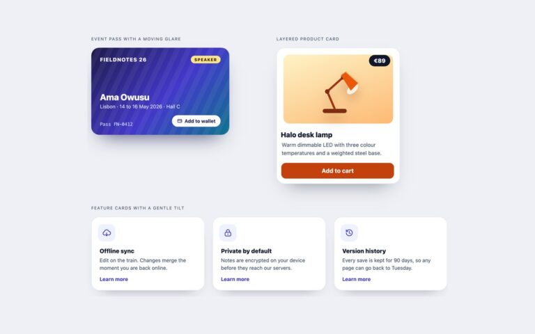
Interface pieces drawn in isometric projection, in three variants. The card stack shows three app cards, Inbox, Calendar and Notes, lying on an isometric plane one above another; hovering the stack or tabbing to one of its links fans the cards apart, and the focused card lifts further. The status illustration is a cluster card with three server towers on a floor plate, each tower a CSS solid with a light top and two side faces striped like rack units, next to the cluster name, node count, uptime and load. The raised tiles are three links, Analytics, Billing and Team, drawn as thick slabs whose edge is a stack of box-shadows on the turned plane; hover or focus lifts a tile and deepens its edge. Every piece sits on a plane turned with rotateX(55deg) rotateZ(-45deg) and no perspective, so parallel edges stay parallel as in an isometric drawing. Depth comes from translateZ for the stack and the towers and from stacked shadows for the tiles. No JavaScript is used.

What’s included

  • Isometric plane from rotateX(55deg) rotateZ(-45deg) with no perspective
  • Card stack that fans out on hover and on keyboard focus
  • Server towers built as CSS solids on a floor grid
  • Slab tiles whose edge is a stack of box-shadows
  • No JavaScript; the Bootstrap version uses .card

Accessibility

Each card and tile keeps real text and a named link, and the towers are one image with a text alternative that describes them. Keyboard focus fans the stack out and lifts the focused card or tile, the same as hover, and every link shows a 3px focus outline. Transitions are removed under prefers-reduced-motion, so the states change without movement.

Customise it

Change the projection in --iso on .iso, the fan distance in the translate3d values on .iso-stack li, tower heights with --h and tile colours with --t and --t-edge. In Tailwind these are the [transform:] utilities and the [--t:] and [--t-edge:] properties on each tile.