/* Simple sign-up cards. Native inputs with visible labels; the eye button only appears once the script runs. */
.su{--su-accent:#9a3412;--su-accent-dark:#7c2d12;--su-ring:rgba(154,52,18,.22);--su-ink:#1c1917;--su-muted:#57534e;
  --su-line:#8a817a;--su-bg:#fff;--su-error:#b91c1c;--su-ok-bg:#f0fdf4;--su-ok:#166534;
  background:var(--su-bg);color:var(--su-ink);border-radius:18px;padding:34px 32px 28px;font-size:.92rem;line-height:1.45;
  box-shadow:0 1px 2px rgba(28,25,23,.06),0 14px 34px -14px rgba(28,25,23,.22)}
.su--green{--su-accent:#166534;--su-accent-dark:#14532d;--su-ring:rgba(22,101,52,.22)}
.su-brand{display:flex;align-items:center;gap:10px;font-weight:700;margin-bottom:22px}
.su-mark{width:32px;height:32px;border-radius:9px;background:var(--su-accent);color:#fff;display:grid;place-items:center}
.su-title{font-family:Georgia,"Times New Roman",serif;font-size:1.62rem;font-weight:400;line-height:1.15;letter-spacing:-.01em}
.su-sub{color:var(--su-muted);margin:6px 0 20px}
.su-note{font-size:.8rem;color:var(--su-muted);margin-bottom:14px}
.su-req{color:var(--su-accent);font-weight:700}
.su-row{display:grid;grid-template-columns:1fr 1fr;gap:0 16px}
.su-field{margin-bottom:16px;min-width:0}
.su-label{display:block;font-size:.84rem;font-weight:600;margin-bottom:6px}
.su-input{display:block;width:100%;font:inherit;color:inherit;background:#fff;border:1px solid var(--su-line);border-radius:10px;
  padding:11px 13px;transition:border-color .15s,box-shadow .15s}
.su-input:focus{outline:none;border-color:var(--su-accent);box-shadow:0 0 0 3px var(--su-ring)}
/* password: input and eye button share one border */
.su-pw{display:flex;background:#fff;border:1px solid var(--su-line);border-radius:10px;transition:border-color .15s,box-shadow .15s}
.su-pw:focus-within{border-color:var(--su-accent);box-shadow:0 0 0 3px var(--su-ring)}
.su-pw .su-input,.su-pw .su-input:focus{flex:1;min-width:0;border:0;box-shadow:none;background:transparent}
.su-eye{flex:none;width:46px;border:0;background:none;color:var(--su-muted);cursor:pointer;border-radius:0 10px 10px 0;display:grid;place-items:center}
.su-eye:hover{color:var(--su-ink)}
.su-eye:focus-visible{outline:2px solid var(--su-accent);outline-offset:-5px;border-radius:8px}
.su-eye[hidden],.su-eye[aria-pressed="true"] .su-show,.su-eye[aria-pressed="false"] .su-hide{display:none}
.su-hint{font-size:.8rem;color:var(--su-muted);margin-top:6px}
/* error state, set by the script */
.su-input.is-invalid,.su-pw:has(.is-invalid){border-color:var(--su-error)}
.su-input.is-invalid:focus,.su-pw:has(.is-invalid):focus-within{box-shadow:0 0 0 3px rgba(185,28,28,.2)}
.su-err{display:flex;gap:6px;align-items:flex-start;color:var(--su-error);font-size:.8rem;font-weight:600;margin-top:6px}
.su-err::before{content:"!";flex:none;width:16px;height:16px;margin-top:1px;border-radius:50%;background:var(--su-error);color:#fff;
  font-size:.7rem;font-weight:800;display:grid;place-items:center}
.su-err:empty{display:none}
/* checkbox drawn on the native input */
.su-check{display:flex;gap:10px;align-items:flex-start;font-size:.86rem;margin:4px 0 18px;cursor:pointer}
.su-check input{appearance:none;flex:none;width:18px;height:18px;margin-top:1px;border:1.5px solid var(--su-line);border-radius:5px;
  background:#fff center/12px no-repeat;cursor:pointer;transition:background-color .15s,border-color .15s}
.su-check input:checked{background-color:var(--su-accent);border-color:var(--su-accent);
  background-image:url("data:image/svg+xml,%3Csvg xmlns='http://www.w3.org/2000/svg' viewBox='0 0 16 16'%3E%3Cpath d='M3.5 8.5l3 3 6-7' fill='none' stroke='%23fff' stroke-width='2.2' stroke-linecap='round' stroke-linejoin='round'/%3E%3C/svg%3E")}
.su-check input:focus-visible{outline:2px solid var(--su-accent);outline-offset:2px}
.su-check input.is-invalid{border-color:var(--su-error)}
.su-check-wrap .su-err{margin:-12px 0 16px 28px}
.su a{color:var(--su-accent);text-decoration:underline;text-underline-offset:2px}
.su a:hover{color:var(--su-accent-dark)}
.su a:focus-visible{outline:2px solid var(--su-accent);outline-offset:2px;border-radius:3px}
.su-btn{display:block;width:100%;font:inherit;font-weight:600;color:#fff;background:var(--su-accent);border:0;border-radius:10px;padding:12px 16px;
  cursor:pointer;transition:background-color .15s}
.su-btn:hover{background:var(--su-accent-dark)}
.su-btn:focus-visible{outline:2px solid var(--su-accent);outline-offset:3px}
.su-status:not(:empty){margin-top:14px;padding:10px 12px;border-radius:10px;background:var(--su-ok-bg);color:var(--su-ok);font-weight:600;font-size:.84rem}
.su-terms{font-size:.78rem;color:var(--su-muted);margin:2px 0 16px}
.su-foot{margin-top:18px;text-align:center;color:var(--su-muted);font-size:.86rem}
/* floating label: the label sits inside the field and rises when it has focus or a value */
.su-fl{position:relative}
.su-fl .su-input{padding:21px 13px 7px}
.su-fl label{position:absolute;left:14px;top:14px;font-size:.92rem;color:var(--su-muted);pointer-events:none;
  transform-origin:0 0;transition:transform .15s,color .15s}
.su-fl .su-input:focus~label,.su-fl .su-input:not(:placeholder-shown)~label{transform:translateY(-8px) scale(.78);color:var(--su-ink);font-weight:600}
.su-fl.su-pw .su-input{padding-right:6px}
@media (prefers-reduced-motion:reduce){.su-fl label{transition:none}}
@media (max-width:420px){.su{padding:26px 20px 22px}.su-row{grid-template-columns:1fr;gap:0}}
@media (prefers-reduced-motion:reduce){.su-input,.su-pw,.su-check input,.su-btn{transition:none}}
JavaScript
// Show/hide password, and inline errors on submit. No libraries. Without the script the eye button
// stays hidden and the browser's own validation still checks the required fields.
document.querySelectorAll('[data-pw-toggle]').forEach(function (btn) {
  var input = document.getElementById(btn.getAttribute('aria-controls'));
  btn.hidden = false;
  btn.addEventListener('click', function () {
    var show = input.type === 'password';
    input.type = show ? 'text' : 'password';
    btn.setAttribute('aria-pressed', show ? 'true' : 'false');
  });
});
document.querySelectorAll('form[data-signup]').forEach(function (form) {
  var status = form.querySelector('[data-status]');
  form.noValidate = true;
  function check(input) {
    var v = input.validity, msg = v.valid ? '' : v.valueMissing ? input.dataset.missing : (input.dataset.bad || input.validationMessage);
    var out = document.getElementById(input.id + '-err');
    input.classList.toggle('is-invalid', !!msg);
    if (msg) input.setAttribute('aria-invalid', 'true'); else input.removeAttribute('aria-invalid');
    if (out) out.textContent = msg;
    return !msg;
  }
  form.addEventListener('submit', function (e) {
    e.preventDefault(); // demo only: nothing is sent
    var bad = Array.prototype.filter.call(form.querySelectorAll('[required]'), function (f) { return !check(f); });
    status.textContent = '';
    if (bad.length) { bad[0].focus(); return; }
    status.textContent = 'Account created. We sent a confirmation link to ' + form.elements.email.value + '.';
  });
  form.addEventListener('input', function (e) { if (e.target.classList.contains('is-invalid')) check(e.target); });
});
// Show/hide password, and inline errors on submit using Bootstrap's .is-invalid. No libraries, no Bootstrap JS.
// Without the script the eye button stays hidden and the browser's own validation still checks the required fields.
document.querySelectorAll('[data-pw-toggle]').forEach(function (btn) {
  var input = document.getElementById(btn.getAttribute('aria-controls'));
  btn.hidden = false;
  btn.addEventListener('click', function () {
    var show = input.type === 'password';
    input.type = show ? 'text' : 'password';
    btn.setAttribute('aria-pressed', show ? 'true' : 'false');
  });
});
document.querySelectorAll('form[data-signup]').forEach(function (form) {
  var status = form.querySelector('[data-status]');
  form.noValidate = true;
  function check(input) {
    var v = input.validity, msg = v.valid ? '' : v.valueMissing ? input.dataset.missing : (input.dataset.bad || input.validationMessage);
    var out = document.getElementById(input.id + '-err');
    input.classList.toggle('is-invalid', !!msg);
    if (msg) input.setAttribute('aria-invalid', 'true'); else input.removeAttribute('aria-invalid');
    if (out) out.textContent = msg;
    return !msg;
  }
  form.addEventListener('submit', function (e) {
    e.preventDefault(); // demo only: nothing is sent
    var bad = Array.prototype.filter.call(form.querySelectorAll('[required]'), function (f) { return !check(f); });
    status.textContent = '';
    if (bad.length) { bad[0].focus(); return; }
    status.textContent = 'Account created. We sent a confirmation link to ' + form.elements.email.value + '.';
  });
  form.addEventListener('input', function (e) { if (e.target.classList.contains('is-invalid')) check(e.target); });
});
// Show/hide password, and inline errors on submit. No libraries. Without the script the eye button
// stays hidden and the browser's own validation still checks the required fields.
document.querySelectorAll('[data-pw-toggle]').forEach(function (btn) {
  var input = document.getElementById(btn.getAttribute('aria-controls'));
  btn.hidden = false;
  btn.addEventListener('click', function () {
    var show = input.type === 'password';
    input.type = show ? 'text' : 'password';
    btn.setAttribute('aria-pressed', show ? 'true' : 'false');
  });
});
document.querySelectorAll('form[data-signup]').forEach(function (form) {
  var status = form.querySelector('[data-status]');
  form.noValidate = true;
  function check(input) {
    var v = input.validity, msg = v.valid ? '' : v.valueMissing ? input.dataset.missing : (input.dataset.bad || input.validationMessage);
    var out = document.getElementById(input.id + '-err');
    input.classList.toggle('is-invalid', !!msg);
    if (msg) input.setAttribute('aria-invalid', 'true'); else input.removeAttribute('aria-invalid');
    if (out) out.textContent = msg;
    return !msg;
  }
  form.addEventListener('submit', function (e) {
    e.preventDefault(); // demo only: nothing is sent
    var bad = Array.prototype.filter.call(form.querySelectorAll('[required]'), function (f) { return !check(f); });
    status.textContent = '';
    if (bad.length) { bad[0].focus(); return; }
    status.textContent = 'Account created. We sent a confirmation link to ' + form.elements.email.value + '.';
  });
  form.addEventListener('input', function (e) { if (e.target.classList.contains('is-invalid')) check(e.target); });
});
About this set
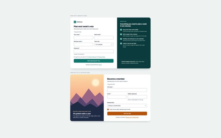
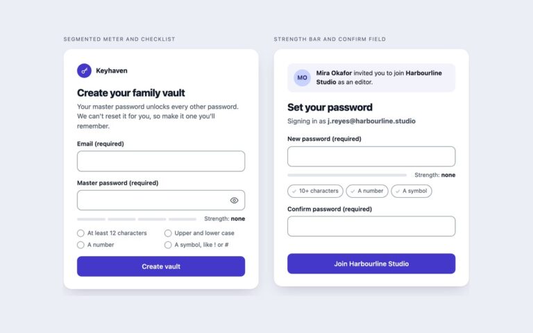
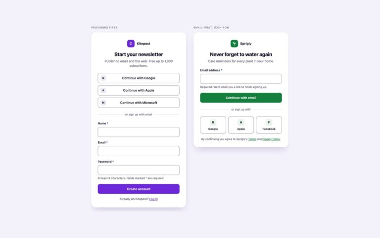
Two single-card sign-up forms that cover the account creation screen most products need. Classic card is a journaling app sign-up with stacked labels above each field: full name, email, a password with a show and hide button, and a required terms checkbox with links to the terms and privacy policy. Floating labels is a grocery list app sign-up where each label starts inside its field and rises when the field has focus or a value; first and last name share a row that stacks on narrow screens, and an optional meal-plan email checkbox sits above a line of terms text. Use the classic card when clarity matters most and the floating version where vertical space is tight. Both forms keep the browser’s own validation when JavaScript is off. A short script switches it to inline messages: on submit every required field is checked, each failing field gets aria-invalid, a red border and a message with an icon written into its linked error element, and focus moves to the first problem. Flagged fields re-check as you type, and a valid submit shows a confirmation in a status region. The wording of each message lives in data attributes on its input.
What’s included
Two layouts: stacked labels and floating labels
Show and hide password button with aria-pressed, hidden until the script runs
Inline error messages from data-missing and data-bad attributes, focus moved to the first error
Required fields marked with an asterisk and a written key, not colour alone
Bootstrap version uses .form-control, .form-floating, .input-group, .form-check and .is-invalid
Accessibility
Every input has a visible label and an autocomplete value (name, given-name, family-name, email, new-password). Error messages are linked through aria-describedby and the input gets aria-invalid="true" while a message shows; focus moves to the first invalid field and a valid submit is announced through role="status". The password toggle is a real button named Show password whose aria-pressed state changes, and every control has a visible focus ring. Transitions switch off under prefers-reduced-motion.
Customise it
Change --su-accent, --su-accent-dark and --su-ring on .su for the brand colour (.su--green shows a second palette), and --su-line for field borders. In Bootstrap the same variables sit on the .card along with --bs-border-radius; in Tailwind set the [--su-accent:…] properties on the form and edit the su-* theme colours.