Open demo

CSS code

HTML
<div class="wide"><span class="lbl">Spinning record</span>
<div class="an an-deck-card" data-an data-length="24" role="group" aria-label="Harbour Lights by Juniper Vale">
  <audio src="../audio/track-1.mp3" preload="metadata"></audio>
  <div class="an-deck" aria-hidden="true">
    <div class="an-disc"><div class="an-label" style="--art:radial-gradient(circle at 68% 40%,#fde68a 0 11%,transparent 11.5%),repeating-linear-gradient(180deg,transparent 0 6%,rgba(253,230,138,.3) 6% 7.5%) bottom/100% 42% no-repeat,linear-gradient(180deg,#fb923c,#e11d48 58%,#312e81 58%,#1e1b4b)"></div></div>
    <div class="an-sheen"></div>
    <div class="an-arm"><i></i></div>
  </div>
  <div class="an-deck-info">
    <div><p class="an-title">Harbour Lights</p><p class="an-artist">Juniper Vale · Low Tide Radio</p></div>
    <div class="an-bar">
      <span class="an-time" data-cur>0:00</span>
      <input type="range" data-seek min="0" max="24" step="any" value="0" aria-label="Seek Harbour Lights" aria-valuetext="0:00 of 0:24">
      <span class="an-time" data-dur>0:24</span>
    </div>
    <button type="button" class="an-play" data-play="Harbour Lights" aria-label="Play Harbour Lights"><svg class="i-play" viewBox="0 0 24 24" aria-hidden="true" fill="currentColor"><path d="M8 5.5v13a1 1 0 0 0 1.5.86l10.5-6.5a1 1 0 0 0 0-1.72L9.5 4.64A1 1 0 0 0 8 5.5z"/></svg><svg class="i-pause" viewBox="0 0 24 24" aria-hidden="true" fill="currentColor"><rect x="6.5" y="5" width="4" height="14" rx="1.2"/><rect x="13.5" y="5" width="4" height="14" rx="1.2"/></svg></button>
  </div>
</div></div>

<div><span class="lbl">Equaliser bars</span>
<div class="an an-eq-card" data-an data-length="24" role="group" aria-label="Paper Kites by The Lumen Choir">
  <audio src="../audio/track-2.mp3" preload="metadata"></audio>
  <div class="an-head">
    <div class="an-art" style="--art:linear-gradient(to bottom right,transparent 50%,#fde047 50%) 37.5% 26.67%/20% 25% no-repeat,linear-gradient(to bottom left,transparent 50%,#f97316 50%) 62.5% 26.67%/20% 25% no-repeat,linear-gradient(to top right,transparent 50%,#fb923c 50%) 37.5% 69.23%/20% 35% no-repeat,linear-gradient(to top left,transparent 50%,#facc15 50%) 62.5% 69.23%/20% 35% no-repeat,linear-gradient(to bottom right,transparent calc(50% - 1px),rgba(255,255,255,.85) 0 calc(50% + 1px),transparent 0) 41.86% 100%/14% 20% no-repeat,linear-gradient(160deg,#0ea5e9,#14b8a6 55%,#84cc16)" aria-hidden="true"></div>
    <div><p class="an-title">Paper Kites</p><p class="an-artist">The Lumen Choir</p></div>
    <div class="an-eq" aria-hidden="true"><i></i><i></i><i></i><i></i><i></i></div>
  </div>
  <div class="an-bar">
    <button type="button" class="an-play" data-play="Paper Kites" aria-label="Play Paper Kites"><svg class="i-play" viewBox="0 0 24 24" aria-hidden="true" fill="currentColor"><path d="M8 5.5v13a1 1 0 0 0 1.5.86l10.5-6.5a1 1 0 0 0 0-1.72L9.5 4.64A1 1 0 0 0 8 5.5z"/></svg><svg class="i-pause" viewBox="0 0 24 24" aria-hidden="true" fill="currentColor"><rect x="6.5" y="5" width="4" height="14" rx="1.2"/><rect x="13.5" y="5" width="4" height="14" rx="1.2"/></svg></button>
    <input type="range" data-seek min="0" max="24" step="any" value="0" aria-label="Seek Paper Kites" aria-valuetext="0:00 of 0:24">
    <span class="an-time" data-left>0:24 left</span>
  </div>
</div></div>

<div><span class="lbl">Pulse button</span>
<div class="an an-pulse-card" data-an data-length="29" role="group" aria-label="Copper Sky by Milo & the Tidelines">
  <audio src="../audio/track-4.mp3" preload="metadata"></audio>
  <div class="an-pulse">
    <span class="an-ring" aria-hidden="true"></span><span class="an-ring" aria-hidden="true"></span>
    <button type="button" class="an-play" data-play="Copper Sky" aria-label="Play Copper Sky"><svg class="i-play" viewBox="0 0 24 24" aria-hidden="true" fill="currentColor"><path d="M8 5.5v13a1 1 0 0 0 1.5.86l10.5-6.5a1 1 0 0 0 0-1.72L9.5 4.64A1 1 0 0 0 8 5.5z"/></svg><svg class="i-pause" viewBox="0 0 24 24" aria-hidden="true" fill="currentColor"><rect x="6.5" y="5" width="4" height="14" rx="1.2"/><rect x="13.5" y="5" width="4" height="14" rx="1.2"/></svg></button>
  </div>
  <p class="an-title">Copper Sky</p>
  <p class="an-artist">Milo & the Tidelines</p>
  <p class="an-time"><span data-cur>0:00</span> / <span data-dur>0:29</span></p>
</div></div>
CSS
/* Animated players: a spinning record, equaliser bars and a pulsing play button.
   Every animation runs only while [data-playing] is set and is switched off under prefers-reduced-motion. */
.an{--an-accent:#c2410c;--an-ink:#1f1a17;--an-muted:#5c534c;--an-track:#8f857c;--p:0;color:var(--an-ink);
  background:#fff;border-radius:22px;box-shadow:0 1px 2px rgba(31,26,23,.06),0 14px 34px rgba(31,26,23,.1)}
.an button{flex:none;display:grid;place-items:center;border:0;background:none;color:inherit;cursor:pointer;font:inherit}
.an button:focus-visible{outline:2px solid var(--an-accent);outline-offset:3px}
.an svg{display:block;width:22px;height:22px}
.an .an-play{width:52px;height:52px;border-radius:50%;background:var(--an-accent);color:#fff}
.an .i-pause,.an[data-playing] .i-play{display:none}
.an[data-playing] .i-pause{display:block}
.an-title{font-weight:800;font-size:1.15rem;letter-spacing:-.01em}
.an-artist{font-size:.88rem;color:var(--an-muted);margin-top:3px}
.an-time{font-size:.78rem;color:var(--an-muted);font-variant-numeric:tabular-nums;white-space:nowrap}
.an-bar{display:flex;align-items:center;gap:8px}
.an input[type="range"]{-webkit-appearance:none;appearance:none;display:block;flex:1;min-width:0;height:14px;margin:0;background:none;cursor:pointer}
.an input[type="range"]:focus-visible{outline:none}
.an input[type="range"]::-webkit-slider-runnable-track{height:4px;border-radius:999px;
  background:linear-gradient(to right,var(--an-accent) 0 calc(7px + (100% - 14px) * var(--p)),var(--an-track) 0)}
.an input[type="range"]::-moz-range-track{height:4px;border-radius:999px;
  background:linear-gradient(to right,var(--an-accent) 0 calc(7px + (100% - 14px) * var(--p)),var(--an-track) 0)}
.an input[type="range"]::-webkit-slider-thumb{-webkit-appearance:none;appearance:none;width:14px;height:14px;margin-top:-5px;border:0;border-radius:50%;background:var(--an-accent)}
.an input[type="range"]::-moz-range-thumb{width:14px;height:14px;border:0;border-radius:50%;background:var(--an-accent)}
.an input[type="range"]:focus-visible::-webkit-slider-thumb{box-shadow:0 0 0 3px #fff,0 0 0 5px var(--an-accent)}
.an input[type="range"]:focus-visible::-moz-range-thumb{box-shadow:0 0 0 3px #fff,0 0 0 5px var(--an-accent)}
/* 1. turntable: the record turns and the tonearm swings in while playing */
.an-deck-card{display:grid;grid-template-columns:auto 1fr;gap:28px;align-items:center;padding:22px}
.an-deck{position:relative;width:220px;aspect-ratio:1;border-radius:18px;background:linear-gradient(145deg,#3a332e,#1f1a17);
  box-shadow:inset 0 1px 0 rgba(255,255,255,.08)}
.an-disc{position:absolute;inset:14px;border-radius:50%;
  background:radial-gradient(circle,transparent 0 33%,#0f0d0c 33.5%),repeating-radial-gradient(circle,#191614 0 1px,#2b2623 1.5px 3px);
  box-shadow:0 6px 16px rgba(0,0,0,.45);animation:an-spin 2.4s linear infinite paused}
.an-label{position:absolute;inset:33%;border-radius:50%;background:var(--art)}
.an-label::after{content:"";position:absolute;inset:44%;border-radius:50%;background:#f3efe8}
.an-sheen{position:absolute;inset:14px;border-radius:50%;pointer-events:none;
  background:conic-gradient(from 20deg,transparent 0 10%,rgba(255,255,255,.1) 14%,transparent 20% 60%,rgba(255,255,255,.07) 64%,transparent 70%)}
.an-arm{position:absolute;top:16px;right:20px;width:8px;height:122px;transform-origin:4px 8px;transform:rotate(-12deg);transition:transform .7s ease}
.an-arm::before{content:"";position:absolute;left:-7px;top:-3px;width:22px;height:22px;border-radius:50%;background:#d6d0c8;box-shadow:inset 0 0 0 5px #a39c94}
.an-arm i{position:absolute;left:2px;top:10px;width:4px;height:104px;border-radius:2px;background:linear-gradient(90deg,#efeae4,#a39c94)}
.an-arm::after{content:"";position:absolute;left:-2px;bottom:0;width:12px;height:16px;border-radius:3px;background:#efeae4}
.an[data-playing] .an-disc{animation-play-state:running}
.an[data-playing] .an-arm{transform:rotate(18deg)}
.an-deck-info{display:flex;flex-direction:column;gap:16px;min-width:0}
@keyframes an-spin{to{transform:rotate(1turn)}}
/* 2. equaliser card: bars rest in a pattern and bounce while playing */
.an-eq-card{display:flex;flex-direction:column;gap:16px;padding:22px}
.an-head{display:flex;align-items:center;gap:16px}
.an-art{flex:none;width:60px;height:60px;border-radius:14px;background:var(--art)}
.an-head > div:nth-child(2){flex:1;min-width:0}
.an-eq{display:flex;align-items:flex-end;gap:4px;height:40px}
.an-eq i{width:6px;height:100%;border-radius:3px;background:var(--an-accent);transform-origin:bottom;transform:scaleY(var(--s))}
.an-eq i:nth-child(1){--s:.45}.an-eq i:nth-child(2){--s:.8}.an-eq i:nth-child(3){--s:.6}.an-eq i:nth-child(4){--s:1}.an-eq i:nth-child(5){--s:.7}
.an[data-playing] .an-eq i{animation:an-eq .9s ease-in-out infinite}
.an[data-playing] .an-eq i:nth-child(2){animation-duration:.7s;animation-delay:-.2s}
.an[data-playing] .an-eq i:nth-child(3){animation-duration:1.1s;animation-delay:-.5s}
.an[data-playing] .an-eq i:nth-child(4){animation-duration:.8s;animation-delay:-.35s}
.an[data-playing] .an-eq i:nth-child(5){animation-duration:1s;animation-delay:-.1s}
.an-eq-card .an-bar .an-play{width:44px;height:44px}
.an-eq-card .an-bar .an-play svg{width:20px;height:20px}
@keyframes an-eq{0%,100%{transform:scaleY(var(--s))}50%{transform:scaleY(.2)}}
/* 3. pulse button: two rings ripple out from the button while playing */
.an-pulse-card{display:flex;flex-direction:column;align-items:center;gap:6px;padding:30px 22px 26px;text-align:center}
.an-pulse{position:relative;display:grid;place-items:center;width:132px;height:132px;margin-bottom:12px}
.an-pulse .an-play{position:relative;z-index:1;width:84px;height:84px;box-shadow:0 10px 24px rgba(194,65,12,.35)}
.an-pulse .an-play svg{width:32px;height:32px}
.an-ring{position:absolute;inset:24px;border-radius:50%;border:2px solid var(--an-accent);opacity:0}
.an[data-playing] .an-ring{animation:an-ring 1.8s ease-out infinite}
.an[data-playing] .an-ring + .an-ring{animation-delay:.9s}
@keyframes an-ring{0%{transform:scale(1);opacity:.6}100%{transform:scale(1.55);opacity:0}}
@media (max-width:560px){
  .an-deck-card{grid-template-columns:1fr;justify-items:center}
  .an-deck-info{width:100%}
}
@media (prefers-reduced-motion:reduce){
  .an-disc,.an[data-playing] .an-eq i,.an[data-playing] .an-ring{animation:none}
  .an-arm{transition:none}
}
JavaScript
// Animated players. Each [data-an] wraps one <audio>; the script wires whichever controls it contains
// and toggles [data-playing], which is what starts and stops the CSS animations.
(() => {
  const fmt = s => { s = Math.floor(s || 0); return Math.floor(s / 60) + ':' + String(s % 60).padStart(2, '0'); };
  document.querySelectorAll('[data-an]').forEach(root => {
    const $ = s => root.querySelector(s);
    const audio = $('audio'), play = $('[data-play]'), seek = $('[data-seek]'), cur = $('[data-cur]'), dur = $('[data-dur]'), left = $('[data-left]');
    const mute = $('[data-mute]'), name = play.dataset.play;
    let raf = 0;
    const length = () => audio.duration || +root.dataset.length;
    const sync = () => {
      const t = audio.currentTime, d = length(), text = fmt(t) + ' of ' + fmt(d);
      root.style.setProperty('--p', d ? t / d : 0);
      if (cur) cur.textContent = fmt(t);
      if (left) left.textContent = fmt(d - t) + ' left';
      if (seek) {
        seek.value = t;
        if (seek.getAttribute('aria-valuetext') !== text) seek.setAttribute('aria-valuetext', text);
      }
    };
    const tick = () => { sync(); raf = requestAnimationFrame(tick); };
    const meta = () => { if (seek) seek.max = audio.duration; if (dur) dur.textContent = fmt(audio.duration); sync(); };
    play.addEventListener('click', () => {
      if (!audio.paused) return audio.pause();
      document.querySelectorAll('audio').forEach(a => { if (a !== audio) a.pause(); });
      audio.play().catch(() => {});
    });
    audio.addEventListener('play', () => { root.setAttribute('data-playing', ''); play.setAttribute('aria-label', 'Pause ' + name); tick(); });
    audio.addEventListener('pause', () => { root.removeAttribute('data-playing'); play.setAttribute('aria-label', 'Play ' + name); cancelAnimationFrame(raf); sync(); });
    audio.addEventListener('loadedmetadata', meta);
    if (audio.readyState > 0) meta();
    if (seek) seek.addEventListener('input', () => { audio.currentTime = seek.value; sync(); });
    // Arrow keys jump 5 seconds; Home and End work natively.
    if (seek) seek.addEventListener('keydown', e => {
      const step = { ArrowLeft: -5, ArrowDown: -5, ArrowRight: 5, ArrowUp: 5 }[e.key];
      if (!step) return;
      e.preventDefault();
      audio.currentTime = Math.min(Math.max(audio.currentTime + step, 0), length());
      sync();
    });
    if (mute) {
      mute.addEventListener('click', () => { audio.muted = !audio.muted; });
      audio.addEventListener('volumechange', () => mute.setAttribute('aria-pressed', String(audio.muted)));
    }
  });
})();

Bootstrap 5 code

Requires: Bootstrap 5.3.8 CSS

HTML
<div class="wide"><span class="lbl">Spinning record</span>
<div class="card an an-deck-card" data-an data-length="24" role="group" aria-label="Harbour Lights by Juniper Vale">
  <audio src="../audio/track-1.mp3" preload="metadata"></audio>
  <div class="an-deck" aria-hidden="true">
    <div class="an-disc"><div class="an-label" style="--art:radial-gradient(circle at 68% 40%,#fde68a 0 11%,transparent 11.5%),repeating-linear-gradient(180deg,transparent 0 6%,rgba(253,230,138,.3) 6% 7.5%) bottom/100% 42% no-repeat,linear-gradient(180deg,#fb923c,#e11d48 58%,#312e81 58%,#1e1b4b)"></div></div>
    <div class="an-sheen"></div>
    <div class="an-arm"><i></i></div>
  </div>
  <div class="d-flex flex-column gap-3" style="min-width:0">
    <div><p class="an-title mb-0">Harbour Lights</p><p class="an-artist mb-0">Juniper Vale · Low Tide Radio</p></div>
    <div class="d-flex align-items-center gap-2">
      <span class="an-time" data-cur>0:00</span>
      <input type="range" class="form-range" data-seek min="0" max="24" step="any" value="0" aria-label="Seek Harbour Lights" aria-valuetext="0:00 of 0:24">
      <span class="an-time" data-dur>0:24</span>
    </div>
    <button type="button" class="btn an-play rounded-circle" data-play="Harbour Lights" aria-label="Play Harbour Lights"><svg class="i-play" viewBox="0 0 24 24" aria-hidden="true" fill="currentColor"><path d="M8 5.5v13a1 1 0 0 0 1.5.86l10.5-6.5a1 1 0 0 0 0-1.72L9.5 4.64A1 1 0 0 0 8 5.5z"/></svg><svg class="i-pause" viewBox="0 0 24 24" aria-hidden="true" fill="currentColor"><rect x="6.5" y="5" width="4" height="14" rx="1.2"/><rect x="13.5" y="5" width="4" height="14" rx="1.2"/></svg></button>
  </div>
</div></div>

<div><span class="lbl">Equaliser bars</span>
<div class="card an an-eq-card" data-an data-length="24" role="group" aria-label="Paper Kites by The Lumen Choir">
  <div class="card-body d-flex flex-column gap-3" style="padding:22px">
  <audio src="../audio/track-2.mp3" preload="metadata"></audio>
  <div class="d-flex align-items-center gap-3">
    <div class="an-art" style="--art:linear-gradient(to bottom right,transparent 50%,#fde047 50%) 37.5% 26.67%/20% 25% no-repeat,linear-gradient(to bottom left,transparent 50%,#f97316 50%) 62.5% 26.67%/20% 25% no-repeat,linear-gradient(to top right,transparent 50%,#fb923c 50%) 37.5% 69.23%/20% 35% no-repeat,linear-gradient(to top left,transparent 50%,#facc15 50%) 62.5% 69.23%/20% 35% no-repeat,linear-gradient(to bottom right,transparent calc(50% - 1px),rgba(255,255,255,.85) 0 calc(50% + 1px),transparent 0) 41.86% 100%/14% 20% no-repeat,linear-gradient(160deg,#0ea5e9,#14b8a6 55%,#84cc16)" aria-hidden="true"></div>
    <div class="flex-grow-1" style="min-width:0"><p class="an-title mb-0">Paper Kites</p><p class="an-artist mb-0">The Lumen Choir</p></div>
    <div class="an-eq" aria-hidden="true"><i></i><i></i><i></i><i></i><i></i></div>
  </div>
  <div class="d-flex align-items-center gap-2">
    <button type="button" class="btn an-play rounded-circle" data-play="Paper Kites" aria-label="Play Paper Kites"><svg class="i-play" viewBox="0 0 24 24" aria-hidden="true" fill="currentColor"><path d="M8 5.5v13a1 1 0 0 0 1.5.86l10.5-6.5a1 1 0 0 0 0-1.72L9.5 4.64A1 1 0 0 0 8 5.5z"/></svg><svg class="i-pause" viewBox="0 0 24 24" aria-hidden="true" fill="currentColor"><rect x="6.5" y="5" width="4" height="14" rx="1.2"/><rect x="13.5" y="5" width="4" height="14" rx="1.2"/></svg></button>
    <input type="range" class="form-range" data-seek min="0" max="24" step="any" value="0" aria-label="Seek Paper Kites" aria-valuetext="0:00 of 0:24">
    <span class="an-time" data-left>0:24 left</span>
  </div>
  </div>
</div></div>

<div><span class="lbl">Pulse button</span>
<div class="card an an-pulse-card" data-an data-length="29" role="group" aria-label="Copper Sky by Milo & the Tidelines">
  <div class="card-body d-flex flex-column align-items-center text-center" style="padding:30px 22px 26px;gap:6px">
  <audio src="../audio/track-4.mp3" preload="metadata"></audio>
  <div class="an-pulse">
    <span class="an-ring" aria-hidden="true"></span><span class="an-ring" aria-hidden="true"></span>
    <button type="button" class="btn an-play rounded-circle" data-play="Copper Sky" aria-label="Play Copper Sky"><svg class="i-play" viewBox="0 0 24 24" aria-hidden="true" fill="currentColor"><path d="M8 5.5v13a1 1 0 0 0 1.5.86l10.5-6.5a1 1 0 0 0 0-1.72L9.5 4.64A1 1 0 0 0 8 5.5z"/></svg><svg class="i-pause" viewBox="0 0 24 24" aria-hidden="true" fill="currentColor"><rect x="6.5" y="5" width="4" height="14" rx="1.2"/><rect x="13.5" y="5" width="4" height="14" rx="1.2"/></svg></button>
  </div>
  <p class="an-title mb-0">Copper Sky</p>
  <p class="an-artist mb-0">Milo & the Tidelines</p>
  <p class="an-time mb-0"><span data-cur>0:00</span> / <span data-dur>0:29</span></p>
  </div>
</div></div>
CSS
/* Animated players on Bootstrap: .card shells, .btn controls and .form-range, plus a spinning record,
   equaliser bars and a pulsing play button. Animations run only while [data-playing] is set and stop under prefers-reduced-motion. */
.an{--an-accent:#c2410c;--an-ink:#1f1a17;--an-muted:#5c534c;--an-track:#8f857c;--p:0;
  --bs-card-border-width:0;--bs-card-border-radius:22px;--bs-card-color:var(--an-ink);color:var(--an-ink);
  box-shadow:0 1px 2px rgba(31,26,23,.06),0 14px 34px rgba(31,26,23,.1)}
.an .btn{--bs-btn-padding-x:0;--bs-btn-padding-y:0;--bs-btn-border-width:0;flex:none;display:grid;place-items:center}
.an .btn:focus-visible{outline:2px solid var(--an-accent);outline-offset:3px;box-shadow:none}
.an svg{display:block;width:22px;height:22px}
.an .an-play{--bs-btn-bg:var(--an-accent);--bs-btn-color:#fff;--bs-btn-hover-bg:#9a3412;--bs-btn-hover-color:#fff;
  --bs-btn-active-bg:#7c2d12;--bs-btn-active-color:#fff;width:52px;height:52px}
.an .i-pause,.an[data-playing] .i-play{display:none}
.an[data-playing] .i-pause{display:block}
.an-title{font-weight:800;font-size:1.15rem;letter-spacing:-.01em}
.an-artist{font-size:.88rem;color:var(--an-muted);margin-top:3px}
.an-time{font-size:.78rem;color:var(--an-muted);font-variant-numeric:tabular-nums;white-space:nowrap}
.an .form-range{flex:1;min-width:0;width:auto;height:14px}
.an .form-range::-webkit-slider-runnable-track{height:4px;border-radius:999px;
  background:linear-gradient(to right,var(--an-accent) 0 calc(7px + (100% - 14px) * var(--p)),var(--an-track) 0)}
.an .form-range::-moz-range-track{height:4px;border-radius:999px;
  background:linear-gradient(to right,var(--an-accent) 0 calc(7px + (100% - 14px) * var(--p)),var(--an-track) 0)}
.an .form-range::-webkit-slider-thumb{width:14px;height:14px;margin-top:-5px;background:var(--an-accent)}
.an .form-range::-moz-range-thumb{width:14px;height:14px;background:var(--an-accent)}
.an .form-range:focus::-webkit-slider-thumb{box-shadow:none}
.an .form-range:focus::-moz-range-thumb{box-shadow:none}
.an .form-range:focus-visible::-webkit-slider-thumb{box-shadow:0 0 0 3px #fff,0 0 0 5px var(--an-accent)}
.an .form-range:focus-visible::-moz-range-thumb{box-shadow:0 0 0 3px #fff,0 0 0 5px var(--an-accent)}
/* 1. turntable: the record turns and the tonearm swings in while playing */
.an-deck-card{display:grid;grid-template-columns:auto 1fr;gap:28px;align-items:center;padding:22px}
.an-deck{position:relative;width:220px;aspect-ratio:1;border-radius:18px;background:linear-gradient(145deg,#3a332e,#1f1a17);
  box-shadow:inset 0 1px 0 rgba(255,255,255,.08)}
.an-disc{position:absolute;inset:14px;border-radius:50%;
  background:radial-gradient(circle,transparent 0 33%,#0f0d0c 33.5%),repeating-radial-gradient(circle,#191614 0 1px,#2b2623 1.5px 3px);
  box-shadow:0 6px 16px rgba(0,0,0,.45);animation:an-spin 2.4s linear infinite paused}
.an-label{position:absolute;inset:33%;border-radius:50%;background:var(--art)}
.an-label::after{content:"";position:absolute;inset:44%;border-radius:50%;background:#f3efe8}
.an-sheen{position:absolute;inset:14px;border-radius:50%;pointer-events:none;
  background:conic-gradient(from 20deg,transparent 0 10%,rgba(255,255,255,.1) 14%,transparent 20% 60%,rgba(255,255,255,.07) 64%,transparent 70%)}
.an-arm{position:absolute;top:16px;right:20px;width:8px;height:122px;transform-origin:4px 8px;transform:rotate(-12deg);transition:transform .7s ease}
.an-arm::before{content:"";position:absolute;left:-7px;top:-3px;width:22px;height:22px;border-radius:50%;background:#d6d0c8;box-shadow:inset 0 0 0 5px #a39c94}
.an-arm i{position:absolute;left:2px;top:10px;width:4px;height:104px;border-radius:2px;background:linear-gradient(90deg,#efeae4,#a39c94)}
.an-arm::after{content:"";position:absolute;left:-2px;bottom:0;width:12px;height:16px;border-radius:3px;background:#efeae4}
.an[data-playing] .an-disc{animation-play-state:running}
.an[data-playing] .an-arm{transform:rotate(18deg)}
@keyframes an-spin{to{transform:rotate(1turn)}}
/* 2. equaliser card: bars rest in a pattern and bounce while playing */
.an-art{flex:none;width:60px;height:60px;border-radius:14px;background:var(--art)}
.an-eq{display:flex;align-items:flex-end;gap:4px;height:40px}
.an-eq i{width:6px;height:100%;border-radius:3px;background:var(--an-accent);transform-origin:bottom;transform:scaleY(var(--s))}
.an-eq i:nth-child(1){--s:.45}.an-eq i:nth-child(2){--s:.8}.an-eq i:nth-child(3){--s:.6}.an-eq i:nth-child(4){--s:1}.an-eq i:nth-child(5){--s:.7}
.an[data-playing] .an-eq i{animation:an-eq .9s ease-in-out infinite}
.an[data-playing] .an-eq i:nth-child(2){animation-duration:.7s;animation-delay:-.2s}
.an[data-playing] .an-eq i:nth-child(3){animation-duration:1.1s;animation-delay:-.5s}
.an[data-playing] .an-eq i:nth-child(4){animation-duration:.8s;animation-delay:-.35s}
.an[data-playing] .an-eq i:nth-child(5){animation-duration:1s;animation-delay:-.1s}
.an-eq-card .an-play{width:44px;height:44px}
.an-eq-card .an-play svg{width:20px;height:20px}
@keyframes an-eq{0%,100%{transform:scaleY(var(--s))}50%{transform:scaleY(.2)}}
/* 3. pulse button: two rings ripple out from the button while playing */
.an-pulse{position:relative;display:grid;place-items:center;width:132px;height:132px;margin-bottom:12px}
.an-pulse .an-play{position:relative;z-index:1;width:84px;height:84px;box-shadow:0 10px 24px rgba(194,65,12,.35)}
.an-pulse .an-play svg{width:32px;height:32px}
.an-ring{position:absolute;inset:24px;border-radius:50%;border:2px solid var(--an-accent);opacity:0}
.an[data-playing] .an-ring{animation:an-ring 1.8s ease-out infinite}
.an[data-playing] .an-ring + .an-ring{animation-delay:.9s}
@keyframes an-ring{0%{transform:scale(1);opacity:.6}100%{transform:scale(1.55);opacity:0}}
@media (max-width:560px){.an-deck-card{grid-template-columns:1fr;justify-items:center}.an-deck-card > :last-child{width:100%}}
@media (prefers-reduced-motion:reduce){
  .an-disc,.an[data-playing] .an-eq i,.an[data-playing] .an-ring{animation:none}
  .an-arm{transition:none}
}
JavaScript
// Animated players. Each [data-an] wraps one <audio>; the script wires whichever controls it contains
// and toggles [data-playing], which is what starts and stops the CSS animations.
(() => {
  const fmt = s => { s = Math.floor(s || 0); return Math.floor(s / 60) + ':' + String(s % 60).padStart(2, '0'); };
  document.querySelectorAll('[data-an]').forEach(root => {
    const $ = s => root.querySelector(s);
    const audio = $('audio'), play = $('[data-play]'), seek = $('[data-seek]'), cur = $('[data-cur]'), dur = $('[data-dur]'), left = $('[data-left]');
    const mute = $('[data-mute]'), name = play.dataset.play;
    let raf = 0;
    const length = () => audio.duration || +root.dataset.length;
    const sync = () => {
      const t = audio.currentTime, d = length(), text = fmt(t) + ' of ' + fmt(d);
      root.style.setProperty('--p', d ? t / d : 0);
      if (cur) cur.textContent = fmt(t);
      if (left) left.textContent = fmt(d - t) + ' left';
      if (seek) {
        seek.value = t;
        if (seek.getAttribute('aria-valuetext') !== text) seek.setAttribute('aria-valuetext', text);
      }
    };
    const tick = () => { sync(); raf = requestAnimationFrame(tick); };
    const meta = () => { if (seek) seek.max = audio.duration; if (dur) dur.textContent = fmt(audio.duration); sync(); };
    play.addEventListener('click', () => {
      if (!audio.paused) return audio.pause();
      document.querySelectorAll('audio').forEach(a => { if (a !== audio) a.pause(); });
      audio.play().catch(() => {});
    });
    audio.addEventListener('play', () => { root.setAttribute('data-playing', ''); play.setAttribute('aria-label', 'Pause ' + name); tick(); });
    audio.addEventListener('pause', () => { root.removeAttribute('data-playing'); play.setAttribute('aria-label', 'Play ' + name); cancelAnimationFrame(raf); sync(); });
    audio.addEventListener('loadedmetadata', meta);
    if (audio.readyState > 0) meta();
    if (seek) seek.addEventListener('input', () => { audio.currentTime = seek.value; sync(); });
    // Arrow keys jump 5 seconds; Home and End work natively.
    if (seek) seek.addEventListener('keydown', e => {
      const step = { ArrowLeft: -5, ArrowDown: -5, ArrowRight: 5, ArrowUp: 5 }[e.key];
      if (!step) return;
      e.preventDefault();
      audio.currentTime = Math.min(Math.max(audio.currentTime + step, 0), length());
      sync();
    });
    if (mute) {
      mute.addEventListener('click', () => { audio.muted = !audio.muted; });
      audio.addEventListener('volumechange', () => mute.setAttribute('aria-pressed', String(audio.muted)));
    }
  });
})();

Tailwind 4 code

Requires: Tailwind CSS 4

HTML
<div class="col-span-full"><span class="mb-3.5 block text-[.72rem] tracking-[.12em] text-[#6b625b] uppercase">Spinning record</span>
<div class="group rounded-[22px] bg-white text-[#1f1a17] shadow-[0_1px_2px_rgba(31,26,23,.06),0_14px_34px_rgba(31,26,23,.1)] [--p:0] grid grid-cols-[auto_1fr] items-center gap-7 p-[22px] max-[560px]:grid-cols-1 max-[560px]:justify-items-center" data-an data-length="24" role="group" aria-label="Harbour Lights by Juniper Vale">
  <audio src="../audio/track-1.mp3" preload="metadata"></audio>
  <div class="relative aspect-square w-[220px] rounded-[18px] bg-[linear-gradient(145deg,#3a332e,#1f1a17)] shadow-[inset_0_1px_0_rgba(255,255,255,.08)]" aria-hidden="true">
    <div class="absolute inset-3.5 rounded-full [background:radial-gradient(circle,transparent_0_33%,#0f0d0c_33.5%),repeating-radial-gradient(circle,#191614_0_1px,#2b2623_1.5px_3px)] shadow-[0_6px_16px_rgba(0,0,0,.45)] motion-safe:animate-an-spin group-data-playing:[animation-play-state:running]"><div class="absolute inset-[33%] rounded-full [background:radial-gradient(circle_at_68%_40%,#fde68a_0_11%,transparent_11.5%),repeating-linear-gradient(180deg,transparent_0_6%,rgba(253,230,138,.3)_6%_7.5%)_bottom/100%_42%_no-repeat,linear-gradient(180deg,#fb923c,#e11d48_58%,#312e81_58%,#1e1b4b)] after:absolute after:inset-[44%] after:rounded-full after:bg-[#f3efe8] after:content-['']"></div></div>
    <div class="pointer-events-none absolute inset-3.5 rounded-full bg-[conic-gradient(from_20deg,transparent_0_10%,rgba(255,255,255,.1)_14%,transparent_20%_60%,rgba(255,255,255,.07)_64%,transparent_70%)]"></div>
    <div class="absolute top-4 right-5 h-[122px] w-2 origin-[4px_8px] rotate-[-12deg] transition-transform duration-700 ease-[ease] group-data-playing:rotate-[18deg] motion-reduce:transition-none before:absolute before:-top-[3px] before:-left-[7px] before:size-[22px] before:rounded-full before:bg-[#d6d0c8] before:shadow-[inset_0_0_0_5px_#a39c94] before:content-[''] after:absolute after:bottom-0 after:-left-0.5 after:h-4 after:w-3 after:rounded-[3px] after:bg-[#efeae4] after:content-['']"><i class="absolute top-2.5 left-0.5 h-[104px] w-1 rounded-[2px] bg-[linear-gradient(90deg,#efeae4,#a39c94)]"></i></div>
  </div>
  <div class="flex min-w-0 flex-col gap-4 max-[560px]:w-full">
    <div><p class="text-[1.15rem] font-extrabold tracking-[-.01em]">Harbour Lights</p><p class="mt-[3px] text-[.88rem] text-an-muted">Juniper Vale · Low Tide Radio</p></div>
    <div class="flex items-center gap-2">
      <span class="text-[.78rem] whitespace-nowrap text-an-muted tabular-nums" data-cur>0:00</span>
      <input type="range" class="flex-1 block h-[14px] min-w-0 cursor-pointer appearance-none bg-transparent [--f:var(--p)] focus-visible:outline-none [&::-webkit-slider-runnable-track]:h-[4px] [&::-webkit-slider-runnable-track]:rounded-full [&::-webkit-slider-runnable-track]:bg-[linear-gradient(to_right,var(--color-an-accent)_0_calc(7px_+_(100%_-_14px)_*_var(--f)),var(--color-an-track)_0)] [&::-moz-range-track]:h-[4px] [&::-moz-range-track]:rounded-full [&::-moz-range-track]:bg-[linear-gradient(to_right,var(--color-an-accent)_0_calc(7px_+_(100%_-_14px)_*_var(--f)),var(--color-an-track)_0)] [&::-webkit-slider-thumb]:-mt-[5px] [&::-webkit-slider-thumb]:appearance-none [&::-webkit-slider-thumb]:size-[14px] [&::-webkit-slider-thumb]:rounded-full [&::-webkit-slider-thumb]:bg-[color:var(--color-an-accent)] [&::-webkit-slider-thumb]:border-0 focus-visible:[&::-webkit-slider-thumb]:shadow-[0_0_0_3px_#fff,0_0_0_5px_var(--color-an-accent)] [&::-moz-range-thumb]:size-[14px] [&::-moz-range-thumb]:rounded-full [&::-moz-range-thumb]:bg-[color:var(--color-an-accent)] [&::-moz-range-thumb]:border-0 focus-visible:[&::-moz-range-thumb]:shadow-[0_0_0_3px_#fff,0_0_0_5px_var(--color-an-accent)]" data-seek min="0" max="24" step="any" value="0" aria-label="Seek Harbour Lights" aria-valuetext="0:00 of 0:24">
      <span class="text-[.78rem] whitespace-nowrap text-an-muted tabular-nums" data-dur>0:24</span>
    </div>
    <button type="button" class="grid flex-none cursor-pointer place-items-center rounded-full bg-an-accent text-white focus-visible:outline-2 focus-visible:outline-offset-3 focus-visible:outline-an-accent size-[52px]" data-play="Harbour Lights" aria-label="Play Harbour Lights"><svg class="block size-[22px] group-data-playing:hidden" viewBox="0 0 24 24" aria-hidden="true" fill="currentColor"><path d="M8 5.5v13a1 1 0 0 0 1.5.86l10.5-6.5a1 1 0 0 0 0-1.72L9.5 4.64A1 1 0 0 0 8 5.5z"/></svg><svg class="hidden size-[22px] group-data-playing:block" viewBox="0 0 24 24" aria-hidden="true" fill="currentColor"><rect x="6.5" y="5" width="4" height="14" rx="1.2"/><rect x="13.5" y="5" width="4" height="14" rx="1.2"/></svg></button>
  </div>
</div></div>

<div><span class="mb-3.5 block text-[.72rem] tracking-[.12em] text-[#6b625b] uppercase">Equaliser bars</span>
<div class="group rounded-[22px] bg-white text-[#1f1a17] shadow-[0_1px_2px_rgba(31,26,23,.06),0_14px_34px_rgba(31,26,23,.1)] [--p:0] flex flex-col gap-4 p-[22px]" data-an data-length="24" role="group" aria-label="Paper Kites by The Lumen Choir">
  <audio src="../audio/track-2.mp3" preload="metadata"></audio>
  <div class="flex items-center gap-4">
    <div class="size-[60px] flex-none rounded-[14px] [background:linear-gradient(to_bottom_right,transparent_50%,#fde047_50%)_37.5%_26.67%/20%_25%_no-repeat,linear-gradient(to_bottom_left,transparent_50%,#f97316_50%)_62.5%_26.67%/20%_25%_no-repeat,linear-gradient(to_top_right,transparent_50%,#fb923c_50%)_37.5%_69.23%/20%_35%_no-repeat,linear-gradient(to_top_left,transparent_50%,#facc15_50%)_62.5%_69.23%/20%_35%_no-repeat,linear-gradient(to_bottom_right,transparent_calc(50%_-_1px),rgba(255,255,255,.85)_0_calc(50%_+_1px),transparent_0)_41.86%_100%/14%_20%_no-repeat,linear-gradient(160deg,#0ea5e9,#14b8a6_55%,#84cc16)]" aria-hidden="true"></div>
    <div class="min-w-0 flex-1"><p class="text-[1.15rem] font-extrabold tracking-[-.01em]">Paper Kites</p><p class="mt-[3px] text-[.88rem] text-an-muted">The Lumen Choir</p></div>
    <div class="flex h-10 items-end gap-1" aria-hidden="true"><i class="h-full w-1.5 origin-bottom rounded-[3px] bg-an-accent [transform:scaleY(var(--s))] [--s:.45] motion-safe:group-data-playing:animate-an-eq-1"></i><i class="h-full w-1.5 origin-bottom rounded-[3px] bg-an-accent [transform:scaleY(var(--s))] [--s:.8] motion-safe:group-data-playing:animate-an-eq-2"></i><i class="h-full w-1.5 origin-bottom rounded-[3px] bg-an-accent [transform:scaleY(var(--s))] [--s:.6] motion-safe:group-data-playing:animate-an-eq-3"></i><i class="h-full w-1.5 origin-bottom rounded-[3px] bg-an-accent [transform:scaleY(var(--s))] [--s:1] motion-safe:group-data-playing:animate-an-eq-4"></i><i class="h-full w-1.5 origin-bottom rounded-[3px] bg-an-accent [transform:scaleY(var(--s))] [--s:.7] motion-safe:group-data-playing:animate-an-eq-5"></i></div>
  </div>
  <div class="flex items-center gap-2">
    <button type="button" class="grid flex-none cursor-pointer place-items-center rounded-full bg-an-accent text-white focus-visible:outline-2 focus-visible:outline-offset-3 focus-visible:outline-an-accent size-11" data-play="Paper Kites" aria-label="Play Paper Kites"><svg class="block size-5 group-data-playing:hidden" viewBox="0 0 24 24" aria-hidden="true" fill="currentColor"><path d="M8 5.5v13a1 1 0 0 0 1.5.86l10.5-6.5a1 1 0 0 0 0-1.72L9.5 4.64A1 1 0 0 0 8 5.5z"/></svg><svg class="hidden size-5 group-data-playing:block" viewBox="0 0 24 24" aria-hidden="true" fill="currentColor"><rect x="6.5" y="5" width="4" height="14" rx="1.2"/><rect x="13.5" y="5" width="4" height="14" rx="1.2"/></svg></button>
    <input type="range" class="flex-1 block h-[14px] min-w-0 cursor-pointer appearance-none bg-transparent [--f:var(--p)] focus-visible:outline-none [&::-webkit-slider-runnable-track]:h-[4px] [&::-webkit-slider-runnable-track]:rounded-full [&::-webkit-slider-runnable-track]:bg-[linear-gradient(to_right,var(--color-an-accent)_0_calc(7px_+_(100%_-_14px)_*_var(--f)),var(--color-an-track)_0)] [&::-moz-range-track]:h-[4px] [&::-moz-range-track]:rounded-full [&::-moz-range-track]:bg-[linear-gradient(to_right,var(--color-an-accent)_0_calc(7px_+_(100%_-_14px)_*_var(--f)),var(--color-an-track)_0)] [&::-webkit-slider-thumb]:-mt-[5px] [&::-webkit-slider-thumb]:appearance-none [&::-webkit-slider-thumb]:size-[14px] [&::-webkit-slider-thumb]:rounded-full [&::-webkit-slider-thumb]:bg-[color:var(--color-an-accent)] [&::-webkit-slider-thumb]:border-0 focus-visible:[&::-webkit-slider-thumb]:shadow-[0_0_0_3px_#fff,0_0_0_5px_var(--color-an-accent)] [&::-moz-range-thumb]:size-[14px] [&::-moz-range-thumb]:rounded-full [&::-moz-range-thumb]:bg-[color:var(--color-an-accent)] [&::-moz-range-thumb]:border-0 focus-visible:[&::-moz-range-thumb]:shadow-[0_0_0_3px_#fff,0_0_0_5px_var(--color-an-accent)]" data-seek min="0" max="24" step="any" value="0" aria-label="Seek Paper Kites" aria-valuetext="0:00 of 0:24">
    <span class="text-[.78rem] whitespace-nowrap text-an-muted tabular-nums" data-left>0:24 left</span>
  </div>
</div></div>

<div><span class="mb-3.5 block text-[.72rem] tracking-[.12em] text-[#6b625b] uppercase">Pulse button</span>
<div class="group rounded-[22px] bg-white text-[#1f1a17] shadow-[0_1px_2px_rgba(31,26,23,.06),0_14px_34px_rgba(31,26,23,.1)] [--p:0] flex flex-col items-center gap-1.5 px-[22px] pt-[30px] pb-[26px] text-center" data-an data-length="29" role="group" aria-label="Copper Sky by Milo & the Tidelines">
  <audio src="../audio/track-4.mp3" preload="metadata"></audio>
  <div class="relative mb-3 grid size-[132px] place-items-center">
    <span class="absolute inset-6 rounded-full border-2 border-an-accent opacity-0 motion-safe:group-data-playing:animate-an-ring" aria-hidden="true"></span><span class="absolute inset-6 rounded-full border-2 border-an-accent opacity-0 motion-safe:group-data-playing:animate-an-ring-2" aria-hidden="true"></span>
    <button type="button" class="grid flex-none cursor-pointer place-items-center rounded-full bg-an-accent text-white focus-visible:outline-2 focus-visible:outline-offset-3 focus-visible:outline-an-accent relative z-[1] size-[84px] shadow-[0_10px_24px_rgba(194,65,12,.35)]" data-play="Copper Sky" aria-label="Play Copper Sky"><svg class="block size-8 group-data-playing:hidden" viewBox="0 0 24 24" aria-hidden="true" fill="currentColor"><path d="M8 5.5v13a1 1 0 0 0 1.5.86l10.5-6.5a1 1 0 0 0 0-1.72L9.5 4.64A1 1 0 0 0 8 5.5z"/></svg><svg class="hidden size-8 group-data-playing:block" viewBox="0 0 24 24" aria-hidden="true" fill="currentColor"><rect x="6.5" y="5" width="4" height="14" rx="1.2"/><rect x="13.5" y="5" width="4" height="14" rx="1.2"/></svg></button>
  </div>
  <p class="text-[1.15rem] font-extrabold tracking-[-.01em]">Copper Sky</p>
  <p class="mt-[3px] text-[.88rem] text-an-muted">Milo & the Tidelines</p>
  <p class="text-[.78rem] whitespace-nowrap text-an-muted tabular-nums"><span data-cur>0:00</span> / <span data-dur>0:29</span></p>
</div></div>
CSS
@theme {
  --color-an-accent: #c2410c;
  --color-an-muted: #5c534c;
  --color-an-track: #8f857c;
  --animate-an-spin: an-spin 2.4s linear infinite paused;
  --animate-an-eq-1: an-eq .9s ease-in-out infinite;
  --animate-an-eq-2: an-eq .7s ease-in-out -.2s infinite;
  --animate-an-eq-3: an-eq 1.1s ease-in-out -.5s infinite;
  --animate-an-eq-4: an-eq .8s ease-in-out -.35s infinite;
  --animate-an-eq-5: an-eq 1s ease-in-out -.1s infinite;
  --animate-an-ring: an-ring 1.8s ease-out infinite;
  --animate-an-ring-2: an-ring 1.8s ease-out .9s infinite;
  @keyframes an-spin { to { transform: rotate(1turn); } }
  @keyframes an-eq { 0%, 100% { transform: scaleY(var(--s)); } 50% { transform: scaleY(.2); } }
  @keyframes an-ring { 0% { transform: scale(1); opacity: .6; } 100% { transform: scale(1.55); opacity: 0; } }
}
JavaScript
// Animated players. Each [data-an] wraps one <audio>; the script wires whichever controls it contains
// and toggles [data-playing], which is what starts and stops the CSS animations.
(() => {
  const fmt = s => { s = Math.floor(s || 0); return Math.floor(s / 60) + ':' + String(s % 60).padStart(2, '0'); };
  document.querySelectorAll('[data-an]').forEach(root => {
    const $ = s => root.querySelector(s);
    const audio = $('audio'), play = $('[data-play]'), seek = $('[data-seek]'), cur = $('[data-cur]'), dur = $('[data-dur]'), left = $('[data-left]');
    const mute = $('[data-mute]'), name = play.dataset.play;
    let raf = 0;
    const length = () => audio.duration || +root.dataset.length;
    const sync = () => {
      const t = audio.currentTime, d = length(), text = fmt(t) + ' of ' + fmt(d);
      root.style.setProperty('--p', d ? t / d : 0);
      if (cur) cur.textContent = fmt(t);
      if (left) left.textContent = fmt(d - t) + ' left';
      if (seek) {
        seek.value = t;
        if (seek.getAttribute('aria-valuetext') !== text) seek.setAttribute('aria-valuetext', text);
      }
    };
    const tick = () => { sync(); raf = requestAnimationFrame(tick); };
    const meta = () => { if (seek) seek.max = audio.duration; if (dur) dur.textContent = fmt(audio.duration); sync(); };
    play.addEventListener('click', () => {
      if (!audio.paused) return audio.pause();
      document.querySelectorAll('audio').forEach(a => { if (a !== audio) a.pause(); });
      audio.play().catch(() => {});
    });
    audio.addEventListener('play', () => { root.setAttribute('data-playing', ''); play.setAttribute('aria-label', 'Pause ' + name); tick(); });
    audio.addEventListener('pause', () => { root.removeAttribute('data-playing'); play.setAttribute('aria-label', 'Play ' + name); cancelAnimationFrame(raf); sync(); });
    audio.addEventListener('loadedmetadata', meta);
    if (audio.readyState > 0) meta();
    if (seek) seek.addEventListener('input', () => { audio.currentTime = seek.value; sync(); });
    // Arrow keys jump 5 seconds; Home and End work natively.
    if (seek) seek.addEventListener('keydown', e => {
      const step = { ArrowLeft: -5, ArrowDown: -5, ArrowRight: 5, ArrowUp: 5 }[e.key];
      if (!step) return;
      e.preventDefault();
      audio.currentTime = Math.min(Math.max(audio.currentTime + step, 0), length());
      sync();
    });
    if (mute) {
      mute.addEventListener('click', () => { audio.muted = !audio.muted; });
      audio.addEventListener('volumechange', () => mute.setAttribute('aria-pressed', String(audio.muted)));
    }
  });
})();

About this set

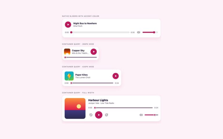
Three players with motion that follows the audio. The spinning record is a CSS turntable: a vinyl disc drawn with a repeating radial gradient for the grooves, the cover art as its centre label, a fixed sheen on top and a tonearm that swings onto the record when playback starts. The disc runs a linear rotation whose animation-play-state switches between paused and running, so it stops where it is when the music stops. The equaliser bars card shows five bars beside the cover and title; at rest they hold a fixed pattern, and while the track plays each bar scales on its own duration and delay. The pulse button is an 84 pixel play button with two rings that grow and fade out from behind it, half a cycle apart. Every animation is keyed to a data-playing attribute that the script sets on the play event and removes on pause, so motion never runs while the audio is silent. Under prefers-reduced-motion: reduce the animations are switched off, the record stays still and the tonearm moves without a transition, while play, seek and time keep working.

What’s included

  • Turntable with a turning record and a tonearm that swings in
  • Equaliser bars that rest in a pattern and bounce while playing
  • Play button with two rippling rings
  • Motion runs only while audio plays, keyed to data-playing
  • All animation removed under prefers-reduced-motion
  • Tailwind version uses @theme keyframes and motion-safe: variants

Accessibility

The turntable, bars and rings are hidden from screen readers; each player is a group named after its track, with a play button labelled Play or Pause and a seek slider that reads as 0:09 of 0:24. Keyboard focus draws a 2px outline 3px off the button and a ring on the slider thumb. With prefers-reduced-motion set, nothing spins, bounces or ripples, and the tonearm moves without a transition.

Customise it

Change --an-accent and --an-track on .an, the 2.4s duration on .an-disc for a faster or slower record, and the per-bar animation-duration values for the equaliser. In Tailwind the --animate-an-* values and keyframes live in the @theme block.