/* ── Claymorphism UI kit tokens (uiCookies) — identical in every set ──────────────
   Every component is a puffy pastel object floating above --clay-bg: one big soft drop shadow
   below it, an inset highlight top left and an inset shade bottom right. Change a token and
   the whole kit follows; the shadow recipes below are built from these values. */
:root{
  --clay-bg:#f3effa;          /* page, a pale lilac white */
  --clay-surface:#fffcf8;     /* cards, fields and plain objects */
  --clay-peach:#ffd2bd;       /* object fills: ink text on every fill reaches 11:1 */
  --clay-lilac:#dccdff;
  --clay-mint:#bdeed6;
  --clay-sky:#c2e0ff;
  --clay-lemon:#ffe9a3;
  --clay-ink:#241a3d;         /* text, 14.4:1 on --clay-bg */
  --clay-muted:#51476a;       /* secondary text, 5.7:1 or more on every fill */
  --clay-edge:#7a6e96;        /* control boundary, 4.1:1 on --clay-bg, so shadows are never the only edge */
  --clay-line:rgba(36,26,61,.12); /* decorative edge on cards and panels */
  --clay-accent:#6236e8;      /* focus ring and on / selected / current states, 5.8:1 on --clay-bg */
  --clay-on-accent:#ffffff;   /* text and marks on accent fills, 6.5:1 */
  --clay-tint:#e9e1ff;        /* light accent wash behind current items */
  --clay-drop:rgba(86,56,168,.30); /* colour of the outer drop shadow */
  --clay-hi:rgba(255,255,255,.88);  /* inset highlight, top left */
  --clay-lo:rgba(52,30,112,.20);    /* inset shade, bottom right */
  --clay-lift:14px;           /* how high objects float; every shadow scales from it */
  --clay-radius:30px;         /* cards; buttons are pills, fields use .55 of it */
  --clay-bw:1.5px;            /* control border width */
  --clay-success:#17663d;--clay-warning:#8a4b00;--clay-danger:#b3261e;
  --clay-font:ui-rounded,"SF Pro Rounded","Nunito","Quicksand","Varela Round","Arial Rounded MT Bold",system-ui,sans-serif;
}
/* --clay-fill is set by .clay-peach, .clay-mint… on one object and must not leak into its children */
@property --clay-fill{syntax:"*";inherits:false}
/* Dark clay: data-clay="dark" on any wrapper, or a checked .clay-theme-input inside a [data-clay] element.
   :is() is a forgiving list, so browsers without :has() still apply data-clay="dark" */
[data-clay]:is([data-clay="dark"],:has(.clay-theme-input:checked)){
  --clay-bg:#1a1530;--clay-surface:#2a2347;
  --clay-peach:#6e3f33;--clay-lilac:#4a3a8a;--clay-mint:#215a4a;--clay-sky:#26497c;--clay-lemon:#5f5220;
  --clay-ink:#f7f3ff;--clay-muted:#d2c9ea;--clay-edge:#8f83b8;--clay-line:rgba(255,255,255,.1);
  --clay-accent:#bba6ff;--clay-on-accent:#1a1530;--clay-tint:#3a2f66;
  --clay-drop:rgba(4,2,14,.62);--clay-hi:rgba(255,255,255,.2);--clay-lo:rgba(0,0,0,.34);
  --clay-success:#86e3b0;--clay-warning:#ffc76e;--clay-danger:#ffa196;color-scheme:dark}
/* More contrast requested: soft shading stays, but every edge and secondary text turns full ink */
@media (prefers-contrast:more){:root,[data-clay]:is([data-clay],:has(.clay-theme-input:checked)){
  --clay-edge:var(--clay-ink);--clay-line:var(--clay-ink);--clay-muted:var(--clay-ink);--clay-bw:2px}}
:root,[data-clay]{
  --clay-shadow:0 var(--clay-lift) calc(var(--clay-lift)*2.2) calc(var(--clay-lift)*-.3) var(--clay-drop),
    inset calc(var(--clay-lift)*.45) calc(var(--clay-lift)*.5) calc(var(--clay-lift)*.9) var(--clay-hi),
    inset calc(var(--clay-lift)*-.45) calc(var(--clay-lift)*-.6) calc(var(--clay-lift)*.9) var(--clay-lo);
  --clay-shadow-sm:0 calc(var(--clay-lift)*.55) calc(var(--clay-lift)*1.2) calc(var(--clay-lift)*-.15) var(--clay-drop),
    inset calc(var(--clay-lift)*.25) calc(var(--clay-lift)*.3) calc(var(--clay-lift)*.5) var(--clay-hi),
    inset calc(var(--clay-lift)*-.25) calc(var(--clay-lift)*-.35) calc(var(--clay-lift)*.5) var(--clay-lo);
  --clay-press:0 calc(var(--clay-lift)*.12) calc(var(--clay-lift)*.25) 0 var(--clay-drop),
    inset calc(var(--clay-lift)*.2) calc(var(--clay-lift)*.25) calc(var(--clay-lift)*.45) var(--clay-lo),
    inset calc(var(--clay-lift)*-.12) calc(var(--clay-lift)*-.12) calc(var(--clay-lift)*.3) var(--clay-hi);
  --clay-well:inset calc(var(--clay-lift)*.15) calc(var(--clay-lift)*.22) calc(var(--clay-lift)*.45) var(--clay-lo),
    inset calc(var(--clay-lift)*-.12) calc(var(--clay-lift)*-.12) calc(var(--clay-lift)*.3) var(--clay-hi);
}
[data-clay]{background:var(--clay-bg);color:var(--clay-ink)}
/* Components */
:where([class*="clay-"]),:where([class*="clay-"])::before,:where([class*="clay-"])::after{box-sizing:border-box}
.clay-sr{position:absolute;width:1px;height:1px;padding:0;margin:-1px;overflow:hidden;clip:rect(0,0,0,0);white-space:nowrap;border:0}
.clay-ico{width:22px;height:22px;flex:none}
.clay-ico--lg{width:28px;height:28px}
/* Fills: put one on any object; components read --clay-fill */
.clay-peach{--clay-fill:var(--clay-peach)}.clay-lilac{--clay-fill:var(--clay-lilac)}.clay-mint{--clay-fill:var(--clay-mint)}
.clay-sky{--clay-fill:var(--clay-sky)}.clay-lemon{--clay-fill:var(--clay-lemon)}
/* Card: a puffy panel that floats on the big drop shadow */
.clay-card{margin:0;padding:1.6rem;border:var(--clay-bw) solid var(--clay-line);border-radius:var(--clay-radius);
  background:var(--clay-fill,var(--clay-surface));color:var(--clay-ink);box-shadow:var(--clay-shadow)}
/* Layout helpers */
.clay-cluster{display:flex;flex-wrap:wrap;align-items:center;gap:18px}
.clay-tiles{display:grid;grid-template-columns:repeat(auto-fit,minmax(160px,1fr));gap:22px}
.clay-stack{display:grid;gap:1.4rem}
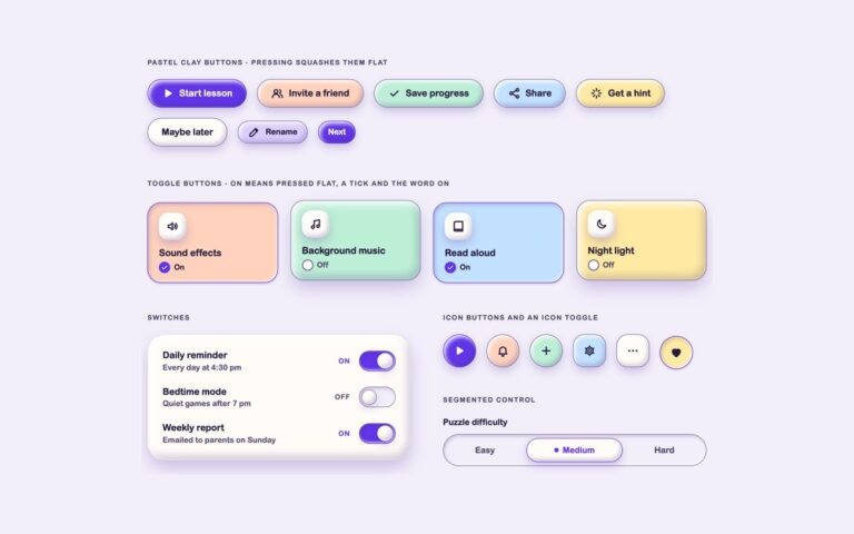
/* Buttons: pastel pills that float; hover lifts them, pressing squashes the shadow flat */
.clay-btn{display:inline-flex;align-items:center;justify-content:center;gap:.55rem;min-height:50px;margin:0;padding:.7rem 1.5rem;
  border:var(--clay-bw) solid var(--clay-edge);border-radius:999px;background:var(--clay-fill,var(--clay-surface));color:var(--clay-ink);
  font-family:inherit;font-size:1rem;font-weight:800;line-height:1.2;text-decoration:none;cursor:pointer;
  box-shadow:var(--clay-shadow-sm);transition:transform .18s,box-shadow .18s}
.clay-btn:hover{transform:translateY(-2px);box-shadow:var(--clay-shadow)}
.clay-btn:active{transform:translateY(2px);box-shadow:var(--clay-press)}
.clay-btn:focus-visible{outline:3px solid var(--clay-accent);outline-offset:4px}
.clay-btn--accent{--clay-fill:var(--clay-accent);border-color:var(--clay-accent);color:var(--clay-on-accent)}
.clay-btn--sm{min-height:40px;padding:.45rem 1.05rem;font-size:.88rem}
.clay-btn--block{width:100%}
/* Icon buttons: round (or squircle) clay pebbles with a chunky icon and an aria-label */
.clay-iconbtn{display:inline-grid;place-items:center;width:58px;height:58px;margin:0;padding:0;border:var(--clay-bw) solid var(--clay-edge);border-radius:50%;
  background:var(--clay-fill,var(--clay-surface));color:var(--clay-ink);cursor:pointer;box-shadow:var(--clay-shadow-sm);transition:transform .18s,box-shadow .18s}
.clay-iconbtn:hover{transform:translateY(-2px);box-shadow:var(--clay-shadow)}
.clay-iconbtn:active{transform:translateY(2px);box-shadow:var(--clay-press)}
.clay-iconbtn:focus-visible{outline:3px solid var(--clay-accent);outline-offset:4px}
.clay-iconbtn--sq{border-radius:20px}
.clay-iconbtn--sm{width:44px;height:44px}
.clay-iconbtn--lg{width:72px;height:72px}
.clay-iconbtn--accent{--clay-fill:var(--clay-accent);border-color:var(--clay-accent);color:var(--clay-on-accent)}
@media (prefers-reduced-motion:reduce){.clay-btn,.clay-iconbtn{transition:none}.clay-btn:hover,.clay-btn:active,.clay-iconbtn:hover,.clay-iconbtn:active{transform:none}}
/* Blob: a small puffy icon tile that sits on any card */
.clay-blob{display:grid;place-items:center;flex:none;width:52px;height:52px;border:var(--clay-bw) solid var(--clay-line);border-radius:18px;
  background:var(--clay-fill,var(--clay-surface));color:var(--clay-ink);box-shadow:var(--clay-shadow-sm)}
.clay-chip{display:inline-flex;align-items:center;gap:.35rem;padding:.3rem .75rem;border:var(--clay-bw) solid var(--clay-line);border-radius:999px;
  background:var(--clay-surface);color:var(--clay-ink);font-size:.8rem;font-weight:800;line-height:1.3}
.clay-chip .clay-ico{width:16px;height:16px}
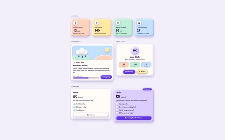
/* Stat cards: coloured clay slabs with a blob icon, a big number and a sentence that explains the change */
.clay-stats{display:grid;grid-template-columns:repeat(auto-fit,minmax(200px,1fr));gap:24px}
.clay-stat{display:grid;gap:.25rem;align-content:start}
.clay-stat__label{margin:.85rem 0 0;font-size:.9rem;font-weight:800;color:var(--clay-muted)}
.clay-stat__value{margin:0;font-size:2.2rem;font-weight:800;line-height:1.1;letter-spacing:-.01em}
.clay-stat__unit{font-size:1rem;font-weight:700}
.clay-stat__note{margin:0;font-size:.86rem;font-weight:600;color:var(--clay-muted)}
/* Content card: an illustration panel made of clay shapes, a chip, a title and a progress line */
.clay-lesson{display:flex;flex-direction:column;gap:1rem;padding:1rem 1rem 1.4rem}
.clay-art{position:relative;height:170px;overflow:hidden;border-radius:calc(var(--clay-radius)*.75);background:var(--clay-sky);box-shadow:var(--clay-well)}
.clay-art__shape{position:absolute;border-radius:50%;box-shadow:var(--clay-shadow-sm)}
.clay-art__shape--sun{top:22px;right:34px;width:58px;height:58px;background:var(--clay-lemon)}
.clay-art__shape--cloud{top:52px;left:40px;width:140px;height:54px;border-radius:999px;background:var(--clay-surface)}
.clay-art__shape--cloud2{top:30px;left:78px;width:70px;height:60px;background:var(--clay-surface)}
.clay-art__shape--hill{bottom:-70px;left:-20px;width:240px;height:140px;background:var(--clay-mint)}
.clay-art__shape--hill2{bottom:-90px;right:-40px;width:260px;height:150px;background:var(--clay-peach)}
.clay-art__shape--drop{top:116px;width:14px;height:20px;border-radius:50% 50% 50% 50%/60% 60% 40% 40%;background:var(--clay-accent);box-shadow:none}
.clay-lesson__body{display:grid;gap:.55rem;padding:0 .5rem}
.clay-lesson__tag{margin:0}
.clay-lesson__title{margin:0;font-size:1.3rem;font-weight:800;line-height:1.25}
.clay-lesson__text{margin:0;color:var(--clay-muted)}
.clay-lesson__foot{display:flex;flex-wrap:wrap;align-items:center;justify-content:space-between;gap:1rem;padding:0 .5rem}
.clay-meter{display:grid;gap:.35rem;flex:1;min-width:140px;font-size:.84rem;font-weight:700;color:var(--clay-muted)}
.clay-meter__bar{height:14px;border:var(--clay-bw) solid var(--clay-edge);border-radius:999px;background:var(--clay-bg);box-shadow:var(--clay-well);overflow:hidden}
.clay-meter__fill{display:block;height:100%;width:var(--clay-pct,50%);border-radius:999px;background:var(--clay-accent)}
/* Profile card */
.clay-profile{display:grid;justify-items:center;gap:.4rem;text-align:center}
.clay-avatar{display:grid;place-items:center;width:96px;height:96px;margin-bottom:.6rem;border:var(--clay-bw) solid var(--clay-line);border-radius:50%;
  background:var(--clay-fill,var(--clay-lilac));font-size:2rem;font-weight:800;box-shadow:var(--clay-shadow)}
.clay-profile__name{margin:0;font-size:1.3rem;font-weight:800;line-height:1.25}
.clay-profile__role{margin:0;color:var(--clay-muted)}
.clay-profile__stats{display:grid;grid-template-columns:repeat(3,1fr);gap:10px;width:100%;margin:.9rem 0 1.1rem;padding:0;list-style:none}
.clay-profile__stat{display:grid;padding:.6rem .3rem;border-radius:18px;background:var(--clay-fill,var(--clay-bg));box-shadow:var(--clay-well)}
.clay-profile__num{font-size:1.25rem;font-weight:800;line-height:1.2}
.clay-profile__key{font-size:.78rem;font-weight:700;color:var(--clay-muted)}
.clay-profile__actions{display:flex;flex-wrap:wrap;justify-content:center;gap:12px}
/* Pricing pair */
.clay-plans{display:grid;grid-template-columns:repeat(auto-fit,minmax(260px,1fr));gap:28px;align-items:start}
.clay-plan{position:relative;display:grid;gap:.9rem}
.clay-plan__badge{position:absolute;top:-14px;right:24px;padding:.3rem .85rem;border:var(--clay-bw) solid var(--clay-accent);border-radius:999px;
  background:var(--clay-accent);color:var(--clay-on-accent);font-size:.78rem;font-weight:800;box-shadow:var(--clay-shadow-sm)}
.clay-plan__name{margin:0;font-size:1.15rem;font-weight:800}
.clay-plan__price{margin:0;font-size:2.6rem;font-weight:800;line-height:1}
.clay-plan__per{font-size:1rem;font-weight:700;color:var(--clay-muted)}
.clay-plan__desc{margin:0;color:var(--clay-muted)}
.clay-plan__list{display:grid;gap:.6rem;margin:.2rem 0 .4rem;padding:0;list-style:none}
.clay-plan__item{display:flex;align-items:center;gap:.6rem;font-weight:600}
.clay-plan__tick{display:grid;place-items:center;flex:none;width:26px;height:26px;border-radius:50%;background:var(--clay-fill,var(--clay-surface));box-shadow:var(--clay-shadow-sm)}
.clay-plan__tick .clay-ico{width:16px;height:16px}
.clay-two{display:grid;grid-template-columns:minmax(0,1.15fr) minmax(0,1fr);gap:28px;align-items:start}
@media (max-width:767px){.clay-two{grid-template-columns:1fr}}
.clay-stats--two{grid-template-columns:repeat(auto-fit,minmax(150px,1fr))}
/* Navbar: a floating clay pill. The current link is a raised tint pebble, accent text, a dot and aria-current */
.clay-nav{display:flex;flex-wrap:wrap;align-items:center;gap:12px 18px;padding:.7rem .8rem .7rem 1rem;border:var(--clay-bw) solid var(--clay-line);border-radius:999px;
  background:var(--clay-surface);box-shadow:var(--clay-shadow)}
.clay-nav__brand{display:flex;align-items:center;gap:.6rem;margin-right:auto;color:var(--clay-ink);font-size:1.15rem;font-weight:800;text-decoration:none;border-radius:14px}
.clay-nav__brand:focus-visible{outline:3px solid var(--clay-accent);outline-offset:3px}
.clay-nav__mark{display:grid;place-items:center;width:42px;height:42px;border-radius:15px;background:var(--clay-peach);box-shadow:var(--clay-shadow-sm)}
.clay-nav__list{display:flex;flex-wrap:wrap;gap:6px;margin:0;padding:0;list-style:none}
.clay-nav__link{display:flex;align-items:center;gap:.4rem;min-height:44px;padding:.5rem 1rem;border:var(--clay-bw) solid transparent;border-radius:999px;
  color:var(--clay-muted);font-weight:800;text-decoration:none;transition:background-color .18s,box-shadow .18s}
.clay-nav__link:hover{color:var(--clay-ink);background:var(--clay-bg)}
.clay-nav__link:focus-visible{outline:3px solid var(--clay-accent);outline-offset:2px}
.clay-nav__link[aria-current="page"]{border-color:var(--clay-accent);background:var(--clay-tint);color:var(--clay-accent);box-shadow:var(--clay-shadow-sm)}
.clay-nav__link[aria-current="page"]::before{content:"";width:8px;height:8px;border-radius:50%;background:currentColor}
.clay-nav__tools{display:flex;align-items:center;gap:10px}
/* Tabs: role="tablist". The selected tab pops up as a pebble with an accent edge and a dot */
.clay-tabs{display:grid;gap:1.2rem}
.clay-tabs__list{display:flex;flex-wrap:wrap;gap:6px;width:fit-content;max-width:100%;padding:6px;border:var(--clay-bw) solid var(--clay-edge);border-radius:999px;background:var(--clay-bg);box-shadow:var(--clay-well)}
.clay-tab{display:flex;align-items:center;gap:.45rem;min-height:44px;margin:0;padding:.45rem 1.1rem;border:var(--clay-bw) solid transparent;border-radius:999px;background:transparent;
  color:var(--clay-muted);font-family:inherit;font-size:.95rem;font-weight:800;cursor:pointer;transition:background-color .18s,box-shadow .18s}
.clay-tab:hover{color:var(--clay-ink)}
.clay-tab:focus-visible{outline:3px solid var(--clay-accent);outline-offset:2px}
.clay-tab[aria-selected="true"]{border-color:var(--clay-accent);background:var(--clay-surface);color:var(--clay-accent);box-shadow:var(--clay-shadow-sm)}
.clay-tab .clay-ico{width:20px;height:20px}
.clay-tabpanel{display:flex;flex-wrap:wrap;align-items:center;gap:1.2rem}
.clay-tabpanel[hidden]{display:none}
.clay-tabpanel:focus-visible{outline:3px solid var(--clay-accent);outline-offset:4px}
.clay-tabpanel__text{flex:1;min-width:200px}
.clay-tabpanel__title{margin:0 0 .3rem;font-size:1.15rem;font-weight:800}
.clay-tabpanel__copy{margin:0;color:var(--clay-muted)}
/* Sidebar: grouped links; the current one sits on a tint pebble with an accent bar and aria-current */
.clay-side{display:grid;gap:.4rem;padding:1.2rem}
.clay-side__heading{margin:.6rem .7rem .3rem;font-size:.74rem;font-weight:800;letter-spacing:.1em;text-transform:uppercase;color:var(--clay-muted)}
.clay-side__heading:first-child{margin-top:0}
.clay-side__list{display:grid;gap:6px;margin:0;padding:0;list-style:none}
.clay-side__link{position:relative;display:flex;align-items:center;gap:.75rem;min-height:50px;padding:.35rem .6rem;border:var(--clay-bw) solid transparent;border-radius:18px;
  color:var(--clay-ink);font-weight:800;text-decoration:none;transition:background-color .18s,box-shadow .18s}
.clay-side__link:hover{background:var(--clay-bg)}
.clay-side__link:focus-visible{outline:3px solid var(--clay-accent);outline-offset:2px}
.clay-side__link[aria-current="page"]{border-color:var(--clay-accent);background:var(--clay-tint);box-shadow:var(--clay-shadow-sm)}
.clay-side__link[aria-current="page"]::after{content:"";position:absolute;left:-1px;top:12px;bottom:12px;width:5px;border-radius:0 6px 6px 0;background:var(--clay-accent)}
.clay-side__icon{display:grid;place-items:center;flex:none;width:38px;height:38px;border-radius:13px;background:var(--clay-fill,var(--clay-surface));box-shadow:var(--clay-shadow-sm)}
.clay-side__icon .clay-ico{width:20px;height:20px}
.clay-side__count{margin-left:auto;min-width:28px;padding:.1rem .5rem;border-radius:999px;background:var(--clay-accent);color:var(--clay-on-accent);font-size:.78rem;font-weight:800;text-align:center}
/* Pagination: round pebbles; the current page is accent, pressed flat and marked with aria-current */
.clay-pages__list{display:flex;flex-wrap:wrap;align-items:center;gap:10px;margin:0;padding:0;list-style:none}
.clay-page{display:grid;place-items:center;min-width:48px;height:48px;padding:0 .8rem;border:var(--clay-bw) solid var(--clay-edge);border-radius:999px;
  background:var(--clay-surface);color:var(--clay-ink);font-weight:800;text-decoration:none;box-shadow:var(--clay-shadow-sm);transition:transform .18s,box-shadow .18s}
.clay-page:hover{transform:translateY(-2px);box-shadow:var(--clay-shadow)}
.clay-page:focus-visible{outline:3px solid var(--clay-accent);outline-offset:3px}
.clay-page[aria-current="page"]{transform:translateY(2px);border-color:var(--clay-accent);background:var(--clay-accent);color:var(--clay-on-accent);box-shadow:var(--clay-press)}
.clay-page--wide{display:flex;gap:.3rem;padding:0 1.1rem}
.clay-page[aria-disabled="true"]{color:var(--clay-muted);box-shadow:none;cursor:not-allowed;transform:none}
.clay-page__gap{padding:0 .2rem;font-weight:800;color:var(--clay-muted)}
@media (max-width:600px){.clay-nav,.clay-tabs__list{border-radius:var(--clay-radius)}}
@media (prefers-reduced-motion:reduce){.clay-nav__link,.clay-tab,.clay-side__link,.clay-page{transition:none}.clay-page:hover{transform:none}}
JavaScript
// Tabs: click or Left / Right / Home / End move between tabs (ARIA tabs pattern, automatic activation)
document.querySelectorAll('[data-clay-tabs]').forEach(function (list) {
  var tabs = Array.prototype.slice.call(list.querySelectorAll('[role="tab"]'));
  function select(tab) {
    tabs.forEach(function (t) {
      var on = t === tab;
      t.setAttribute('aria-selected', on); t.tabIndex = on ? 0 : -1;
      document.getElementById(t.getAttribute('aria-controls')).hidden = !on;
    });
  }
  tabs.forEach(function (tab, i) {
    tab.addEventListener('click', function () { select(tab); });
    tab.addEventListener('keydown', function (e) {
      var n = { ArrowRight: i + 1, ArrowLeft: i - 1, Home: 0, End: tabs.length - 1 }[e.key];
      if (n === undefined) return;
      e.preventDefault(); var t = tabs[(n + tabs.length) % tabs.length]; select(t); t.focus();
    });
  });
});
/* ── Claymorphism UI kit tokens (uiCookies) — identical in every set ──────────────
   Every component is a puffy pastel object floating above --clay-bg: one big soft drop shadow
   below it, an inset highlight top left and an inset shade bottom right. Change a token and
   the whole kit follows; the shadow recipes below are built from these values. */
:root{
  --clay-bg:#f3effa;          /* page, a pale lilac white */
  --clay-surface:#fffcf8;     /* cards, fields and plain objects */
  --clay-peach:#ffd2bd;       /* object fills: ink text on every fill reaches 11:1 */
  --clay-lilac:#dccdff;
  --clay-mint:#bdeed6;
  --clay-sky:#c2e0ff;
  --clay-lemon:#ffe9a3;
  --clay-ink:#241a3d;         /* text, 14.4:1 on --clay-bg */
  --clay-muted:#51476a;       /* secondary text, 5.7:1 or more on every fill */
  --clay-edge:#7a6e96;        /* control boundary, 4.1:1 on --clay-bg, so shadows are never the only edge */
  --clay-line:rgba(36,26,61,.12); /* decorative edge on cards and panels */
  --clay-accent:#6236e8;      /* focus ring and on / selected / current states, 5.8:1 on --clay-bg */
  --clay-on-accent:#ffffff;   /* text and marks on accent fills, 6.5:1 */
  --clay-tint:#e9e1ff;        /* light accent wash behind current items */
  --clay-drop:rgba(86,56,168,.30); /* colour of the outer drop shadow */
  --clay-hi:rgba(255,255,255,.88);  /* inset highlight, top left */
  --clay-lo:rgba(52,30,112,.20);    /* inset shade, bottom right */
  --clay-lift:14px;           /* how high objects float; every shadow scales from it */
  --clay-radius:30px;         /* cards; buttons are pills, fields use .55 of it */
  --clay-bw:1.5px;            /* control border width */
  --clay-success:#17663d;--clay-warning:#8a4b00;--clay-danger:#b3261e;
  --clay-font:ui-rounded,"SF Pro Rounded","Nunito","Quicksand","Varela Round","Arial Rounded MT Bold",system-ui,sans-serif;
}
/* --clay-fill is set by .clay-peach, .clay-mint… on one object and must not leak into its children */
@property --clay-fill{syntax:"*";inherits:false}
/* Dark clay: data-clay="dark" on any wrapper, or a checked .clay-theme-input inside a [data-clay] element.
   :is() is a forgiving list, so browsers without :has() still apply data-clay="dark" */
[data-clay]:is([data-clay="dark"],:has(.clay-theme-input:checked)){
  --clay-bg:#1a1530;--clay-surface:#2a2347;
  --clay-peach:#6e3f33;--clay-lilac:#4a3a8a;--clay-mint:#215a4a;--clay-sky:#26497c;--clay-lemon:#5f5220;
  --clay-ink:#f7f3ff;--clay-muted:#d2c9ea;--clay-edge:#8f83b8;--clay-line:rgba(255,255,255,.1);
  --clay-accent:#bba6ff;--clay-on-accent:#1a1530;--clay-tint:#3a2f66;
  --clay-drop:rgba(4,2,14,.62);--clay-hi:rgba(255,255,255,.2);--clay-lo:rgba(0,0,0,.34);
  --clay-success:#86e3b0;--clay-warning:#ffc76e;--clay-danger:#ffa196;color-scheme:dark}
/* More contrast requested: soft shading stays, but every edge and secondary text turns full ink */
@media (prefers-contrast:more){:root,[data-clay]:is([data-clay],:has(.clay-theme-input:checked)){
  --clay-edge:var(--clay-ink);--clay-line:var(--clay-ink);--clay-muted:var(--clay-ink);--clay-bw:2px}}
:root,[data-clay]{
  --clay-shadow:0 var(--clay-lift) calc(var(--clay-lift)*2.2) calc(var(--clay-lift)*-.3) var(--clay-drop),
    inset calc(var(--clay-lift)*.45) calc(var(--clay-lift)*.5) calc(var(--clay-lift)*.9) var(--clay-hi),
    inset calc(var(--clay-lift)*-.45) calc(var(--clay-lift)*-.6) calc(var(--clay-lift)*.9) var(--clay-lo);
  --clay-shadow-sm:0 calc(var(--clay-lift)*.55) calc(var(--clay-lift)*1.2) calc(var(--clay-lift)*-.15) var(--clay-drop),
    inset calc(var(--clay-lift)*.25) calc(var(--clay-lift)*.3) calc(var(--clay-lift)*.5) var(--clay-hi),
    inset calc(var(--clay-lift)*-.25) calc(var(--clay-lift)*-.35) calc(var(--clay-lift)*.5) var(--clay-lo);
  --clay-press:0 calc(var(--clay-lift)*.12) calc(var(--clay-lift)*.25) 0 var(--clay-drop),
    inset calc(var(--clay-lift)*.2) calc(var(--clay-lift)*.25) calc(var(--clay-lift)*.45) var(--clay-lo),
    inset calc(var(--clay-lift)*-.12) calc(var(--clay-lift)*-.12) calc(var(--clay-lift)*.3) var(--clay-hi);
  --clay-well:inset calc(var(--clay-lift)*.15) calc(var(--clay-lift)*.22) calc(var(--clay-lift)*.45) var(--clay-lo),
    inset calc(var(--clay-lift)*-.12) calc(var(--clay-lift)*-.12) calc(var(--clay-lift)*.3) var(--clay-hi);
}
[data-clay]{background:var(--clay-bg);color:var(--clay-ink)}
/* The tokens above, exposed as Tailwind utilities: bg-clay-peach, text-clay-muted, border-clay-edge,
   shadow-clay, shadow-clay-sm, shadow-clay-press, shadow-clay-well, rounded-clay, rounded-clay-field, font-clay… */
@theme inline {
  --color-clay-bg: var(--clay-bg); --color-clay-surface: var(--clay-surface);
  --color-clay-peach: var(--clay-peach); --color-clay-lilac: var(--clay-lilac); --color-clay-mint: var(--clay-mint);
  --color-clay-sky: var(--clay-sky); --color-clay-lemon: var(--clay-lemon);
  --color-clay-ink: var(--clay-ink); --color-clay-muted: var(--clay-muted); --color-clay-edge: var(--clay-edge); --color-clay-line: var(--clay-line);
  --color-clay-accent: var(--clay-accent); --color-clay-on-accent: var(--clay-on-accent); --color-clay-tint: var(--clay-tint);
  --color-clay-success: var(--clay-success); --color-clay-warning: var(--clay-warning); --color-clay-danger: var(--clay-danger);
  --shadow-clay: var(--clay-shadow); --shadow-clay-sm: var(--clay-shadow-sm); --shadow-clay-press: var(--clay-press); --shadow-clay-well: var(--clay-well);
  --radius-clay: var(--clay-radius); --radius-clay-field: calc(var(--clay-radius) * .55); --radius-clay-sm: calc(var(--clay-radius) * .4);
  --font-clay: var(--clay-font);
}
JavaScript
// Tabs: click or Left / Right / Home / End move between tabs (ARIA tabs pattern, automatic activation)
document.querySelectorAll('[data-clay-tabs]').forEach(function (list) {
  var tabs = Array.prototype.slice.call(list.querySelectorAll('[role="tab"]'));
  function select(tab) {
    tabs.forEach(function (t) {
      var on = t === tab;
      t.setAttribute('aria-selected', on); t.tabIndex = on ? 0 : -1;
      document.getElementById(t.getAttribute('aria-controls')).hidden = !on;
    });
  }
  tabs.forEach(function (tab, i) {
    tab.addEventListener('click', function () { select(tab); });
    tab.addEventListener('keydown', function (e) {
      var n = { ArrowRight: i + 1, ArrowLeft: i - 1, Home: 0, End: tabs.length - 1 }[e.key];
      if (n === undefined) return;
      e.preventDefault(); var t = tabs[(n + tabs.length) % tabs.length]; select(t); t.focus();
    });
  });
});
About this set
Navigation patterns for a soft, rounded app. The navbar is a floating clay pill with a brand mark, four links and two round icon buttons for notifications and the profile. The current link sits on a raised tint pebble with an accent edge, accent text and a dot, and carries aria-current=”page”. The grouped sidebar lists Today, Reading, Maths, Puzzles, Badges and Settings with small coloured icon blobs and unread counts; the current item gets a tint pebble, an accent edge and an accent bar at its left. Tabs switch between Reading, Maths and Art panels, each a coloured card with a call to action, and the selected tab pops up out of an inset tray. Pagination uses round pebbles with Previous and Next labels, and the current page is an accent pebble pressed flat. Use the set as the frame of a learning app, a family dashboard or any friendly product. The tabs follow the ARIA tabs pattern with Left, Right, Home and End keys; the plain and Tailwind versions use a short script and the Bootstrap version uses its own tab plugin.
What’s included
Floating pill navbar with icon buttons
Grouped sidebar with icon blobs, counts and an accent bar on the current item
ARIA tabs with arrow key, Home and End support
Round pebble pagination with aria-current on the current page
Bootstrap version built on .navbar, .nav-pills, .nav and .pagination
Accessibility
Current items are marked with aria-current and shown by a tint, an accent edge and a dot or bar, not colour alone. Tabs use role="tablist", role="tab" and role="tabpanel" with roving tabindex, page links have aria-labels such as Page 3, and the sidebar groups are labelled by their headings. Every link and button shows a 3px accent focus ring, and transitions stop under prefers-reduced-motion.
Customise it
The current-item colours come from --clay-accent and --clay-tint, and the icon blobs take a fill class. Bootstrap maps the tokens onto --bs-navbar-*, --bs-nav-pills-* and --bs-pagination-* variables; Tailwind styles the states with aria-[current=page]: and aria-selected: variants.