About this set
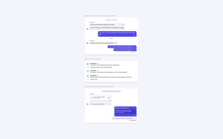
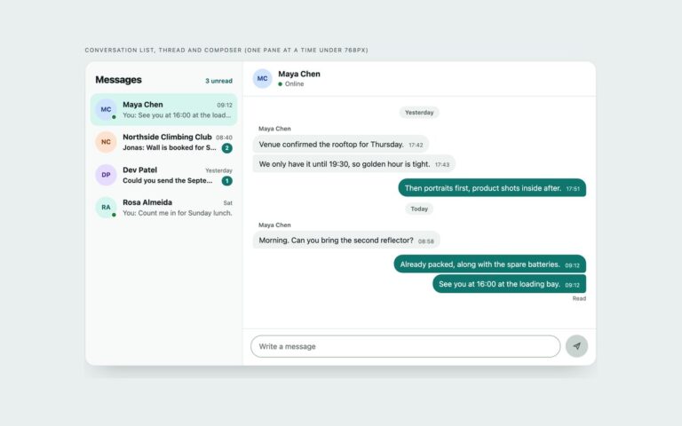
Two chat interfaces for dark products. Direct messages pairs a dark grey received bubble with a violet-to-blue gradient for your messages, an online dot on the contact’s avatar, a date separator and a Read receipt written as text. Live-stream chat is the compact layout of streaming and event sites: a LIVE badge, a pinned moderator message, one line per message with a time, a coloured name and a MOD tag, and a composer with a character count and a Chat button. Every text colour, including the five name colours, the gradient endpoints and the muted timestamps, reaches at least 4.5:1 contrast against its background, and focus rings use a light violet that stands out on the near-black panel. Both share one short script: the textarea grows, Enter sends, Shift+Enter adds a line, the button stays disabled while the field is empty and the count follows maxlength. The Bootstrap file runs in data-bs-theme=”dark” with .card, .badge, .form-control and .btn. For a very busy stream, consider turning the live region off and offering a pause button instead.
What’s included
- Gradient sent bubbles and dark received bubbles
- Live-stream chat with a pinned message and a MOD tag
- Name colours and timestamps at 4.5:1 contrast or better
- Character count, Enter to send and a disabled empty state
- Bootstrap version in data-bs-theme="dark"
Accessibility
Both chats are focusable role="log" regions with aria-live="polite". Every message has a time element and a sender, written as a hidden name in the direct-message thread, and the LIVE and MOD labels are text. Textareas have hidden labels, focus outlines are light violet for contrast on the dark panel, and the only transition, on the Send button, is removed under prefers-reduced-motion.
Customise it
Change --dk-from and --dk-to for the bubble gradient, --dk-raise and --dk-bg for the surfaces, and the .u1 to .u5 name colours. In Tailwind edit the --color-dk-* theme colours; Bootstrap reads the same variables on top of its dark colour mode.