<div><span class="lbl">Sidebar slot, 280px: compact row</span>
<div class="mc"><article class="mc-card" aria-labelledby="mc-noa-1">
  <div class="mc-cover" aria-hidden="true"></div>
  <span class="mc-av" aria-hidden="true">NB</span>
  <h3 class="mc-name" id="mc-noa-1">Noa Brandt</h3>
  <p class="mc-role">Type designer, Rotterdam</p>
  <p class="mc-bio">Draws text faces for long reading. Her Halden family ships in 14 weights and covers 212 languages.</p>
  <dl class="mc-stats"><div><dt>Fonts</dt><dd>9</dd></div><div><dt>Followers</dt><dd>18.6k</dd></div><div><dt>Licences</dt><dd>3,410</dd></div></dl>
  <label class="mc-follow"><input type="checkbox"><span><svg viewBox="0 0 24 24" fill="none" stroke="currentColor" stroke-width="2.2" stroke-linecap="round" aria-hidden="true" focusable="false" class="off"><path d="M12 5v14M5 12h14"/></svg><svg viewBox="0 0 24 24" fill="none" stroke="currentColor" stroke-width="2.2" stroke-linecap="round" stroke-linejoin="round" aria-hidden="true" focusable="false" class="on"><path d="M5 12.5l4.5 4.5L19 7.5"/></svg>Follow<span class="sr-only"> Noa Brandt</span></span></label>
  <p class="mc-note">You follow Noa. New releases will show in your feed.</p>
</article></div></div>

<div><span class="lbl">Card slot, 420px: full card</span>
<div class="mc"><article class="mc-card" aria-labelledby="mc-noa-2">
  <div class="mc-cover" aria-hidden="true"></div>
  <span class="mc-av" aria-hidden="true">NB</span>
  <h3 class="mc-name" id="mc-noa-2">Noa Brandt</h3>
  <p class="mc-role">Type designer, Rotterdam</p>
  <p class="mc-bio">Draws text faces for long reading. Her Halden family ships in 14 weights and covers 212 languages.</p>
  <dl class="mc-stats"><div><dt>Fonts</dt><dd>9</dd></div><div><dt>Followers</dt><dd>18.6k</dd></div><div><dt>Licences</dt><dd>3,410</dd></div></dl>
  <label class="mc-follow"><input type="checkbox" checked><span><svg viewBox="0 0 24 24" fill="none" stroke="currentColor" stroke-width="2.2" stroke-linecap="round" aria-hidden="true" focusable="false" class="off"><path d="M12 5v14M5 12h14"/></svg><svg viewBox="0 0 24 24" fill="none" stroke="currentColor" stroke-width="2.2" stroke-linecap="round" stroke-linejoin="round" aria-hidden="true" focusable="false" class="on"><path d="M5 12.5l4.5 4.5L19 7.5"/></svg>Follow<span class="sr-only"> Noa Brandt</span></span></label>
  <p class="mc-note">You follow Noa. New releases will show in your feed.</p>
</article></div></div>

<div class="full"><span class="lbl">Wide slot: cover beside the details</span>
<div class="mc"><article class="mc-card" aria-labelledby="mc-noa-3">
  <div class="mc-cover" aria-hidden="true"></div>
  <span class="mc-av" aria-hidden="true">NB</span>
  <h3 class="mc-name" id="mc-noa-3">Noa Brandt</h3>
  <p class="mc-role">Type designer, Rotterdam</p>
  <p class="mc-bio">Draws text faces for long reading. Her Halden family ships in 14 weights and covers 212 languages.</p>
  <dl class="mc-stats"><div><dt>Fonts</dt><dd>9</dd></div><div><dt>Followers</dt><dd>18.6k</dd></div><div><dt>Licences</dt><dd>3,410</dd></div></dl>
  <label class="mc-follow"><input type="checkbox"><span><svg viewBox="0 0 24 24" fill="none" stroke="currentColor" stroke-width="2.2" stroke-linecap="round" aria-hidden="true" focusable="false" class="off"><path d="M12 5v14M5 12h14"/></svg><svg viewBox="0 0 24 24" fill="none" stroke="currentColor" stroke-width="2.2" stroke-linecap="round" stroke-linejoin="round" aria-hidden="true" focusable="false" class="on"><path d="M5 12.5l4.5 4.5L19 7.5"/></svg>Follow<span class="sr-only"> Noa Brandt</span></span></label>
  <p class="mc-note">You follow Noa. New releases will show in your feed.</p>
</article></div></div>
CSS
/* One profile card, three layouts. The wrapper is a size container, so the card lays itself out by the width of its slot:
   under 320px a compact row, from 320px a full card, from 600px a wide card with the cover beside the details.
   The Follow checkbox drives the card state with :has(), and the border is a conic gradient whose angle is a registered
   @property, so it can spin. The ring appears once followed and turns only while the pointer is over the card (never under
   prefers-reduced-motion). */
@property --mc-angle{syntax:"<angle>";inherits:false;initial-value:0deg}
.mc{--mc-ink:#1c1917;--mc-muted:#57534e;--mc-line:#e7e5e4;--mc-accent:#c2410c;--mc-ring:conic-gradient(from var(--mc-angle),#f43f5e,#f59e0b,#10b981,#3b82f6,#a855f7,#f43f5e);
  container:mc-card/inline-size;color:var(--mc-ink)}
.mc :where(h3,p,dl,dd){margin:0}
.mc-card{--mc-angle:0deg;position:relative;display:grid;grid-template-columns:1fr;justify-items:center;padding:0 22px 22px;text-align:center;
  border:2px solid transparent;border-radius:24px;background:linear-gradient(#fff,#fff) padding-box,linear-gradient(var(--mc-line),var(--mc-line)) border-box;
  box-shadow:0 24px 44px -32px rgba(28,25,23,.45);transition:box-shadow .3s}
.mc-card:hover,.mc-card:has(.mc-follow input:checked){background:linear-gradient(#fff,#fff) padding-box,var(--mc-ring) border-box}
.mc-card:hover{animation:mc-spin 4s linear infinite}
.mc-card:has(.mc-follow input:checked){box-shadow:0 26px 50px -28px rgba(194,65,12,.5)}
@keyframes mc-spin{to{--mc-angle:360deg}}
.mc-cover{justify-self:stretch;height:92px;margin:0 -22px;border-radius:22px 22px 0 0;
  background:radial-gradient(circle at 20% 120%,#fdba74,transparent 55%),radial-gradient(circle at 85% -10%,#a5b4fc,transparent 55%),linear-gradient(120deg,#fde68a,#fbcfe8)}
.mc-av{display:grid;place-items:center;width:84px;height:84px;margin-top:-42px;border:4px solid #fff;border-radius:50%;
  background:radial-gradient(circle at 30% 25%,rgba(255,255,255,.45),transparent 40%),linear-gradient(135deg,#9a3412,#be185d);color:#fff;font-size:1.35rem;font-weight:800}
.mc-name{margin-top:12px;font-size:1.2rem;font-weight:800;letter-spacing:-.01em}
.mc-role{margin-top:3px;font-size:.88rem;color:var(--mc-muted)}
.mc-bio{margin-top:12px;font-size:.9rem;line-height:1.55;color:var(--mc-muted)}
.mc-stats{display:grid;grid-template-columns:repeat(3,1fr);justify-self:stretch;margin-top:18px;padding:12px 0;border-block:1px solid var(--mc-line)}
.mc-stats div{display:flex;flex-direction:column-reverse;gap:2px}
.mc-stats dd{font-size:1.1rem;font-weight:800;font-variant-numeric:tabular-nums}
.mc-stats dt{font-size:.72rem;font-weight:600;letter-spacing:.06em;text-transform:uppercase;color:var(--mc-muted)}
.mc-follow{position:relative;justify-self:stretch;margin-top:18px;cursor:pointer}
.mc-follow input{position:absolute;opacity:0;width:1px;height:1px;margin:0}
.mc-follow>span{display:flex;align-items:center;justify-content:center;gap:7px;padding:11px 16px;border:1.5px solid var(--mc-ink);border-radius:999px;background:var(--mc-ink);color:#fff;
  font-size:.92rem;font-weight:700;transition:background-color .2s,color .2s,border-color .2s}
.mc-follow svg{width:16px;height:16px}
.mc-follow .on,.mc-follow input:checked+span .off{display:none}
.mc-follow input:checked+span .on{display:block}
.mc-follow input:checked+span{background:#fff7ed;color:#9a3412;border-color:var(--mc-accent)}
.mc-follow input:focus-visible+span{outline:3px solid var(--mc-accent);outline-offset:3px}
.mc-note{display:none;margin-top:10px;font-size:.82rem;font-weight:600;color:#9a3412}
.mc-card:has(.mc-follow input:checked) .mc-note{display:block}
.mc .sr-only{position:absolute;width:1px;height:1px;padding:0;margin:-1px;overflow:hidden;clip:rect(0,0,0,0);white-space:nowrap;border:0}
/* compact row */
@container mc-card (width < 320px){
  .mc-card{grid-template-columns:auto 1fr auto;align-items:center;justify-items:start;column-gap:12px;padding:12px 12px 12px 14px;text-align:left;border-radius:18px}
  .mc-cover,.mc-bio,.mc-stats{display:none}
  .mc-av{grid-row:1/3;width:46px;height:46px;margin:0;border:0;font-size:.95rem}
  .mc-name{grid-column:2;margin:0;font-size:.98rem}
  .mc-role{grid-column:2;font-size:.8rem}
  .mc-follow{grid-column:3;grid-row:1/3;margin:0}
  .mc-follow>span{padding:7px 12px;font-size:.82rem}
  .mc-note{grid-column:1/-1;margin-top:8px}
}
/* wide card */
@container mc-card (width >= 600px){
  .mc-card{grid-template-columns:220px 1fr 1fr;grid-template-rows:auto auto 1fr auto auto;justify-items:start;column-gap:0;padding:0;text-align:left}
  .mc-cover{grid-column:1;grid-row:1/-1;height:auto;margin:0;border-radius:22px 0 0 22px}
  .mc-av{grid-column:1;grid-row:1/-1;align-self:center;justify-self:center;width:112px;height:112px;margin:0;font-size:1.8rem}
  .mc-name,.mc-role,.mc-bio,.mc-stats{grid-column:2/-1;margin-left:28px;margin-right:28px}
  .mc-name{margin-top:26px;font-size:1.4rem}
  .mc-stats{justify-self:start;gap:28px;grid-template-columns:repeat(3,auto);border:0;padding:0}
  .mc-follow{grid-column:2;justify-self:start;margin:20px 0 26px 28px}
  .mc-note{grid-column:3;align-self:center;margin:20px 28px 26px 16px}
}
@media (prefers-reduced-motion:reduce){.mc-card,.mc-card:hover{animation:none;transition:none}.mc-follow>span{transition:none}}
Bootstrap 5 code
Requires: Bootstrap 5.3.8 CSS
HTML
<div><span class="lbl">Sidebar slot, 280px: compact row</span>
<div class="mc"><article class="card mc-card" aria-labelledby="mc-noa-1">
  <div class="mc-cover" aria-hidden="true"></div>
  <span class="mc-av" aria-hidden="true">NB</span>
  <h3 class="mc-name" id="mc-noa-1">Noa Brandt</h3>
  <p class="mc-role">Type designer, Rotterdam</p>
  <p class="mc-bio">Draws text faces for long reading. Her Halden family ships in 14 weights and covers 212 languages.</p>
  <dl class="mc-stats"><div><dt>Fonts</dt><dd>9</dd></div><div><dt>Followers</dt><dd>18.6k</dd></div><div><dt>Licences</dt><dd>3,410</dd></div></dl>
  <div class="mc-follow"><input class="btn-check" type="checkbox" id="mc-follow-1" autocomplete="off"><label class="btn" for="mc-follow-1"><svg viewBox="0 0 24 24" fill="none" stroke="currentColor" stroke-width="2.2" stroke-linecap="round" aria-hidden="true" focusable="false" class="off"><path d="M12 5v14M5 12h14"/></svg><svg viewBox="0 0 24 24" fill="none" stroke="currentColor" stroke-width="2.2" stroke-linecap="round" stroke-linejoin="round" aria-hidden="true" focusable="false" class="on"><path d="M5 12.5l4.5 4.5L19 7.5"/></svg>Follow<span class="visually-hidden"> Noa Brandt</span></label></div>
  <p class="mc-note">You follow Noa. New releases will show in your feed.</p>
</article></div></div>

<div><span class="lbl">Card slot, 420px: full card</span>
<div class="mc"><article class="card mc-card" aria-labelledby="mc-noa-2">
  <div class="mc-cover" aria-hidden="true"></div>
  <span class="mc-av" aria-hidden="true">NB</span>
  <h3 class="mc-name" id="mc-noa-2">Noa Brandt</h3>
  <p class="mc-role">Type designer, Rotterdam</p>
  <p class="mc-bio">Draws text faces for long reading. Her Halden family ships in 14 weights and covers 212 languages.</p>
  <dl class="mc-stats"><div><dt>Fonts</dt><dd>9</dd></div><div><dt>Followers</dt><dd>18.6k</dd></div><div><dt>Licences</dt><dd>3,410</dd></div></dl>
  <div class="mc-follow"><input class="btn-check" type="checkbox" id="mc-follow-2" autocomplete="off" checked><label class="btn" for="mc-follow-2"><svg viewBox="0 0 24 24" fill="none" stroke="currentColor" stroke-width="2.2" stroke-linecap="round" aria-hidden="true" focusable="false" class="off"><path d="M12 5v14M5 12h14"/></svg><svg viewBox="0 0 24 24" fill="none" stroke="currentColor" stroke-width="2.2" stroke-linecap="round" stroke-linejoin="round" aria-hidden="true" focusable="false" class="on"><path d="M5 12.5l4.5 4.5L19 7.5"/></svg>Follow<span class="visually-hidden"> Noa Brandt</span></label></div>
  <p class="mc-note">You follow Noa. New releases will show in your feed.</p>
</article></div></div>

<div class="full"><span class="lbl">Wide slot: cover beside the details</span>
<div class="mc"><article class="card mc-card" aria-labelledby="mc-noa-3">
  <div class="mc-cover" aria-hidden="true"></div>
  <span class="mc-av" aria-hidden="true">NB</span>
  <h3 class="mc-name" id="mc-noa-3">Noa Brandt</h3>
  <p class="mc-role">Type designer, Rotterdam</p>
  <p class="mc-bio">Draws text faces for long reading. Her Halden family ships in 14 weights and covers 212 languages.</p>
  <dl class="mc-stats"><div><dt>Fonts</dt><dd>9</dd></div><div><dt>Followers</dt><dd>18.6k</dd></div><div><dt>Licences</dt><dd>3,410</dd></div></dl>
  <div class="mc-follow"><input class="btn-check" type="checkbox" id="mc-follow-3" autocomplete="off"><label class="btn" for="mc-follow-3"><svg viewBox="0 0 24 24" fill="none" stroke="currentColor" stroke-width="2.2" stroke-linecap="round" aria-hidden="true" focusable="false" class="off"><path d="M12 5v14M5 12h14"/></svg><svg viewBox="0 0 24 24" fill="none" stroke="currentColor" stroke-width="2.2" stroke-linecap="round" stroke-linejoin="round" aria-hidden="true" focusable="false" class="on"><path d="M5 12.5l4.5 4.5L19 7.5"/></svg>Follow<span class="visually-hidden"> Noa Brandt</span></label></div>
  <p class="mc-note">You follow Noa. New releases will show in your feed.</p>
</article></div></div>
CSS
/* One profile card on Bootstrap .card and a .btn-check toggle, three layouts. The wrapper is a size container, so the card lays itself out by the width of its slot:
   under 320px a compact row, from 320px a full card, from 600px a wide card with the cover beside the details.
   The Follow .btn-check drives the card state with :has(), and the border is a conic gradient whose angle is a registered
   @property, so it can spin. The ring appears once followed and turns only while the pointer is over the card (never under
   prefers-reduced-motion). */
@property --mc-angle{syntax:"<angle>";inherits:false;initial-value:0deg}
.mc{--mc-ink:#1c1917;--mc-muted:#57534e;--mc-line:#e7e5e4;--mc-accent:#c2410c;--mc-ring:conic-gradient(from var(--mc-angle),#f43f5e,#f59e0b,#10b981,#3b82f6,#a855f7,#f43f5e);
  container:mc-card/inline-size;color:var(--mc-ink)}
.mc :where(h3,p,dl,dd,dt){margin:0}
.mc-card.card{--mc-angle:0deg;--bs-card-border-width:0;position:relative;color:var(--mc-ink);display:grid;grid-template-columns:1fr;justify-items:center;padding:0 22px 22px;text-align:center;
  border:2px solid transparent;border-radius:24px;background:linear-gradient(#fff,#fff) padding-box,linear-gradient(var(--mc-line),var(--mc-line)) border-box;
  box-shadow:0 24px 44px -32px rgba(28,25,23,.45);transition:box-shadow .3s}
.mc-card:hover,.mc-card:has(.btn-check:checked){background:linear-gradient(#fff,#fff) padding-box,var(--mc-ring) border-box}
.mc-card:hover{animation:mc-spin 4s linear infinite}
.mc-card:has(.btn-check:checked){box-shadow:0 26px 50px -28px rgba(194,65,12,.5)}
@keyframes mc-spin{to{--mc-angle:360deg}}
.mc-cover{justify-self:stretch;height:92px;margin:0 -22px;border-radius:22px 22px 0 0;
  background:radial-gradient(circle at 20% 120%,#fdba74,transparent 55%),radial-gradient(circle at 85% -10%,#a5b4fc,transparent 55%),linear-gradient(120deg,#fde68a,#fbcfe8)}
.mc-av{display:grid;place-items:center;width:84px;height:84px;margin-top:-42px;border:4px solid #fff;border-radius:50%;
  background:radial-gradient(circle at 30% 25%,rgba(255,255,255,.45),transparent 40%),linear-gradient(135deg,#9a3412,#be185d);color:#fff;font-size:1.35rem;font-weight:800}
.mc .mc-name{margin-top:12px;font-size:1.2rem;font-weight:800;letter-spacing:-.01em;line-height:normal}
.mc-role{margin-top:3px;font-size:.88rem;color:var(--mc-muted)}
.mc-bio{margin-top:12px;font-size:.9rem;line-height:1.55;color:var(--mc-muted)}
.mc-stats{display:grid;grid-template-columns:repeat(3,1fr);justify-self:stretch;margin-top:18px;padding:12px 0;border-block:1px solid var(--mc-line)}
.mc-stats div{display:flex;flex-direction:column-reverse;gap:2px}
.mc-stats dd{font-size:1.1rem;font-weight:800;font-variant-numeric:tabular-nums}
.mc-stats dt{font-size:.72rem;font-weight:600;letter-spacing:.06em;text-transform:uppercase;color:var(--mc-muted)}
.mc-follow{justify-self:stretch;margin-top:18px}
.mc-follow .btn{--bs-btn-padding-x:16px;--bs-btn-padding-y:11px;--bs-btn-font-size:.92rem;--bs-btn-font-weight:700;--bs-btn-line-height:1.2;--bs-btn-border-width:1.5px;--bs-btn-border-radius:999px;
  --bs-btn-color:#fff;--bs-btn-bg:var(--mc-ink);--bs-btn-border-color:var(--mc-ink);--bs-btn-hover-color:#fff;--bs-btn-hover-bg:#44403c;--bs-btn-hover-border-color:#44403c;
  --bs-btn-active-color:#9a3412;--bs-btn-active-bg:#fff7ed;--bs-btn-active-border-color:var(--mc-accent);--bs-btn-focus-box-shadow:none;
  display:flex;align-items:center;justify-content:center;gap:7px;width:100%;transition:background-color .2s,color .2s,border-color .2s}
.mc-follow svg{width:16px;height:16px}
.mc-follow .on,.btn-check:checked+.btn .off{display:none}
.btn-check:checked+.btn .on{display:block}
.mc-follow .btn-check:focus-visible+.btn{outline:3px solid var(--mc-accent);outline-offset:3px;box-shadow:none}
.mc-note{display:none;margin-top:10px;font-size:.82rem;font-weight:600;color:#9a3412}
.mc-card:has(.btn-check:checked) .mc-note{display:block}
/* compact row */
@container mc-card (width < 320px){
  .mc-card.card{grid-template-columns:auto 1fr auto;align-items:center;justify-items:start;column-gap:12px;padding:12px 12px 12px 14px;text-align:left;border-radius:18px}
  .mc-cover,.mc-bio,.mc-stats{display:none}
  .mc-av{grid-row:1/3;width:46px;height:46px;margin:0;border:0;font-size:.95rem}
  .mc .mc-name{grid-column:2;margin:0;font-size:.98rem}
  .mc-role{grid-column:2;font-size:.8rem}
  .mc-follow{grid-column:3;grid-row:1/3;margin:0}
  .mc-follow .btn{--bs-btn-padding-x:12px;--bs-btn-padding-y:7px;--bs-btn-font-size:.82rem}
  .mc-note{grid-column:1/-1;margin-top:8px}
}
/* wide card */
@container mc-card (width >= 600px){
  .mc-card.card{grid-template-columns:220px 1fr 1fr;grid-template-rows:auto auto 1fr auto auto;justify-items:start;column-gap:0;padding:0;text-align:left}
  .mc-cover{grid-column:1;grid-row:1/-1;height:auto;margin:0;border-radius:22px 0 0 22px}
  .mc-av{grid-column:1;grid-row:1/-1;align-self:center;justify-self:center;width:112px;height:112px;margin:0;font-size:1.8rem}
  .mc .mc-name,.mc-role,.mc-bio,.mc-stats{grid-column:2/-1;margin-left:28px;margin-right:28px}
  .mc .mc-name{margin-top:26px;font-size:1.4rem}
  .mc-stats{justify-self:start;gap:28px;grid-template-columns:repeat(3,auto);border:0;padding:0}
  .mc-follow{grid-column:2;justify-self:start;margin:20px 0 26px 28px}
  .mc-note{grid-column:3;align-self:center;margin:20px 28px 26px 16px}
}
@media (prefers-reduced-motion:reduce){.mc-card,.mc-card:hover{animation:none;transition:none}.mc-follow .btn{transition:none}}
/* The border is a conic gradient whose angle is a registered @property, so hover can spin it; the layouts come from
   @container variants (@max-[320px] compact row, @min-[600px] wide card) and the followed state from has-checked. */
@property --mc-angle { syntax: "<angle>"; inherits: false; initial-value: 0deg; }
@theme {
  --animate-mc-spin: mc-spin 4s linear infinite;
  @keyframes mc-spin { to { --mc-angle: 360deg; } }
}
@utility mc-plain { background: linear-gradient(#fff, #fff) padding-box, linear-gradient(#e7e5e4, #e7e5e4) border-box; }
@utility mc-ring { background: linear-gradient(#fff, #fff) padding-box, conic-gradient(from var(--mc-angle), #f43f5e, #f59e0b, #10b981, #3b82f6, #a855f7, #f43f5e) border-box; }
About this set
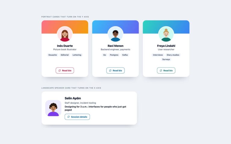
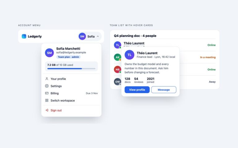
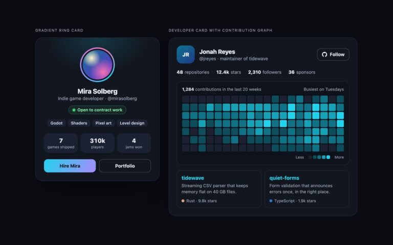
One profile card that lays itself out by the space it is given, shown in three slots. In a 280 pixel sidebar it is a compact row with the avatar, name, role and a small Follow button. From 320 pixels it becomes a full card with a cover, a centred avatar, a bio, three stats and a wide Follow button. From 600 pixels the cover moves to the left and the details sit beside it. The same markup does all three, because the wrapper is a size container and the layouts are container queries, so the card fits a sidebar, a grid cell or a full-width row without knowing the window size. Follow is a native checkbox. With :has(), checking it gives the whole card a multicolour gradient border and shows a You follow Noa note, with no JavaScript. The border is a conic gradient whose angle is a registered @property, so it can be animated: it turns slowly while the pointer is over the card and stays still under prefers-reduced-motion. Without these features the card falls back to the full layout and the checkbox still works.
What’s included
Container queries switch between compact row, full card and wide card
:has() marks the followed card and shows a note without JavaScript
@property animates a conic gradient border on hover
Native checkbox Follow control, so the state needs no script
Bootstrap version uses .btn-check; Tailwind uses @container variants
Accessibility
Follow is a real checkbox whose name includes the person's name, so its state is announced as checked or not checked. The visible button shows a 3px outline when the hidden checkbox has keyboard focus. Decorative cover and avatar are hidden from screen readers. The border animation and transitions are removed under prefers-reduced-motion.
Customise it
Change the breakpoints in the two @container rules, the ring colours in --mc-ring and the accent in --mc-accent on .mc. In Tailwind the ring lives in the mc-ring utility and the breakpoints are the @max-[320px] and @min-[600px] variants.