
Bootstrap 6 Cards — 10 Free Card Templates
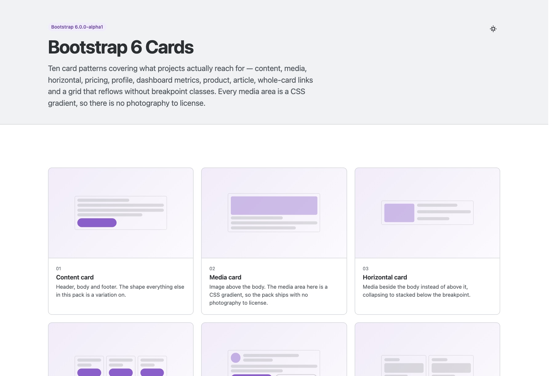
Ten Bootstrap 6 card patterns covering what projects actually reach for — content and media cards, horizontal layouts, pricing tiers, profile cards, dashboard metrics with a CSS sparkline, commerce product cards, editorial article cards, properly-built clickable cards and a grid that reflows without breakpoint classes.
Every media area in this pack is a CSS gradient rather than a bundled photograph, so there is nothing to re-license and nothing to replace before you ship. The pack also settles the clickable-card question properly: wrapping a card in an anchor swallows any button inside it and gives the link an accessible name made of the card’s entire text, so the whole-card variant stretches a single title link with a pseudo-element instead — the full surface stays clickable while the tab order and the announced name stay sensible.
Key features
- Ten standalone card pages plus an index gallery
- Zero image dependencies — every media area is a CSS gradient
- Dashboard metric tiles with a sparkline built from flex spans, no chart library
- Three-tier pricing row with the featured card outlined rather than scaled
- Product cards with sale badges, star ratings and struck-through was-prices
- Whole-card links done properly — stretched title link, not a wrapping anchor
- Profile cards using the v6 Avatar and Chip components
- Equal-height card rows via h-100 with mt-auto actions
- Responsive grid using repeat(auto-fill, minmax()) — no breakpoint classes
- Notes on avoiding layout shift with aspect-ratio and object-fit
- Bootstrap 6 vendored at a pinned commit, ESM-only, no build step
Before you use it
Bootstrap 6 is in alpha: 6.0.0-alpha.1 shipped on 8 October 2026, and more breaking changes are expected before the stable release. This template bundles the exact Bootstrap build it was tested against, so nothing changes until you choose to upgrade. Bootstrap 6 supports Chrome and Edge 130+, Firefox 132+ and Safari 18+.