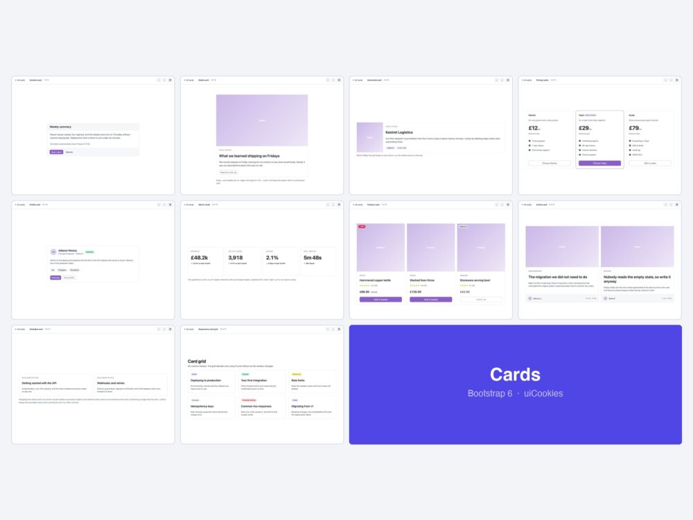
Ten card templates for Bootstrap 6 — content cards, media cards, horizontal cards that stack on mobile, a three-tier pricing row, profile cards, dashboard metric tiles with a CSS sparkline, product cards, article cards, fully clickable cards and a responsive grid.
Every screen was designed and coded in-house by uiCookies against the Bootstrap 6 alpha. Each design is its own page with prev/next navigation, there is no build step, and light and dark mode both work out of the box.
Download all 10 (free) Browse live demos
What changed for cards in Bootstrap 6
The card itself survived largely intact. What changed around it will still break a v5 card the moment you paste it in.
- The spacing scale was renumbered. Keys now run 0–9 and the values moved. For v5 parity,
.p-3becomes.p-4,.p-4becomes.p-6, and.p-5becomes.p-9. A card pasted from v5 keeps its class names and silently loses a third of its padding. - Responsive utilities use a prefix syntax.
.col-md-6is now.md:col-6and.d-md-noneis.md:d-none. The breakpoints moved too —lgis 1024px (was 992),xlis 1280 (was 1200), andxxlis now2xlat 1536. - Colour utilities were renamed.
.text-mutedis.fg-secondaryand.text-dangeris.fg-danger. Buttons split into a variant plus a theme:.btn-primaryis now.btn-solid .theme-primary. .display-1–.display-6and.leadare gone. Use the new type scale —.fs-xsthrough.fs-6xl, wherelgand above are fluidclamp()values.
The ten designs
1. Content card
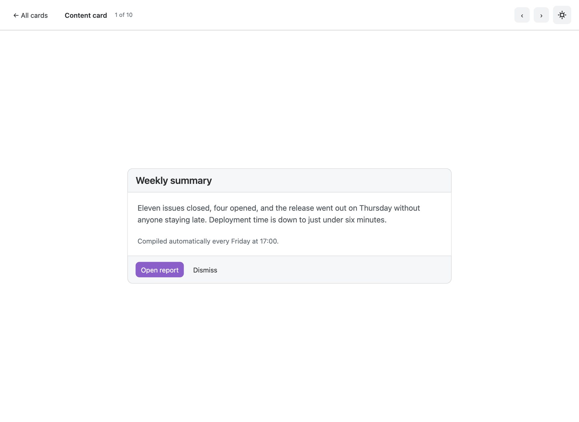
Header, body and footer. The shape everything else in this pack is a variation on.
2. Media card
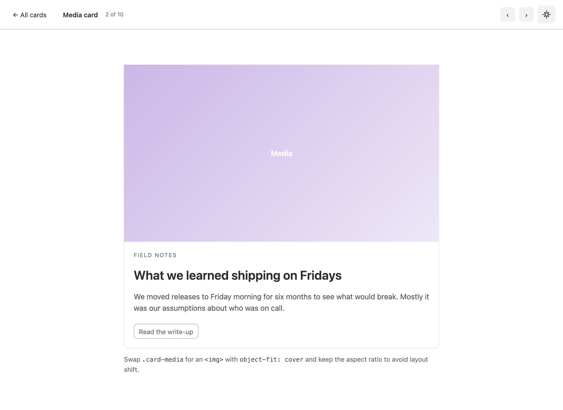
Image above the body. The media area here is a CSS gradient, so the pack ships with no photography to license.
3. Horizontal card
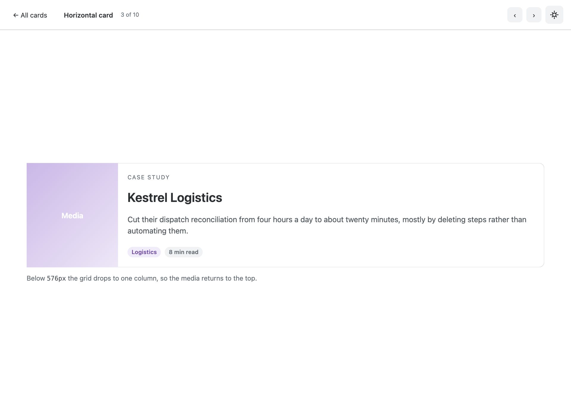
Media beside the body instead of above it, collapsing to stacked below the breakpoint.
4. Pricing cards
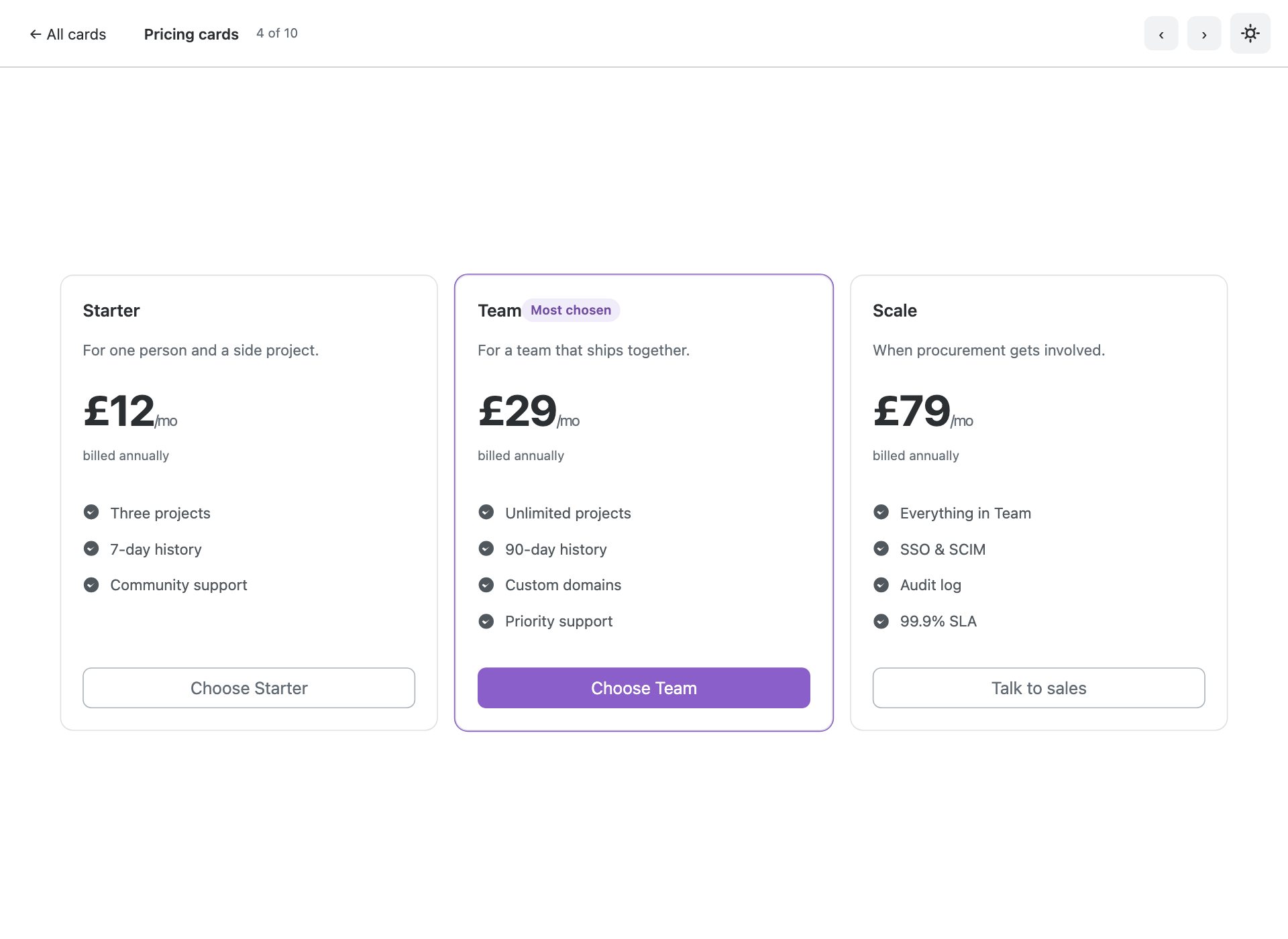
Three tiers with the middle one marked. The featured card is outlined rather than scaled, so nothing shifts on hover.
5. Profile card
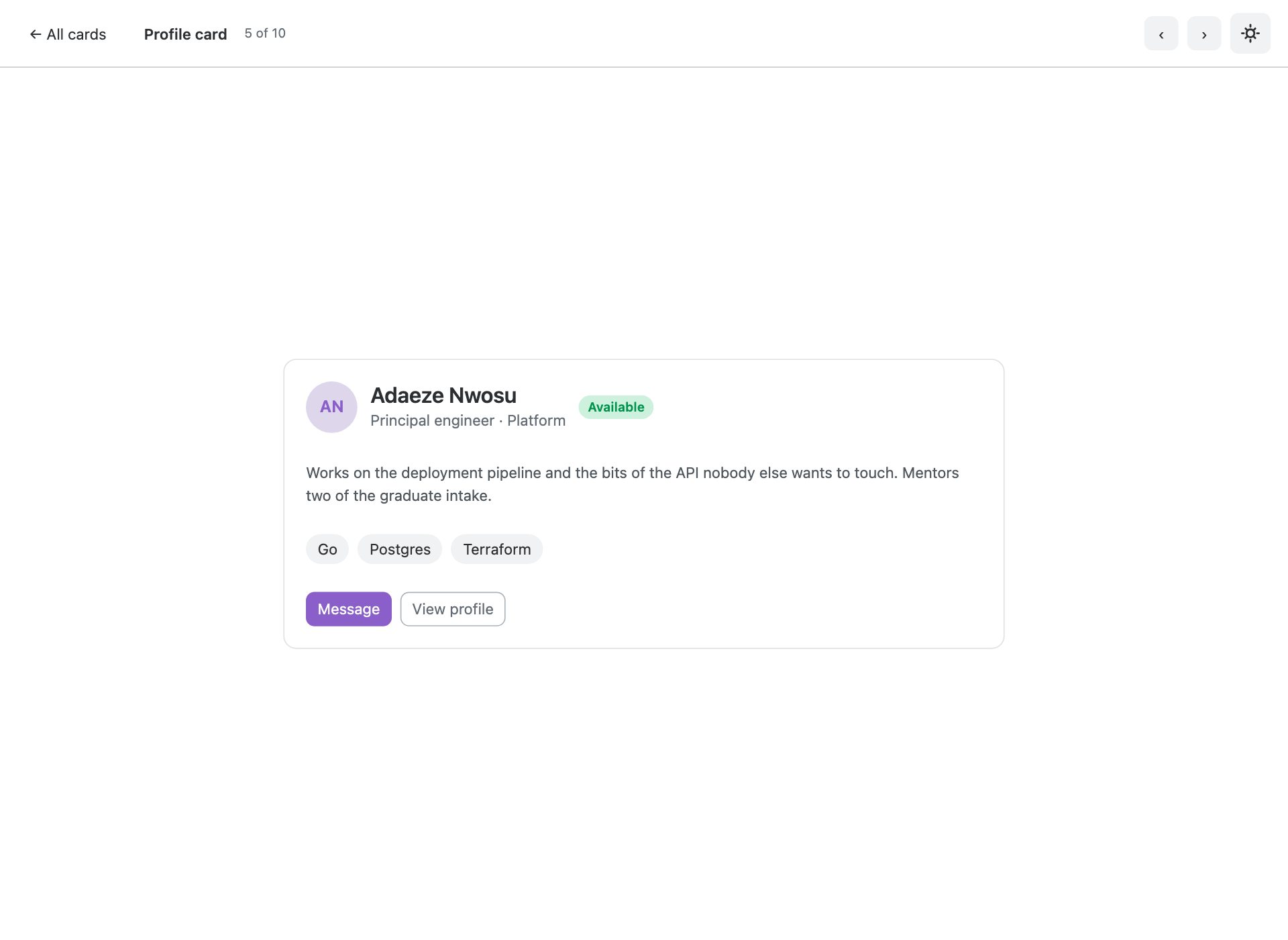
Avatar, role and contact actions. Uses the v6 Avatar component rather than a bare rounded image.
6. Metric cards
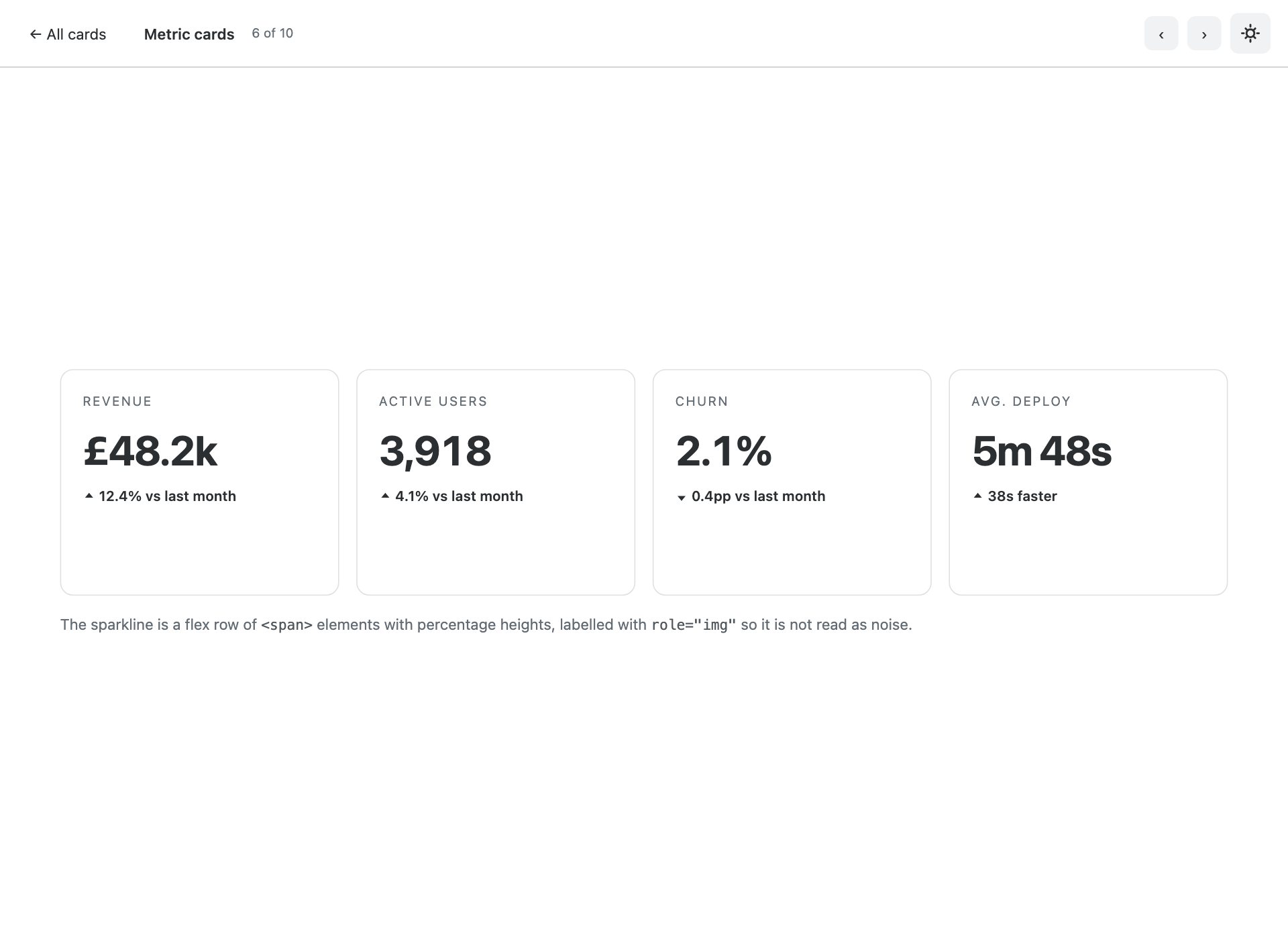
Dashboard tiles with a figure, a direction-of-travel delta and a CSS sparkline — no chart library.
7. Product card
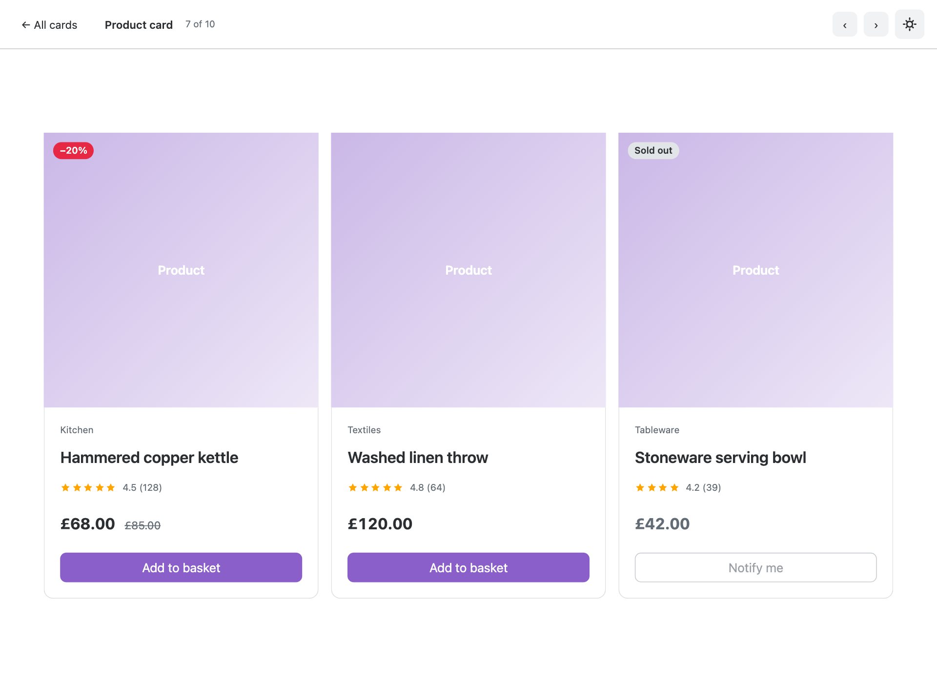
Commerce shape — media, sale badge, rating, struck-through was-price and an add-to-basket action.
8. Article card
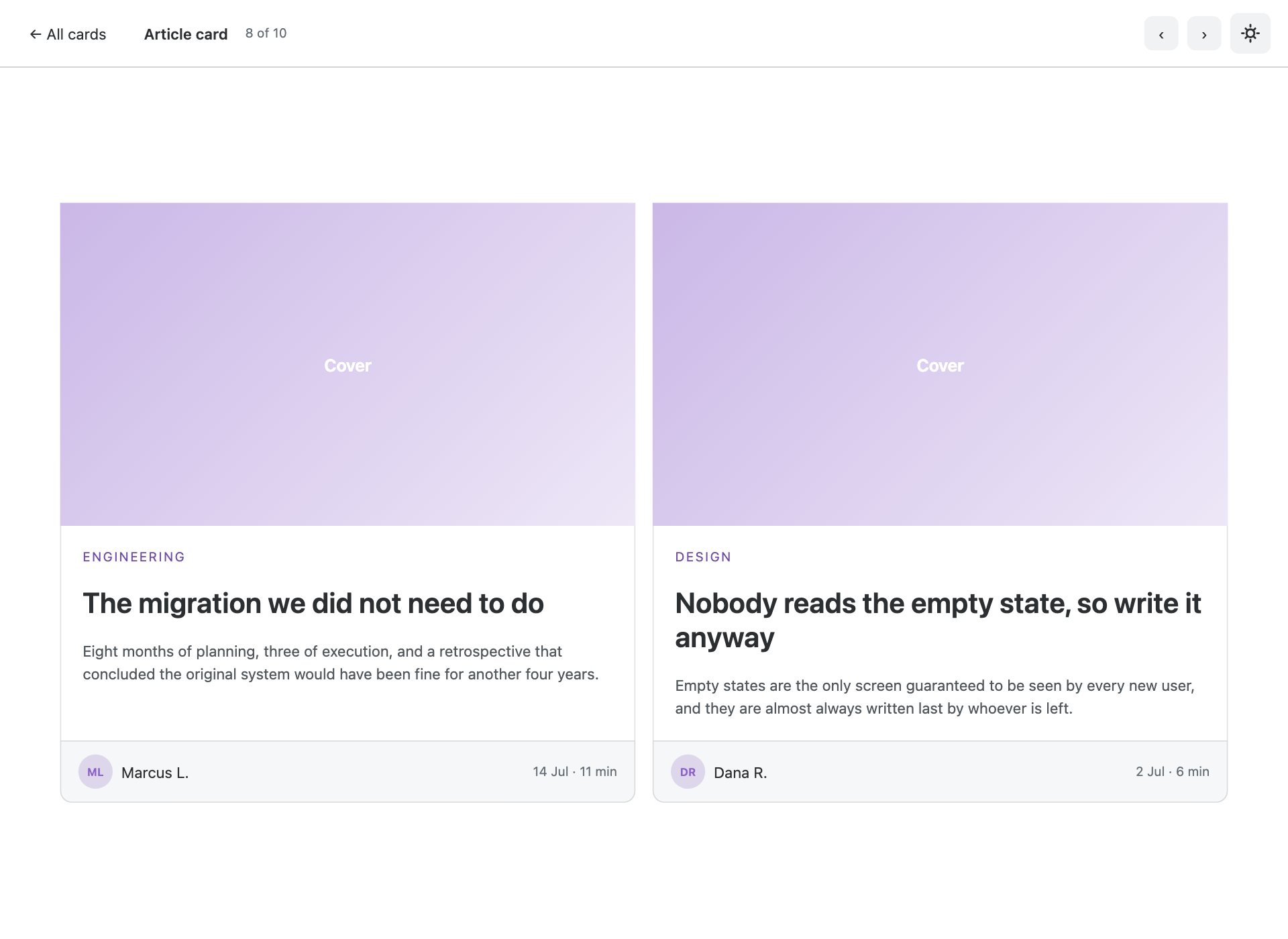
Editorial shape with a kicker, author row and reading time. Meta goes in the footer so cards in a row stay aligned.
9. Clickable card
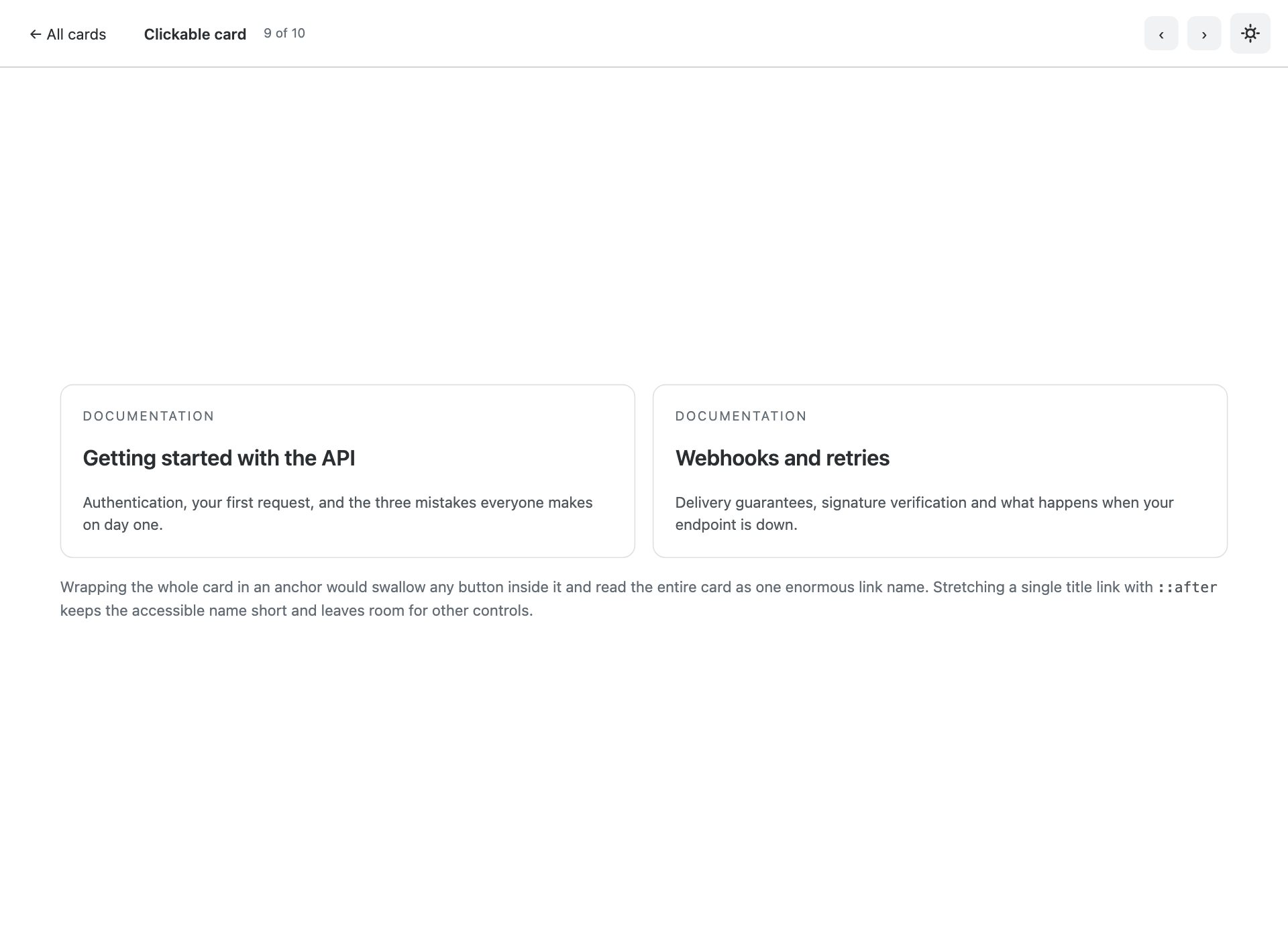
The entire surface is clickable, but only the title is in the tab order — one link, stretched with a pseudo-element.
10. Responsive card grid
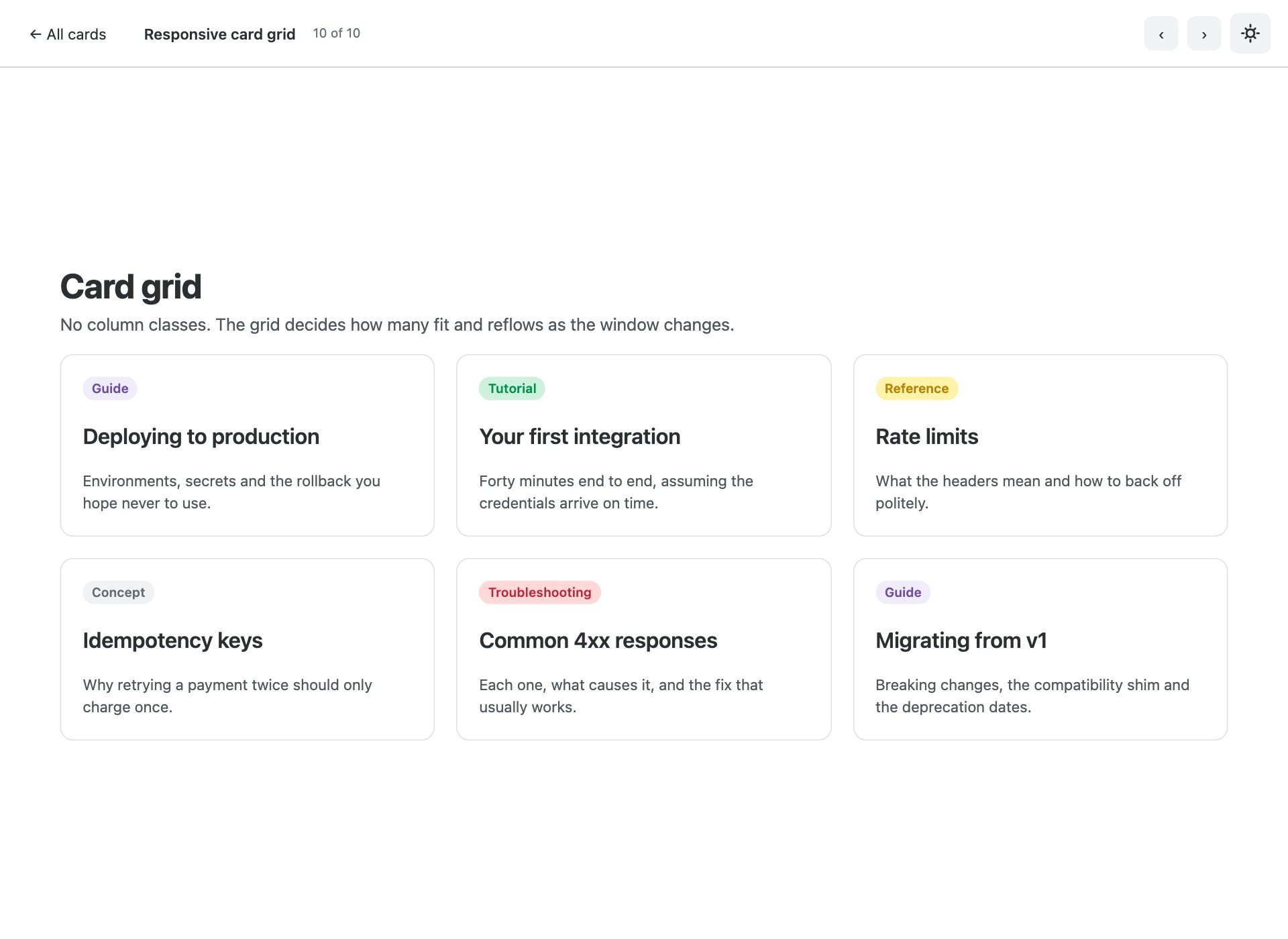
Cards in an auto-filling grid that reflows without breakpoint classes — repeat(auto-fill, minmax()) doing the work.
What is in the pack
- Ten standalone card pages plus an index gallery
- Zero image dependencies — every media area is a CSS gradient
- Dashboard metric tiles with a sparkline built from flex spans, no chart library
- Three-tier pricing row with the featured card outlined rather than scaled
- Product cards with sale badges, star ratings and struck-through was-prices
- Whole-card links done properly — stretched title link, not a wrapping anchor
- Profile cards using the v6 Avatar and Chip components
- Equal-height card rows via h-100 with mt-auto actions
- Responsive grid using repeat(auto-fill, minmax()) — no breakpoint classes
- Notes on avoiding layout shift with aspect-ratio and object-fit
- Bootstrap 6 vendored at a pinned commit, ESM-only, no build step
Installing Bootstrap 6
These were built against a pinned Bootstrap 6 alpha dist, which ships inside the download under assets/vendor/bootstrap6/. There is no npm release to install against yet, so vendoring the exact build is the only way to keep a template reproducible while the alpha moves.
Frequently asked questions
Is Bootstrap 6 released yet?
Not as a stable version. Bootstrap 6 is in alpha, and it is not published to npm — npm i bootstrap@6 will not fetch it. These templates ship the compiled alpha dist they were built against, pinned to a specific commit, so they keep working regardless of what changes upstream.
Can I use these in production?
Treat them the way you would treat any alpha. They are complete, tested templates and the markup is correct for the build they ship with — but Bootstrap 6 class names and component APIs are still moving, so a later alpha may require changes. For a site you have to maintain today, Bootstrap 5 is still the safer answer.
Do I need a build step?
No. Every file is plain HTML with the compiled CSS and an ESM script tag. Open it from the folder and it runs. Bootstrap 6 is ESM-only, which means there is no window.bootstrap — you import the bundle for its side effects and that registers the data-attribute API.
Why does the console log an error about more than one instance?
On pages using a Combobox you will see “Bootstrap doesn’t allow more than one instance per element. Bound instance: bs.combobox.” That is an upstream bug in the alpha: the Combobox constructor creates a Menu on an element that already holds a combobox instance. It is a logged error, not a thrown one, and every component still works. We have deliberately not patched around it, because the fix belongs upstream.
Are these free for commercial use?
Yes — free for personal and commercial projects, including client work. What you cannot do is repackage the pack itself for redistribution.
More Bootstrap 6 templates
The rest of the Bootstrap 6 component packs, all built against the same pinned alpha build:
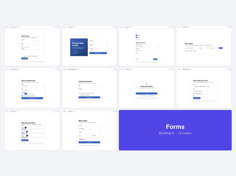
- Bootstrap 6 forms — 10 form layouts
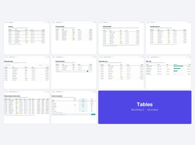
- Bootstrap 6 tables — 10 table templates
- Bootstrap 6 navbars & menus — 8 navigation patterns
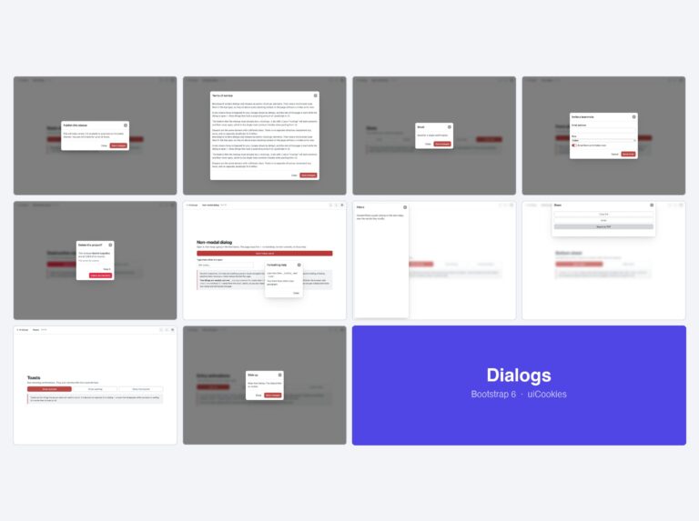
- Bootstrap 6 modals & drawers — 10 dialog templates
- Bootstrap 6 login forms — 8 auth screens
For complete sites and admin UIs rather than single components, see all 34 free Bootstrap 6 templates — which also covers what changed from Bootstrap 5 in full.
Download all 10 templates (free) Browse live demos