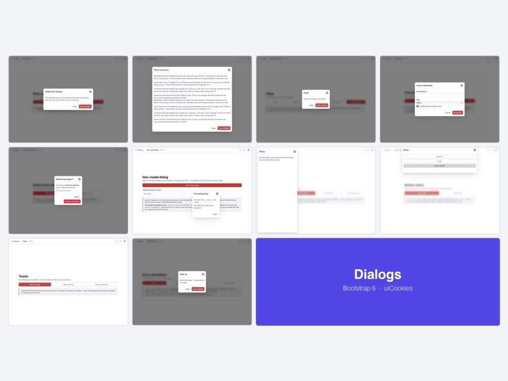
Ten dialog and drawer templates for Bootstrap 6 — basic dialogs, scrollable bodies with fixed headers, four sizes plus fullscreen, form dialogs, confirmations, non-modal dialogs, drawers from all four edges, a mobile sheet, toasts and motion.
Every screen was designed and coded in-house by uiCookies against the Bootstrap 6 alpha. Each design is its own page with prev/next navigation, there is no build step, and light and dark mode both work out of the box.
Download all 10 (free) Browse live demos
What changed for modals in Bootstrap 6
This is the biggest rename in the framework, and it is not just a rename.
- Modal is now Dialog, Offcanvas is now Drawer — both rendered as native
<dialog>elements. The browser puts them in the top layer, so they sit above every stacking context without a z-index race, and focus trapping and Escape-to-close come from the platform rather than from Bootstrap. - The
ModalandOffcanvasJS exports are gone. So isDropdown. Anything callingnew bootstrap.Modal(...)has to be rewritten — and there is nowindow.bootstrapto call it on either, because v6 is ESM-only. - Non-modal dialogs have no v5 equivalent. A dialog that leaves the rest of the page interactive — no backdrop, no inert content, no focus trap — is genuinely new. One trap:
.dialog-nonmodalis a style class. It does not make the dialog non-modal; how you open it does. - Drawers from any edge share one class. There are no separate
offcanvas-start/-end/-top/-bottomcomponents any more.
The ten designs
1. Basic dialog
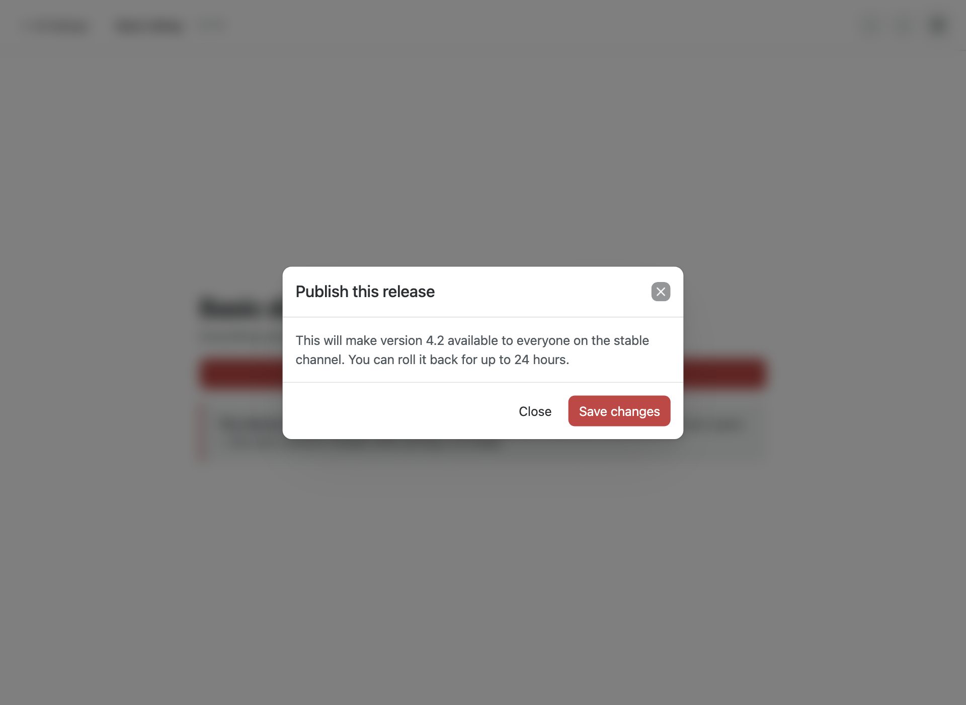
The default. A native <dialog> with header, body and footer — focus trapping and Escape come from the browser.
2. Scrollable dialog
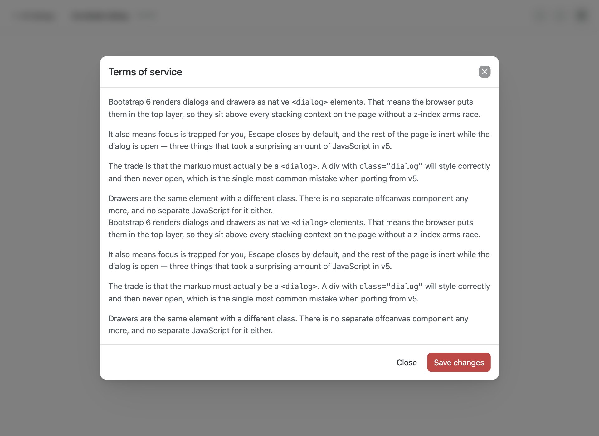
.dialog-scrollable keeps the header and footer fixed while only the body scrolls, so the actions never leave the screen.
3. Sizes & fullscreen
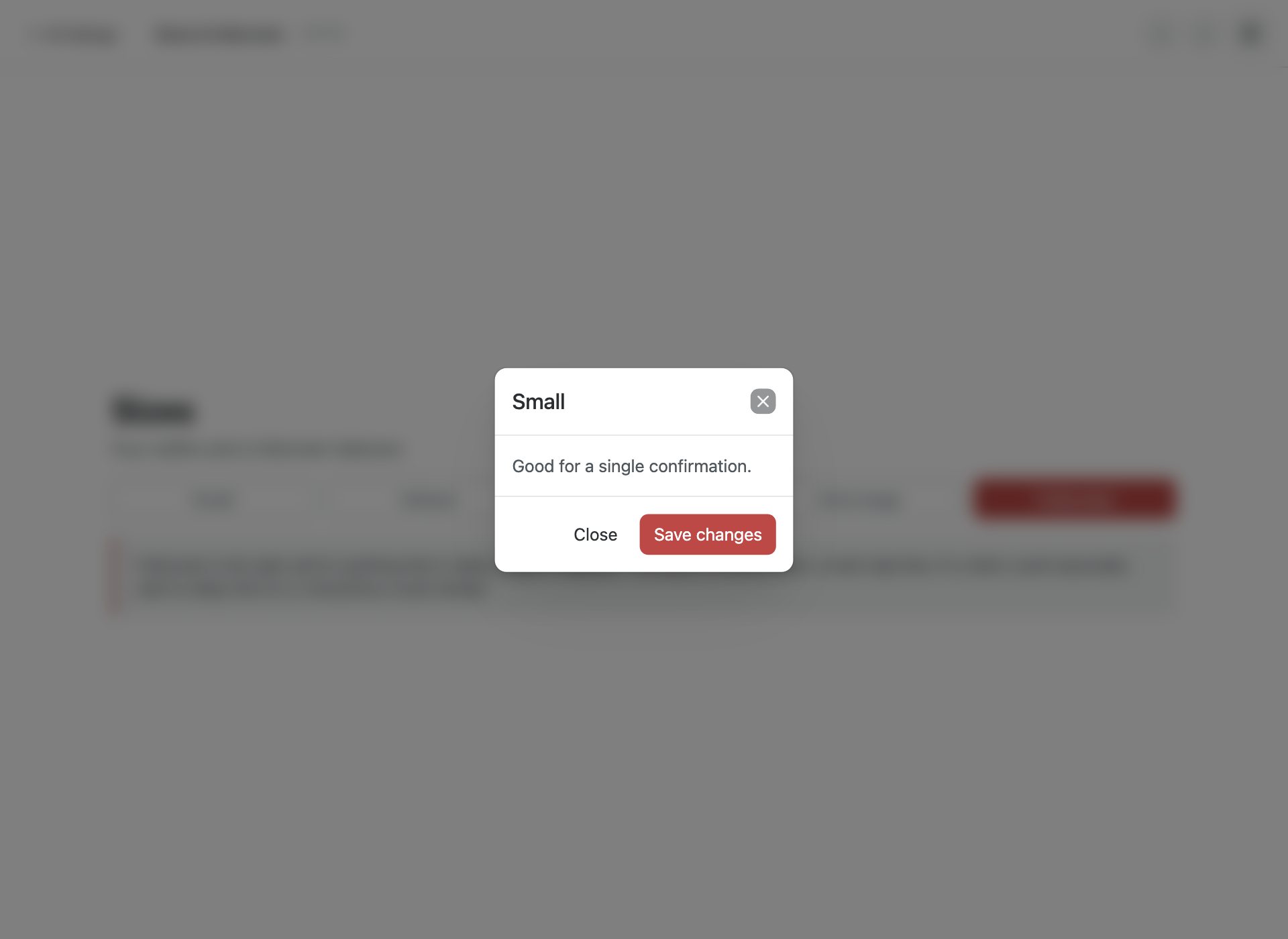
.dialog-sm through .dialog-xl, plus .dialog-fullscreen for the takeover pattern.
4. Form dialog
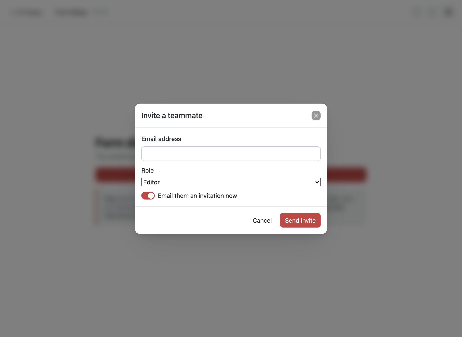
A form inside a dialog, submitted from the footer using form= so the button can live outside the form element.
5. Destructive confirm
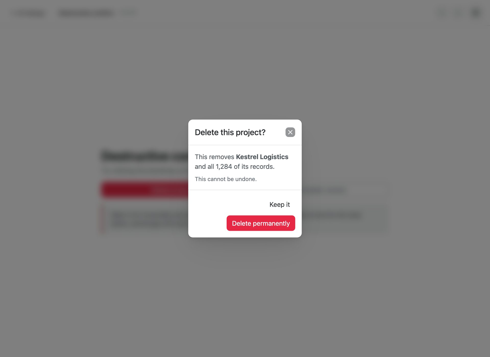
data-bs-static stops a backdrop click dismissing it, so a destructive action needs a deliberate answer.
6. Non-modal dialog
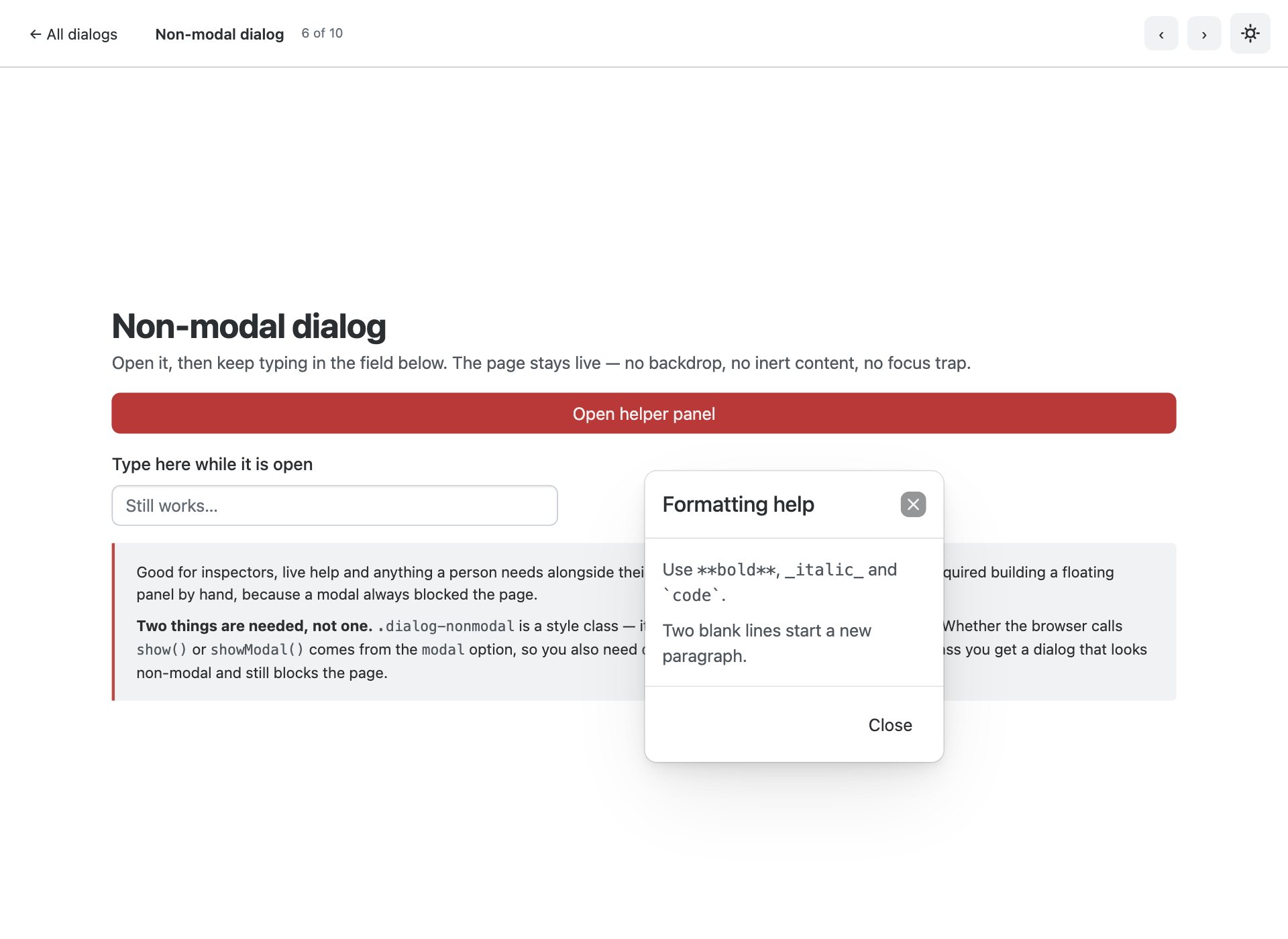
.dialog-nonmodal has no backdrop and leaves the page usable underneath — impossible with a v5 modal.
7. Drawers, four sides
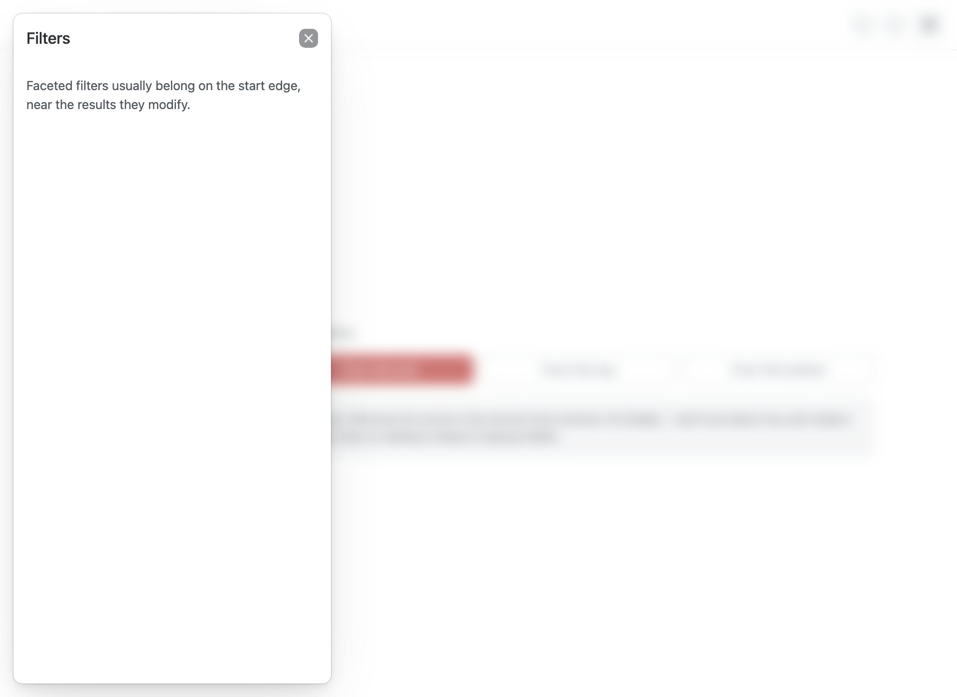
.drawer-start, -end, -top and -bottom. Offcanvas is gone; a drawer is a <dialog> too.
8. Bottom sheet
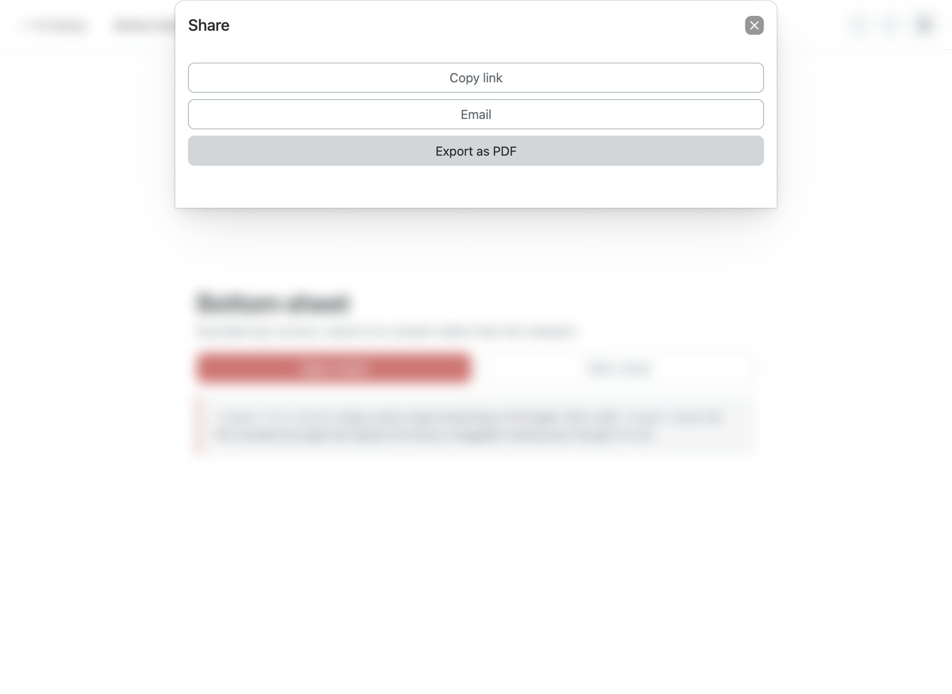
.drawer-sheet with .drawer-fit-content — the mobile sheet pattern, sized to its content.
9. Toasts
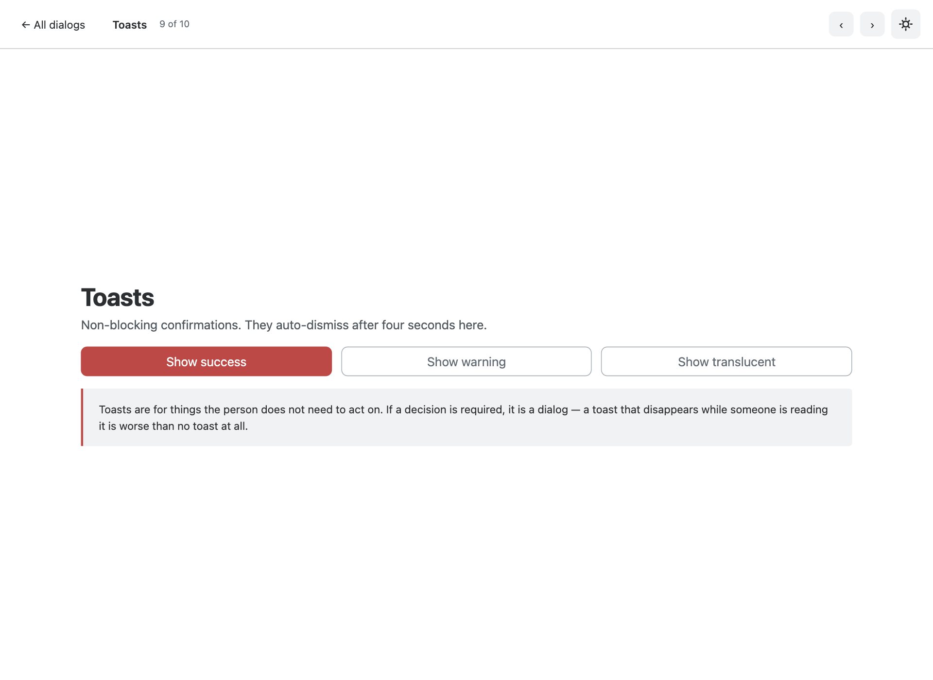
Stacked notifications in a .toast-container, including the translucent variant. Markup plus a class, no component to construct.
10. Entry animations
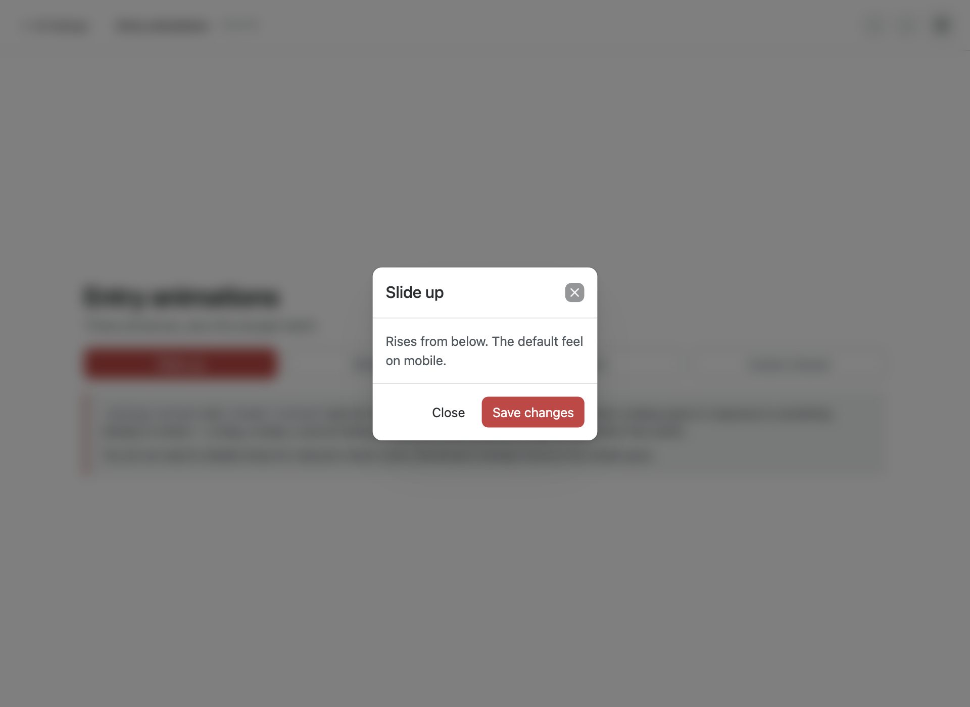
.dialog-slide-up, .dialog-slide-down and .dialog-instant — and why the last one matters.
What is in the pack
- Ten standalone dialog pages plus an index gallery
- Built on native <dialog> — top layer, focus trapping and Escape come from the browser
- Non-modal dialogs that leave the page interactive — no v5 equivalent at all
- Drawers on all four edges, replacing Offcanvas with the same element and JS
- Mobile bottom sheet via .drawer-sheet with .drawer-fit-content
- Static destructive confirms that resist backdrop dismissal
- Form dialogs submitting from the footer using the form attribute
- Four dialog sizes plus fullscreen takeover
- Stacked toasts including the translucent variant
- Slide-up, slide-down and instant entry animations, reduced-motion aware
- Porting notes covering the div-instead-of-dialog trap that silently breaks v5 ports
- Bootstrap 6 vendored at a pinned commit, ESM-only, no build step
Installing Bootstrap 6
There is no Bootstrap 6 npm release yet, so the compiled alpha dist these were tested against ships inside the download at assets/vendor/bootstrap6/. Nothing to install, and the dialogs behave exactly as they do in the demos.
Frequently asked questions
Is Bootstrap 6 released yet?
Not as a stable version. Bootstrap 6 is in alpha, and it is not published to npm — npm i bootstrap@6 will not fetch it. These templates ship the compiled alpha dist they were built against, pinned to a specific commit, so they keep working regardless of what changes upstream.
Can I use these in production?
Treat them the way you would treat any alpha. They are complete, tested templates and the markup is correct for the build they ship with — but Bootstrap 6 class names and component APIs are still moving, so a later alpha may require changes. For a site you have to maintain today, Bootstrap 5 is still the safer answer.
Do I need a build step?
No. Every file is plain HTML with the compiled CSS and an ESM script tag. Open it from the folder and it runs. Bootstrap 6 is ESM-only, which means there is no window.bootstrap — you import the bundle for its side effects and that registers the data-attribute API.
Why does the console log an error about more than one instance?
On pages using a Combobox you will see “Bootstrap doesn’t allow more than one instance per element. Bound instance: bs.combobox.” That is an upstream bug in the alpha: the Combobox constructor creates a Menu on an element that already holds a combobox instance. It is a logged error, not a thrown one, and every component still works. We have deliberately not patched around it, because the fix belongs upstream.
Are these free for commercial use?
Yes — free for personal and commercial projects, including client work. What you cannot do is repackage the pack itself for redistribution.
More Bootstrap 6 templates
The rest of the Bootstrap 6 component packs, all built against the same pinned alpha build:
- Bootstrap 6 forms — 10 form layouts
- Bootstrap 6 cards — 10 card templates
- Bootstrap 6 tables — 10 table templates
- Bootstrap 6 navbars & menus — 8 navigation patterns
- Bootstrap 6 login forms — 8 auth screens
For complete sites and admin UIs rather than single components, see all 34 free Bootstrap 6 templates — which also covers what changed from Bootstrap 5 in full.
Download all 10 templates (free) Browse live demos