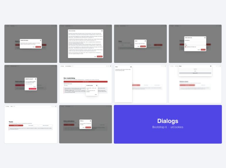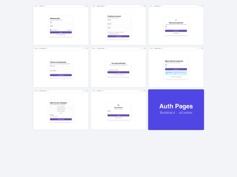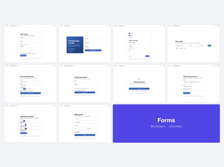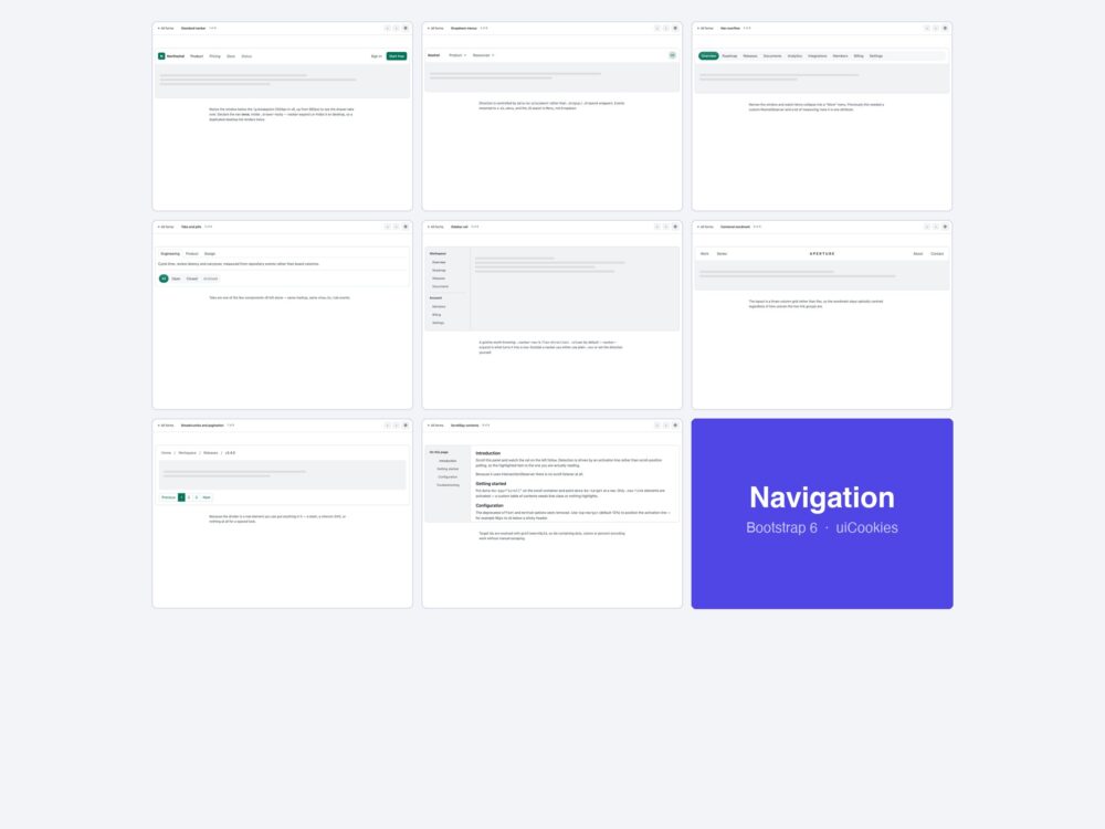
Eight navigation patterns for Bootstrap 6 — a standard navbar with a drawer mobile menu, dropdowns built on the new Menu component, the Nav overflow that folds items into a More button, tabs, a collapsible icon rail, a centred-logo bar, breadcrumbs and scrollspy.
Every screen was designed and coded in-house by uiCookies against the Bootstrap 6 alpha. Each design is its own page with prev/next navigation, there is no build step, and light and dark mode both work out of the box.
Download all 8 (free) Browse live demos
What changed for navigation in Bootstrap 6
Navigation took the heaviest rewrite in v6. A v5 navbar does not degrade here — it stops working.
.navbar-collapseis gone entirely. The mobile menu is now a Drawer — a native<dialog>that slides in — so the pattern is a toggler that opens a drawer, not a collapse that expands in place. Declare the nav exactly once and share it; duplicating it for desktop and mobile is what produces two sets of focusable links.- Dropdown became Menu. New markup, new component, positioned by Floating UI — and the
DropdownJS export no longer exists. Same forModalandOffcanvas, which became Dialog and Drawer. - Nav overflow is new. A nav that measures itself and folds whatever does not fit into a More menu, with no v5 equivalent and no JavaScript of your own.
- ScrollSpy only activates
.nav-link. If your markup uses a different class on the anchors, scrollspy runs and highlights nothing — a silent failure worth knowing before you debug the observer.
The eight designs
1. Standard navbar
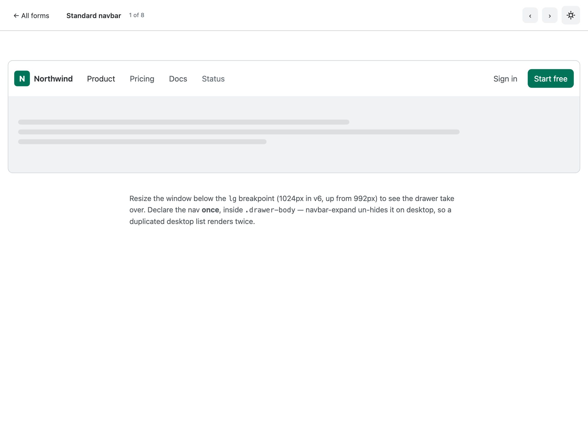
The v6 baseline. There is no .navbar-collapse any more — the mobile menu is a native <dialog class="drawer"> that navbar-expand inlines on desktop.
2. Dropdown menus
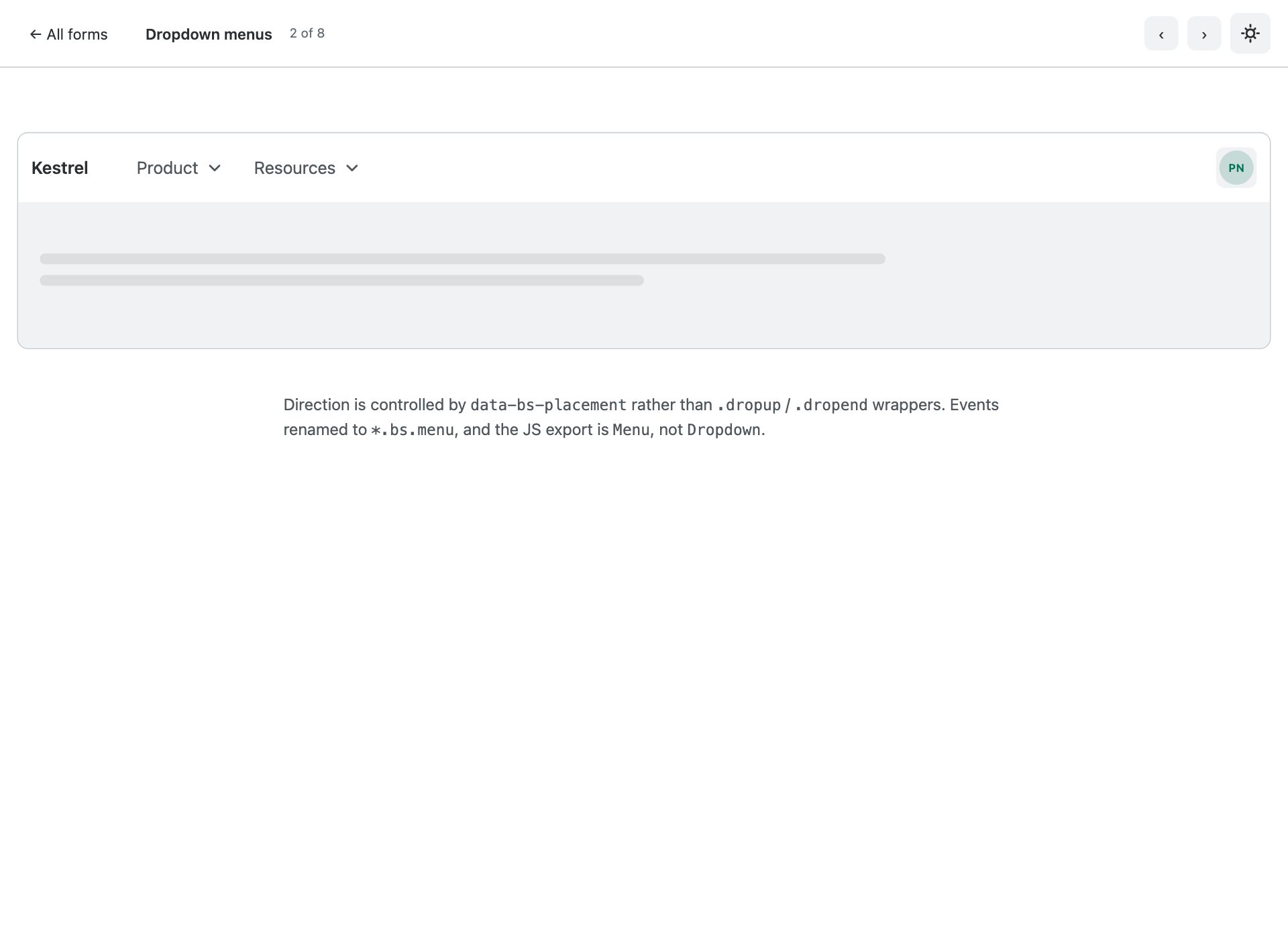
Dropdown is now Menu. No .dropdown wrapper, no .dropdown-toggle — the toggle and the .menu are siblings, positioned by Floating UI.
3. Nav overflow
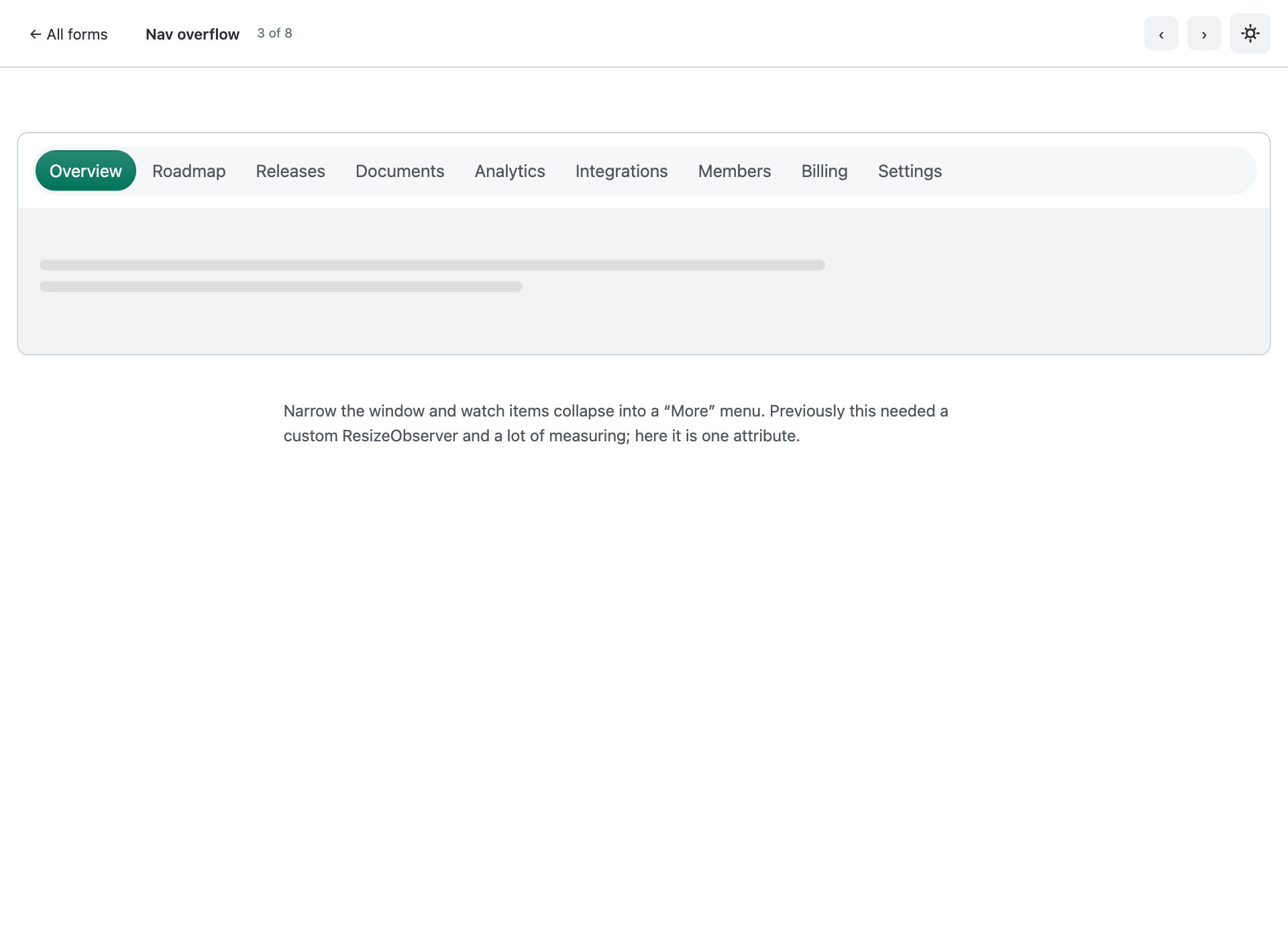
New in v6, no equivalent in Bootstrap 5. Items that do not fit fold into a menu automatically as the viewport narrows.
4. Tabs and pills
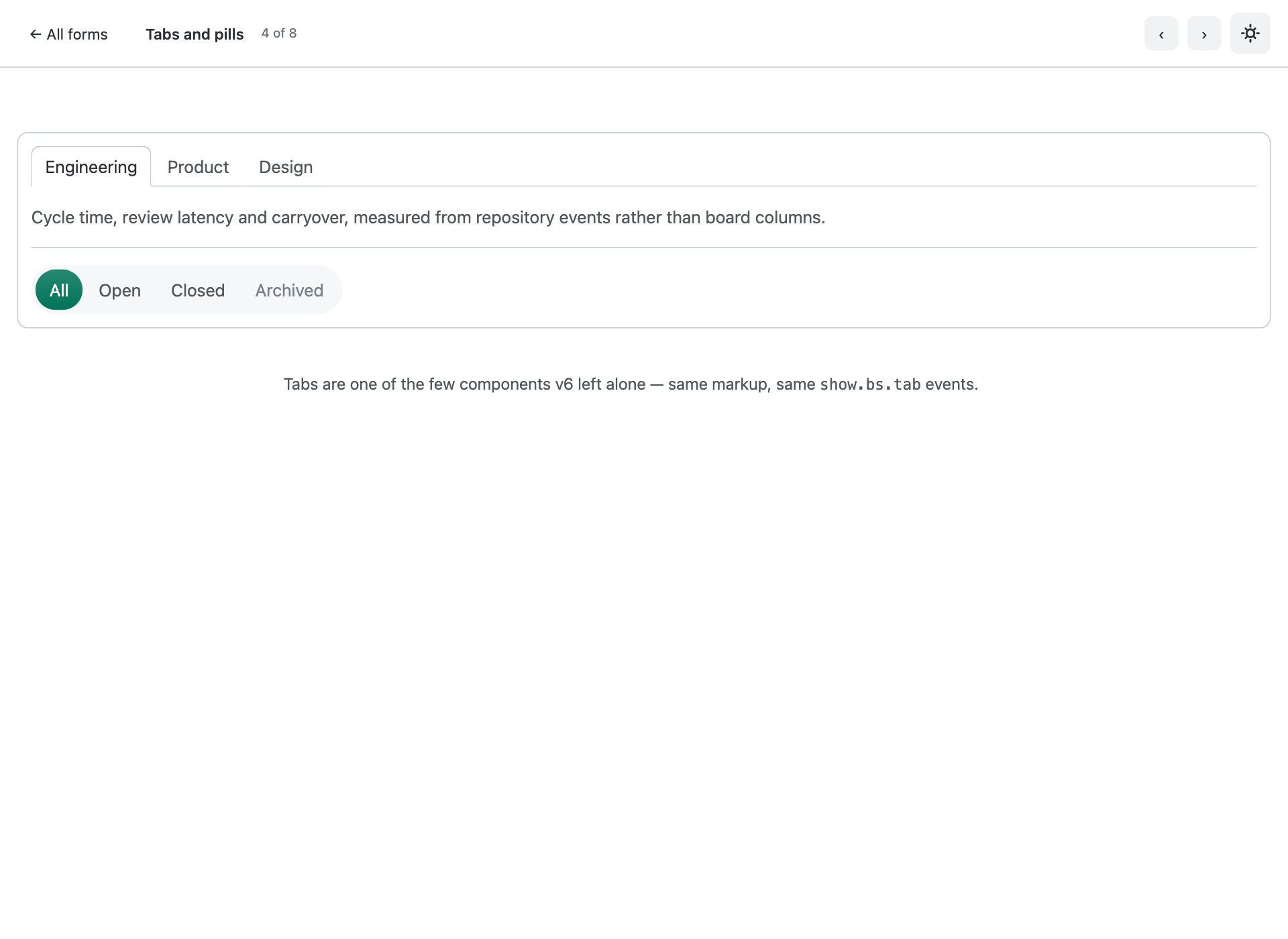
Tab panels with fade transitions, plus the pill variant. Markup and the JS API are unchanged from v5.
5. Sidebar rail
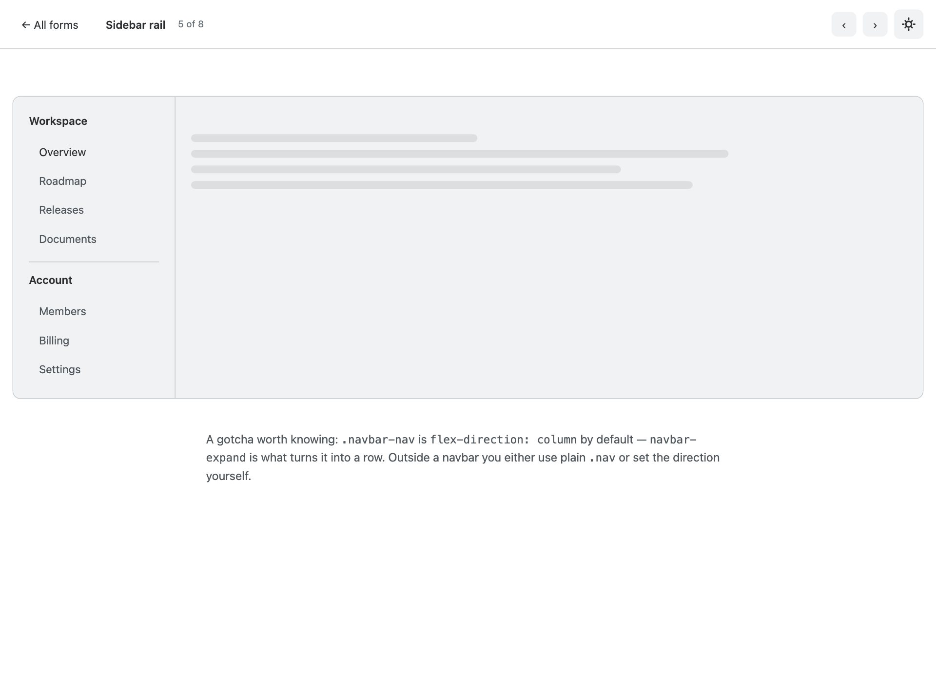
A vertical navigation rail for applications. Note .navbar-nav is column by default — navbar-expand is what makes it a row.
6. Centered wordmark
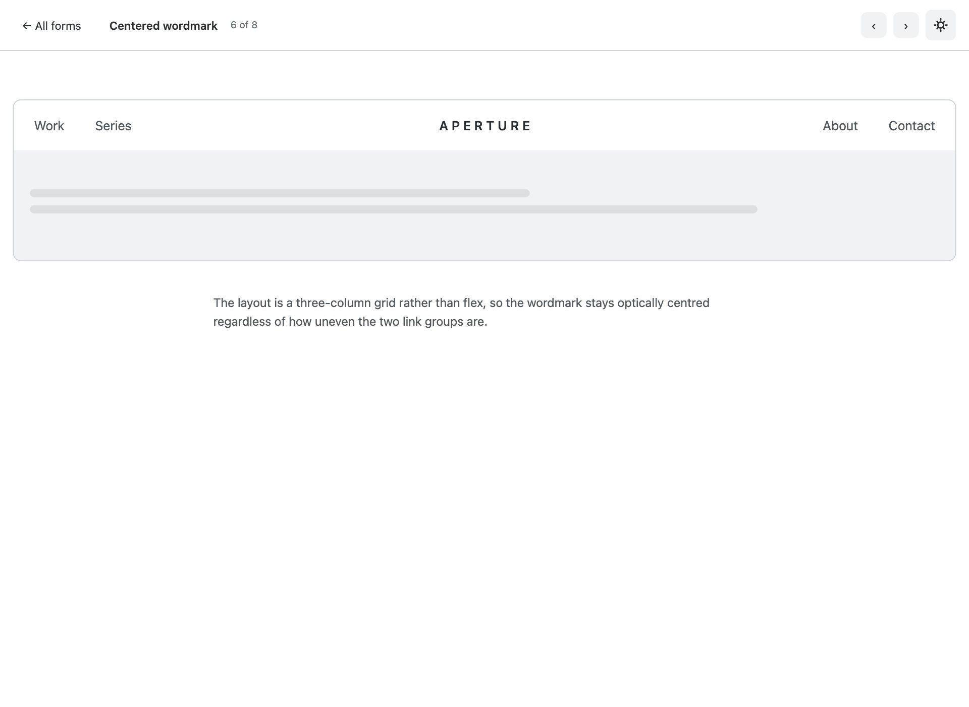
Editorial masthead: brand centred with the navigation split either side. Common on magazines and portfolios.
7. Breadcrumbs and pagination
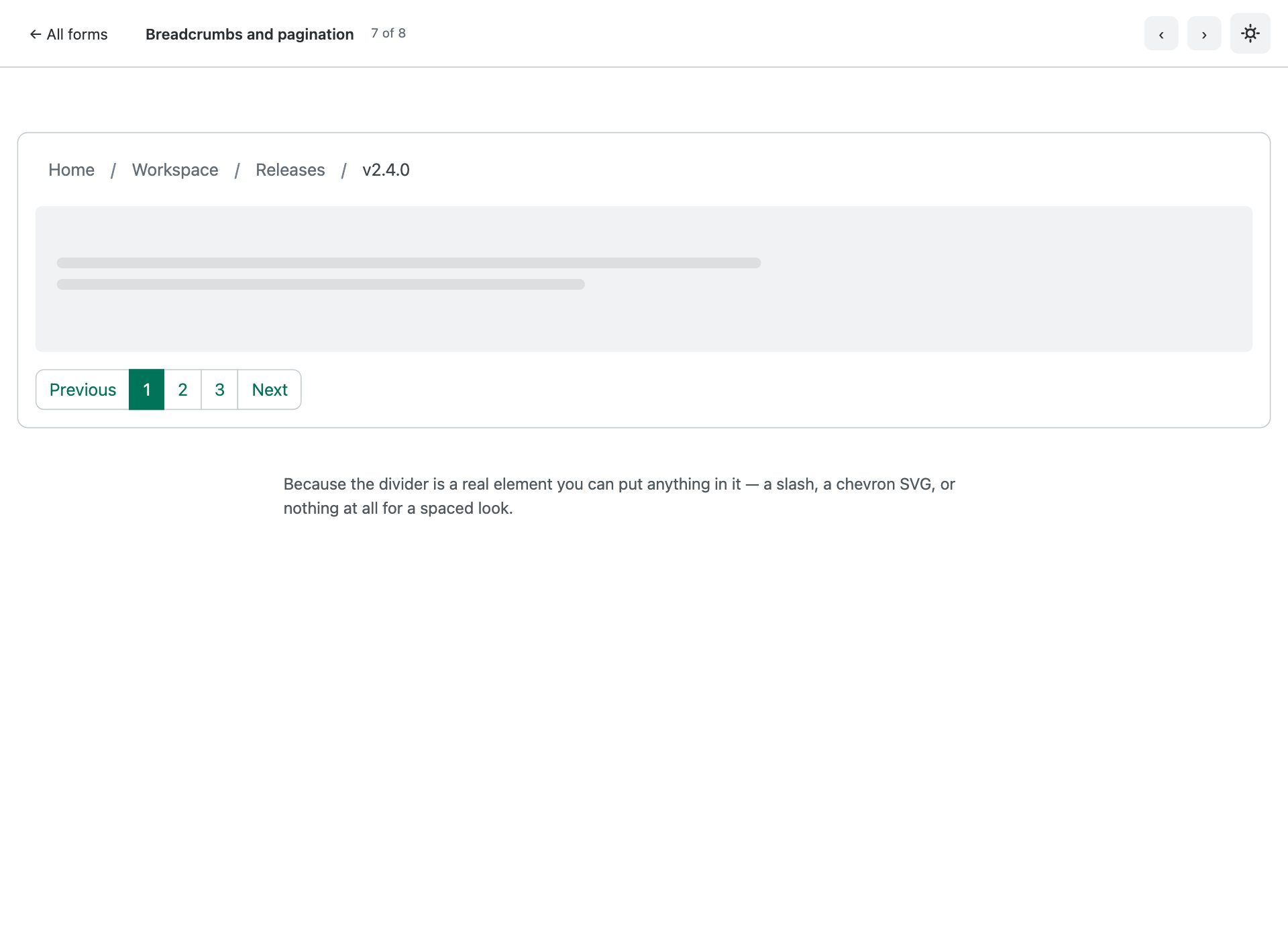
Both changed in v6: links take .breadcrumb-link, and separators are real .breadcrumb-divider elements rather than ::before pseudo-elements.
8. ScrollSpy contents
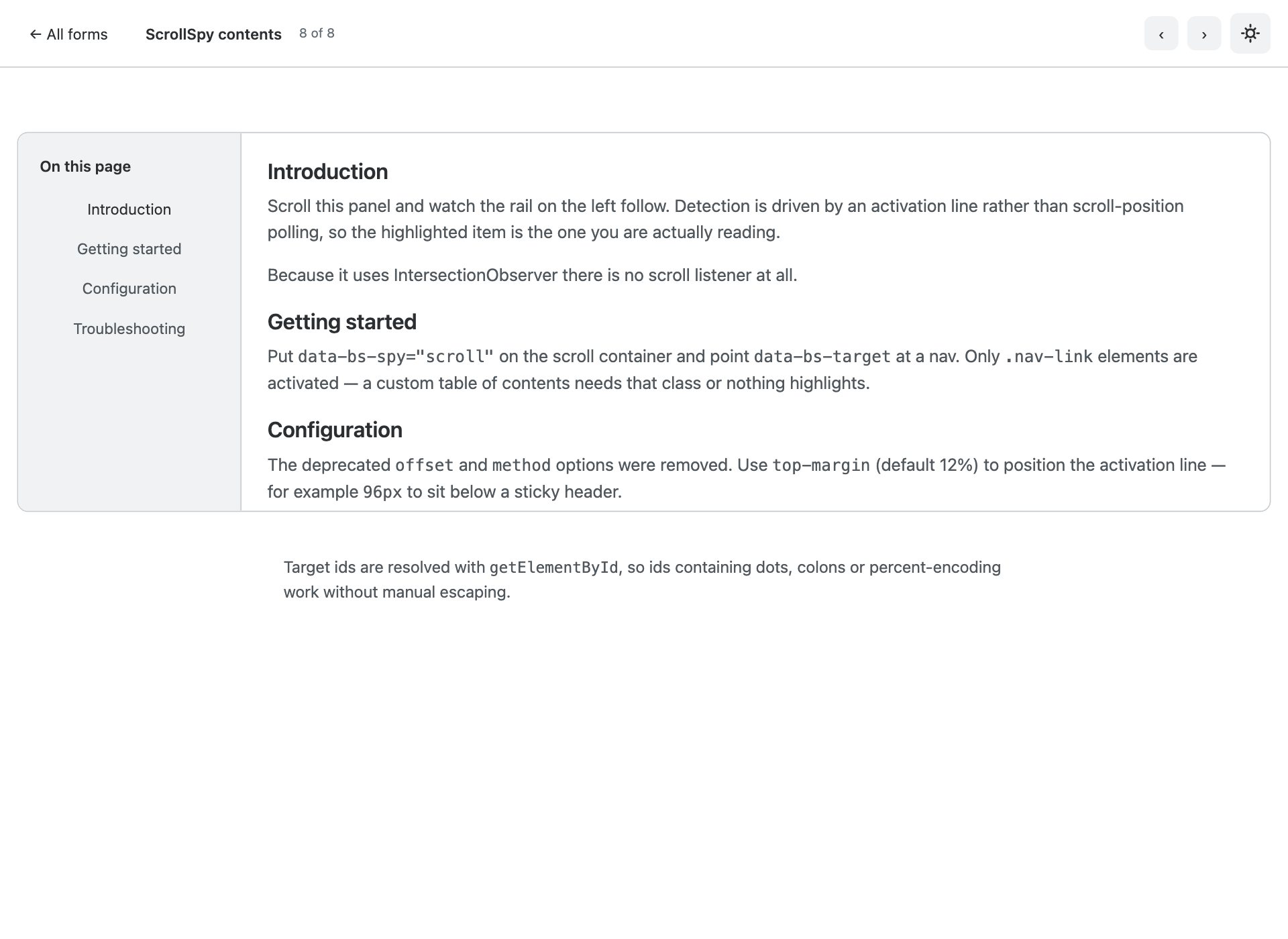
ScrollSpy was rebuilt on IntersectionObserver. The offset option is gone; use top-margin to clear a sticky header.
What is in the pack
- Eight navigation patterns, each on its own page with prev/next navigation
- Standard navbar showing the v6 drawer pattern that replaces .navbar-collapse
- Dropdown menus using the new Menu component, positioned by Floating UI
- Nav overflow — items fold into a menu automatically, new in v6
- Tabs with fade panels, plus the pill variant
- Application sidebar rail, with the .navbar-nav column-by-default gotcha explained
- Centered editorial masthead using a three-column grid
- Breadcrumbs with the new .breadcrumb-link and real divider elements, plus pagination
- Working ScrollSpy contents rebuilt on IntersectionObserver, with top-margin
- Every example notes what changed from Bootstrap 5 — a migration reference as much as a pack
- ESM-only vanilla JavaScript — no jQuery, no bundler, no build step
Installing Bootstrap 6
Bootstrap 6 has no npm package yet, so the pack vendors the compiled alpha dist it was built against in assets/vendor/bootstrap6/. That matters more for navigation than for anything else — the Menu and Drawer components are still moving between alpha builds.
Frequently asked questions
Is Bootstrap 6 released yet?
Not as a stable version. Bootstrap 6 is in alpha, and it is not published to npm — npm i bootstrap@6 will not fetch it. These templates ship the compiled alpha dist they were built against, pinned to a specific commit, so they keep working regardless of what changes upstream.
Can I use these in production?
Treat them the way you would treat any alpha. They are complete, tested templates and the markup is correct for the build they ship with — but Bootstrap 6 class names and component APIs are still moving, so a later alpha may require changes. For a site you have to maintain today, Bootstrap 5 is still the safer answer.
Do I need a build step?
No. Every file is plain HTML with the compiled CSS and an ESM script tag. Open it from the folder and it runs. Bootstrap 6 is ESM-only, which means there is no window.bootstrap — you import the bundle for its side effects and that registers the data-attribute API.
Why does the console log an error about more than one instance?
On pages using a Combobox you will see “Bootstrap doesn’t allow more than one instance per element. Bound instance: bs.combobox.” That is an upstream bug in the alpha: the Combobox constructor creates a Menu on an element that already holds a combobox instance. It is a logged error, not a thrown one, and every component still works. We have deliberately not patched around it, because the fix belongs upstream.
Are these free for commercial use?
Yes — free for personal and commercial projects, including client work. What you cannot do is repackage the pack itself for redistribution.
More Bootstrap 6 templates
The rest of the Bootstrap 6 component packs, all built against the same pinned alpha build:
- Bootstrap 6 forms — 10 form layouts
- Bootstrap 6 cards — 10 card templates
- Bootstrap 6 tables — 10 table templates
- Bootstrap 6 modals & drawers — 10 dialog templates
- Bootstrap 6 login forms — 8 auth screens
For complete sites and admin UIs rather than single components, see all 34 free Bootstrap 6 templates — which also covers what changed from Bootstrap 5 in full.
Download all 8 templates (free) Browse live demos