
Buttons – 22 Free CSS Button Sets (126 Styles)
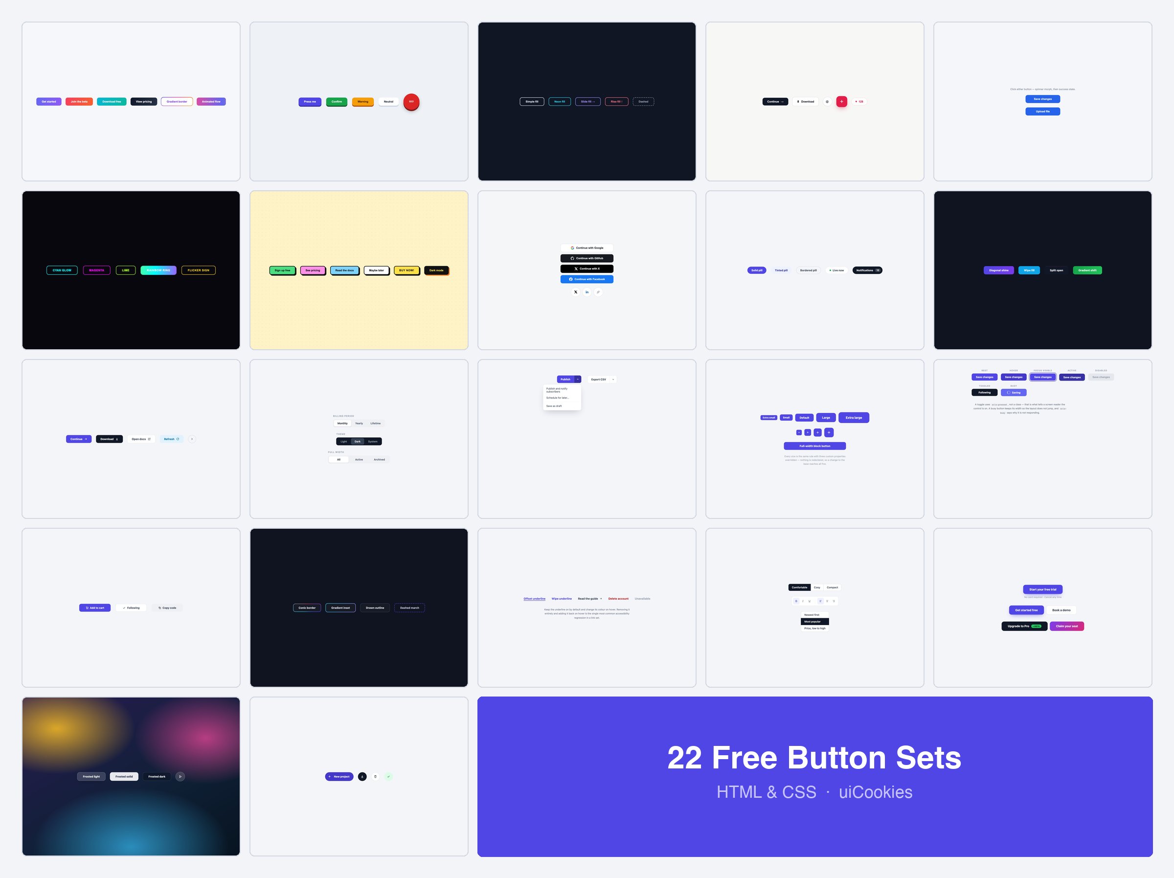
Buttons is a pack of 22 button sets — 126 individual button styles — each set a single self-contained HTML file with the CSS inline. Eleven sets cover the styles people go looking for: gradients, 3D presses, ghosts, neon, neobrutalism, social sign-in, pills, shines and moving icons. The other eleven cover the half of a button system that usually gets improvised: a size scale, every state, groups and toolbars, segmented controls and split buttons.
At a glance
- 22 sets, one folder each, single
index.htmlper set - 126 individual buttons in total
- Pure CSS apart from the original loading demo — the segmented control is radio inputs, the split button is a native
<details>, and the change-on-click buttons are a checkbox and a label - Icon-only buttons carry an
aria-label; toggles usearia-pressedand busy buttons usearia-busy - Focus is styled with
:focus-visible, and motion respectsprefers-reduced-motion - No framework, no build step, no icon font — the social logos are inline SVG
How to use
Open the set you want, copy the buttons you need along with their rules from the <style> block, and rename the short class names to fit your codebase. Each set is self-contained — nothing depends on the other 21.
FAQ
Are these button styles free?
Yes — free for personal and commercial projects, including client work.
Will they clash with Bootstrap?
No. Nothing here touches .btn, so you can load both and apply whichever you want per button.