About this set
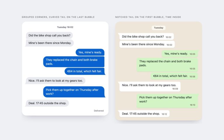
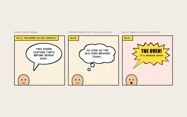
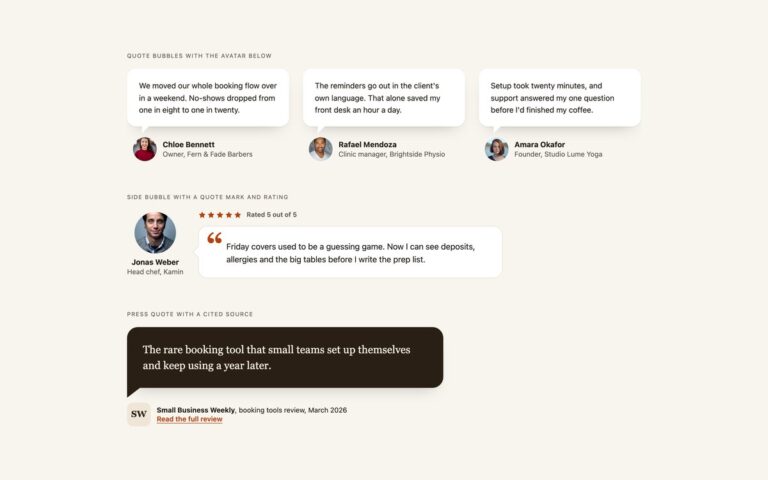
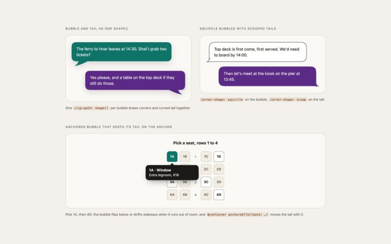
Twelve speech bubbles covering every tail position people ask for. Tails on four sides puts a centred triangle on the top, right, bottom or left edge of a filled bubble. Corner tails drops the radius on one corner and carries the two straight edges on into a right-angled point, the shape most comic and chat designs use. Bordered bubbles with matching tail borders is the version that usually goes wrong: an outlined box whose tail has exactly the same border, with no gap or seam where tail meets box. The filled tails are the classic border trick, a zero-size ::after with one coloured border. The outlined tails are a small rotated square with a border on its two outer sides, painted over the bubble’s own border so the outline runs unbroken into the point. Each bubble is one paragraph and a class such as .sb-top or .sb-br, the tail reads the bubble’s colour from –sb-c, and –sb-pos moves it along its edge, shown on the third outlined bubble. The drop shadow uses filter: drop-shadow, so it follows the tail as well as the box.
What’s included
- Tails on the top, right, bottom and left edges
- Four corner tails with the matching corner squared off
- Outlined bubbles whose tail shares the border without a seam
- --sb-c, --sb-t and --sb-pos set colour, tail size and tail position
- Drop shadow that follows the tail
Accessibility
Each bubble is an ordinary paragraph, so screen readers read its text and nothing else; the tails are empty pseudo-elements and are not announced. Text colours reach at least 4.5:1 on every bubble colour, and the set contains no controls, so there is nothing to focus.
Customise it
Change --sb-c and --sb-ink on .sb for the bubble and text colour, --sb-t for the tail size and --sb-pos to slide the tail along its edge. Outlined bubbles add --sb-line, --sb-bw and --sb-s. In Tailwind set [--sb-c:…] next to bg-(--sb-c) and edit the --color-sb-* theme colours; Bootstrap uses the same variables with .p-3 and .rounded-4.