/* ===== uiCookies Glassmorphism kit: design tokens (identical in every set) =====
   Retheme the whole kit here. Light scene on :root, dark scene on [data-scene="dark"]
   (or any [data-scene] holding a checked [data-scene-switch]). Selectors use :where()
   so the fallbacks below always win. */
:where(:root,[data-scene="light"]){
  color-scheme:light;
  /* background scene: the colour the glass frosts */
  --scene-base:linear-gradient(155deg,#eceffe 0%,#fbeef7 52%,#e6f6fb 100%);
  --scene-1:linear-gradient(140deg,#7c3aed,#c026d3);
  --scene-2:linear-gradient(140deg,#fb7185,#f97316);
  --scene-3:linear-gradient(140deg,#22d3ee,#3b82f6);
  --scene-4:linear-gradient(140deg,#fde047,#fb923c);
  /* glass */
  --glass-tint:255 255 255;
  --glass-border:rgb(255 255 255 / .8);
  --glass-edge:rgb(36 32 88 / .9);
  --glass-highlight:inset 0 1px 0 rgb(255 255 255 / .85);
  --glass-shadow:0 18px 40px -18px rgb(37 30 102 / .45);
  --glass-ink:#16133a;
  --glass-ink-soft:#3b3862;
  --glass-accent:#4338ca;
  --glass-accent-bg:rgb(67 56 202 / .92);
  --glass-on-accent:#fff;
  --glass-check-icon:url("data:image/svg+xml,%3Csvg xmlns='http://www.w3.org/2000/svg' viewBox='0 0 16 16'%3E%3Cpath d='M3.5 8.5l3 3 6-7' fill='none' stroke='%23fff' stroke-width='2.4' stroke-linecap='round' stroke-linejoin='round'/%3E%3C/svg%3E");
  --glass-focus:#1e1b4b;
  --glass-good:#14532d;--glass-good-bg:rgb(220 252 231 / .9);
  --glass-bad:#991b1b;--glass-bad-bg:rgb(254 226 226 / .9);
  --glass-warn:#7c2d12;--glass-warn-bg:rgb(254 243 199 / .9);
  --glass-scrim:rgb(22 19 58 / .3);
}
:where([data-scene="dark"]),:where([data-scene]:has([data-scene-switch]:checked)){
  color-scheme:dark;
  --scene-base:linear-gradient(155deg,#0a0c22 0%,#170c2c 52%,#06171f 100%);
  --scene-1:linear-gradient(140deg,#6d28d9,#a21caf);
  --scene-2:linear-gradient(140deg,#e11d48,#ea580c);
  --scene-3:linear-gradient(140deg,#0891b2,#2563eb);
  --scene-4:linear-gradient(140deg,#ca8a04,#c2410c);
  --glass-tint:16 18 44;
  --glass-border:rgb(255 255 255 / .2);
  --glass-edge:rgb(214 220 255 / .72);
  --glass-highlight:inset 0 1px 0 rgb(255 255 255 / .16);
  --glass-shadow:0 18px 40px -18px rgb(0 0 0 / .75);
  --glass-ink:#f5f6ff;
  --glass-ink-soft:#d0d3ee;
  --glass-accent:#a5b4fc;
  --glass-accent-bg:rgb(165 180 252 / .96);
  --glass-on-accent:#14123a;
  --glass-check-icon:url("data:image/svg+xml,%3Csvg xmlns='http://www.w3.org/2000/svg' viewBox='0 0 16 16'%3E%3Cpath d='M3.5 8.5l3 3 6-7' fill='none' stroke='%2314123a' stroke-width='2.4' stroke-linecap='round' stroke-linejoin='round'/%3E%3C/svg%3E");
  --glass-focus:#c7d2fe;
  --glass-good:#bbf7d0;--glass-good-bg:rgb(20 83 45 / .7);
  --glass-bad:#fecaca;--glass-bad-bg:rgb(127 29 29 / .7);
  --glass-warn:#fde68a;--glass-warn-bg:rgb(120 53 15 / .7);
  --glass-scrim:rgb(0 0 0 / .5);
}
:where(:root){
  --glass-alpha:.6;          /* panels and cards */
  --glass-alpha-strong:.82;  /* menus, dialogs, toasts: they cover unknown content */
  --glass-alpha-control:.5;  /* buttons and fields sitting on a panel */
  --glass-blur:18px;
  --glass-saturate:150%;
  --glass-radius:20px;
}
/* derived: recomputed inside every scene so a dark scene gets dark glass */
:where(:root,[data-scene]){
  --glass-bg:rgb(var(--glass-tint) / var(--glass-alpha));
  --glass-bg-strong:rgb(var(--glass-tint) / var(--glass-alpha-strong));
  --glass-bg-control:rgb(var(--glass-tint) / var(--glass-alpha-control));
}
/* no backdrop-filter: frosting can't happen, so the glass turns nearly solid */
@supports not ((backdrop-filter:blur(1px)) or (-webkit-backdrop-filter:blur(1px))){
  :where(:root){--glass-alpha:.94;--glass-alpha-strong:.97;--glass-alpha-control:.9}
}
@media (prefers-reduced-transparency:reduce){
  :where(:root){--glass-alpha:.93;--glass-alpha-strong:.97;--glass-alpha-control:.9;--glass-blur:8px}
}
@media (prefers-contrast:more){
  :where(:root){--glass-alpha:.96;--glass-alpha-strong:.98;--glass-alpha-control:.96}
  :where(:root,[data-scene]){--glass-border:var(--glass-ink);--glass-edge:var(--glass-ink)}
}
/* ===== end of tokens ===== */
/* Tailwind theme: utilities such as bg-glass, border-glass-edge, backdrop-blur-glass and text-ink read the tokens above */
@theme inline {
  --color-glass: var(--glass-bg);
  --color-glass-strong: var(--glass-bg-strong);
  --color-glass-control: var(--glass-bg-control);
  --color-glass-border: var(--glass-border);
  --color-glass-edge: var(--glass-edge);
  --color-ink: var(--glass-ink);
  --color-ink-soft: var(--glass-ink-soft);
  --color-accent: var(--glass-accent);
  --color-accent-glass: var(--glass-accent-bg);
  --color-on-accent: var(--glass-on-accent);
  --color-focus: var(--glass-focus);
  --color-good: var(--glass-good);
  --color-good-glass: var(--glass-good-bg);
  --color-bad: var(--glass-bad);
  --color-bad-glass: var(--glass-bad-bg);
  --color-warn: var(--glass-warn);
  --color-warn-glass: var(--glass-warn-bg);
  --color-scrim: var(--glass-scrim);
  --blur-glass: var(--glass-blur);
  --radius-glass: var(--glass-radius);
  --shadow-glass: var(--glass-shadow);
  --inset-shadow-glass: var(--glass-highlight);
  --animate-drift: g-drift 32s ease-in-out infinite alternate;
}
@keyframes g-drift { to { transform: translate3d(3vw,4vh,0) scale(1.06); } }
About this set
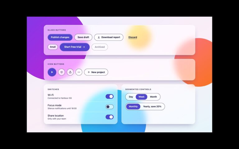
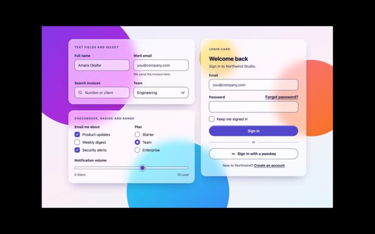
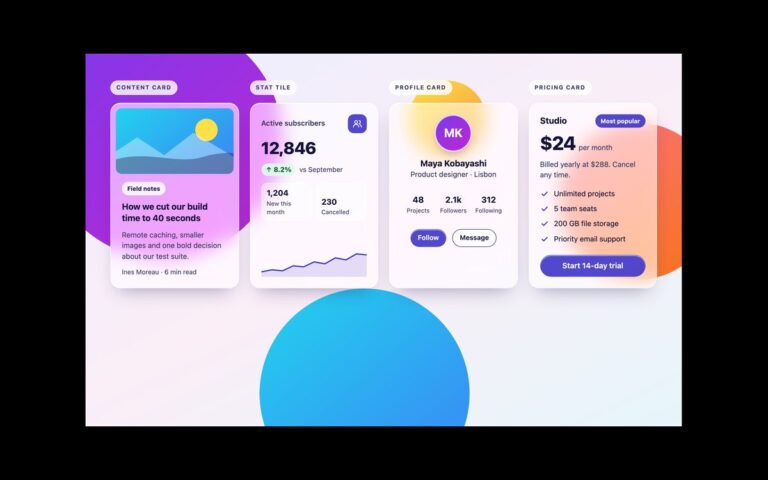
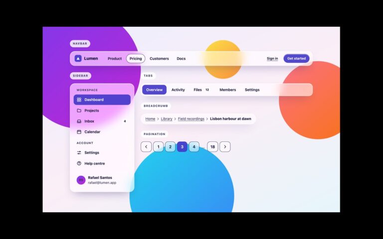
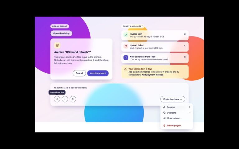
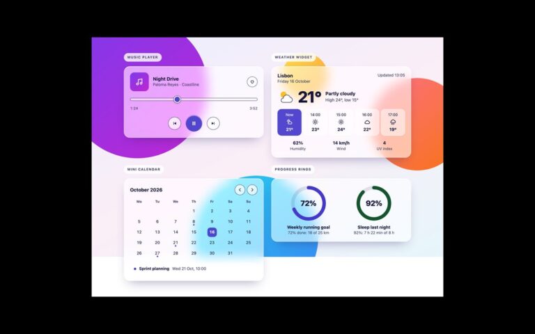
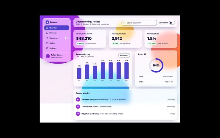
The core components of the uiCookies glassmorphism UI kit on the dark scene: buttons, icon buttons and switches, form controls, a stat tile, tabs and pagination, and a toast. Nothing in the markup changes except one attribute: data-scene=”dark” on the wrapper swaps the token values, so the same classes give deeper orbs, a dark navy tint, light text and lighter edges. Dark glass fails in a different place from light glass. The risk is a bright orb, such as amber, showing through and washing out light text, and a dark accent colour disappearing against dark glass. So the dark tokens raise the edge to a light 72 percent tint, switch the accent to a pale lavender with dark text on it, and swap the checkbox tick to a dark stroke through a token. Every text run and control edge was measured against the brightest and darkest dark-scene colours, not just the average. The same fallbacks apply: nearly opaque glass without backdrop-filter or under prefers-reduced-transparency, and solid borders under prefers-contrast: more. The Bootstrap version also sets data-bs-theme=”dark” so Bootstrap’s own select chevron follows. The Bootstrap version feeds the tokens into Bootstrap’s own component variables, and the Tailwind version maps them to theme utilities such as bg-glass, border-glass-edge, backdrop-blur-glass and text-ink.
What’s included
One attribute, data-scene="dark", switches every token
Pale lavender accent with dark text for 3:1 boundaries on dark glass
Buttons, switches, fields, stat tile, tabs, pagination and toast
color-scheme: dark so native select popups match
Same markup and classes as the light sets
Accessibility
Text was measured at 4.5:1 and control edges at 3:1 against every dark-scene colour, including the amber orb that washes out most dark glass designs. Switches are checkboxes with role="switch", fields have labels and hints, the current tab and page use aria-current, and the toast sits in a role="status" region. The focus outline turns light on the dark scene, and transitions stop under prefers-reduced-motion.
Customise it
Edit the [data-scene="dark"] block in the tokens: --glass-tint for the glass colour, --glass-edge for boundaries and --glass-accent-bg with --glass-on-accent for the accent. In Bootstrap keep data-bs-theme="dark" on the same wrapper; in Tailwind the same utilities read the dark values automatically.