About this set
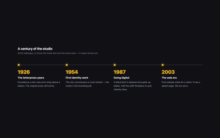
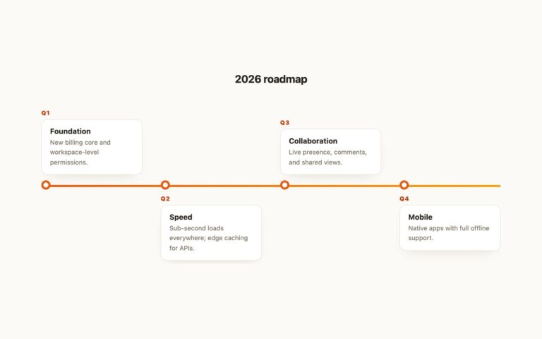
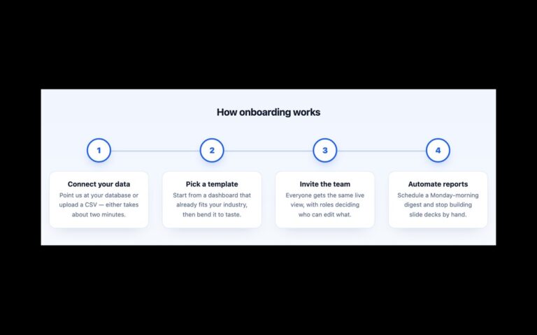
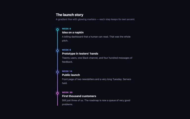
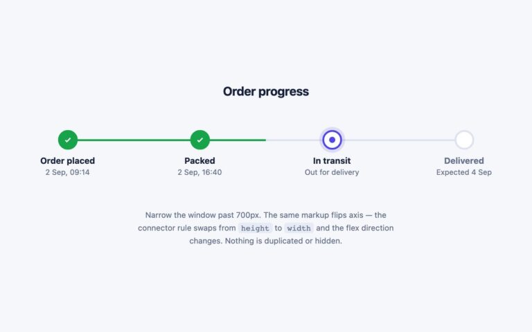
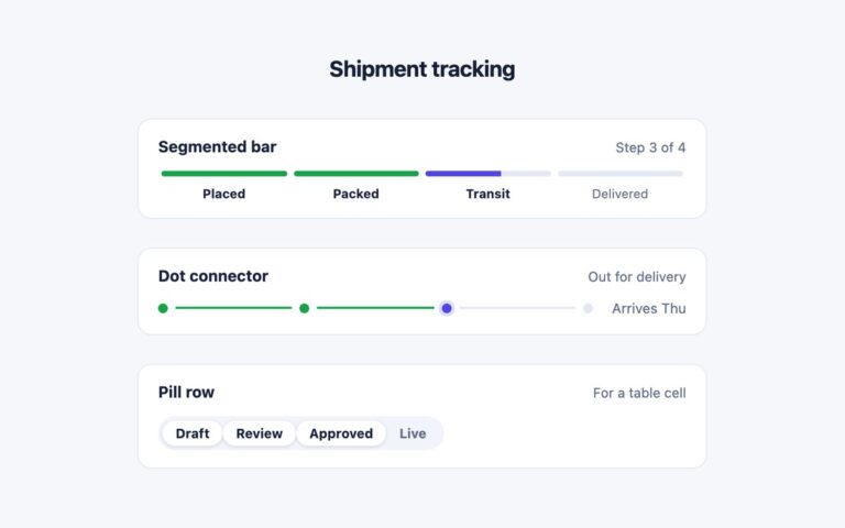
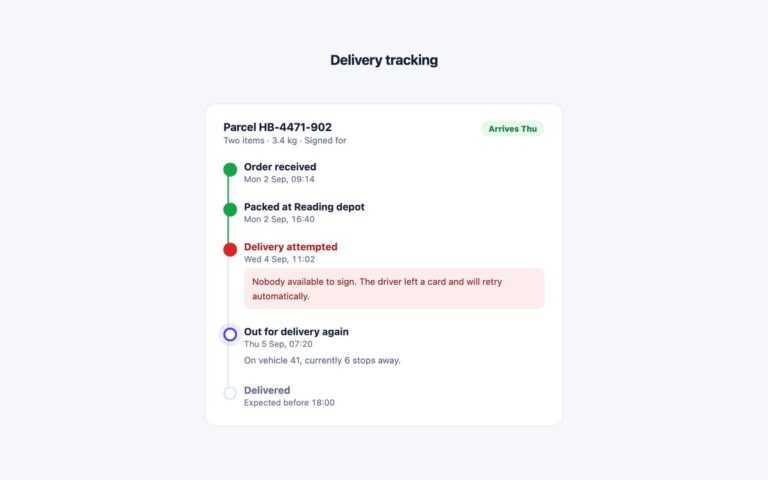
A horizontal step timeline for order progress: Cart, Shipping, Payment, Review and Done, each with a circle and a short caption. Completed steps show an indigo tick, the current step has a white circle with an indigo ring and halo, and future steps are numbered grey circles. Each step draws its own segment of the connecting bar, so the bar is indigo up to the current step and grey after it, and the current segment is half and half. Use it at the top of a checkout, an onboarding flow, a shipping tracker or any multi-step form. The steps are an ordered list. The current one has aria-current=”step”, and completed and current steps carry visually hidden text, so a screen reader hears Cart completed and Payment current step rather than relying on colour. Under 640 pixels the row turns into a vertical list with the bar on the left, and the bar now starts and stops at the centre of the first and last circles. The Bootstrap version uses .d-flex, .rounded-circle and .visually-hidden, and the Tailwind version builds the two layouts with a min-[641px]: breakpoint.
What’s included
- Completed, current and upcoming states with a filling bar
- Current step marked with aria-current="step"
- Visually hidden completed and current-step text
- Stacks into a vertical list under 640px
- Upcoming step text darkened to pass 4.5:1
Accessibility
The steps form an ordered list, and the current step has aria-current="step". Hidden text after the step name says completed or current step, so state is not given by colour alone. The circles are aria-hidden. Upcoming labels and captions were darkened to #5e6a85 so they reach 5:1. There is no animation.
Customise it
Change --st-accent, --st-line, --st-muted and --st-todo on .steps (plain CSS and Bootstrap). The 640px media query sets where it stacks. In Tailwind edit the #4f46e5 and #dde3f0 values and the min-[641px]: prefix.