About this set
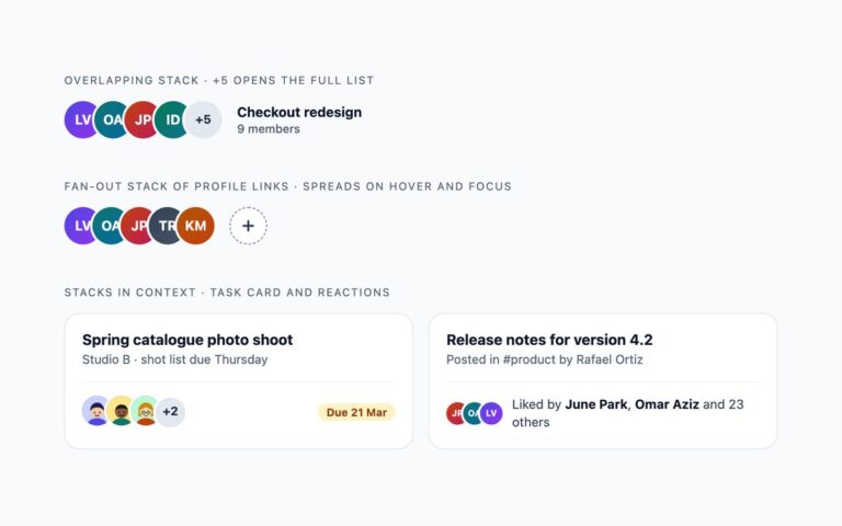
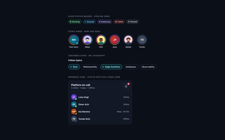
Avatars that need no photos. Initials avatars come in five sizes from 24 to 72 pixels, as circles and as rounded squares, on gradient fills dark enough for white letters. Four illustrated faces are drawn as small inline SVGs, next to four abstract avatars made only from CSS gradients: a soft mesh, a desert dune, a tiled diamond pattern and concentric rings. Icon fallbacks cover a guest user, a team, an assistant bot and a deleted account drawn with a dashed outline. The last row adds presence: online, away, do not disturb and offline dots that scale with the avatar, and a list where each person’s status is written next to their name. Use initials as the default when no picture is uploaded, the drawn faces or abstract avatars for sample data and onboarding, and the icon fallbacks for accounts that are not people. Each status dot has its own shape, a filled dot, a crescent, a bar or a hollow ring, and the status is part of the avatar’s accessible name.
What’s included
- Five sizes in circle and rounded square shapes
- Four hand-drawn SVG faces and four CSS gradient avatars
- Guest, team, bot and deleted account fallbacks
- Status dots that change shape as well as colour
- Each avatar is named with role="img" and aria-label
Accessibility
Every standalone avatar is role="img" with the person's name, and avatars with a status include it in the name, for example June Park, do not disturb. In the presence list the name and status are visible text, so the avatar is hidden from screen readers. Status dots differ by shape, not only colour, and there are no interactive elements or animations in this set.
Customise it
Size comes from --av on .av and the gradient from --a and --b; add a modifier class like .teal to set both. Bootstrap uses the same classes with .rounded-circle and positioning utilities; in Tailwind change the size-, from- and to- utilities.