Open demo

CSS code

HTML
<div class="bp-motion">
<label class="bp-pause-label"><input type="checkbox" class="bp-pause"> Pause the conic rays</label>
<div><span class="lbl">@property and color-mix()</span><div class="bp-grid bp-3">
<div class="bp-rays bp-tile"><span class="bp-tag">Conic rays</span></div>
<div class="bp-tint bp-tile" style="--bp-color:#0d9488"><span class="bp-tag">Tinted grid · teal</span></div>
<div class="bp-tint bp-tile" style="--bp-color:#e11d48"><span class="bp-tag">Tinted grid · rose</span></div>
</div></div>
<div><span class="lbl">light-dark(), mask-image and container queries</span><div class="bp-grid bp-3">
<div class="bp-split bp-tile"><div class="bp-ld bp-scheme-light"></div><div class="bp-ld bp-scheme-dark"></div><span class="bp-tag">light-dark() dots</span></div>
<div class="bp-fade bp-tile"><span class="bp-tag">Mask-image fade</span></div>
<div class="bp-split bp-cq-pair bp-tile"><div class="bp-cq"><div class="bp-cq-dots"></div></div><div class="bp-cq"><div class="bp-cq-dots"></div></div><span class="bp-tag">Container query density</span></div>
</div></div>
</div>
CSS
/* Modern CSS backgrounds: @property animation, color-mix() theming from one colour, light-dark(), mask-image fades and container query density. Each feature sits behind @supports or degrades to a static pattern. */
@property --bp-angle{syntax:"<angle>";inherits:false;initial-value:0deg}
@keyframes bp-turn{to{--bp-angle:calc(var(--bp-size) * 2)}}
/* Conic rays: --bp-angle is registered with @property, so it animates smoothly; both ray colours come from --bp-color */
.bp-rays{--bp-color:#f59e0b;--bp-c1:#fde68a;--bp-c2:#fcd34d;--bp-size:10deg;--bp-speed:18s;position:relative;isolation:isolate;overflow:hidden;background:repeating-conic-gradient(from var(--bp-angle) at 50% 115%,var(--bp-c1) 0 var(--bp-size),var(--bp-c2) 0 calc(var(--bp-size) * 2));animation:bp-turn var(--bp-speed) linear infinite}
@supports (color:color-mix(in oklab,red,blue)){.bp-rays{--bp-c1:color-mix(in oklab,var(--bp-color) 25%,#fff);--bp-c2:color-mix(in oklab,var(--bp-color) 45%,#fff)}}
@media (prefers-reduced-motion:reduce){.bp-rays{animation:none}}
/* Tinted grid: ground, lines, nodes and glow are all mixed from the one --bp-color */
.bp-tint{--bp-color:#4f46e5;--bp-size:24px;--bp-bg:#f1f5f9;--bp-line:rgb(15 23 42 / .12);--bp-node:rgb(15 23 42 / .3);--bp-glow:transparent;position:relative;isolation:isolate;overflow:hidden;background:radial-gradient(70% 60% at 100% 0%,var(--bp-glow),transparent 70%),var(--bp-bg)}
.bp-tint::before{content:"";position:absolute;inset:0;z-index:-1;pointer-events:none;background-image:radial-gradient(circle,var(--bp-node) 1.5px,transparent 2px),linear-gradient(var(--bp-line) 1px,transparent 1px),linear-gradient(90deg,var(--bp-line) 1px,transparent 1px);background-size:var(--bp-size) var(--bp-size);background-position:calc(var(--bp-size) / -2) calc(var(--bp-size) / -2),0 0,0 0}
@supports (color:color-mix(in oklab,red,blue)){.bp-tint{--bp-bg:color-mix(in oklab,var(--bp-color) 7%,#fff);--bp-line:color-mix(in oklab,var(--bp-color) 22%,transparent);--bp-node:color-mix(in oklab,var(--bp-color) 60%,transparent);--bp-glow:color-mix(in oklab,var(--bp-color) 22%,transparent)}}
/* light-dark() dots: one rule that follows color-scheme, shown here forced light and dark */
.bp-ld{--bp-size:18px;--bp-bg-light:#f8fafc;--bp-bg-dark:#0f172a;--bp-ink-light:#94a3b8;--bp-ink-dark:#475569;background-color:var(--bp-bg-light);background-image:radial-gradient(circle,var(--bp-ink-light) 1.5px,transparent 2px);background-size:var(--bp-size) var(--bp-size)}
@supports (color:light-dark(#000,#fff)){.bp-ld{background-color:light-dark(var(--bp-bg-light),var(--bp-bg-dark));background-image:radial-gradient(circle,light-dark(var(--bp-ink-light),var(--bp-ink-dark)) 1.5px,transparent 2px)}}
/* Mask-image fade: the grid dissolves toward the bottom; --bp-fade sets where it is gone */
.bp-fade{--bp-color:#4f46e5;--bp-size:28px;--bp-opacity:.4;--bp-fade:70%;position:relative;isolation:isolate;overflow:hidden;background:#fff}
.bp-fade::before{content:"";position:absolute;inset:0;z-index:-1;pointer-events:none;opacity:var(--bp-opacity);background-image:linear-gradient(var(--bp-color) 1px,transparent 1px),linear-gradient(90deg,var(--bp-color) 1px,transparent 1px);background-size:var(--bp-size) var(--bp-size);-webkit-mask-image:radial-gradient(ellipse 90% 100% at 50% 0%,#000 20%,transparent var(--bp-fade));mask-image:radial-gradient(ellipse 90% 100% at 50% 0%,#000 20%,transparent var(--bp-fade))}
/* Container query density: the dots get bigger and sparser as their container gets wider */
.bp-cq-dots{--bp-bg:#f0fdfa;--bp-color:#0f766e;--bp-size:12px;--bp-dot:1.5px;--bp-opacity:.45;position:absolute;inset:0;isolation:isolate;background:var(--bp-bg)}
.bp-cq-dots::before{content:"";position:absolute;inset:0;z-index:-1;pointer-events:none;opacity:var(--bp-opacity);background-image:radial-gradient(circle,var(--bp-color) var(--bp-dot),transparent calc(var(--bp-dot) + .5px));background-size:var(--bp-size) var(--bp-size)}
/* Two-up tiles for the light-dark() and container query demos */
.bp-split{position:relative;display:grid;grid-template-columns:1fr 1fr;overflow:hidden}
.bp-scheme-light{color-scheme:light}
.bp-scheme-dark{color-scheme:dark}
.bp-cq-pair{grid-template-columns:38% 1fr}
.bp-cq{position:relative;container-type:inline-size}
.bp-cq + .bp-cq{border-left:1px solid #99f6e4}
@container (min-width:160px){.bp-cq-dots{--bp-size:20px;--bp-dot:2.5px}}
@container (min-width:280px){.bp-cq-dots{--bp-size:28px;--bp-dot:3.5px}}
.bp-motion{display:flex;flex-direction:column;gap:32px}
.bp-motion:has(.bp-pause:checked) .bp-rays{animation-play-state:paused}
.bp-pause-label{display:inline-flex;align-items:center;gap:8px;align-self:flex-start;font-size:.875rem;line-height:20px;font-weight:600;color:#334155;cursor:pointer}
.bp-pause{width:16px;height:16px;margin:0;accent-color:#4f46e5}
.bp-pause:focus-visible{outline:2px solid #4f46e5;outline-offset:3px}
/* Demo tile and name chip */
.bp-tile{min-height:var(--bp-tile-h,180px);border-radius:16px;border:1px solid #dee2e6}
/* The name chip is an opaque scrim, so its text keeps 4.5:1 whatever pattern is underneath. */
.bp-tag{position:absolute;left:16px;bottom:16px;padding:4px 8px;border-radius:6px;background:#fff;color:#0f172a;font-size:.875rem;font-weight:600;line-height:1.5;box-shadow:0 2px 4px rgb(0 0 0 / .075)}

Bootstrap 5 code

Requires: Bootstrap 5.3.8 CSS

HTML
<div class="bp-motion">
<div class="form-check"><input class="form-check-input bp-pause" type="checkbox" id="bp-pause"><label class="form-check-label" for="bp-pause">Pause the conic rays</label></div>
<div><span class="lbl">@property and color-mix()</span><div class="row row-cols-1 row-cols-sm-2 row-cols-lg-3 g-3">
<div class="col"><div class="bp-rays bp-tile rounded-4 border"><span class="position-absolute start-0 bottom-0 m-3 px-2 py-1 rounded-2 bg-white text-dark small fw-semibold shadow-sm lh-base">Conic rays</span></div></div>
<div class="col"><div class="bp-tint bp-tile rounded-4 border" style="--bp-color:#0d9488"><span class="position-absolute start-0 bottom-0 m-3 px-2 py-1 rounded-2 bg-white text-dark small fw-semibold shadow-sm lh-base">Tinted grid · teal</span></div></div>
<div class="col"><div class="bp-tint bp-tile rounded-4 border" style="--bp-color:#e11d48"><span class="position-absolute start-0 bottom-0 m-3 px-2 py-1 rounded-2 bg-white text-dark small fw-semibold shadow-sm lh-base">Tinted grid · rose</span></div></div>
</div></div>
<div><span class="lbl">light-dark(), mask-image and container queries</span><div class="row row-cols-1 row-cols-sm-2 row-cols-lg-3 g-3">
<div class="col"><div class="bp-split bp-tile rounded-4 border"><div class="bp-ld" data-bs-theme="light"></div><div class="bp-ld" data-bs-theme="dark"></div><span class="position-absolute start-0 bottom-0 m-3 px-2 py-1 rounded-2 bg-white text-dark small fw-semibold shadow-sm lh-base">light-dark() dots</span></div></div>
<div class="col"><div class="bp-fade bp-tile rounded-4 border"><span class="position-absolute start-0 bottom-0 m-3 px-2 py-1 rounded-2 bg-white text-dark small fw-semibold shadow-sm lh-base">Mask-image fade</span></div></div>
<div class="col"><div class="bp-split bp-cq-pair bp-tile rounded-4 border"><div class="bp-cq"><div class="bp-cq-dots"></div></div><div class="bp-cq"><div class="bp-cq-dots"></div></div><span class="position-absolute start-0 bottom-0 m-3 px-2 py-1 rounded-2 bg-white text-dark small fw-semibold shadow-sm lh-base">Container query density</span></div></div>
</div></div>
</div>
CSS
/* Modern CSS backgrounds: @property animation, color-mix() theming from one colour, light-dark(), mask-image fades and container query density. Each feature sits behind @supports or degrades to a static pattern. */
@property --bp-angle{syntax:"<angle>";inherits:false;initial-value:0deg}
@keyframes bp-turn{to{--bp-angle:calc(var(--bp-size) * 2)}}
/* Conic rays: --bp-angle is registered with @property, so it animates smoothly; both ray colours come from --bp-color */
.bp-rays{--bp-color:#f59e0b;--bp-c1:#fde68a;--bp-c2:#fcd34d;--bp-size:10deg;--bp-speed:18s;position:relative;isolation:isolate;overflow:hidden;background:repeating-conic-gradient(from var(--bp-angle) at 50% 115%,var(--bp-c1) 0 var(--bp-size),var(--bp-c2) 0 calc(var(--bp-size) * 2));animation:bp-turn var(--bp-speed) linear infinite}
@supports (color:color-mix(in oklab,red,blue)){.bp-rays{--bp-c1:color-mix(in oklab,var(--bp-color) 25%,#fff);--bp-c2:color-mix(in oklab,var(--bp-color) 45%,#fff)}}
@media (prefers-reduced-motion:reduce){.bp-rays{animation:none}}
/* Tinted grid: ground, lines, nodes and glow are all mixed from the one --bp-color */
.bp-tint{--bp-color:#4f46e5;--bp-size:24px;--bp-bg:#f1f5f9;--bp-line:rgb(15 23 42 / .12);--bp-node:rgb(15 23 42 / .3);--bp-glow:transparent;position:relative;isolation:isolate;overflow:hidden;background:radial-gradient(70% 60% at 100% 0%,var(--bp-glow),transparent 70%),var(--bp-bg)}
.bp-tint::before{content:"";position:absolute;inset:0;z-index:-1;pointer-events:none;background-image:radial-gradient(circle,var(--bp-node) 1.5px,transparent 2px),linear-gradient(var(--bp-line) 1px,transparent 1px),linear-gradient(90deg,var(--bp-line) 1px,transparent 1px);background-size:var(--bp-size) var(--bp-size);background-position:calc(var(--bp-size) / -2) calc(var(--bp-size) / -2),0 0,0 0}
@supports (color:color-mix(in oklab,red,blue)){.bp-tint{--bp-bg:color-mix(in oklab,var(--bp-color) 7%,#fff);--bp-line:color-mix(in oklab,var(--bp-color) 22%,transparent);--bp-node:color-mix(in oklab,var(--bp-color) 60%,transparent);--bp-glow:color-mix(in oklab,var(--bp-color) 22%,transparent)}}
/* light-dark() dots: one rule that follows color-scheme, shown here forced light and dark */
.bp-ld{--bp-size:18px;--bp-bg-light:#f8fafc;--bp-bg-dark:#0f172a;--bp-ink-light:#94a3b8;--bp-ink-dark:#475569;background-color:var(--bp-bg-light);background-image:radial-gradient(circle,var(--bp-ink-light) 1.5px,transparent 2px);background-size:var(--bp-size) var(--bp-size)}
@supports (color:light-dark(#000,#fff)){.bp-ld{background-color:light-dark(var(--bp-bg-light),var(--bp-bg-dark));background-image:radial-gradient(circle,light-dark(var(--bp-ink-light),var(--bp-ink-dark)) 1.5px,transparent 2px)}}
/* Mask-image fade: the grid dissolves toward the bottom; --bp-fade sets where it is gone */
.bp-fade{--bp-color:#4f46e5;--bp-size:28px;--bp-opacity:.4;--bp-fade:70%;position:relative;isolation:isolate;overflow:hidden;background:#fff}
.bp-fade::before{content:"";position:absolute;inset:0;z-index:-1;pointer-events:none;opacity:var(--bp-opacity);background-image:linear-gradient(var(--bp-color) 1px,transparent 1px),linear-gradient(90deg,var(--bp-color) 1px,transparent 1px);background-size:var(--bp-size) var(--bp-size);-webkit-mask-image:radial-gradient(ellipse 90% 100% at 50% 0%,#000 20%,transparent var(--bp-fade));mask-image:radial-gradient(ellipse 90% 100% at 50% 0%,#000 20%,transparent var(--bp-fade))}
/* Container query density: the dots get bigger and sparser as their container gets wider */
.bp-cq-dots{--bp-bg:#f0fdfa;--bp-color:#0f766e;--bp-size:12px;--bp-dot:1.5px;--bp-opacity:.45;position:absolute;inset:0;isolation:isolate;background:var(--bp-bg)}
.bp-cq-dots::before{content:"";position:absolute;inset:0;z-index:-1;pointer-events:none;opacity:var(--bp-opacity);background-image:radial-gradient(circle,var(--bp-color) var(--bp-dot),transparent calc(var(--bp-dot) + .5px));background-size:var(--bp-size) var(--bp-size)}
/* Two-up tiles for the light-dark() and container query demos */
.bp-split{position:relative;display:grid;grid-template-columns:1fr 1fr;overflow:hidden}
.bp-scheme-light{color-scheme:light}
.bp-scheme-dark{color-scheme:dark}
.bp-cq-pair{grid-template-columns:38% 1fr}
.bp-cq{position:relative;container-type:inline-size}
.bp-cq + .bp-cq{border-left:1px solid #99f6e4}
@container (min-width:160px){.bp-cq-dots{--bp-size:20px;--bp-dot:2.5px}}
@container (min-width:280px){.bp-cq-dots{--bp-size:28px;--bp-dot:3.5px}}
.bp-motion{display:flex;flex-direction:column;gap:32px}
.bp-motion:has(.bp-pause:checked) .bp-rays{animation-play-state:paused}
.bp-motion .form-check{align-self:flex-start;min-height:0;margin:0;line-height:20px;font-size:.875rem;font-weight:600;color:#334155}
.bp-motion .form-check-input{--bs-border-color:#64748b}
.bp-motion .form-check-input:checked{background-color:#4f46e5;border-color:#4f46e5}
.bp-motion .form-check-input:focus-visible{outline:2px solid #4f46e5;outline-offset:3px;box-shadow:none}
/* Demo tile height; corners, border and the name chip use Bootstrap utilities */
.bp-tile{min-height:var(--bp-tile-h,180px)}

Tailwind 4 code

Requires: Tailwind CSS 4

HTML
<div class="bp-motion flex flex-col gap-8">
<label class="inline-flex cursor-pointer items-center gap-2 self-start text-sm leading-5 font-semibold text-[#334155]"><input type="checkbox" class="bp-pause m-0 size-4 accent-[#4f46e5] focus-visible:outline-2 focus-visible:outline-offset-3 focus-visible:outline-[#4f46e5]"> Pause the conic rays</label>
<div><span class="mb-4 block text-[.72rem] tracking-[.12em] text-[#5b6477] uppercase">@property and color-mix()</span><div class="grid grid-cols-1 gap-4 min-[576px]:grid-cols-2 min-[992px]:grid-cols-3">
<div class="bp-rays relative min-h-[180px] overflow-hidden rounded-2xl border border-[#dee2e6]"><span class="absolute bottom-4 left-4 rounded-md bg-white px-2 py-1 text-sm leading-normal font-semibold text-[#0f172a] shadow-[0_2px_4px_rgb(0_0_0/.075)]">Conic rays</span></div>
<div class="bp-tint [--bp-color:#0d9488] relative min-h-[180px] overflow-hidden rounded-2xl border border-[#dee2e6]"><span class="absolute bottom-4 left-4 rounded-md bg-white px-2 py-1 text-sm leading-normal font-semibold text-[#0f172a] shadow-[0_2px_4px_rgb(0_0_0/.075)]">Tinted grid · teal</span></div>
<div class="bp-tint [--bp-color:#e11d48] relative min-h-[180px] overflow-hidden rounded-2xl border border-[#dee2e6]"><span class="absolute bottom-4 left-4 rounded-md bg-white px-2 py-1 text-sm leading-normal font-semibold text-[#0f172a] shadow-[0_2px_4px_rgb(0_0_0/.075)]">Tinted grid · rose</span></div>
</div></div>
<div><span class="mb-4 block text-[.72rem] tracking-[.12em] text-[#5b6477] uppercase">light-dark(), mask-image and container queries</span><div class="grid grid-cols-1 gap-4 min-[576px]:grid-cols-2 min-[992px]:grid-cols-3">
<div class="grid grid-cols-2 relative min-h-[180px] overflow-hidden rounded-2xl border border-[#dee2e6]"><div class="bp-ld [color-scheme:light]"></div><div class="bp-ld [color-scheme:dark]"></div><span class="absolute bottom-4 left-4 rounded-md bg-white px-2 py-1 text-sm leading-normal font-semibold text-[#0f172a] shadow-[0_2px_4px_rgb(0_0_0/.075)]">light-dark() dots</span></div>
<div class="bp-fade relative min-h-[180px] overflow-hidden rounded-2xl border border-[#dee2e6]"><span class="absolute bottom-4 left-4 rounded-md bg-white px-2 py-1 text-sm leading-normal font-semibold text-[#0f172a] shadow-[0_2px_4px_rgb(0_0_0/.075)]">Mask-image fade</span></div>
<div class="grid grid-cols-[38%_1fr] relative min-h-[180px] overflow-hidden rounded-2xl border border-[#dee2e6]"><div class="@container relative"><div class="bp-cq-dots @min-[160px]:[--bp-size:20px] @min-[160px]:[--bp-dot:2.5px] @min-[280px]:[--bp-size:28px] @min-[280px]:[--bp-dot:3.5px]"></div></div><div class="@container relative border-l border-[#99f6e4]"><div class="bp-cq-dots @min-[160px]:[--bp-size:20px] @min-[160px]:[--bp-dot:2.5px] @min-[280px]:[--bp-size:28px] @min-[280px]:[--bp-dot:3.5px]"></div></div><span class="absolute bottom-4 left-4 rounded-md bg-white px-2 py-1 text-sm leading-normal font-semibold text-[#0f172a] shadow-[0_2px_4px_rgb(0_0_0/.075)]">Container query density</span></div>
</div></div>
</div>
CSS
/* Modern CSS backgrounds: @property animation, color-mix() theming from one colour, light-dark(), mask-image fades and container query density. Each feature sits behind @supports or degrades to a static pattern. Each pattern is a utility; container density and colour schemes are set with utilities in the markup. */
@property --bp-angle{syntax:"<angle>";inherits:false;initial-value:0deg}
@keyframes bp-turn{to{--bp-angle:calc(var(--bp-size) * 2)}}
/* Conic rays: --bp-angle is registered with @property, so it animates smoothly; both ray colours come from --bp-color */
@utility bp-rays{
  position:relative;isolation:isolate;overflow:hidden;background:repeating-conic-gradient(from var(--bp-angle) at 50% 115%,var(--bp-c1,#fde68a) 0 var(--bp-size,10deg),var(--bp-c2,#fcd34d) 0 calc(var(--bp-size,10deg) * 2));animation:bp-turn var(--bp-speed,18s) linear infinite;
  @supports (color:color-mix(in oklab,red,blue)){--bp-c1:color-mix(in oklab,var(--bp-color,#f59e0b) 25%,#fff);--bp-c2:color-mix(in oklab,var(--bp-color,#f59e0b) 45%,#fff);}
  @media (prefers-reduced-motion:reduce){animation:none;}
}
/* Tinted grid: ground, lines, nodes and glow are all mixed from the one --bp-color */
@utility bp-tint{
  position:relative;isolation:isolate;overflow:hidden;background:radial-gradient(70% 60% at 100% 0%,var(--bp-glow,transparent),transparent 70%),var(--bp-bg,#f1f5f9);
  &::before{content:"";position:absolute;inset:0;z-index:-1;pointer-events:none;background-image:radial-gradient(circle,var(--bp-node,rgb(15 23 42 / .3)) 1.5px,transparent 2px),linear-gradient(var(--bp-line,rgb(15 23 42 / .12)) 1px,transparent 1px),linear-gradient(90deg,var(--bp-line,rgb(15 23 42 / .12)) 1px,transparent 1px);background-size:var(--bp-size,24px) var(--bp-size,24px);background-position:calc(var(--bp-size,24px) / -2) calc(var(--bp-size,24px) / -2),0 0,0 0}
  @supports (color:color-mix(in oklab,red,blue)){--bp-bg:color-mix(in oklab,var(--bp-color,#4f46e5) 7%,#fff);--bp-line:color-mix(in oklab,var(--bp-color,#4f46e5) 22%,transparent);--bp-node:color-mix(in oklab,var(--bp-color,#4f46e5) 60%,transparent);--bp-glow:color-mix(in oklab,var(--bp-color,#4f46e5) 22%,transparent);}
}
/* light-dark() dots: one rule that follows color-scheme, shown here forced light and dark */
@utility bp-ld{
  background-color:var(--bp-bg-light,#f8fafc);background-image:radial-gradient(circle,var(--bp-ink-light,#94a3b8) 1.5px,transparent 2px);background-size:var(--bp-size,18px) var(--bp-size,18px);
  @supports (color:light-dark(#000,#fff)){background-color:light-dark(var(--bp-bg-light,#f8fafc),var(--bp-bg-dark,#0f172a));background-image:radial-gradient(circle,light-dark(var(--bp-ink-light,#94a3b8),var(--bp-ink-dark,#475569)) 1.5px,transparent 2px);}
}
/* Mask-image fade: the grid dissolves toward the bottom; --bp-fade sets where it is gone */
@utility bp-fade{
  position:relative;isolation:isolate;overflow:hidden;background:#fff;
  &::before{content:"";position:absolute;inset:0;z-index:-1;pointer-events:none;opacity:var(--bp-opacity,.4);background-image:linear-gradient(var(--bp-color,#4f46e5) 1px,transparent 1px),linear-gradient(90deg,var(--bp-color,#4f46e5) 1px,transparent 1px);background-size:var(--bp-size,28px) var(--bp-size,28px);-webkit-mask-image:radial-gradient(ellipse 90% 100% at 50% 0%,#000 20%,transparent var(--bp-fade,70%));mask-image:radial-gradient(ellipse 90% 100% at 50% 0%,#000 20%,transparent var(--bp-fade,70%))}
}
/* Container query density: the dots get bigger and sparser as their container gets wider */
@utility bp-cq-dots{
  position:absolute;inset:0;isolation:isolate;background:var(--bp-bg,#f0fdfa);
  &::before{content:"";position:absolute;inset:0;z-index:-1;pointer-events:none;opacity:var(--bp-opacity,.45);background-image:radial-gradient(circle,var(--bp-color,#0f766e) var(--bp-dot,1.5px),transparent calc(var(--bp-dot,1.5px) + .5px));background-size:var(--bp-size,12px) var(--bp-size,12px)}
}
/* Pause checkbox: freezes the rays inside .bp-motion (:has()). */
.bp-motion:has(.bp-pause:checked) .bp-rays{animation-play-state:paused}

About this set

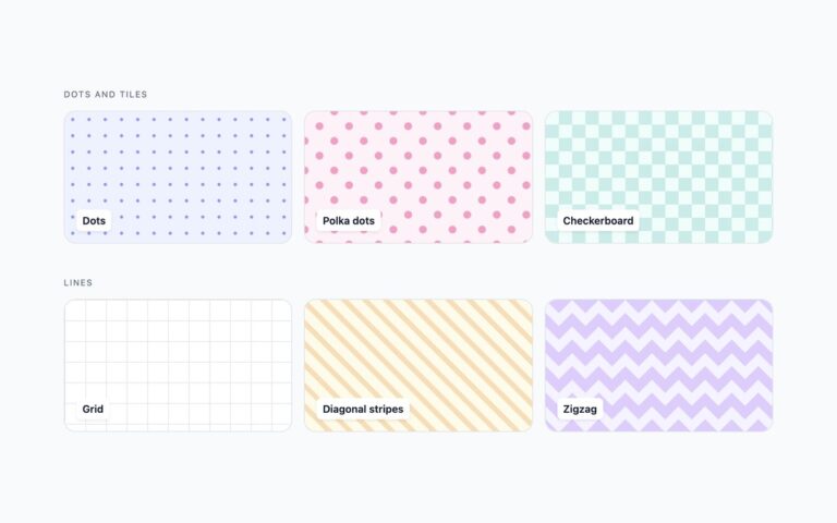
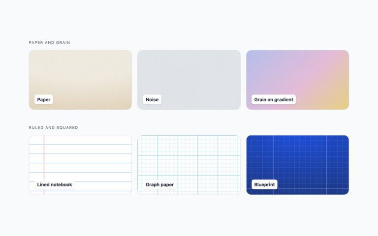
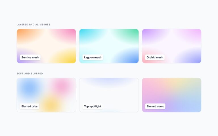
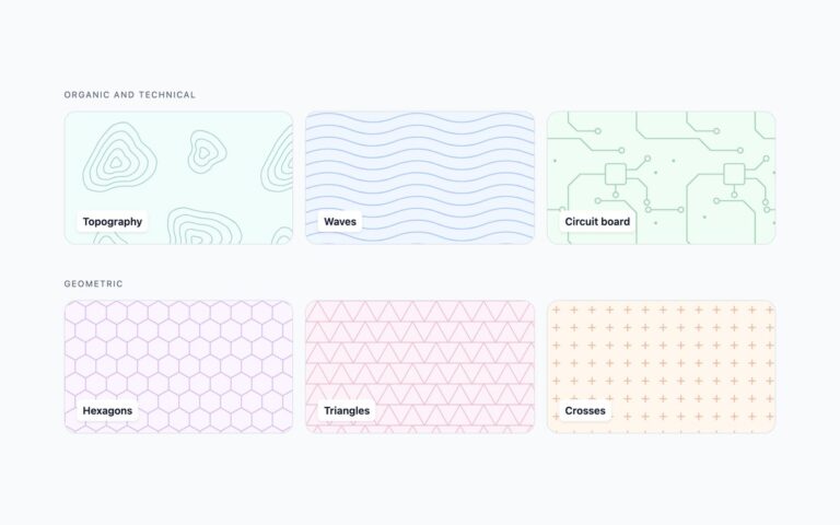
Six tiles that use newer CSS for jobs that used to need JavaScript or several hand-picked colours. Conic rays is a repeating-conic-gradient whose start angle, –bp-angle, is registered with @property, so the browser can animate it smoothly; the animation turns exactly one ray pair per loop, so it never jumps. Its two ray colours are mixed from –bp-color. Tinted grid derives its ground, lines, nodes and corner glow from a single –bp-color with color-mix(), shown in teal and rose from the same class. light-dark() dots is one rule that follows color-scheme, shown forced light and forced dark side by side. Mask-image fade dissolves a grid toward the bottom with a radial mask, with –bp-fade setting where it disappears. Container query density makes the dots bigger and sparser as their container gets wider, shown in a narrow and a wide container. Each feature has a fallback: color-mix() and light-dark() sit behind @supports with plain colours otherwise, and without @property the rays stand still. A checkbox pauses the rays through :has(), and reduced motion stops them.

What’s included

  • @property animates the conic angle smoothly and seamlessly
  • color-mix() builds a full palette from one --bp-color
  • light-dark() follows color-scheme with no media query
  • mask-image fade and container query density
  • @supports fallbacks, a pause checkbox and a reduced-motion stop

Accessibility

The patterns are decorative and need no alt text. The rays stop under prefers-reduced-motion, and a labelled Pause the conic rays checkbox freezes them, with a 2px outline on keyboard focus. Name labels are opaque white chips with text above 4.5:1 on every tile.

Customise it

Set --bp-color on the rays or the tinted grid to re-theme everything at once, --bp-size and --bp-speed for the rays, --bp-bg-light, --bp-bg-dark, --bp-ink-light and --bp-ink-dark for light-dark(), and --bp-fade for the mask. In Bootstrap the light and dark halves use data-bs-theme; in Tailwind density is set with @min-[160px]: container variants.