@theme {
  --color-mc-ink:#1b1a17; --color-mc-teal:#0e7468; --color-mc-plum:#5b2a86; --color-mc-line:#d9d1c4;
}
/* Utilities draw the bubbles and seats (peer-checked:[anchor-name:--seat], supports-[corner-shape:scoop]:…).
   The shape() paths, tails, @position-try rules and anchored container queries live here. */

/* 1. shape(): fallback is rounded corners plus a border-triangle tail */
.mc-shape p{margin-bottom:16px;border-radius:18px}
.mc-shape p::after{content:"";position:absolute;top:100%;left:22px;border:solid transparent;border-width:14px 14px 0 0;border-top-color:var(--color-mc-teal)}
.mc-shape.mc-me p::after{left:auto;right:22px;border-width:14px 0 0 14px;border-top-color:var(--color-mc-plum)}
@supports (clip-path:shape(from 0 0,line to 1px 1px)){
  .mc-shape p{margin-bottom:0;border-radius:0;padding-bottom:32px;
    clip-path:shape(from 18px 0,hline to calc(100% - 18px),curve to 100% 18px with 100% 0,vline to calc(100% - 36px),
      curve to calc(100% - 18px) calc(100% - 18px) with 100% calc(100% - 18px),hline to 60px,
      curve to 10px 100% with 34px calc(100% - 4px),curve to 26px calc(100% - 18px) with 24px calc(100% - 8px),
      hline to 18px,curve to 0 calc(100% - 36px) with 0 calc(100% - 18px),vline to 18px,curve to 18px 0 with 0 0,close)}
  .mc-shape.mc-me p{clip-path:shape(from calc(100% - 18px) 0,hline to 18px,curve to 0 18px with 0 0,vline to calc(100% - 36px),
      curve to 18px calc(100% - 18px) with 0 calc(100% - 18px),hline to calc(100% - 60px),
      curve to calc(100% - 10px) 100% with calc(100% - 34px) calc(100% - 4px),curve to calc(100% - 26px) calc(100% - 18px) with calc(100% - 24px) calc(100% - 8px),
      hline to calc(100% - 18px),curve to 100% calc(100% - 36px) with 100% calc(100% - 18px),vline to 18px,curve to calc(100% - 18px) 0 with 100% 0,close)}
  .mc-shape p::after{display:none}
}


/* 2. Scooped tail: radial-gradient fallback, corner-shape: scoop where supported */
.mc-sq::after{content:"";position:absolute;bottom:-1.5px;left:-13.5px;width:15px;height:20px;background:radial-gradient(12px 20px at 0 0,transparent 96%,var(--color-mc-ink) 100%)}
.mc-sq.mc-me::after{left:auto;right:-13.5px;background:radial-gradient(12px 20px at 100% 0,transparent 96%,var(--color-mc-plum) 100%)}
@supports (corner-shape:scoop){
  .mc-sq::after{background:#fff;border:solid var(--color-mc-ink);border-width:1.5px 0 1.5px 1.5px;border-top-left-radius:100% 100%;corner-shape:scoop}
  .mc-sq.mc-me::after{background:var(--color-mc-plum);border-color:var(--color-mc-plum);border-width:1.5px 1.5px 1.5px 0;border-top-left-radius:0;border-top-right-radius:100% 100%}
}

/* 3. Anchored bubble */
.mc-bub{position:absolute;z-index:2;position-anchor:--seat;position-area:top;justify-self:unsafe anchor-center;margin-bottom:12px;width:200px;container-type:anchored;
  position-try-fallbacks:--mc-b,--mc-tr,--mc-tl,--mc-br,--mc-bl}
@position-try --mc-b{position-area:bottom;justify-self:unsafe anchor-center;margin:12px 0 0}
@position-try --mc-tr{position-area:top span-right;justify-self:normal;margin:0 0 12px}
@position-try --mc-tl{position-area:top span-left;justify-self:normal;margin:0 0 12px}
@position-try --mc-br{position-area:bottom span-right;justify-self:normal;margin:12px 0 0}
@position-try --mc-bl{position-area:bottom span-left;justify-self:normal;margin:12px 0 0}
.mc-bub-in::after{content:"";position:absolute;top:100%;left:50%;width:14px;height:8px;translate:-50% 0;background:inherit;clip-path:polygon(0 0,100% 0,50% 100%)}
@container anchored(fallback:--mc-b){.mc-bub-in::after{top:auto;bottom:100%;clip-path:polygon(50% 0,100% 100%,0 100%)}}
@container anchored(fallback:--mc-tr){.mc-bub-in::after{left:20px}}
@container anchored(fallback:--mc-tl){.mc-bub-in::after{left:auto;right:20px;translate:50% 0}}
@container anchored(fallback:--mc-br){.mc-bub-in::after{top:auto;bottom:100%;left:20px;clip-path:polygon(50% 0,100% 100%,0 100%)}}
@container anchored(fallback:--mc-bl){.mc-bub-in::after{top:auto;bottom:100%;left:auto;right:20px;translate:50% 0;clip-path:polygon(50% 0,100% 100%,0 100%)}}
@supports not (container-type:anchored){.mc-bub{position-try-fallbacks:none}}
@supports not (anchor-name:--seat){.mc-seat{position:relative}.mc-bub{bottom:100%;left:50%;translate:-50% 0;width:180px}}
About this set
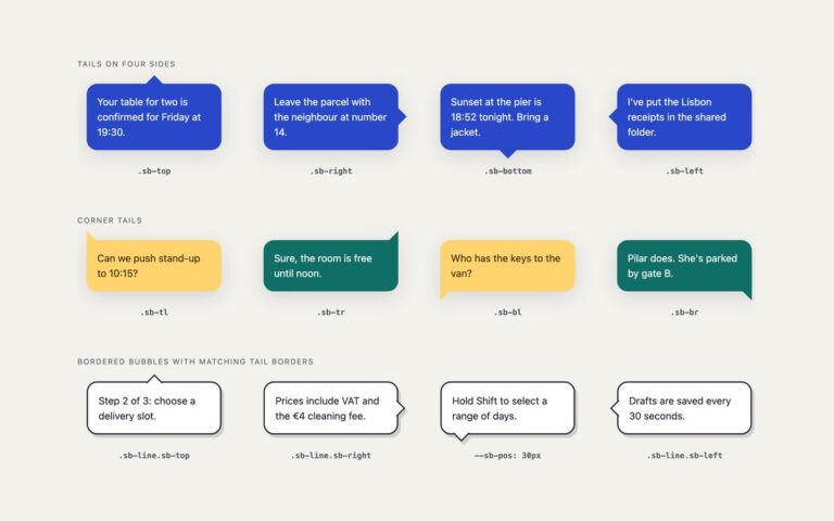
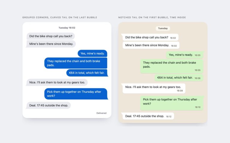
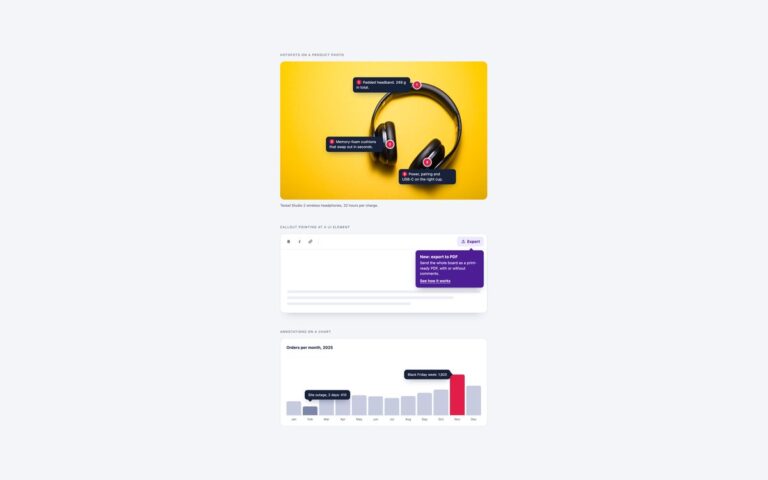
Three bubbles built with CSS features from 2024 and 2025, each behind @supports with a classic bubble as the fallback. Bubble and tail as one shape() draws the corners and a curved, tapering tail as a single clip-path: shape() path written with calc() and percentages, so it stretches with the text; the shadow comes from drop-shadow on a wrapper because clip-path would cut it off. Squircle bubbles with scooped tails uses corner-shape: squircle for the bubble corners and a tail that is one corner of a small box with corner-shape: scoop, so even the outlined bubble’s border follows the tail’s concave curve. Anchored bubble that keeps its tail on the anchor is a seat picker built from radio buttons: the checked seat becomes the anchor, anchor-scope lets every seat reuse the name –seat, and the bubble tries above, below and shifted placements with position-try-fallbacks. Anchored container queries then move the tail to match the placement, so it always points at the seat. It needs no JavaScript.
What’s included
Bubble and tail drawn as one clip-path: shape() path
corner-shape: squircle bubbles with corner-shape: scoop tails
Anchor-positioned bubble with five @position-try placements
Anchored container queries keep the tail on the anchor
Classic fallbacks behind @supports for every technique
Accessibility
Messages start with visually hidden sender names. The seat picker is a radiogroup labelled by its heading, each seat is a native radio with a label that includes its details or the word taken, taken seats are disabled, and the focused seat shows a 2px outline. The visual bubble repeats the label text, so it is aria-hidden.
Customise it
Change --mc-teal, --mc-plum and --mc-ink on .mc for colours. Edit the 18px corner and 60px / 10px tail points in the shape() paths, the corner radii on .mc-sq, and the @position-try rules to change where the seat bubble may go. In Tailwind edit the --color-mc-* theme colours; Bootstrap uses .card stages and .btn-check radios.