About this set
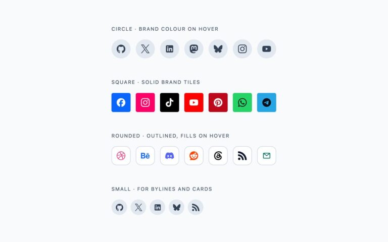
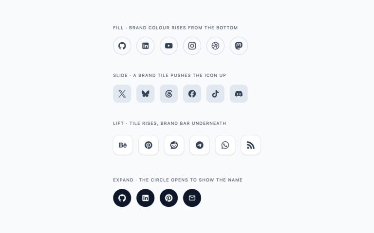
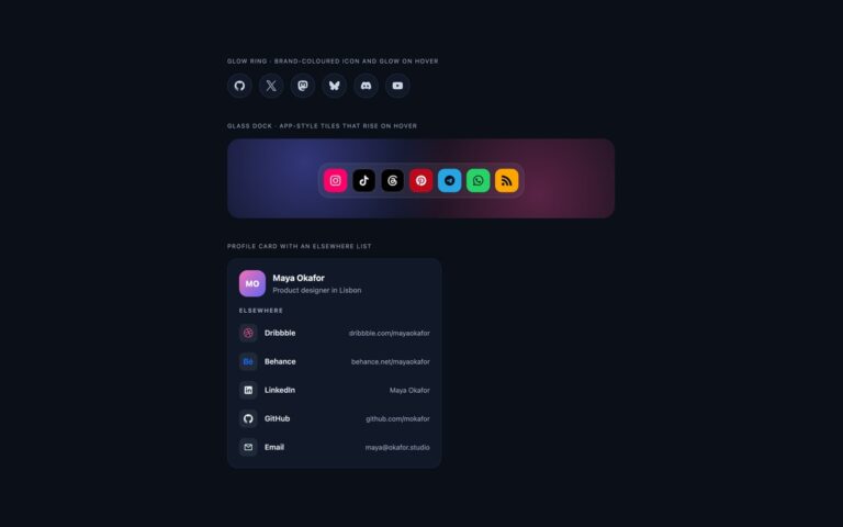
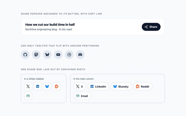
Social icons for designs where full brand colour would be too loud. Outline circles are thin slate rings whose icon and ring take the network’s colour on hover, a good fit for minimal portfolios. Bare glyphs follow a line of text, Follow along, with no container at all, each with a 44 pixel hit area around a 22 pixel logo so it stays easy to tap. The monochrome pill group joins six networks into one bordered control with hairline dividers, and the segment under the pointer or focus inverts to dark. Ink tiles are dark squares with white logos that invert to white on hover, for print-like or editorial layouts. The outline and bare variants use –om-ink, the brand colour where it keeps 3:1 contrast on white, and slate where it does not, so WhatsApp, Telegram and RSS never turn into pale shapes. The pill group and ink tiles stay strictly monochrome. The Bootstrap version uses .btn variables, .btn-group for the pill group and .btn-dark for the ink tiles. No JavaScript.
What’s included
- Outline circles, bare glyphs, a pill group and ink tiles
- Hover colour falls back to slate where a brand colour is too light on white
- Pill group is a labelled group of links built on .btn-group in Bootstrap
- 44 pixel hit areas even for the bare glyphs
- No JavaScript and no icon font
Accessibility
Every link is named by aria-label, such as uiCookies on Mastodon, and its SVG is aria-hidden; the pill group is a role=group labelled uiCookies elsewhere. Each link shows a 3px focus outline, drawn inside the segment for the pill group, and the colour transitions are switched off under prefers-reduced-motion.
Customise it
Change the ring colour in .om-ring, the glyph colour in .om-bare and the dark ink #0f172a in .om-group and .om-tile; per-network hover colours are the --om-ink values in the .om-network classes. In Tailwind swap the #64748b, #475569 and #0f172a colour utilities.