About this set
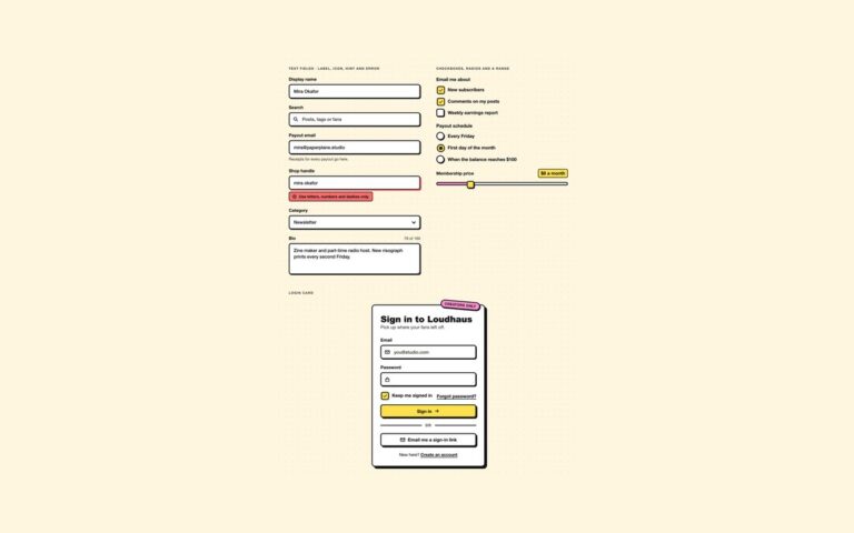
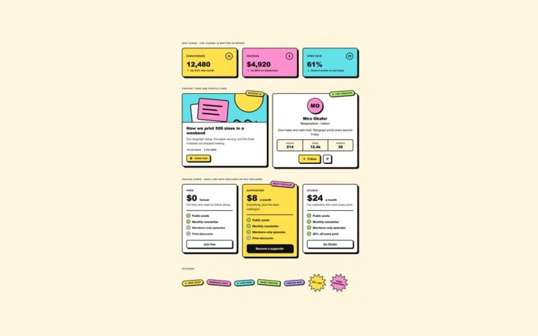
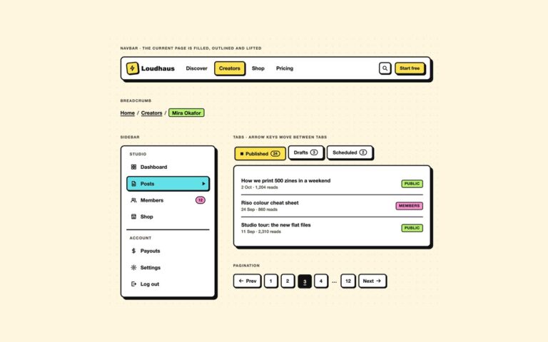
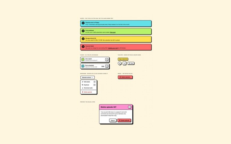
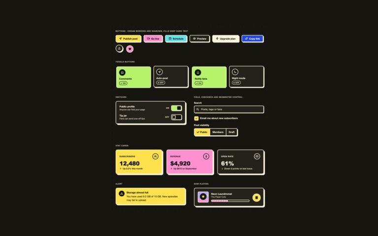
The controls a neobrutalist interface is built from: thick ink borders, hard offset shadows and flat lemon, pink, cyan, lime and blue fills on cream paper. Buttons come in seven fills, three sizes and a disabled state with a dashed border. Hovering lifts a button by two pixels and its shadow grows; pressing moves it into its own shadow, so the click feels physical. Toggle tiles for comments, auto-posting, notifications and a watermark are visually hidden checkboxes behind a face that, when on, is pushed into its shadow, fills lime, turns its icon into a dark disc and swaps a hollow dot and the word Off for a check and the word On. Switch rows pair a label and a hint with a square knob, a lime track and an On or Off word. Round and square icon buttons sit beside a favourite toggle whose outline heart becomes a solid one, and a segmented control picks post visibility from a radio group. Use the buttons for any call to action and the tiles where several settings need to be scanned at a glance. Every colour, border width, shadow offset and radius comes from the shared –nb-* tokens at the top of the file.
What’s included
- Seven fills, three sizes and a dashed disabled state
- Pressed state moves the control into its hard shadow
- Toggle tiles that say On or Off and show a check, not only a colour
- Switch rows with role="switch" and a visible state word
- Segmented control built from a native radio group
Accessibility
Toggles are native checkboxes, switches add role="switch", the segmented control is a fieldset with a legend, and icon-only buttons carry an aria-label. Keyboard focus is a 3px dashed blue outline set apart from the black shadow. Fills keep dark text at 6.8:1 or more and white text appears only on the blue fill, at 6.8:1. Transitions switch off under prefers-reduced-motion.
Customise it
Change --nb-ink, --nb-paper, --nb-bw, --nb-shadow-x, --nb-shadow-y, --nb-radius and the palette tokens such as --nb-lemon at the top. Bootstrap maps them onto --bs-btn-* through .btn-nb and .btn-nb-lemon, and Tailwind exposes them as bg-nb-lemon, shadow-nb, rounded-nb-sm and outline-nb-focus.