About this set
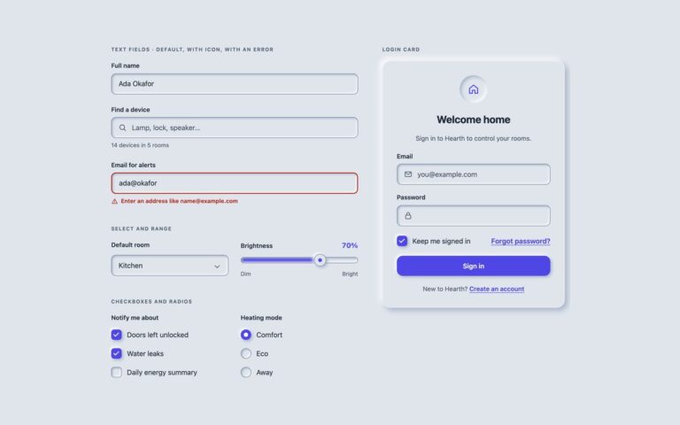
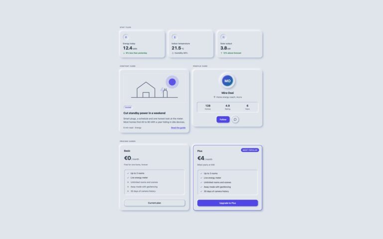
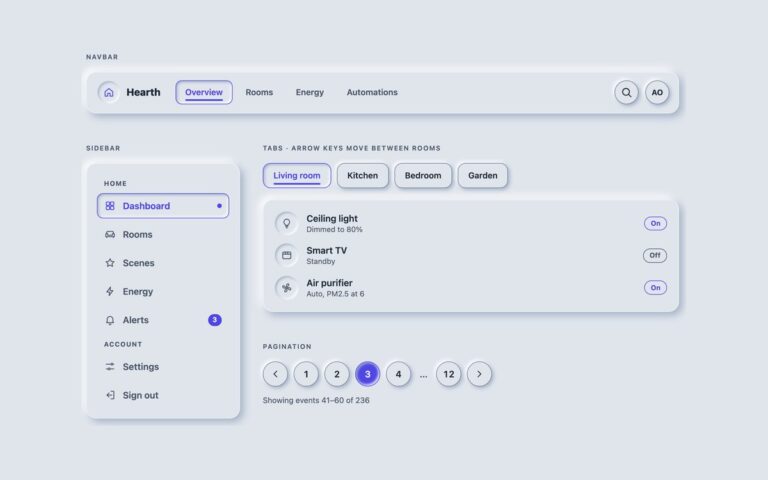
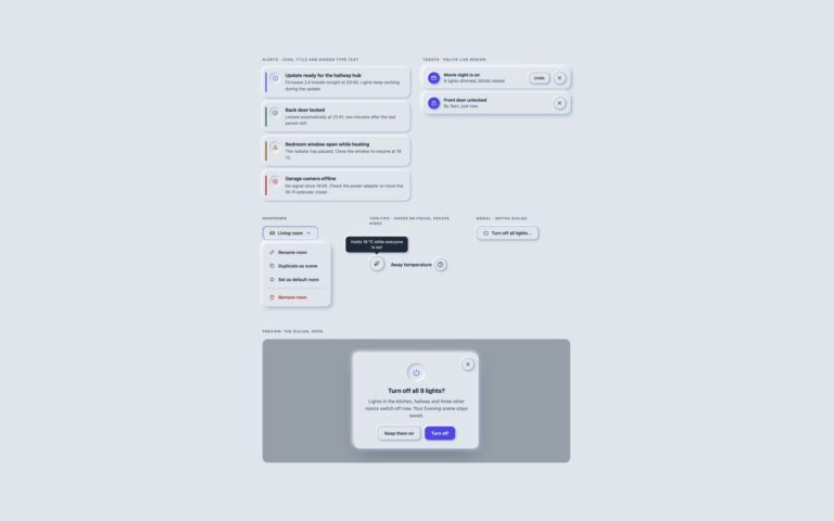
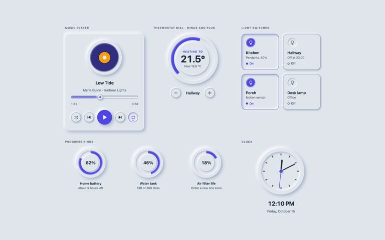
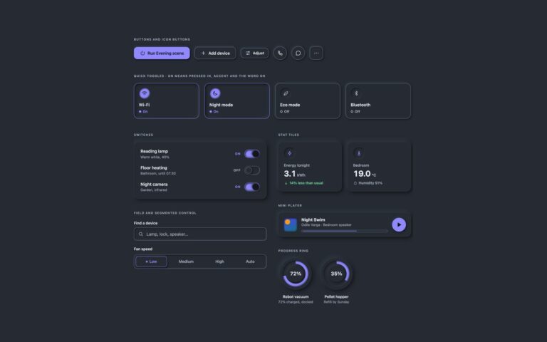
The controls a soft UI is built from, drawn so they stay readable. Raised buttons come in default and accent fills, with icons and a small size, and sink into the surface while they are held. Toggle buttons for Wi-Fi, Bluetooth, Do not disturb and Eco mode press in when they are on and also turn their icon accent, fill a dot and print the word On, so the state never depends on a shadow alone. Round and square icon buttons cover call, message, share and more, next to a favourite toggle whose outline heart becomes a filled one. Switch rows pair a label and a hint with an On or Off word and a track that fills with accent, and a segmented control picks a fan speed. Toggles and switches are visually hidden native checkboxes followed by a face that reacts to :checked, the segmented control is a radio group in a fieldset, and every boundary carries a 1px edge that reaches 3:1 against the background. All colours, shadow distance, blur and radius come from the shared –neu-* tokens at the top of the file.
What’s included
- Raised, pressed and accent buttons with a 3:1 edge
- Toggle tiles that show On by shape, accent colour, a filled dot and text
- Switch rows with role="switch" and a visible On or Off word
- Segmented control built from a native radio group
- Outlined, shadow-free variant under prefers-contrast: more
Accessibility
Toggles are native checkboxes, switches add role="switch", the segmented control is a fieldset with a legend, and icon-only buttons carry an aria-label. Every control shows a 3px accent focus ring that sits outside the shadow. The on state is shown by shape, accent colour and visible text together. Transitions switch off under prefers-reduced-motion, and prefers-contrast: more removes the soft shadows and draws 2px solid outlines.
Customise it
Change --neu-bg, --neu-light, --neu-dark, --neu-distance, --neu-blur, --neu-radius and --neu-accent in the token block at the top. Bootstrap maps the same tokens onto --bs-btn-* through .btn-neu, and Tailwind exposes them as bg-neu-bg, shadow-neu, shadow-neu-in and rounded-neu-btn through an @theme inline block.