About this set
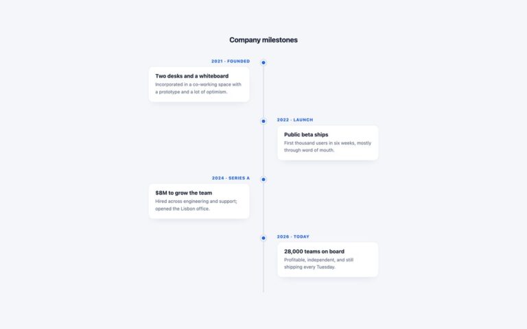
A centred vertical timeline with cards alternating left and right of a gradient line and a rounded icon tile on the line for each milestone. Every card has a small pointer facing the line, an uppercase year, a heading and a sentence. The demo tells a studio’s story in four milestones, from being founded above a bakery to employee ownership, with a building, a lightning bolt, a person and a shield as icons. Use it for an about page, a company history or a product’s major releases where a few milestones need room to breathe. The milestones are an ordered list, and the alternation comes from :nth-child(even), which moves every second item to the right half and flips its icon and pointer, so the markup stays a plain sequence. Below 760 pixels the line moves to the left edge, all cards line up to its right and every pointer faces left, keeping a single readable column on a phone. The years are time elements and the icons are hidden from screen readers. The Bootstrap version uses a .row-item class so Bootstrap’s grid .row is not triggered, and the Tailwind version uses even: and group-even: variants.
What’s included
- Cards alternate sides of a centred gradient line
- Icon tile on the line for each milestone
- Card pointers that face the line
- Single left-aligned column below 760px
- Alternation from :nth-child(even), no extra classes
Accessibility
Milestones are an ordered list in date order with headings and years in time elements, so the reading order is the chronological order on every screen size. The icon tiles are aria-hidden, and the line and pointers are CSS decoration. Body text was darkened to meet 4.5:1, and nothing animates.
Customise it
Change --al-accent, --al-line, --al-border and --al-muted on .alt-tl (plain CSS and Bootstrap), or the --color-al-* theme colours in Tailwind. The 760px media query, or the max-[760px]: prefix, sets when it becomes one column.