About this set
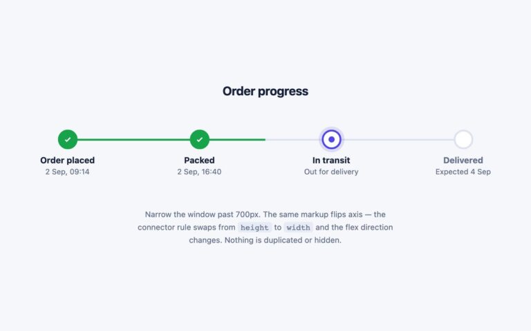
Three small progress trackers sized to sit inside a card, a list row or a table cell rather than take over a page. The segmented bar shows four rounded segments, green for completed steps and a part-filled indigo segment for the current one, with step names underneath and a Step 3 of 4 counter. The dot connector packs the same four steps into one line of dots and joining rules, followed by a short status such as Arrives Thu. The pill row is the smallest: a grey capsule holding four words, with the steps reached so far raised on white pills. Use the bar on order or shipment cards, the dots where only one line is free, and the pills for content workflow states like Draft, Review, Approved and Live. Each tracker is an ordered list, and every step carries visually hidden text saying whether it is done, current or still to do, with aria-current=”step” on the current one, so the state never depends on colour. The bars, dots and lines are decoration. The Bootstrap version wraps each tracker in a .card, and the Tailwind version uses flex and sr-only utilities.
What’s included
- Segmented bar, dot connector and pill row variants
- Each tracker is an ordered list of steps
- Done, current and to-do states in visually hidden text
- aria-current="step" on the current step
- Fits inside a card or a table cell
Accessibility
Each tracker is an ordered list whose items end with visually hidden state text, for example Transit (current step), and the current item has aria-current="step". Dots, segments and connecting lines are aria-hidden or empty decoration. The step labels and pill text were darkened to meet 4.5:1, and nothing animates.
Customise it
Change --ct-done, --ct-now and --ct-off on .ct for the step colours and --ct-muted or --ct-light for the secondary text (plain CSS and Bootstrap), or the --color-ct-* theme colours in Tailwind. The current segment's fill is the 60% stop in its gradient.