Open demo

CSS code

HTML
<div class="decade-tl">
  <span class="line" aria-hidden="true"></span>
  <span class="tick" style="--x:2%" aria-hidden="true"></span>
  <span class="tick" style="--x:11%" aria-hidden="true"></span>
  <span class="tick" style="--x:31%" aria-hidden="true"></span>
  <span class="tick" style="--x:56%" aria-hidden="true"></span>
  <span class="tick" style="--x:78%" aria-hidden="true"></span>
  <span class="tick" style="--x:97%" aria-hidden="true"></span>
  <ol class="evs">
    <li class="ev up" style="--x:2%"><time datetime="1991">1991</time><span>The first web page goes live at CERN</span></li>
    <li class="ev dn" style="--x:11%"><time datetime="1993">1993</time><span>Mosaic makes images inline</span></li>
    <li class="ev up" style="--x:31%"><time datetime="1996">1996</time><span>CSS 1 published</span></li>
    <li class="ev dn" style="--x:56%"><time datetime="2010">2010</time><span>Media queries; responsive design named</span></li>
    <li class="ev up" style="--x:78%"><time datetime="2017">2017</time><span>Grid ships in every major browser</span></li>
    <li class="ev dn" style="--x:97%"><time datetime="2024">2024</time><span>Container queries and :has() land</span></li>
  </ol>
  <div class="scale" aria-hidden="true"><span>1990</span><span>2000</span><span>2010</span><span>2020</span><span>2026</span></div>
</div>
CSS
/* Proportional axis: each event's --x is its position along the axis. The <ol> carries the events;
   the line, ticks and scale are decoration. Below 760px the axis becomes a plain vertical list. */
.decade-tl{--dt-accent:#4f46e5;--dt-from:#c7d0e4;--dt-stem:#d5dcec;--dt-muted:#5f6a86;--dt-scale:#646f8b;
  position:relative;width:100%;max-width:900px;height:230px;margin-top:10px}
.decade-tl,.decade-tl *{box-sizing:border-box}
.decade-tl .line{position:absolute;top:50%;left:0;right:0;height:3px;background:linear-gradient(90deg,var(--dt-from),var(--dt-accent));
  border-radius:99px}
.decade-tl .tick{position:absolute;top:50%;left:var(--x);transform:translate(-50%,-50%);width:14px;height:14px;
  border-radius:50%;background:#fff;border:3px solid var(--dt-accent);z-index:2}
.decade-tl .evs{position:absolute;inset:0;margin:0;padding:0;list-style:none}
.decade-tl .ev{position:absolute;left:var(--x);width:150px;transform:translateX(-50%);text-align:center}
.decade-tl .ev.up{bottom:calc(50% + 26px)}
.decade-tl .ev.dn{top:calc(50% + 26px)}
.decade-tl .ev time{display:block;font-size:.92rem;font-weight:700;color:var(--dt-accent);letter-spacing:-.01em}
.decade-tl .ev span{display:block;font-size:.78rem;color:var(--dt-muted);line-height:1.5;margin-top:3px}
.decade-tl .ev::after{content:"";position:absolute;left:50%;width:2px;background:var(--dt-stem)}
.decade-tl .ev.up::after{top:100%;height:20px}
.decade-tl .ev.dn::after{bottom:100%;height:20px}
.decade-tl .scale{position:absolute;top:calc(50% + 4px);left:0;right:0;display:flex;justify-content:space-between;
  font-size:.7rem;color:var(--dt-scale);padding-top:12px}
@media(max-width:760px){
  .decade-tl{height:auto;max-width:330px}
  .decade-tl .line,.decade-tl .scale,.decade-tl .tick{display:none}
  .decade-tl .evs{position:static;display:flex;flex-direction:column;gap:16px}
  .decade-tl .ev{position:static;width:100%;transform:none;text-align:left;border-left:3px solid var(--dt-accent);
    padding-left:14px}
  .decade-tl .ev::after{display:none}
}

Bootstrap 5 code

Requires: Bootstrap 5.3.8 CSS

HTML
<div class="decade-tl position-relative w-100">
  <span class="line position-absolute top-50 rounded-pill" aria-hidden="true"></span>
  <span class="tick position-absolute top-50 rounded-circle bg-white" style="--x:2%" aria-hidden="true"></span>
  <span class="tick position-absolute top-50 rounded-circle bg-white" style="--x:11%" aria-hidden="true"></span>
  <span class="tick position-absolute top-50 rounded-circle bg-white" style="--x:31%" aria-hidden="true"></span>
  <span class="tick position-absolute top-50 rounded-circle bg-white" style="--x:56%" aria-hidden="true"></span>
  <span class="tick position-absolute top-50 rounded-circle bg-white" style="--x:78%" aria-hidden="true"></span>
  <span class="tick position-absolute top-50 rounded-circle bg-white" style="--x:97%" aria-hidden="true"></span>
  <ol class="evs list-unstyled m-0">
    <li class="ev up" style="--x:2%"><time class="d-block fw-bold" datetime="1991">1991</time><span class="d-block">The first web page goes live at CERN</span></li>
    <li class="ev dn" style="--x:11%"><time class="d-block fw-bold" datetime="1993">1993</time><span class="d-block">Mosaic makes images inline</span></li>
    <li class="ev up" style="--x:31%"><time class="d-block fw-bold" datetime="1996">1996</time><span class="d-block">CSS 1 published</span></li>
    <li class="ev dn" style="--x:56%"><time class="d-block fw-bold" datetime="2010">2010</time><span class="d-block">Media queries; responsive design named</span></li>
    <li class="ev up" style="--x:78%"><time class="d-block fw-bold" datetime="2017">2017</time><span class="d-block">Grid ships in every major browser</span></li>
    <li class="ev dn" style="--x:97%"><time class="d-block fw-bold" datetime="2024">2024</time><span class="d-block">Container queries and :has() land</span></li>
  </ol>
  <div class="scale position-absolute d-flex justify-content-between" aria-hidden="true"><span>1990</span><span>2000</span><span>2010</span><span>2020</span><span>2026</span></div>
</div>
CSS
/* Bootstrap utilities for the static parts; placement along the axis (--x) and the mobile list are custom CSS. */
.decade-tl{--dt-accent:#4f46e5;--dt-from:#c7d0e4;--dt-stem:#d5dcec;--dt-muted:#5f6a86;--dt-scale:#646f8b;
  max-width:900px;height:230px;margin-top:10px}
.decade-tl .line{left:0;right:0;height:3px;background:linear-gradient(90deg,var(--dt-from),var(--dt-accent))}
.decade-tl .tick{left:var(--x);transform:translate(-50%,-50%);width:14px;height:14px;border:3px solid var(--dt-accent);z-index:2}
.decade-tl .evs{position:absolute;inset:0}
.decade-tl .ev{position:absolute;left:var(--x);width:150px;transform:translateX(-50%);text-align:center}
.decade-tl .ev.up{bottom:calc(50% + 26px)}
.decade-tl .ev.dn{top:calc(50% + 26px)}
.decade-tl .ev time{font-size:.92rem;color:var(--dt-accent);letter-spacing:-.01em}
.decade-tl .ev span{font-size:.78rem;color:var(--dt-muted);line-height:1.5;margin-top:3px}
.decade-tl .ev::after{content:"";position:absolute;left:50%;width:2px;background:var(--dt-stem)}
.decade-tl .ev.up::after{top:100%;height:20px}
.decade-tl .ev.dn::after{bottom:100%;height:20px}
.decade-tl .scale{top:calc(50% + 4px);left:0;right:0;font-size:.7rem;color:var(--dt-scale);padding-top:12px}
@media(max-width:760px){
  .decade-tl{height:auto;max-width:330px}
  .decade-tl .line,.decade-tl .scale,.decade-tl .tick{display:none!important}
  .decade-tl .evs{position:static;display:flex;flex-direction:column;gap:16px}
  .decade-tl .ev{position:static;width:100%;transform:none;text-align:left;border-left:3px solid var(--dt-accent);
    padding-left:14px}
  .decade-tl .ev::after{display:none}
}

Tailwind 4 code

Requires: Tailwind CSS 4

HTML
<div class="relative mt-2.5 h-[230px] w-full max-w-[900px] max-[760px]:h-auto max-[760px]:max-w-[330px]">
  <span class="absolute top-1/2 right-0 left-0 h-[3px] rounded-full bg-[linear-gradient(90deg,var(--color-dt-from),var(--color-dt-accent))] max-[760px]:hidden" aria-hidden="true"></span>
  <span class="absolute top-1/2 left-[var(--x)] z-[2] size-3.5 -translate-1/2 rounded-full border-3 border-dt-accent bg-white max-[760px]:hidden" style="--x:2%" aria-hidden="true"></span>
  <span class="absolute top-1/2 left-[var(--x)] z-[2] size-3.5 -translate-1/2 rounded-full border-3 border-dt-accent bg-white max-[760px]:hidden" style="--x:11%" aria-hidden="true"></span>
  <span class="absolute top-1/2 left-[var(--x)] z-[2] size-3.5 -translate-1/2 rounded-full border-3 border-dt-accent bg-white max-[760px]:hidden" style="--x:31%" aria-hidden="true"></span>
  <span class="absolute top-1/2 left-[var(--x)] z-[2] size-3.5 -translate-1/2 rounded-full border-3 border-dt-accent bg-white max-[760px]:hidden" style="--x:56%" aria-hidden="true"></span>
  <span class="absolute top-1/2 left-[var(--x)] z-[2] size-3.5 -translate-1/2 rounded-full border-3 border-dt-accent bg-white max-[760px]:hidden" style="--x:78%" aria-hidden="true"></span>
  <span class="absolute top-1/2 left-[var(--x)] z-[2] size-3.5 -translate-1/2 rounded-full border-3 border-dt-accent bg-white max-[760px]:hidden" style="--x:97%" aria-hidden="true"></span>
  <ol class="absolute inset-0 max-[760px]:static max-[760px]:flex max-[760px]:flex-col max-[760px]:gap-4">
    <li class="absolute bottom-[calc(50%+26px)] after:top-full left-[var(--x)] w-[150px] -translate-x-1/2 text-center after:absolute after:left-1/2 after:h-5 after:w-0.5 after:bg-dt-stem max-[760px]:static max-[760px]:w-full max-[760px]:translate-x-0 max-[760px]:border-l-3 max-[760px]:border-dt-accent max-[760px]:pl-3.5 max-[760px]:text-left max-[760px]:after:hidden" style="--x:2%"><time class="block text-[.92rem] font-bold tracking-[-.01em] text-dt-accent" datetime="1991">1991</time><span class="mt-[3px] block text-[.78rem] leading-[1.5] text-dt-muted">The first web page goes live at CERN</span></li>
    <li class="absolute top-[calc(50%+26px)] after:bottom-full left-[var(--x)] w-[150px] -translate-x-1/2 text-center after:absolute after:left-1/2 after:h-5 after:w-0.5 after:bg-dt-stem max-[760px]:static max-[760px]:w-full max-[760px]:translate-x-0 max-[760px]:border-l-3 max-[760px]:border-dt-accent max-[760px]:pl-3.5 max-[760px]:text-left max-[760px]:after:hidden" style="--x:11%"><time class="block text-[.92rem] font-bold tracking-[-.01em] text-dt-accent" datetime="1993">1993</time><span class="mt-[3px] block text-[.78rem] leading-[1.5] text-dt-muted">Mosaic makes images inline</span></li>
    <li class="absolute bottom-[calc(50%+26px)] after:top-full left-[var(--x)] w-[150px] -translate-x-1/2 text-center after:absolute after:left-1/2 after:h-5 after:w-0.5 after:bg-dt-stem max-[760px]:static max-[760px]:w-full max-[760px]:translate-x-0 max-[760px]:border-l-3 max-[760px]:border-dt-accent max-[760px]:pl-3.5 max-[760px]:text-left max-[760px]:after:hidden" style="--x:31%"><time class="block text-[.92rem] font-bold tracking-[-.01em] text-dt-accent" datetime="1996">1996</time><span class="mt-[3px] block text-[.78rem] leading-[1.5] text-dt-muted">CSS 1 published</span></li>
    <li class="absolute top-[calc(50%+26px)] after:bottom-full left-[var(--x)] w-[150px] -translate-x-1/2 text-center after:absolute after:left-1/2 after:h-5 after:w-0.5 after:bg-dt-stem max-[760px]:static max-[760px]:w-full max-[760px]:translate-x-0 max-[760px]:border-l-3 max-[760px]:border-dt-accent max-[760px]:pl-3.5 max-[760px]:text-left max-[760px]:after:hidden" style="--x:56%"><time class="block text-[.92rem] font-bold tracking-[-.01em] text-dt-accent" datetime="2010">2010</time><span class="mt-[3px] block text-[.78rem] leading-[1.5] text-dt-muted">Media queries; responsive design named</span></li>
    <li class="absolute bottom-[calc(50%+26px)] after:top-full left-[var(--x)] w-[150px] -translate-x-1/2 text-center after:absolute after:left-1/2 after:h-5 after:w-0.5 after:bg-dt-stem max-[760px]:static max-[760px]:w-full max-[760px]:translate-x-0 max-[760px]:border-l-3 max-[760px]:border-dt-accent max-[760px]:pl-3.5 max-[760px]:text-left max-[760px]:after:hidden" style="--x:78%"><time class="block text-[.92rem] font-bold tracking-[-.01em] text-dt-accent" datetime="2017">2017</time><span class="mt-[3px] block text-[.78rem] leading-[1.5] text-dt-muted">Grid ships in every major browser</span></li>
    <li class="absolute top-[calc(50%+26px)] after:bottom-full left-[var(--x)] w-[150px] -translate-x-1/2 text-center after:absolute after:left-1/2 after:h-5 after:w-0.5 after:bg-dt-stem max-[760px]:static max-[760px]:w-full max-[760px]:translate-x-0 max-[760px]:border-l-3 max-[760px]:border-dt-accent max-[760px]:pl-3.5 max-[760px]:text-left max-[760px]:after:hidden" style="--x:97%"><time class="block text-[.92rem] font-bold tracking-[-.01em] text-dt-accent" datetime="2024">2024</time><span class="mt-[3px] block text-[.78rem] leading-[1.5] text-dt-muted">Container queries and :has() land</span></li>
  </ol>
  <div class="absolute top-[calc(50%+4px)] right-0 left-0 flex justify-between pt-3 text-[.7rem] text-dt-scale max-[760px]:hidden" aria-hidden="true"><span>1990</span><span>2000</span><span>2010</span><span>2020</span><span>2026</span></div>
</div>
CSS
@theme {
  --color-dt-accent: #4f46e5;
  --color-dt-from: #c7d0e4;
  --color-dt-stem: #d5dcec;
  --color-dt-muted: #5f6a86;
  --color-dt-scale: #646f8b;
}

About this set

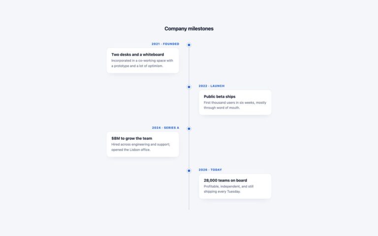
A horizontal timeline where events sit at their true distance along a dated axis instead of being spaced evenly, so a gap of fourteen years looks longer than a gap of two. The demo plots six moments in the history of the web from 1991 to 2024 on a gradient line with a decade scale underneath, alternating the labels above and below the line and joining each one to the axis with a short stem. Use it for histories, research timelines or any story where the spacing between dates matters. Each event has a –x custom property, a percentage along the axis, which positions both its tick and its label; the events themselves are an ordered list with the year in a time element. The line, ticks, stems and scale numbers are decoration and are hidden from screen readers. Below 760 pixels the axis is dropped and the same list becomes a simple vertical stack with an indigo rule beside each entry, which keeps every label readable on a phone. The Bootstrap and Tailwind versions place events through the same –x variable, with left-[var(–x)] doing the work in Tailwind.

What’s included

  • Events positioned proportionally with a --x custom property
  • Labels alternate above and below the axis with stems
  • Decade scale under a gradient line
  • Becomes a vertical list below 760px
  • Years in time elements, decoration hidden from screen readers

Accessibility

The events are an ordered list in date order with each year in a time element, so a screen reader reads a clean chronology. The axis line, ticks and scale are aria-hidden, and stems are CSS pseudo-elements. Text, including the scale numbers, meets 4.5:1 contrast, and nothing animates.

Customise it

Set each event's --x (and its tick's) to the date's position as a percentage. Colours are --dt-accent, --dt-from, --dt-stem and --dt-muted on .decade-tl (plain CSS and Bootstrap) or --color-dt-* in Tailwind; the 760px media query sets when it stacks.