About this set
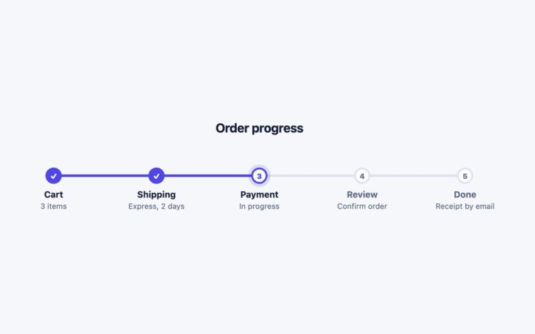
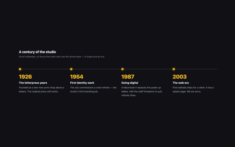
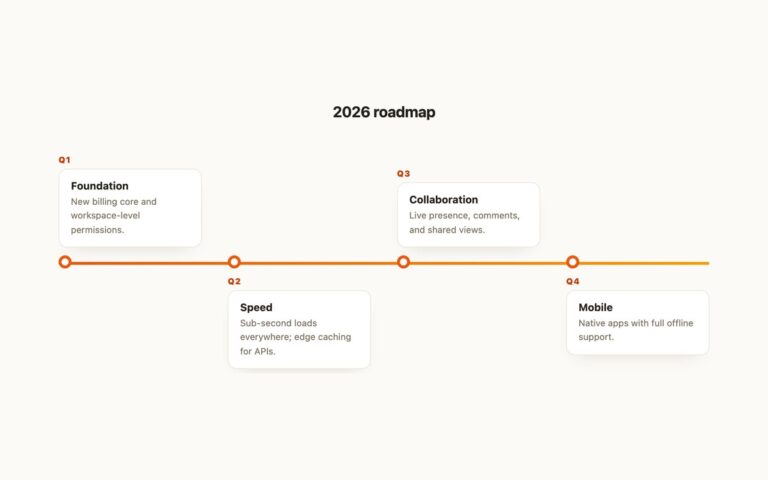
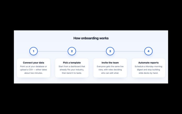
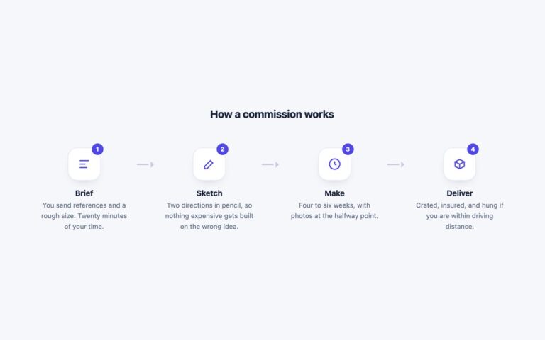
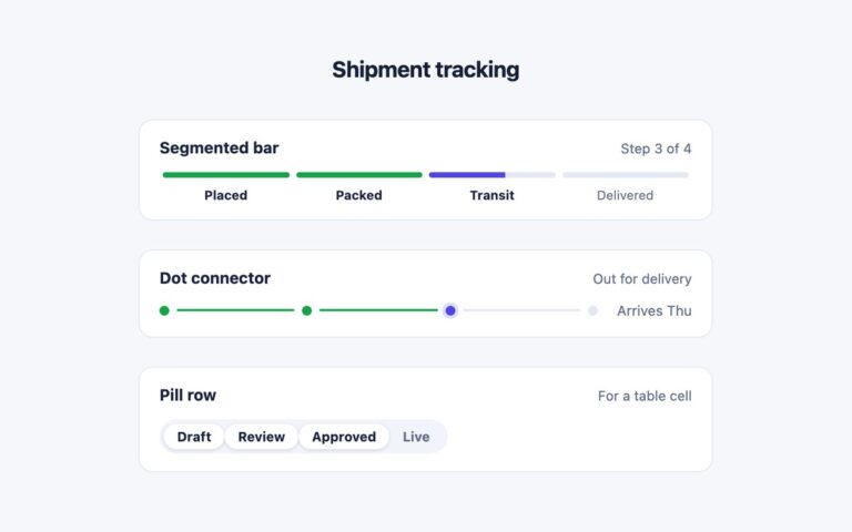
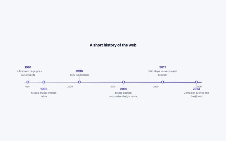
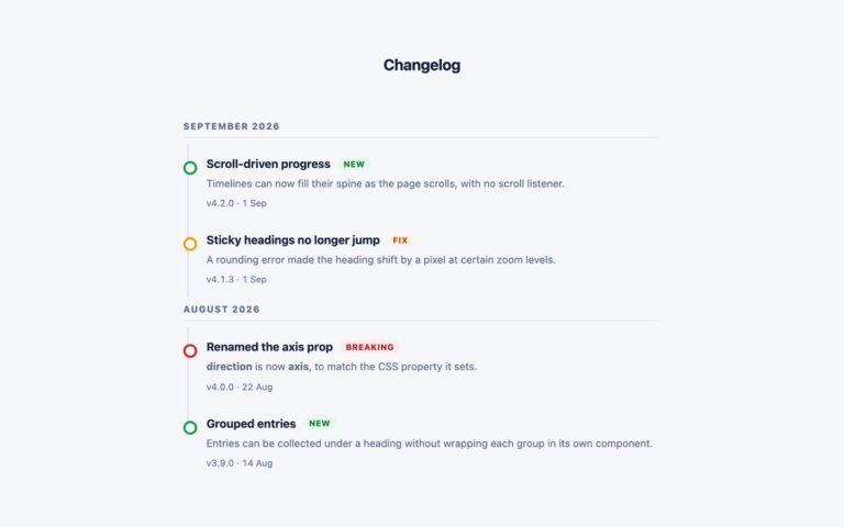
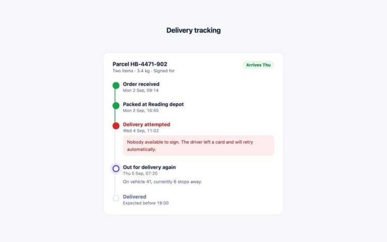
A progress timeline that runs horizontally on wide screens and turns into a vertical list below 700 pixels, from one piece of markup. The demo is an order tracker with four steps: two completed steps with green filled circles and a tick, a current step with an indigo ring and an inner dot, and an upcoming step in a plain grey ring with a lighter heading. Use it for order status, onboarding progress or any short sequence that has to fit a desktop header and a phone screen. The steps are an ordered list. A pseudo-element on each step draws the connector, and at the breakpoint a single media query switches the list to a column and swaps the connector from a 3 pixel tall bar to a 3 pixel wide one, so nothing is duplicated or hidden. Each step carries its state as visually hidden text, done, current step or not yet, and the current one also has aria-current=”step”, so the progress is not conveyed by colour alone. Dates use time elements. The Bootstrap version keeps the axis flip in a small custom block, and the Tailwind version does it with max-[700px]: variants.
What’s included
- One ordered list that is horizontal above 700px and vertical below
- Done, current and upcoming states with a tick, a ring and a plain circle
- State written in visually hidden text plus aria-current="step"
- Connector drawn with pseudo-elements, no extra markup
- Timestamps marked up with time elements
Accessibility
Steps are an ordered list, and each heading ends with visually hidden text giving its state, so a screen reader hears for example In transit (current step); the current item also carries aria-current="step". The circles, ticks and connector lines are aria-hidden or CSS decoration. Text colours meet 4.5:1, and nothing animates.
Customise it
Change --ft-done, --ft-now, --ft-line and --ft-todo on .flip-tl (plain CSS and Bootstrap) or the --color-ft-* theme colours (Tailwind). Edit the 700px media query, or the max-[700px]: prefix in Tailwind, to move the breakpoint.