About this set
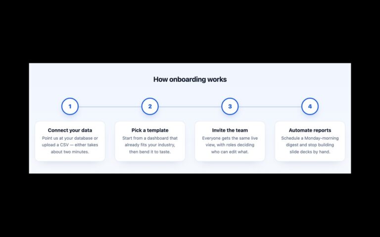
A four-stage process strip with an icon tile, a number badge, a short heading and a sentence per stage, joined by small CSS arrows. The demo explains how a commission works, from brief and sketch to make and deliver, and the same layout suits a how-it-works section on a service page, a hiring process or an onboarding overview. Each stage has a 62 pixel rounded white tile with a soft shadow holding a line icon, and an indigo badge with the step number sits on its top right corner. The stages are an ordered list laid out with flexbox and a 42 pixel gap, and the arrows live in that gap: each stage except the last draws a short line with ::before and a triangle with ::after, so the list contains nothing but list items. Below 760 pixels the list becomes a single column and the arrows turn to point downwards. Icons and number badges are hidden from screen readers because the ordered list already gives the numbering. The Bootstrap version uses its flex and list utilities with the arrows in a small custom block, and the Tailwind version draws the arrows with not-last:before: and not-last:after: utilities.
What’s included
- Four stages with an icon tile, number badge, heading and text
- Connector arrows drawn with pseudo-elements in the flex gap
- Clean ordered list with no decorative list items
- Stacks into one column with downward arrows below 760px
- Inline SVG icons, no icon font
Accessibility
The stages are an ordered list, so screen readers announce the count and position; the visible number badges and icons are aria-hidden to avoid repeating it. Headings and body text meet 4.5:1 contrast, and the arrows are pure CSS decoration. Nothing animates.
Customise it
Change --pr-accent for the icons and badges, --pr-arrow for the connectors and --pr-muted for the body text on .proc (plain CSS and Bootstrap), or the --color-pr-* theme colours in Tailwind. The 760px media query controls when the strip stacks.