About this set
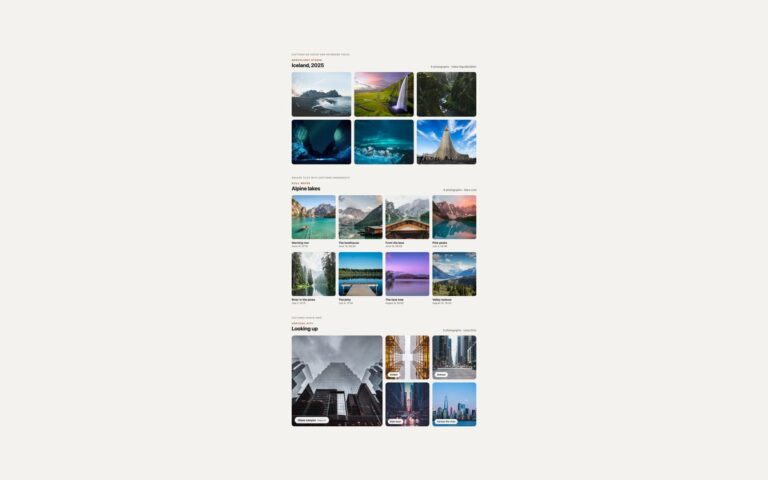
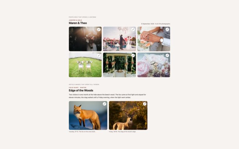
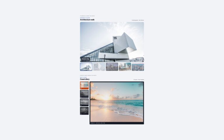
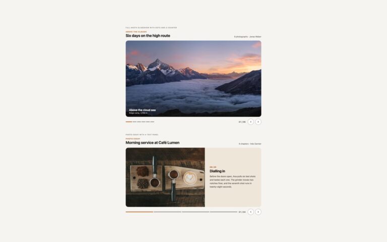
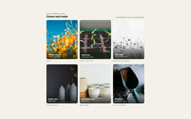
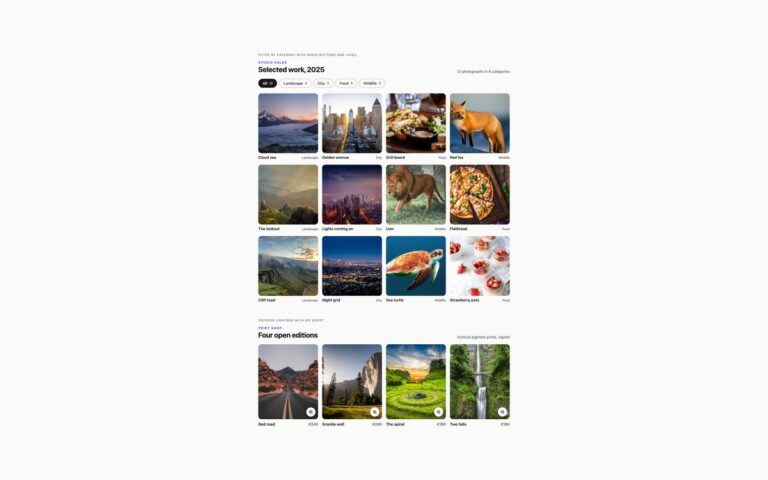
Two masonry layouts for photos that do not share one shape. Column masonry puts twelve forest and coast photographs of different heights into three columns, two on phones, using CSS multi-column layout, so every photo keeps its own proportions and a short caption sits under each one. It is the quickest masonry to build and suits portfolios, mood boards and travel journals; the order runs down each column rather than across. Grid masonry with wide and tall tiles is a twelve-dish food shoot on CSS Grid: rows have a fixed height, ordinary tiles span two rows, tall tiles span three and wide tiles span two columns and three rows, and grid-auto-flow: dense packs them so the edges come out flush, on four columns or two. Here the order runs across, and the dark caption pill sits on each photo. Bootstrap 5 has no masonry layout of its own, so the Bootstrap version uses the same CSS columns and grid with .figure, .badge and the display utilities, and the Tailwind version uses columns-*, break-inside-avoid, row-span and grid-flow-row-dense. No JavaScript.
What’s included
- CSS multi-column masonry that keeps every photo at its own aspect ratio
- Grid masonry with tall and wide tiles packed flush by grid-auto-flow: dense
- Two columns on phones, three or four on wider screens
- No JavaScript and no masonry library
- Row height, gaps and column count set with custom properties
Accessibility
Each photo has descriptive alt text, and the short visible captions name the shot rather than repeat the description. The galleries are plain lists of figures with nothing to operate, so there is no keyboard trap or hidden content. Nothing animates. In the column layout screen readers read the photos in source order, which runs down each column.
Customise it
Set --ms-cols and --ms-gap on .ms for the column masonry, and --mg-row and --mg-gap on .mg for the grid version; add .mg-tall or .mg-wide to any tile to change its size. In Tailwind change columns-2 md:columns-3, auto-rows-[110px] and the row-span-* or col-span-2 classes.