About this set
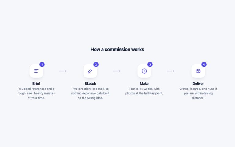
Four onboarding milestones in a row: Connect your data, Pick a template, Invite the team and Automate reports. Each step has a large numbered circle with a blue ring and a soft blue shadow, joined to its neighbours by a pale line, and a centred card below with a heading and two lines of text. The cards stretch to equal height, so uneven copy still lines up. Use it for how it works sections on landing pages, onboarding explainers and short processes of three to five steps where each step needs a sentence. The steps are an ordered list. The circles are aria-hidden and each heading starts with visually hidden text such as Step 1, so a screen reader hears the number once, in the heading, instead of a stray digit. Cards lift 4 pixels on hover, which stops under prefers-reduced-motion. Under 720 pixels the row becomes a single column of steps at most 340 pixels wide and the connecting line is hidden. The Bootstrap version uses .card, .rounded-circle and .visually-hidden, and the Tailwind version uses first: and last: variants to trim the line at the ends.
What’s included
- Numbered circles joined by a connecting line
- Equal-height cards across the row
- Step number moved into each heading as hidden text
- Single column under 720px
- Hover lift switched off under reduced motion
Accessibility
The milestones are an ordered list with a heading each. The visible numbers are aria-hidden and repeated as visually hidden Step 1 to Step 4 text at the start of each heading, so headings are meaningful on their own in a headings list. Text passes 4.5:1. The hover transform is removed when reduced motion is requested.
Customise it
Change --mst-accent, --mst-line and --mst-muted on .mst; Bootstrap cards also take --bs-card-border-color and --bs-card-spacer-x. In Tailwind edit border-[#2563eb], bg-[#c9d8f2] on the line and the min-[721px]: breakpoint.