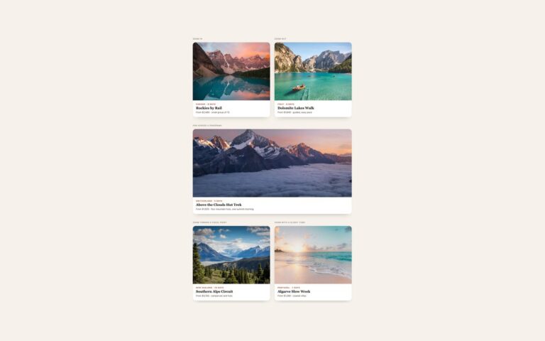
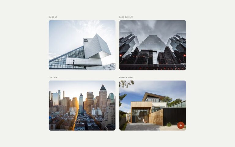
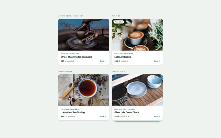
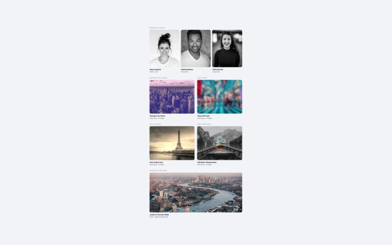
<div class="full"><span class="lbl">:has() sibling dimming</span>
<div class="mg-gal">
  <a href="#" class="mg-item"><span class="mg-ph"><img src="https://images.unsplash.com/photo-1485955900006-10f4d324d411?auto=format&fit=crop&w=450&h=600&q=70" alt="A spiky succulent in a mint-green pot on a white table" width="450" height="600"></span><b>Aloe in Mint Pot</b><small>$24</small></a>
  <a href="#" class="mg-item"><span class="mg-ph"><img src="https://images.unsplash.com/photo-1463936575829-25148e1db1b8?auto=format&fit=crop&w=450&h=600&q=70" alt="A row of green cacti against a pale sky" width="450" height="600"></span><b>Cactus Trio</b><small>$38</small></a>
  <a href="#" class="mg-item"><span class="mg-ph"><img src="https://images.unsplash.com/photo-1610701596007-11502861dcfa?auto=format&fit=crop&w=450&h=600&q=70" alt="Speckled cream ceramic cups and bowls on a white shelf" width="450" height="600"></span><b>Speckled Cup Set</b><small>$46</small></a>
  <a href="#" class="mg-item"><span class="mg-ph"><img src="https://images.unsplash.com/photo-1565193566173-7a0ee3dbe261?auto=format&fit=crop&w=450&h=600&q=70" alt="Three grey stoneware vases with dried seed heads against a dark wall" width="450" height="600"></span><b>Stoneware Vases</b><small>$58</small></a>
  <a href="#" class="mg-item"><span class="mg-ph"><img src="https://images.unsplash.com/photo-1466692476868-aef1dfb1e735?auto=format&fit=crop&w=450&h=600&q=70" alt="Young seedlings sprouting in a dark seed tray" width="450" height="600"></span><b>Seedling Starter Kit</b><small>$19</small></a>
</div></div>
<div><span class="lbl">@property gradient border</span>
<div class="mg-pair">
  <a href="#" class="mg-ring"><span class="mg-ring-ph"><img src="https://images.unsplash.com/photo-1542291026-7eec264c27ff?auto=format&fit=crop&w=500&h=500&q=70" alt="A red running shoe on a red background" width="500" height="500"></span><b>Trail Runner 2</b><small>$139 · 6 colours</small></a>
  <a href="#" class="mg-ring"><span class="mg-ring-ph"><img src="https://images.unsplash.com/photo-1523275335684-37898b6baf30?auto=format&fit=crop&w=500&h=500&q=70" alt="Two white smartwatches lying on a light grey surface" width="500" height="500"></span><b>Halo Watch</b><small>$219 · 2 sizes</small></a>
</div></div>
<div><span class="lbl">View-transition-style crossfade</span>
<a href="#" class="mg-xf"><span class="mg-xf-ph"><img src="https://images.unsplash.com/photo-1600585154340-be6161a56a0c?auto=format&fit=crop&w=900&h=675&q=70" alt="A modern house with large lit windows and a lawn at dusk" width="900" height="675"><img src="https://images.unsplash.com/photo-1600607687939-ce8a6c25118c?auto=format&fit=crop&w=900&h=675&q=70" alt="Its open-plan living room with a white sofa and timber wall" width="900" height="675">
  <span class="mg-xf-tag"><span>Outside · 1/2</span><span>Living room · 2/2</span></span></span>
  <span class="mg-xf-body"><b>Cedar Ridge House</b><small>4 bed · 3 bath · 2,480 sq ft</small><strong>$1,185,000</strong></span></a></div>
<div class="full"><span class="lbl">Container-query sized effect (280px and wide container)</span>
<div class="cq-demo">
  <div class="mg-cq-box"><a href="#" class="mg-cq"><img src="https://images.unsplash.com/photo-1500530855697-b586d89ba3ee?auto=format&fit=crop&w=600&h=450&q=70" alt="A straight road running between red rock cliffs" width="600" height="450">
    <span class="mg-cq-title" aria-hidden="true">Red Rock Road Trip</span>
    <span class="mg-cq-panel"><i>Road trip · 4 days</i><b>Red Rock Road Trip</b><span>Two canyons, a ghost town and a night under dark skies.</span><strong>From $640</strong></span></a></div>
  <div class="mg-cq-box"><a href="#" class="mg-cq"><img src="https://images.unsplash.com/photo-1469474968028-56623f02e42e?auto=format&fit=crop&w=1200&h=675&q=70" alt="Sunlight breaking over misty green hills and rocky outcrops" width="1200" height="675">
    <span class="mg-cq-title" aria-hidden="true">Highland Mist Weekend</span>
    <span class="mg-cq-panel"><i>Walking · 3 days</i><b>Highland Mist Weekend</b><span>Ridge walks at sunrise, a bothy night and a distillery lunch.</span><strong>From $480</strong></span></a></div>
</div></div>
CSS
/* Hover effects that used to need JavaScript: :has(), @property, a plus-lighter crossfade and container
   queries. Each one degrades to a plain hover where the feature is missing. */
.mg-gal,.mg-pair,.mg-xf,.mg-cq-box{--mg-ink:#0f172a;--mg-muted:#475569;--mg-accent:#047857;--mg-ease:cubic-bezier(.2,.7,.2,1)}

/* 1. :has() sibling dimming: hovering or focusing one item fades the rest */
.mg-gal{display:grid;grid-template-columns:repeat(5,minmax(0,1fr));gap:16px}
.mg-item{display:block;border-radius:14px;color:var(--mg-ink);text-decoration:none;line-height:1.35;
  transition:opacity .35s,filter .35s,transform .35s var(--mg-ease)}
.mg-item:focus-visible{outline:3px solid var(--mg-accent);outline-offset:4px}
.mg-ph{display:block;aspect-ratio:3/4;overflow:hidden;border-radius:14px;background:#e2e8f0}
.mg-ph img{display:block;width:100%;height:100%;object-fit:cover}
.mg-item b{display:block;margin-top:10px;font-size:.92rem}
.mg-item small{font-size:.85rem;color:var(--mg-muted)}
.mg-item:is(:hover,:focus-visible){transform:translateY(-4px)}
@media (hover:hover){.mg-gal:has(.mg-item:hover) .mg-item:not(:hover){opacity:.4;filter:grayscale(.8)}}
.mg-gal:has(.mg-item:focus-visible) .mg-item:not(:focus-visible){opacity:.4;filter:grayscale(.8)}

/* 2. @property: a registered angle lets the conic-gradient border spin smoothly */
@property --mg-angle{syntax:"<angle>";inherits:false;initial-value:0deg}
.mg-pair{display:grid;grid-template-columns:repeat(2,minmax(0,1fr));gap:16px}
.mg-ring{--mg-ring:conic-gradient(from var(--mg-angle),#10b981,#06b6d4,#8b5cf6,#f43f5e,#f59e0b,#10b981);
  display:block;padding:12px 12px 16px;border:2px solid #e2e8f0;border-radius:18px;background:#fff;color:var(--mg-ink);
  text-decoration:none;line-height:1.35;transition:border-color .3s,box-shadow .3s}
.mg-ring:focus-visible{outline:3px solid var(--mg-accent);outline-offset:4px}
.mg-ring:is(:hover,:focus-visible){border-color:transparent;background:linear-gradient(#fff,#fff) padding-box,var(--mg-ring) border-box;
  box-shadow:0 14px 30px -14px rgba(139,92,246,.45);animation:mg-spin 3s linear infinite}
@keyframes mg-spin{to{--mg-angle:360deg}}
.mg-ring-ph{display:block;aspect-ratio:1;overflow:hidden;border-radius:10px;background:#f1f5f9}
.mg-ring-ph img{display:block;width:100%;height:100%;object-fit:cover}
.mg-ring b{display:block;margin:12px 4px 2px;font-size:.95rem}
.mg-ring small{display:block;margin:0 4px;font-size:.88rem;color:var(--mg-muted)}

/* 3. Crossfade the way the View Transitions API does it: both photos fade against each other with
   mix-blend-mode: plus-lighter, so the frame never dips in brightness. Without plus-lighter the
   second photo simply fades in over the first. */
.mg-xf{display:block;overflow:hidden;border-radius:18px;background:#fff;color:var(--mg-ink);text-decoration:none;line-height:1.35;
  box-shadow:0 1px 2px rgba(15,23,42,.06),0 16px 36px -22px rgba(15,23,42,.4)}
.mg-xf:focus-visible{outline:3px solid var(--mg-accent);outline-offset:4px}
.mg-xf-ph{position:relative;display:block;aspect-ratio:4/3;overflow:hidden;background:#000;isolation:isolate}
.mg-xf-ph img{position:absolute;inset:0;width:100%;height:100%;object-fit:cover;transition:opacity .7s ease,transform .9s var(--mg-ease)}
.mg-xf-ph img+img{opacity:0}
.mg-xf:is(:hover,:focus-visible) .mg-xf-ph img:first-child{transform:scale(1.05)}
.mg-xf:is(:hover,:focus-visible) .mg-xf-ph img+img{opacity:1}
@supports (mix-blend-mode:plus-lighter){
  .mg-xf-ph img{mix-blend-mode:plus-lighter}
  .mg-xf:is(:hover,:focus-visible) .mg-xf-ph img:first-child{opacity:0}
}
.mg-xf-tag{position:absolute;z-index:1;top:12px;left:12px;display:grid;padding:6px 12px;border-radius:999px;background:rgba(255,255,255,.94);
  font-size:.78rem;font-weight:700;color:var(--mg-ink)}
.mg-xf-tag>span{grid-area:1/1;transition:opacity .4s}
.mg-xf-tag>span+span,.mg-xf:is(:hover,:focus-visible) .mg-xf-tag>span:first-child{opacity:0}
.mg-xf:is(:hover,:focus-visible) .mg-xf-tag>span+span{opacity:1}
.mg-xf-body{display:grid;gap:2px;padding:16px 18px 18px}
.mg-xf-body b{font-size:1.1rem}
.mg-xf-body small{font-size:.88rem;color:var(--mg-muted)}
.mg-xf-body strong{margin-top:6px;color:var(--mg-accent)}

/* 4. Container queries: the same card reveals its details from the bottom when narrow
   and from the side when its container is 480px or wider */
.mg-cq-box{container:mgcq/inline-size}
.mg-cq{position:relative;display:block;aspect-ratio:4/3;overflow:hidden;border-radius:16px;background:#1e293b;color:#fff;text-decoration:none}
.mg-cq:focus-visible{outline:3px solid var(--mg-accent);outline-offset:4px}
.mg-cq img{position:absolute;inset:0;width:100%;height:100%;object-fit:cover;transition:transform .7s var(--mg-ease)}
.mg-cq-title{position:absolute;left:0;right:0;bottom:0;padding:44px 18px 16px;font-size:1.1rem;font-weight:700;line-height:1.25;
  background:linear-gradient(to top,rgba(15,23,42,.9),rgba(15,23,42,0));transition:opacity .3s}
.mg-cq-panel{position:absolute;z-index:1;inset:auto 0 0 0;display:grid;align-content:end;gap:6px;padding:18px;line-height:1.4;
  background:rgba(6,78,59,.95);transform:translateY(101%);transition:transform .45s var(--mg-ease),opacity .3s}
.mg-cq-panel i{font-style:normal;font-size:.72rem;font-weight:700;letter-spacing:.12em;text-transform:uppercase;color:#a7f3d0}
.mg-cq-panel b{font-size:1.15rem;line-height:1.2}
.mg-cq-panel span{font-size:.9rem;color:#d1fae5}
.mg-cq-panel strong{font-size:.95rem}
.mg-cq:is(:hover,:focus-visible) .mg-cq-panel{transform:none}
.mg-cq:is(:hover,:focus-visible) .mg-cq-title{opacity:0}
.mg-cq:is(:hover,:focus-visible) img{transform:scale(1.05)}
@container mgcq (min-width:480px){
  .mg-cq{aspect-ratio:16/9}
  .mg-cq-title{padding:60px 24px 20px;font-size:1.35rem}
  .mg-cq-panel{inset:0 0 0 auto;width:min(46%,320px);align-content:center;padding:24px;transform:translateX(101%)}
  .mg-cq:is(:hover,:focus-visible) .mg-cq-title{opacity:1}
}

@media (max-width:767px){.mg-gal{grid-template-columns:repeat(2,minmax(0,1fr))}}
/* Touch: details panels are shown */
@media (hover:none){.mg-cq .mg-cq-panel{transform:none}.mg-cq-title{display:none}}
/* Reduced motion: no lifting, zooming or spinning; dimming, the static gradient ring and fades remain */
@media (prefers-reduced-motion:reduce){
  .mg-item,.mg-xf-ph img,.mg-cq img{transform:none!important}
  .mg-ring:is(:hover,:focus-visible){animation:none}
  .mg-cq-panel{transform:none!important;opacity:0}
  .mg-cq:is(:hover,:focus-visible) .mg-cq-panel{opacity:1}
  @media (hover:none){.mg-cq-panel{opacity:1}}
}
Bootstrap 5 code
Requires: Bootstrap 5.3.8 CSS
HTML
<div class="row gx-4 gy-5">
<div class="col-12"><span class="lbl">:has() sibling dimming</span>
<div class="mg-gal row row-cols-2 row-cols-md-5 g-3">
  <div class="col"><a href="#" class="mg-item"><span class="mg-ph ratio d-block"><img class="object-fit-cover" src="https://images.unsplash.com/photo-1485955900006-10f4d324d411?auto=format&fit=crop&w=450&h=600&q=70" alt="A spiky succulent in a mint-green pot on a white table" width="450" height="600"></span><b>Aloe in Mint Pot</b><small>$24</small></a></div>
  <div class="col"><a href="#" class="mg-item"><span class="mg-ph ratio d-block"><img class="object-fit-cover" src="https://images.unsplash.com/photo-1463936575829-25148e1db1b8?auto=format&fit=crop&w=450&h=600&q=70" alt="A row of green cacti against a pale sky" width="450" height="600"></span><b>Cactus Trio</b><small>$38</small></a></div>
  <div class="col"><a href="#" class="mg-item"><span class="mg-ph ratio d-block"><img class="object-fit-cover" src="https://images.unsplash.com/photo-1610701596007-11502861dcfa?auto=format&fit=crop&w=450&h=600&q=70" alt="Speckled cream ceramic cups and bowls on a white shelf" width="450" height="600"></span><b>Speckled Cup Set</b><small>$46</small></a></div>
  <div class="col"><a href="#" class="mg-item"><span class="mg-ph ratio d-block"><img class="object-fit-cover" src="https://images.unsplash.com/photo-1565193566173-7a0ee3dbe261?auto=format&fit=crop&w=450&h=600&q=70" alt="Three grey stoneware vases with dried seed heads against a dark wall" width="450" height="600"></span><b>Stoneware Vases</b><small>$58</small></a></div>
  <div class="col"><a href="#" class="mg-item"><span class="mg-ph ratio d-block"><img class="object-fit-cover" src="https://images.unsplash.com/photo-1466692476868-aef1dfb1e735?auto=format&fit=crop&w=450&h=600&q=70" alt="Young seedlings sprouting in a dark seed tray" width="450" height="600"></span><b>Seedling Starter Kit</b><small>$19</small></a></div>
</div></div>
<div class="col-md-6"><span class="lbl">@property gradient border</span>
<div class="mg-pair row row-cols-2 g-3">
  <div class="col"><a href="#" class="mg-ring card text-decoration-none"><span class="mg-ring-ph ratio ratio-1x1 d-block"><img class="object-fit-cover" src="https://images.unsplash.com/photo-1542291026-7eec264c27ff?auto=format&fit=crop&w=500&h=500&q=70" alt="A red running shoe on a red background" width="500" height="500"></span><b>Trail Runner 2</b><small>$139 · 6 colours</small></a></div>
  <div class="col"><a href="#" class="mg-ring card text-decoration-none"><span class="mg-ring-ph ratio ratio-1x1 d-block"><img class="object-fit-cover" src="https://images.unsplash.com/photo-1523275335684-37898b6baf30?auto=format&fit=crop&w=500&h=500&q=70" alt="Two white smartwatches lying on a light grey surface" width="500" height="500"></span><b>Halo Watch</b><small>$219 · 2 sizes</small></a></div>
</div></div>
<div class="col-md-6"><span class="lbl">View-transition-style crossfade</span>
<a href="#" class="mg-xf card text-decoration-none"><span class="mg-xf-ph ratio ratio-4x3 d-block"><img class="object-fit-cover" src="https://images.unsplash.com/photo-1600585154340-be6161a56a0c?auto=format&fit=crop&w=900&h=675&q=70" alt="A modern house with large lit windows and a lawn at dusk" width="900" height="675"><img class="object-fit-cover" src="https://images.unsplash.com/photo-1600607687939-ce8a6c25118c?auto=format&fit=crop&w=900&h=675&q=70" alt="Its open-plan living room with a white sofa and timber wall" width="900" height="675">
  <span class="mg-xf-tag"><span>Outside · 1/2</span><span>Living room · 2/2</span></span></span>
  <span class="card-body mg-xf-body"><b>Cedar Ridge House</b><small>4 bed · 3 bath · 2,480 sq ft</small><strong>$1,185,000</strong></span></a></div>
<div class="col-12"><span class="lbl">Container-query sized effect (280px and wide container)</span>
<div class="cq-demo">
  <div class="mg-cq-box"><a href="#" class="mg-cq"><img src="https://images.unsplash.com/photo-1500530855697-b586d89ba3ee?auto=format&fit=crop&w=600&h=450&q=70" alt="A straight road running between red rock cliffs" width="600" height="450">
    <span class="mg-cq-title" aria-hidden="true">Red Rock Road Trip</span>
    <span class="mg-cq-panel"><i>Road trip · 4 days</i><b>Red Rock Road Trip</b><span>Two canyons, a ghost town and a night under dark skies.</span><strong>From $640</strong></span></a></div>
  <div class="mg-cq-box"><a href="#" class="mg-cq"><img src="https://images.unsplash.com/photo-1469474968028-56623f02e42e?auto=format&fit=crop&w=1200&h=675&q=70" alt="Sunlight breaking over misty green hills and rocky outcrops" width="1200" height="675">
    <span class="mg-cq-title" aria-hidden="true">Highland Mist Weekend</span>
    <span class="mg-cq-panel"><i>Walking · 3 days</i><b>Highland Mist Weekend</b><span>Ridge walks at sunrise, a bothy night and a distillery lunch.</span><strong>From $480</strong></span></a></div>
</div></div>
</div>
CSS
/* Bootstrap .row grids, .card and .ratio, plus the modern CSS Bootstrap has no utility for. Hover effects that used to need JavaScript: :has(), @property, a plus-lighter crossfade and container
   queries. Each one degrades to a plain hover where the feature is missing. */
.mg-gal,.mg-pair,.mg-xf,.mg-cq-box{--mg-ink:#0f172a;--mg-muted:#475569;--mg-accent:#047857;--mg-ease:cubic-bezier(.2,.7,.2,1)}

/* 1. :has() sibling dimming: hovering or focusing one item fades the rest */
.mg-item{display:block;border-radius:14px;color:var(--mg-ink);text-decoration:none;line-height:1.35;
  transition:opacity .35s,filter .35s,transform .35s var(--mg-ease)}
.mg-item:focus-visible{outline:3px solid var(--mg-accent);outline-offset:4px}
.mg-ph{--bs-aspect-ratio:133.333%;overflow:hidden;border-radius:14px;background:#e2e8f0}
.mg-item b{display:block;margin-top:10px;font-size:.92rem}
.mg-item small{font-size:.85rem;color:var(--mg-muted)}
.mg-item:is(:hover,:focus-visible){transform:translateY(-4px)}
@media (hover:hover){.mg-gal:has(.mg-item:hover) .mg-item:not(:hover){opacity:.4;filter:grayscale(.8)}}
.mg-gal:has(.mg-item:focus-visible) .mg-item:not(:focus-visible){opacity:.4;filter:grayscale(.8)}

/* 2. @property: a registered angle lets the conic-gradient border spin smoothly */
@property --mg-angle{syntax:"<angle>";inherits:false;initial-value:0deg}
.mg-ring{--mg-ring:conic-gradient(from var(--mg-angle),#10b981,#06b6d4,#8b5cf6,#f43f5e,#f59e0b,#10b981);
  height:100%;padding:12px 12px 16px;border:2px solid #e2e8f0;border-radius:18px;background:#fff;color:var(--mg-ink);
  line-height:1.35;transition:border-color .3s,box-shadow .3s}
.mg-ring:focus-visible{outline:3px solid var(--mg-accent);outline-offset:4px}
.mg-ring:is(:hover,:focus-visible){border-color:transparent;background:linear-gradient(#fff,#fff) padding-box,var(--mg-ring) border-box;
  box-shadow:0 14px 30px -14px rgba(139,92,246,.45);animation:mg-spin 3s linear infinite}
@keyframes mg-spin{to{--mg-angle:360deg}}
.mg-ring-ph{overflow:hidden;border-radius:10px;background:#f1f5f9}
.mg-ring b{display:block;margin:12px 4px 2px;font-size:.95rem}
.mg-ring small{display:block;margin:0 4px;font-size:.88rem;color:var(--mg-muted)}

/* 3. Crossfade the way the View Transitions API does it: both photos fade against each other with
   mix-blend-mode: plus-lighter, so the frame never dips in brightness. Without plus-lighter the
   second photo simply fades in over the first. */
.mg-xf{--bs-card-border-width:0;--bs-card-border-radius:18px;overflow:hidden;color:var(--mg-ink);line-height:1.35;
  box-shadow:0 1px 2px rgba(15,23,42,.06),0 16px 36px -22px rgba(15,23,42,.4)}
.mg-xf:focus-visible{outline:3px solid var(--mg-accent);outline-offset:4px}
.mg-xf-ph{overflow:hidden;background:#000;isolation:isolate}
.mg-xf-ph img{transition:opacity .7s ease,transform .9s var(--mg-ease)}
.mg-xf-ph img+img{opacity:0}
.mg-xf:is(:hover,:focus-visible) .mg-xf-ph img:first-child{transform:scale(1.05)}
.mg-xf:is(:hover,:focus-visible) .mg-xf-ph img+img{opacity:1}
@supports (mix-blend-mode:plus-lighter){
  .mg-xf-ph img{mix-blend-mode:plus-lighter}
  .mg-xf:is(:hover,:focus-visible) .mg-xf-ph img:first-child{opacity:0}
}
.mg-xf-ph>.mg-xf-tag{z-index:1;top:12px;left:12px;width:auto;height:auto;display:grid;padding:6px 12px;border-radius:999px;background:rgba(255,255,255,.94);
  font-size:.78rem;font-weight:700;color:var(--mg-ink)}
.mg-xf-tag>span{grid-area:1/1;transition:opacity .4s}
.mg-xf-tag>span+span,.mg-xf:is(:hover,:focus-visible) .mg-xf-tag>span:first-child{opacity:0}
.mg-xf:is(:hover,:focus-visible) .mg-xf-tag>span+span{opacity:1}
.mg-xf-body{display:grid;gap:2px;padding:16px 18px 18px;flex:none}
.mg-xf-body b{font-size:1.1rem}
.mg-xf-body small{font-size:.88rem;color:var(--mg-muted)}
.mg-xf-body strong{margin-top:6px;color:var(--mg-accent)}

/* 4. Container queries: the same card reveals its details from the bottom when narrow
   and from the side when its container is 480px or wider */
.mg-cq-box{container:mgcq/inline-size}
.mg-cq{position:relative;display:block;aspect-ratio:4/3;overflow:hidden;border-radius:16px;background:#1e293b;color:#fff;text-decoration:none}
.mg-cq:focus-visible{outline:3px solid var(--mg-accent);outline-offset:4px}
.mg-cq img{position:absolute;inset:0;width:100%;height:100%;object-fit:cover;transition:transform .7s var(--mg-ease)}
.mg-cq-title{position:absolute;left:0;right:0;bottom:0;padding:44px 18px 16px;font-size:1.1rem;font-weight:700;line-height:1.25;
  background:linear-gradient(to top,rgba(15,23,42,.9),rgba(15,23,42,0));transition:opacity .3s}
.mg-cq-panel{position:absolute;z-index:1;inset:auto 0 0 0;display:grid;align-content:end;gap:6px;padding:18px;line-height:1.4;
  background:rgba(6,78,59,.95);transform:translateY(101%);transition:transform .45s var(--mg-ease),opacity .3s}
.mg-cq-panel i{font-style:normal;font-size:.72rem;font-weight:700;letter-spacing:.12em;text-transform:uppercase;color:#a7f3d0}
.mg-cq-panel b{font-size:1.15rem;line-height:1.2}
.mg-cq-panel span{font-size:.9rem;color:#d1fae5}
.mg-cq-panel strong{font-size:.95rem}
.mg-cq:is(:hover,:focus-visible) .mg-cq-panel{transform:none}
.mg-cq:is(:hover,:focus-visible) .mg-cq-title{opacity:0}
.mg-cq:is(:hover,:focus-visible) img{transform:scale(1.05)}
@container mgcq (min-width:480px){
  .mg-cq{aspect-ratio:16/9}
  .mg-cq-title{padding:60px 24px 20px;font-size:1.35rem}
  .mg-cq-panel{inset:0 0 0 auto;width:min(46%,320px);align-content:center;padding:24px;transform:translateX(101%)}
  .mg-cq:is(:hover,:focus-visible) .mg-cq-title{opacity:1}
}

/* Touch: details panels are shown */
@media (hover:none){.mg-cq .mg-cq-panel{transform:none}.mg-cq-title{display:none}}
/* Reduced motion: no lifting, zooming or spinning; dimming, the static gradient ring and fades remain */
@media (prefers-reduced-motion:reduce){
  .mg-item,.mg-xf-ph img,.mg-cq img{transform:none!important}
  .mg-ring:is(:hover,:focus-visible){animation:none}
  .mg-cq-panel{transform:none!important;opacity:0}
  .mg-cq:is(:hover,:focus-visible) .mg-cq-panel{opacity:1}
  @media (hover:none){.mg-cq-panel{opacity:1}}
}
/* touch: screens without hover show the container-query detail panels */
@custom-variant touch (@media (hover: none));
@theme {
  --color-accent: #047857;
  --color-ink: #0f172a;
  --color-muted: #475569;
}
/* a registered angle can be animated, so the conic-gradient border spins */
@property --mg-angle { syntax: "<angle>"; inherits: false; initial-value: 0deg; }
@keyframes mg-spin { to { --mg-angle: 360deg; } }
About this set
Four hover effects that used to need JavaScript, written in current CSS. Sibling dimming is a five-item shop gallery: hovering or focusing one product fades and greys the others, using :has() on the gallery to know that something inside is hovered. The animated gradient border registers an angle with @property, so a conic-gradient ring around two product cards can spin smoothly; without @property the ring still appears, it just does not turn. The crossfade swaps a house listing’s outside photo for its living room the way the View Transitions API does, fading both images against each other with mix-blend-mode: plus-lighter so the frame never dips in brightness, and the label changes from 1/2 to 2/2. The container-query card reveals its details from the bottom when its container is narrow and from the side when it is 480 pixels or wider, shown in a 280 pixel column and a wide one. Each technique falls back to a plain hover where the feature is missing.
What’s included
:has() dims every gallery item except the one hovered or focused
@property animates a conic-gradient border
plus-lighter crossfade between two photos with a fade fallback
Container queries switch the reveal direction by card width
Static ring and fades kept under reduced motion
Accessibility
Every card is one link with a descriptive name; in the crossfade both photos have their own alt text and the duplicated title is aria-hidden in the container-query card. Keyboard focus shows a 3px outline and triggers the same effect, including the :has() dimming. Under prefers-reduced-motion nothing lifts, zooms or spins and the detail panels fade in instead of sliding.
Customise it
Set --mg-accent, --mg-ink and --mg-muted on each component root, the colours inside --mg-ring for the border, and the 480px breakpoint in the @container rule. In Tailwind change the accent, ink and muted theme colours and the @min-[480px]/mgcq: utilities.