/* ── Retro UI kit tokens (uiCookies) — identical in every set ─────────────
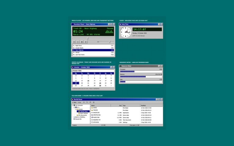
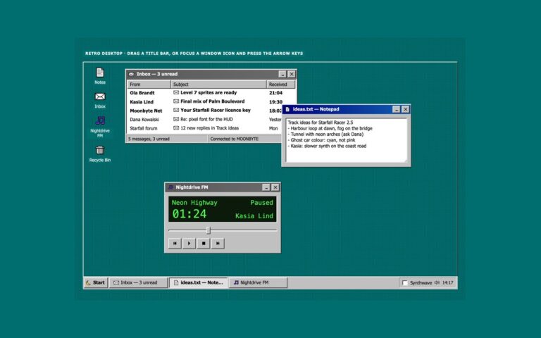
   A classic desktop OS look: grey bevelled faces, navy title bars, sunken white fields on a dithered teal desktop.
   Bevels are four 1px inset shadows built from --retro-hilite, --retro-light, --retro-shadow and --retro-dark,
   so one change to a token re-colours every button, field and window in the kit. */
:root{
  --retro-desk:#006e6e;        /* desktop behind the windows */
  --retro-desk-text:#ffffff;   /* captions and icon labels on the desktop, 6.1:1 */
  --retro-desk-dither:rgba(0,0,0,.22);
  --retro-face:#c0c0c0;        /* window, button and bar faces */
  --retro-hilite:#ffffff;      /* bevel: outer light edge */
  --retro-light:#dfdfdf;       /* bevel: inner light edge */
  --retro-shadow:#808080;      /* bevel: inner dark edge */
  --retro-dark:#0a0a0a;        /* bevel: outer dark edge */
  --retro-text:#000000;        /* text on faces, 11.5:1 */
  --retro-muted:#3d3d3d;       /* secondary text on faces, 6:1 */
  --retro-field:#ffffff;       /* inputs, lists and document areas */
  --retro-field-text:#000000;
  --retro-title:#000080;       /* active title bar gradient, white text 6.3:1 or more */
  --retro-title-2:#1060b0;
  --retro-title-text:#ffffff;
  --retro-idle:#5a5a5a;        /* inactive title bar gradient, white text 5.3:1 or more */
  --retro-idle-2:#6b6b6b;
  --retro-idle-text:#ffffff;
  --retro-select:#000080;      /* highlighted menu items, rows and dates */
  --retro-select-text:#ffffff;
  --retro-link:#0000cc;        /* 6.2:1 on faces */
  --retro-danger:#8a0000;      /* error text, 5.5:1 on faces */
  --retro-tip:#ffffe1;         /* tooltips and balloons */
  --retro-tip-text:#000000;
  --retro-tip-line:#000000;
  --retro-lcd:#0b1a0b;         /* LCD read-outs */
  --retro-lcd-text:#4dff4d;
  --retro-accent:#000080;      /* progress chunks */
  --retro-disabled:#808080;    /* disabled text, embossed */
  --retro-emboss:#ffffff;
  --retro-dither-a:#ffffff;    /* checkerboard behind a latched toggle */
  --retro-dither-b:#c0c0c0;
  --retro-focus:#000000;       /* dotted focus rectangle */
  --retro-glow:0 0 #0000;      /* the synthwave theme adds a neon glow to windows */
  --retro-neon-pink:#ff3fa4;--retro-neon-cyan:#00e5ff;--retro-sun-1:#ffd23f;--retro-sun-2:#ff3fa4;
  --retro-font:Tahoma,"Microsoft Sans Serif","MS Sans Serif",Geneva,Verdana,"Segoe UI",sans-serif;
  --retro-mono:"VT323","Fixedsys","Lucida Console",Consolas,Menlo,"Courier New",ui-monospace,monospace;
}
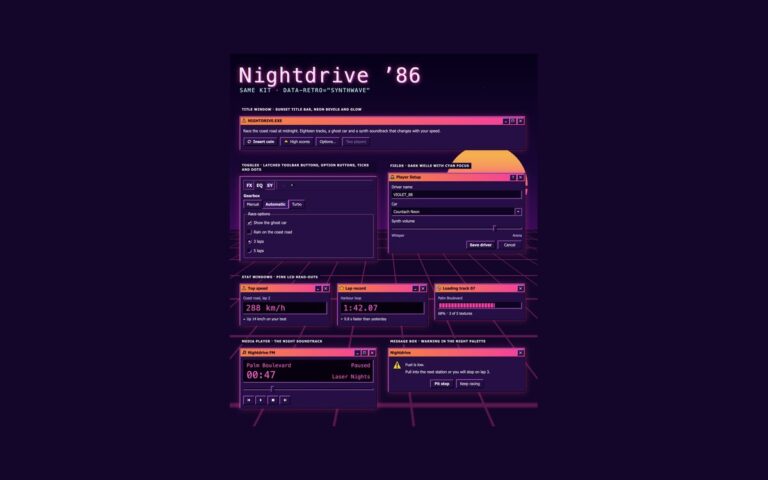
/* Synthwave 80s night theme: data-retro="synthwave" on any wrapper, or a checked .retro-theme-input inside a
   [data-retro] element. :is() is a forgiving list, so browsers without :has() still apply the attribute. */
[data-retro]:is([data-retro="synthwave"],:has(.retro-theme-input:checked)){
  --retro-desk:#14062b;--retro-desk-text:#fff1fb;--retro-desk-dither:rgba(255,63,164,.16);
  --retro-face:#261047;--retro-hilite:#ff6ec7;--retro-light:#a05cff;--retro-shadow:#0d0420;--retro-dark:#000000;
  --retro-text:#fff1fb;--retro-muted:#dcc6ff;--retro-field:#0e0322;--retro-field-text:#fff1fb;
  --retro-title:#ff8a3d;--retro-title-2:#ff3fa4;--retro-title-text:#1b0030;
  --retro-idle:#4a2d6e;--retro-idle-2:#5c3a85;--retro-idle-text:#f3e8ff;
  --retro-select:#00e5ff;--retro-select-text:#14062b;--retro-link:#7cf3ff;--retro-danger:#ff8fa3;
  --retro-tip:#2b1352;--retro-tip-text:#fff1fb;--retro-tip-line:#ff6ec7;
  --retro-lcd:#07010f;--retro-lcd-text:#ff5fd2;--retro-accent:#ff3fa4;
  --retro-disabled:#8a72b0;--retro-emboss:transparent;--retro-dither-a:#3d1a6e;--retro-dither-b:#261047;
  --retro-focus:#5ff4ff;--retro-glow:0 0 0 1px rgba(255,63,164,.45),0 0 22px rgba(255,63,164,.35);color-scheme:dark}
/* More contrast requested: secondary text turns full strength and the glow goes */
@media (prefers-contrast:more){:root,[data-retro],[data-retro]:is([data-retro="synthwave"],:has(.retro-theme-input:checked)){--retro-muted:var(--retro-text);--retro-glow:0 0 #0000}}
:root,[data-retro]{
  --retro-out:inset -1px -1px var(--retro-dark),inset 1px 1px var(--retro-hilite),inset -2px -2px var(--retro-shadow),inset 2px 2px var(--retro-light);
  --retro-in:inset -1px -1px var(--retro-hilite),inset 1px 1px var(--retro-dark),inset -2px -2px var(--retro-light),inset 2px 2px var(--retro-shadow);
  --retro-out-default:inset 0 0 0 1px var(--retro-dark),inset -2px -2px var(--retro-dark),inset 2px 2px var(--retro-hilite),inset -3px -3px var(--retro-shadow),inset 3px 3px var(--retro-light);
  --retro-in-default:inset 0 0 0 1px var(--retro-dark),inset 2px 2px var(--retro-shadow),inset -2px -2px var(--retro-shadow);
  --retro-sunken:inset -1px -1px var(--retro-hilite),inset 1px 1px var(--retro-shadow),inset -2px -2px var(--retro-light),inset 2px 2px var(--retro-dark);
  --retro-frame:inset -1px -1px var(--retro-dark),inset 1px 1px var(--retro-light),inset -2px -2px var(--retro-shadow),inset 2px 2px var(--retro-hilite);
  --retro-window:var(--retro-frame),var(--retro-glow);
  --retro-thin-in:inset -1px -1px var(--retro-hilite),inset 1px 1px var(--retro-shadow);
  --retro-thin-out:inset -1px -1px var(--retro-shadow),inset 1px 1px var(--retro-hilite);
  --retro-title-bg:linear-gradient(90deg,var(--retro-title),var(--retro-title-2));
  --retro-idle-bg:linear-gradient(90deg,var(--retro-idle),var(--retro-idle-2));
  --retro-dither:repeating-conic-gradient(var(--retro-dither-a) 0 25%,var(--retro-dither-b) 0 50%) 0 0/2px 2px;
  --retro-wallpaper:radial-gradient(var(--retro-desk-dither) 1px,transparent 1.5px) 0 0/4px 4px,var(--retro-desk);
  --retro-check-mask:url("data:image/svg+xml,%3Csvg%20xmlns='http://www.w3.org/2000/svg'%20viewBox='0%200%207%207'%20shape-rendering='crispEdges'%3E%3Crect%20x='6'%20y='0'%20width='1'%20height='1'%20fill='%23000'/%3E%3Crect%20x='5'%20y='1'%20width='2'%20height='1'%20fill='%23000'/%3E%3Crect%20x='0'%20y='2'%20width='1'%20height='1'%20fill='%23000'/%3E%3Crect%20x='4'%20y='2'%20width='3'%20height='1'%20fill='%23000'/%3E%3Crect%20x='0'%20y='3'%20width='2'%20height='1'%20fill='%23000'/%3E%3Crect%20x='3'%20y='3'%20width='3'%20height='1'%20fill='%23000'/%3E%3Crect%20x='0'%20y='4'%20width='5'%20height='1'%20fill='%23000'/%3E%3Crect%20x='1'%20y='5'%20width='3'%20height='1'%20fill='%23000'/%3E%3Crect%20x='2'%20y='6'%20width='1'%20height='1'%20fill='%23000'/%3E%3C/svg%3E");
  --retro-arrow-mask:url("data:image/svg+xml,%3Csvg%20xmlns='http://www.w3.org/2000/svg'%20viewBox='0%200%207%204'%20shape-rendering='crispEdges'%3E%3Crect%20x='0'%20y='0'%20width='7'%20height='1'%20fill='%23000'/%3E%3Crect%20x='1'%20y='1'%20width='5'%20height='1'%20fill='%23000'/%3E%3Crect%20x='2'%20y='2'%20width='3'%20height='1'%20fill='%23000'/%3E%3Crect%20x='3'%20y='3'%20width='1'%20height='1'%20fill='%23000'/%3E%3C/svg%3E");
}
[data-retro]{color:var(--retro-text);font-family:var(--retro-font)}
/* The tokens above, exposed as Tailwind utilities: bg-retro-face, text-retro-text, shadow-retro-out,
   shadow-retro-in, shadow-retro-sunken, shadow-retro-window, outline-retro-focus, font-retro, font-retro-mono… */
@theme inline {
  --color-retro-desk: var(--retro-desk); --color-retro-desk-text: var(--retro-desk-text); --color-retro-face: var(--retro-face);
  --color-retro-hilite: var(--retro-hilite); --color-retro-light: var(--retro-light); --color-retro-shadow: var(--retro-shadow); --color-retro-dark: var(--retro-dark);
  --color-retro-text: var(--retro-text); --color-retro-muted: var(--retro-muted); --color-retro-field: var(--retro-field); --color-retro-field-text: var(--retro-field-text);
  --color-retro-title-text: var(--retro-title-text); --color-retro-idle-text: var(--retro-idle-text);
  --color-retro-select: var(--retro-select); --color-retro-select-text: var(--retro-select-text); --color-retro-link: var(--retro-link); --color-retro-danger: var(--retro-danger);
  --color-retro-tip: var(--retro-tip); --color-retro-tip-text: var(--retro-tip-text); --color-retro-tip-line: var(--retro-tip-line);
  --color-retro-lcd: var(--retro-lcd); --color-retro-lcd-text: var(--retro-lcd-text); --color-retro-accent: var(--retro-accent);
  --color-retro-disabled: var(--retro-disabled); --color-retro-focus: var(--retro-focus);
  --color-retro-neon-pink: var(--retro-neon-pink); --color-retro-neon-cyan: var(--retro-neon-cyan);
  --shadow-retro-out: var(--retro-out); --shadow-retro-in: var(--retro-in); --shadow-retro-default: var(--retro-out-default); --shadow-retro-default-in: var(--retro-in-default);
  --shadow-retro-sunken: var(--retro-sunken); --shadow-retro-frame: var(--retro-frame); --shadow-retro-window: var(--retro-window);
  --shadow-retro-thin-in: var(--retro-thin-in); --shadow-retro-thin-out: var(--retro-thin-out);
  --font-retro: var(--retro-font); --font-retro-mono: var(--retro-mono);
}
About this set
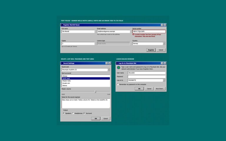
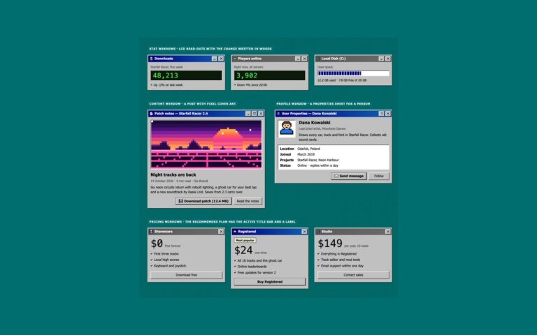
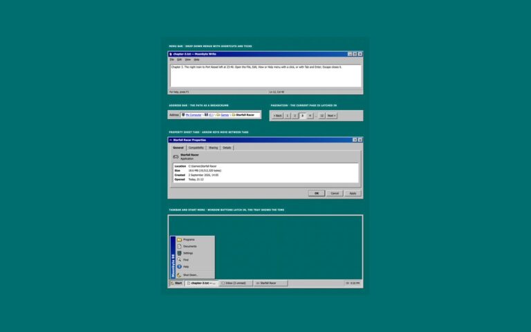
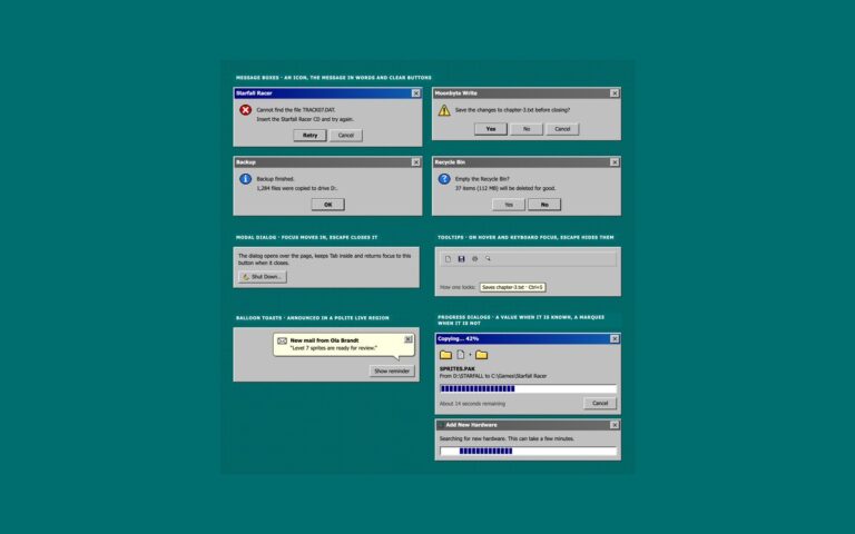
The controls of a classic desktop operating system, rebuilt with real HTML elements. Push buttons have a raised bevel made of four one-pixel inset shadows; pressing one swaps it for the sunken bevel, the default button gets an extra dark frame, and a disabled button shows the old embossed grey text. A word processor window carries a toolbar of flat icon buttons that show a thin bevel on hover, each with an accessible name, plus bold, italic and underline toggles that stay latched in with a checkerboard fill when on. A Display Properties window groups checkboxes and radio buttons in etched group boxes: the inputs are real, drawn with appearance none as sunken white wells, and the tick is a pixel mask coloured by a token. Option buttons pick text alignment and a folder view, and a row of icon buttons ends with a favourite toggle and a mute toggle. Use the push buttons for dialog actions, the toolbar for dense editors and the option buttons where one choice from a few must stay visible. Every colour comes from the shared –retro-* tokens, so the same markup turns into the synthwave theme with one attribute.
What’s included
Raised, pressed, default and disabled push buttons from one bevel recipe
Toolbar of named icon buttons with latched bold, italic and underline toggles
Real checkboxes and radios with a pixel tick and dot
Etched group boxes built on fieldset and legend
Option buttons from radio groups, latched in with a checkerboard fill
Accessibility
Every control is a native button, checkbox or radio; icon-only buttons and toggles carry an aria-label or visually hidden text, and choices sit in fieldsets with legends. Keyboard focus draws a 2px dotted rectangle like the old operating systems, in black on the grey face for 11.5:1 contrast, round the button face or the label text. Text reaches 5.9:1 or more on faces and fields. Nothing animates.
Customise it
Change --retro-face, --retro-hilite, --retro-light, --retro-shadow and --retro-dark to recolour every bevel, and --retro-focus for the focus rectangle. Bootstrap uses .btn-retro on .btn and .btn-check with .btn-group, and Tailwind exposes the bevels as shadow-retro-out, shadow-retro-in and shadow-retro-default.