/* ── Retro UI kit tokens (uiCookies) — identical in every set ─────────────
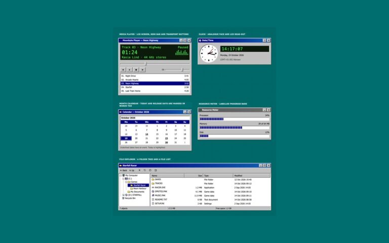
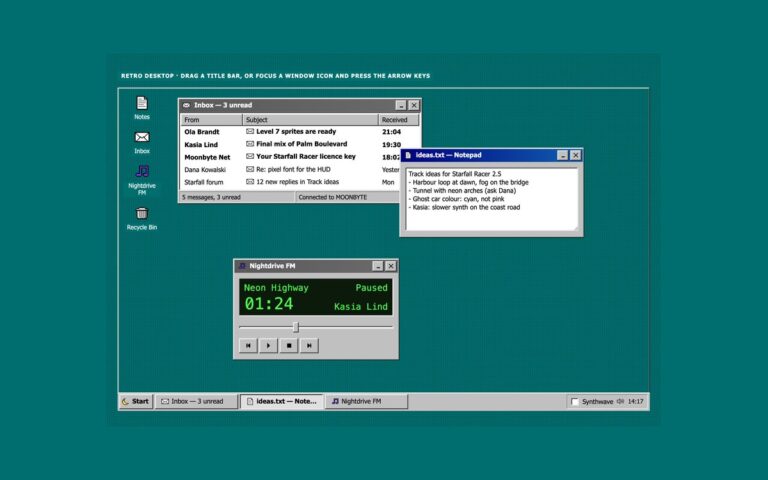
   A classic desktop OS look: grey bevelled faces, navy title bars, sunken white fields on a dithered teal desktop.
   Bevels are four 1px inset shadows built from --retro-hilite, --retro-light, --retro-shadow and --retro-dark,
   so one change to a token re-colours every button, field and window in the kit. */
:root{
  --retro-desk:#006e6e;        /* desktop behind the windows */
  --retro-desk-text:#ffffff;   /* captions and icon labels on the desktop, 6.1:1 */
  --retro-desk-dither:rgba(0,0,0,.22);
  --retro-face:#c0c0c0;        /* window, button and bar faces */
  --retro-hilite:#ffffff;      /* bevel: outer light edge */
  --retro-light:#dfdfdf;       /* bevel: inner light edge */
  --retro-shadow:#808080;      /* bevel: inner dark edge */
  --retro-dark:#0a0a0a;        /* bevel: outer dark edge */
  --retro-text:#000000;        /* text on faces, 11.5:1 */
  --retro-muted:#3d3d3d;       /* secondary text on faces, 6:1 */
  --retro-field:#ffffff;       /* inputs, lists and document areas */
  --retro-field-text:#000000;
  --retro-title:#000080;       /* active title bar gradient, white text 6.3:1 or more */
  --retro-title-2:#1060b0;
  --retro-title-text:#ffffff;
  --retro-idle:#5a5a5a;        /* inactive title bar gradient, white text 5.3:1 or more */
  --retro-idle-2:#6b6b6b;
  --retro-idle-text:#ffffff;
  --retro-select:#000080;      /* highlighted menu items, rows and dates */
  --retro-select-text:#ffffff;
  --retro-link:#0000cc;        /* 6.2:1 on faces */
  --retro-danger:#8a0000;      /* error text, 5.5:1 on faces */
  --retro-tip:#ffffe1;         /* tooltips and balloons */
  --retro-tip-text:#000000;
  --retro-tip-line:#000000;
  --retro-lcd:#0b1a0b;         /* LCD read-outs */
  --retro-lcd-text:#4dff4d;
  --retro-accent:#000080;      /* progress chunks */
  --retro-disabled:#808080;    /* disabled text, embossed */
  --retro-emboss:#ffffff;
  --retro-dither-a:#ffffff;    /* checkerboard behind a latched toggle */
  --retro-dither-b:#c0c0c0;
  --retro-focus:#000000;       /* dotted focus rectangle */
  --retro-glow:0 0 #0000;      /* the synthwave theme adds a neon glow to windows */
  --retro-neon-pink:#ff3fa4;--retro-neon-cyan:#00e5ff;--retro-sun-1:#ffd23f;--retro-sun-2:#ff3fa4;
  --retro-font:Tahoma,"Microsoft Sans Serif","MS Sans Serif",Geneva,Verdana,"Segoe UI",sans-serif;
  --retro-mono:"VT323","Fixedsys","Lucida Console",Consolas,Menlo,"Courier New",ui-monospace,monospace;
}
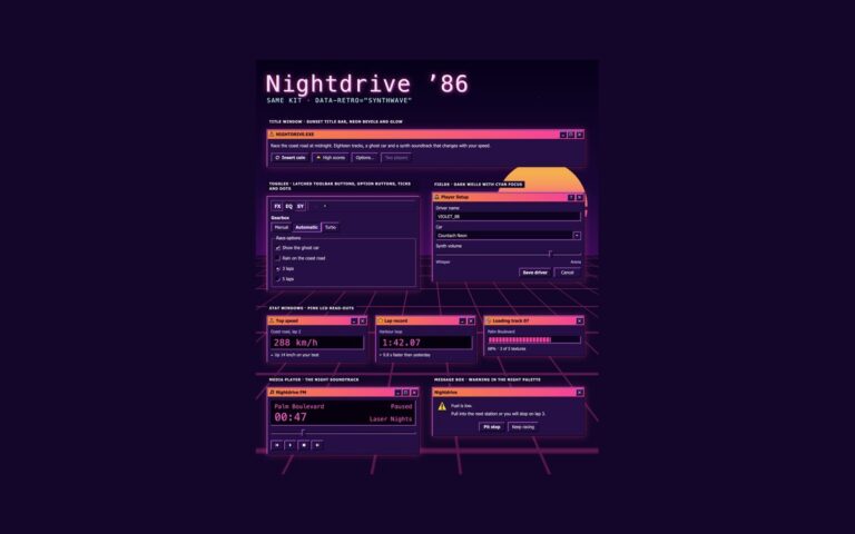
/* Synthwave 80s night theme: data-retro="synthwave" on any wrapper, or a checked .retro-theme-input inside a
   [data-retro] element. :is() is a forgiving list, so browsers without :has() still apply the attribute. */
[data-retro]:is([data-retro="synthwave"],:has(.retro-theme-input:checked)){
  --retro-desk:#14062b;--retro-desk-text:#fff1fb;--retro-desk-dither:rgba(255,63,164,.16);
  --retro-face:#261047;--retro-hilite:#ff6ec7;--retro-light:#a05cff;--retro-shadow:#0d0420;--retro-dark:#000000;
  --retro-text:#fff1fb;--retro-muted:#dcc6ff;--retro-field:#0e0322;--retro-field-text:#fff1fb;
  --retro-title:#ff8a3d;--retro-title-2:#ff3fa4;--retro-title-text:#1b0030;
  --retro-idle:#4a2d6e;--retro-idle-2:#5c3a85;--retro-idle-text:#f3e8ff;
  --retro-select:#00e5ff;--retro-select-text:#14062b;--retro-link:#7cf3ff;--retro-danger:#ff8fa3;
  --retro-tip:#2b1352;--retro-tip-text:#fff1fb;--retro-tip-line:#ff6ec7;
  --retro-lcd:#07010f;--retro-lcd-text:#ff5fd2;--retro-accent:#ff3fa4;
  --retro-disabled:#8a72b0;--retro-emboss:transparent;--retro-dither-a:#3d1a6e;--retro-dither-b:#261047;
  --retro-focus:#5ff4ff;--retro-glow:0 0 0 1px rgba(255,63,164,.45),0 0 22px rgba(255,63,164,.35);color-scheme:dark}
/* More contrast requested: secondary text turns full strength and the glow goes */
@media (prefers-contrast:more){:root,[data-retro],[data-retro]:is([data-retro="synthwave"],:has(.retro-theme-input:checked)){--retro-muted:var(--retro-text);--retro-glow:0 0 #0000}}
:root,[data-retro]{
  --retro-out:inset -1px -1px var(--retro-dark),inset 1px 1px var(--retro-hilite),inset -2px -2px var(--retro-shadow),inset 2px 2px var(--retro-light);
  --retro-in:inset -1px -1px var(--retro-hilite),inset 1px 1px var(--retro-dark),inset -2px -2px var(--retro-light),inset 2px 2px var(--retro-shadow);
  --retro-out-default:inset 0 0 0 1px var(--retro-dark),inset -2px -2px var(--retro-dark),inset 2px 2px var(--retro-hilite),inset -3px -3px var(--retro-shadow),inset 3px 3px var(--retro-light);
  --retro-in-default:inset 0 0 0 1px var(--retro-dark),inset 2px 2px var(--retro-shadow),inset -2px -2px var(--retro-shadow);
  --retro-sunken:inset -1px -1px var(--retro-hilite),inset 1px 1px var(--retro-shadow),inset -2px -2px var(--retro-light),inset 2px 2px var(--retro-dark);
  --retro-frame:inset -1px -1px var(--retro-dark),inset 1px 1px var(--retro-light),inset -2px -2px var(--retro-shadow),inset 2px 2px var(--retro-hilite);
  --retro-window:var(--retro-frame),var(--retro-glow);
  --retro-thin-in:inset -1px -1px var(--retro-hilite),inset 1px 1px var(--retro-shadow);
  --retro-thin-out:inset -1px -1px var(--retro-shadow),inset 1px 1px var(--retro-hilite);
  --retro-title-bg:linear-gradient(90deg,var(--retro-title),var(--retro-title-2));
  --retro-idle-bg:linear-gradient(90deg,var(--retro-idle),var(--retro-idle-2));
  --retro-dither:repeating-conic-gradient(var(--retro-dither-a) 0 25%,var(--retro-dither-b) 0 50%) 0 0/2px 2px;
  --retro-wallpaper:radial-gradient(var(--retro-desk-dither) 1px,transparent 1.5px) 0 0/4px 4px,var(--retro-desk);
  --retro-check-mask:url("data:image/svg+xml,%3Csvg%20xmlns='http://www.w3.org/2000/svg'%20viewBox='0%200%207%207'%20shape-rendering='crispEdges'%3E%3Crect%20x='6'%20y='0'%20width='1'%20height='1'%20fill='%23000'/%3E%3Crect%20x='5'%20y='1'%20width='2'%20height='1'%20fill='%23000'/%3E%3Crect%20x='0'%20y='2'%20width='1'%20height='1'%20fill='%23000'/%3E%3Crect%20x='4'%20y='2'%20width='3'%20height='1'%20fill='%23000'/%3E%3Crect%20x='0'%20y='3'%20width='2'%20height='1'%20fill='%23000'/%3E%3Crect%20x='3'%20y='3'%20width='3'%20height='1'%20fill='%23000'/%3E%3Crect%20x='0'%20y='4'%20width='5'%20height='1'%20fill='%23000'/%3E%3Crect%20x='1'%20y='5'%20width='3'%20height='1'%20fill='%23000'/%3E%3Crect%20x='2'%20y='6'%20width='1'%20height='1'%20fill='%23000'/%3E%3C/svg%3E");
  --retro-arrow-mask:url("data:image/svg+xml,%3Csvg%20xmlns='http://www.w3.org/2000/svg'%20viewBox='0%200%207%204'%20shape-rendering='crispEdges'%3E%3Crect%20x='0'%20y='0'%20width='7'%20height='1'%20fill='%23000'/%3E%3Crect%20x='1'%20y='1'%20width='5'%20height='1'%20fill='%23000'/%3E%3Crect%20x='2'%20y='2'%20width='3'%20height='1'%20fill='%23000'/%3E%3Crect%20x='3'%20y='3'%20width='1'%20height='1'%20fill='%23000'/%3E%3C/svg%3E");
}
[data-retro]{color:var(--retro-text);font-family:var(--retro-font)}
/* The tokens above, exposed as Tailwind utilities: bg-retro-face, text-retro-text, shadow-retro-out,
   shadow-retro-in, shadow-retro-sunken, shadow-retro-window, outline-retro-focus, font-retro, font-retro-mono… */
@theme inline {
  --color-retro-desk: var(--retro-desk); --color-retro-desk-text: var(--retro-desk-text); --color-retro-face: var(--retro-face);
  --color-retro-hilite: var(--retro-hilite); --color-retro-light: var(--retro-light); --color-retro-shadow: var(--retro-shadow); --color-retro-dark: var(--retro-dark);
  --color-retro-text: var(--retro-text); --color-retro-muted: var(--retro-muted); --color-retro-field: var(--retro-field); --color-retro-field-text: var(--retro-field-text);
  --color-retro-title-text: var(--retro-title-text); --color-retro-idle-text: var(--retro-idle-text);
  --color-retro-select: var(--retro-select); --color-retro-select-text: var(--retro-select-text); --color-retro-link: var(--retro-link); --color-retro-danger: var(--retro-danger);
  --color-retro-tip: var(--retro-tip); --color-retro-tip-text: var(--retro-tip-text); --color-retro-tip-line: var(--retro-tip-line);
  --color-retro-lcd: var(--retro-lcd); --color-retro-lcd-text: var(--retro-lcd-text); --color-retro-accent: var(--retro-accent);
  --color-retro-disabled: var(--retro-disabled); --color-retro-focus: var(--retro-focus);
  --color-retro-neon-pink: var(--retro-neon-pink); --color-retro-neon-cyan: var(--retro-neon-cyan);
  --shadow-retro-out: var(--retro-out); --shadow-retro-in: var(--retro-in); --shadow-retro-default: var(--retro-out-default); --shadow-retro-default-in: var(--retro-in-default);
  --shadow-retro-sunken: var(--retro-sunken); --shadow-retro-frame: var(--retro-frame); --shadow-retro-window: var(--retro-window);
  --shadow-retro-thin-in: var(--retro-thin-in); --shadow-retro-thin-out: var(--retro-thin-out);
  --font-retro: var(--retro-font); --font-retro-mono: var(--retro-mono);
}
About this set
Cards drawn as classic desktop windows, each with a gradient title bar, labelled window controls and a bevelled frame. Three stat windows show weekly downloads and players online on green LCD read-outs, with the change written in words next to a small arrow, and a disk window shows used space as a chunked progress bar. A content window holds patch notes for a fictional racing game with pixel-art cover art drawn as an inline SVG of a sunset over a neon grid, a heading, a byline, a paragraph and two actions. A profile window works like a properties sheet: a pixel avatar in a sunken frame, a name and role, and a definition list of location, join date, projects and status. Three pricing windows finish the set; the recommended plan keeps the active navy title bar and a Most popular label while the others use the grey inactive title bar, so the difference is not only colour. Use stat windows on dashboards, the content window for posts and release notes, and the pricing windows on upgrade pages.
What’s included
Stat windows with LCD read-outs and changes written in words
Content window with pixel-art cover art in an inline SVG
Profile window with a definition list in a sunken panel
Pricing windows where the featured plan has the active title bar and a label
Bootstrap version built on .card with the header as the title bar
Accessibility
Each window is a section labelled by its title bar heading, and the minimise, maximise, help and close buttons have names such as Close Patch notes. Changes are written in words, not shown only by an arrow or a colour, and the disk bar is a labelled progressbar with a value. Focus is a 2px dotted rectangle. Nothing animates.
Customise it
Change --retro-title and --retro-title-2 for the active title bar, --retro-idle and --retro-idle-2 for inactive ones, and --retro-lcd and --retro-lcd-text for the read-outs. Bootstrap uses .card.retro-window with .card-header.retro-titlebar, and Tailwind uses shadow-retro-window and bg-[image:var(--retro-title-bg)].