About this set
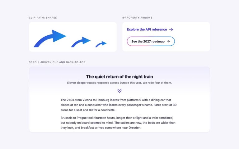
Four animated scroll-down indicators, each placed at the foot of a hero panel the way they are used on landing pages. The mouse is an outlined mouse whose wheel dot slides down and fades, with a Scroll label underneath. The cascading chevrons are three stacked chevrons that light up one after another, for heroes that should stay wordless. The ringed arrow is a circle with a bouncing arrow and a visible Explore the rooms label, which fills on hover. The falling line is a thin vertical track with a segment that drops through it, a quiet choice for editorial pages. Each indicator is a real link to the next section, so it works with a keyboard and a screen reader instead of being a decorative animation. The drawing is aria-hidden; the link is named by its visible text, an aria-label that starts with the visible word, or visually hidden text. The animation plays three times and stops, so nothing on the page moves for longer than five seconds, and it moves again while the link is hovered or focused. Under prefers-reduced-motion the indicators are still.
What’s included
- Mouse, cascading chevrons, ringed arrow and falling line indicators
- Each indicator is a link to the next section
- Animation plays three times, then stops; hover or focus restarts the loop
- Still under prefers-reduced-motion
- Text checked for contrast on dark, gradient and light panels
Accessibility
Every indicator is an anchor to the next section with an accessible name: visible text, an aria-label that contains the visible word, or visually hidden text for the wordless chevrons. The drawings are aria-hidden. Links show a 2px outline in the text colour on keyboard focus. Motion stops after three cycles and is removed entirely under prefers-reduced-motion.
Customise it
The indicators take currentColor, so set color on the hero or the .sd link. Change the timing in the sd-wheel, sd-glow, sd-bob and sd-drop keyframes; in Tailwind the same animations are --animate-sd-* entries in @theme.