About this set
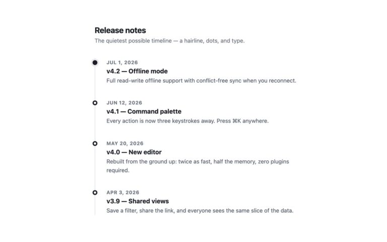
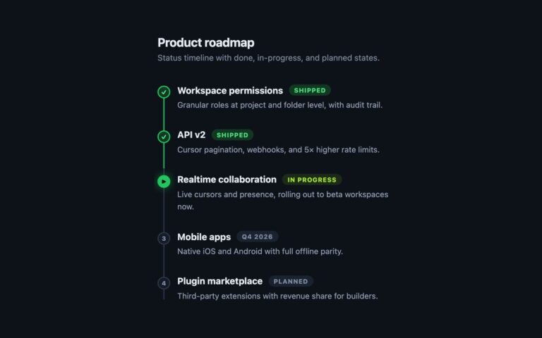
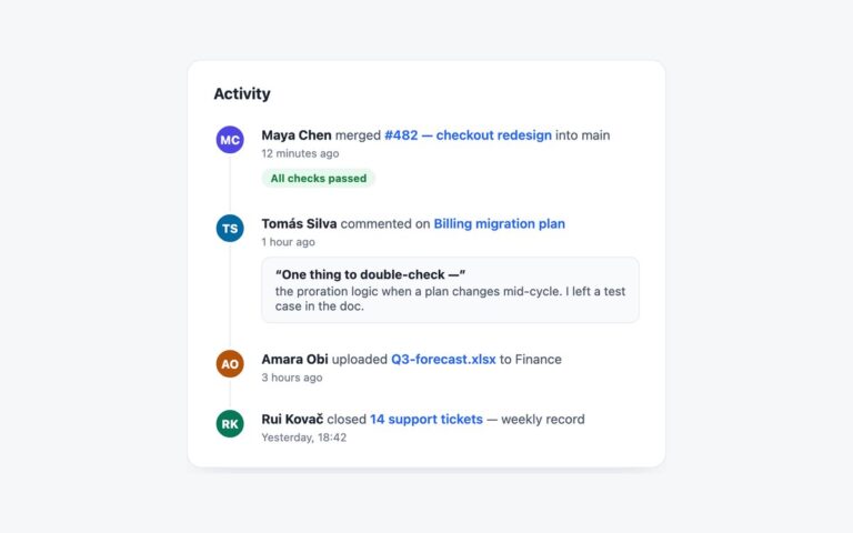
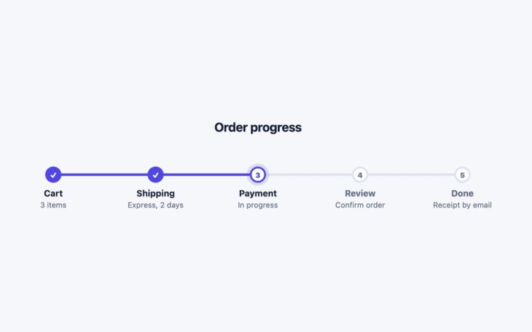
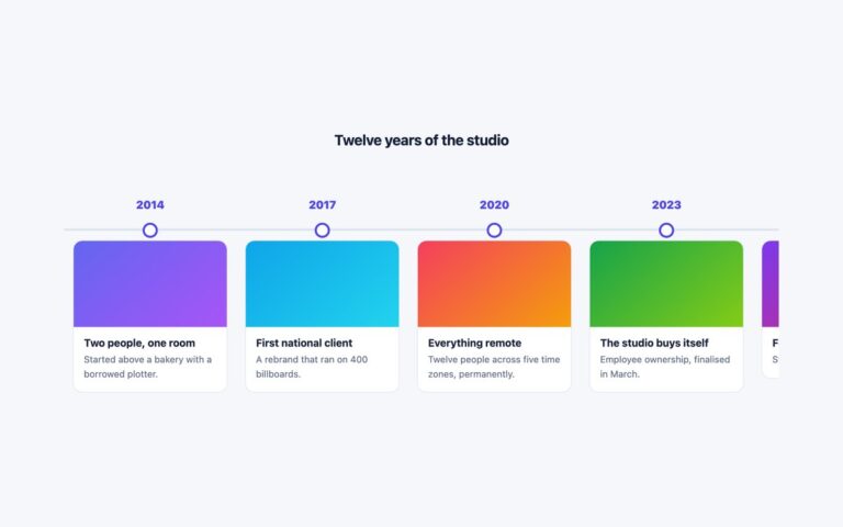
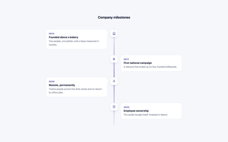
A company history laid out as an alternating vertical timeline: a 3px centre line, a blue dot for each event, and white cards that switch sides from left to right as the story moves down the page. Every entry has an uppercase date line such as 2021 · Founded, a short heading and one or two sentences. Use it for an About page, a founding story or a list of product milestones, where four to eight events read better as a sequence than as a table. The markup is an ordered list, so the order is part of the content, and the years sit in time elements with a datetime attribute. The odd and even items are positioned with nth-child, so adding an entry needs no extra classes. Below 680 pixels the line moves to the left edge and every card stacks in a single column, so long text never squeezes into half the width of a phone. Cards lift by 3 pixels on hover. The Bootstrap version uses .card with –bs-card-* variables, and the Tailwind version builds the same layout with odd:, even: and group-odd: variants.
What’s included
- Ordered list with cards alternating left and right of a centre line
- Years marked up with time and a datetime attribute
- Collapses to a single left-aligned column under 680px
- Dots are decorative and hidden from screen readers
- Hover lift that is switched off under reduced motion
Accessibility
The events are an ordered list, so screen readers announce how many there are and read them in order, and each card has its own heading. The dots are aria-hidden. Date text is the 4.7:1 accent blue on the page background. The 3px hover lift is removed when prefers-reduced-motion is set. There are no interactive controls.
Customise it
Change --vtl-accent, --vtl-line and --vtl-muted on .vtl in the plain CSS and Bootstrap versions; Bootstrap cards also take --bs-card-border-color and --bs-card-border-radius. In Tailwind edit the #2563eb and #dbe2ef arbitrary colours and the min-[681px]: breakpoint.