<div><span class="lbl">Four directions</span>
<div class="stage dirs">
  <div class="cell"><span class="tt"><button class="tb" type="button" aria-describedby="tt-dup">Duplicate</button><span class="tt-tip tt-top" role="tooltip" id="tt-dup">Copies the page and its comments</span></span></div>
  <div class="cell to-right"><span class="tt"><button class="tb" type="button" aria-describedby="tt-move">Move</button><span class="tt-tip tt-right" role="tooltip" id="tt-move">Pick another folder</span></span></div>
  <div class="cell"><span class="tt"><button class="tb" type="button" aria-describedby="tt-export">Export</button><span class="tt-tip tt-bottom" role="tooltip" id="tt-export">PDF, PNG or SVG</span></span></div>
  <div class="cell to-left"><span class="tt"><button class="tb" type="button" aria-describedby="tt-archive">Archive</button><span class="tt-tip tt-left" role="tooltip" id="tt-archive">Restorable for 30 days</span></span></div>
</div></div>

<div><span class="lbl">Definitions inside text</span>
<div class="stage">
  <p class="prose">A <span class="tt"><button class="term" type="button" aria-describedby="tt-reserve">rolling reserve</button><span class="tt-tip tt-top tt-start" role="tooltip" id="tt-reserve">A share of each payout held back and released automatically after 90 days.</span></span> of 5% is held from every payout to cover <span class="tt"><button class="term" type="button" aria-describedby="tt-chargeback">chargebacks</button><span class="tt-tip tt-top tt-start" role="tooltip" id="tt-chargeback">A refund your customer's bank forces after a dispute, plus a $15 fee.</span></span>. Everything else reaches your bank two business days after the sale.</p>
</div></div>

<div><span class="lbl">Explaining a disabled action</span>
<div class="stage">
  <div class="post">
    <div><b>Five rituals of slow mornings</b><small><i aria-hidden="true"></i>Draft · cover image missing</small></div>
    <div class="acts">
      <span class="tt"><button class="tb" type="button" aria-describedby="tt-save">Save draft</button><span class="tt-tip tt-bottom" role="tooltip" id="tt-save">Last saved 2 minutes ago</span></span>
      <span class="tt"><button class="tb primary" type="button" aria-disabled="true" aria-describedby="tt-publish">Publish</button><span class="tt-tip tt-bottom" role="tooltip" id="tt-publish">Add a cover image before publishing</span></span>
    </div>
  </div>
</div></div>
CSS
/* Tooltips: a wrapper (.tt) holds the trigger and its tooltip. CSS shows the tooltip on hover and keyboard focus;
   the script adds Esc to dismiss, tap to open on touch screens and a nudge that keeps it inside the window. */
.tt{--tt-bg:#1b2032;--tt-ink:#f8fafc;--tt-gap:10px;--tt-arrow:6px;--tt-max:240px;position:relative;display:inline-flex;vertical-align:middle}
.tt-tip{position:absolute;z-index:30;width:max-content;max-width:var(--tt-max);padding:7px 11px;border-radius:8px;background:var(--tt-bg);color:var(--tt-ink);
  font:500 .8125rem/1.45 ui-sans-serif,system-ui,-apple-system,"Segoe UI",Roboto,sans-serif;text-align:center;white-space:normal;
  box-shadow:0 10px 24px -10px rgba(15,23,42,.55);
  visibility:hidden;opacity:0;scale:0;transition:opacity .15s,visibility .15s,scale 0s .15s}
.tt:is(:hover,:focus-within,.is-open):not(.is-dismissed)>.tt-tip{visibility:visible;opacity:1;scale:1;transition:opacity .15s,visibility 0s,scale 0s}
.tt-tip::before{content:"";position:absolute;border:var(--tt-arrow) solid transparent}
.tt-tip::after{content:"";position:absolute} /* fills the gap so the pointer can move onto the tooltip */
.tt-top{bottom:calc(100% + var(--tt-gap));left:50%;translate:calc(-50% + var(--tt-nudge,0px)) 0}
.tt-top::before{top:100%;left:calc(50% - var(--tt-arrow) - var(--tt-nudge,0px));border-top-color:var(--tt-bg);border-bottom-width:0}
.tt-top::after{top:100%;left:0;right:0;height:var(--tt-gap)}
.tt-bottom{top:calc(100% + var(--tt-gap));left:50%;translate:calc(-50% + var(--tt-nudge,0px)) 0}
.tt-bottom::before{bottom:100%;left:calc(50% - var(--tt-arrow) - var(--tt-nudge,0px));border-bottom-color:var(--tt-bg);border-top-width:0}
.tt-bottom::after{bottom:100%;left:0;right:0;height:var(--tt-gap)}
.tt-right{left:calc(100% + var(--tt-gap));top:50%;translate:0 -50%}
.tt-right::before{right:100%;top:calc(50% - var(--tt-arrow));border-right-color:var(--tt-bg);border-left-width:0}
.tt-right::after{right:100%;top:0;bottom:0;width:var(--tt-gap)}
.tt-left{right:calc(100% + var(--tt-gap));top:50%;translate:0 -50%}
.tt-left::before{left:100%;top:calc(50% - var(--tt-arrow));border-left-color:var(--tt-bg);border-right-width:0}
.tt-left::after{left:100%;top:0;bottom:0;width:var(--tt-gap)}
.tt-tip.tt-start{left:0;translate:var(--tt-nudge,0px) 0;text-align:left}
.tt-tip.tt-start::before{left:calc(14px - var(--tt-nudge,0px))}

/* Demo triggers */
.tb{display:inline-flex;align-items:center;gap:8px;height:40px;padding:0 16px;border:1px solid #cdd3de;border-radius:10px;background:#fff;color:#1f2433;
  font:600 .875rem/1 ui-sans-serif,system-ui,-apple-system,"Segoe UI",Roboto,sans-serif;cursor:pointer;transition:background-color .15s,border-color .15s}
.tb:hover{background:#f5f6f9;border-color:#b9c1cf}
.tb:focus-visible,.term:focus-visible{outline:2px solid #4f46e5;outline-offset:2px}
.tb.primary{background:#4f46e5;border-color:#4f46e5;color:#fff}
.tb.primary:hover{background:#4338ca}
.tb[aria-disabled="true"]{background:#eef0f4;border-color:#dfe3ea;color:#5f6878;cursor:not-allowed}
.tb svg{width:16px;height:16px}
.dirs{display:grid;grid-template-columns:repeat(2,1fr);gap:12px}
@media (max-width:600px){.dirs{grid-template-columns:1fr}}
.cell{display:flex;align-items:center;justify-content:center;height:140px;padding:0 20px;border:1px dashed #d6dbe4;border-radius:12px;background:#f8f9fb}
.cell.to-right{justify-content:flex-start}
.cell.to-left{justify-content:flex-end}
.term{padding:0;border:0;background:none;color:#3730a3;font:inherit;font-weight:600;text-decoration:underline dotted 1.5px;text-underline-offset:4px;cursor:help;border-radius:3px}
.prose{max-width:560px;margin:0;padding-top:58px;font-size:1rem;line-height:1.75;color:#343a4a}
.post{margin-bottom:48px;display:flex;flex-wrap:wrap;align-items:center;gap:12px;padding:16px;border:1px solid #e1e4eb;border-radius:14px;background:#fafbfc}
.post b{display:block;font-size:.95rem}
.post small{display:flex;align-items:center;gap:6px;color:#5b6474;font-size:.8125rem}
.post small i{width:8px;height:8px;border-radius:50%;background:#d97706}
.post .acts{display:flex;gap:10px;margin-left:auto;padding-bottom:4px}
@media (prefers-reduced-motion:reduce){.tt .tt-tip,.tt:is(:hover,:focus-within,.is-open):not(.is-dismissed)>.tt-tip,.tb{transition:none}}
JavaScript
// Tooltip behaviour for WCAG 1.4.13: Esc dismisses without moving focus or the pointer, a tap opens it on touch screens,
// opening one closes the others, and top/bottom tooltips are nudged sideways to stay inside the window.
(() => {
  const tts = [...document.querySelectorAll('.tt')];
  const fit = t => {
    const tip = t.querySelector(':scope > .tt-top, :scope > .tt-bottom'); if (!tip) return;
    tip.style.removeProperty('--tt-nudge');
    requestAnimationFrame(() => {
      const r = tip.getBoundingClientRect(), w = document.documentElement.clientWidth;
      const d = r.left < 8 ? 8 - r.left : r.right > w - 8 ? w - 8 - r.right : 0;
      if (d) tip.style.setProperty('--tt-nudge', d + 'px');
    });
  };
  const enter = t => { tts.forEach(o => o !== t && o.classList.remove('is-open')); t.classList.remove('is-dismissed'); fit(t); };
  tts.forEach(t => { t.addEventListener('pointerenter', () => enter(t)); t.addEventListener('focusin', () => enter(t)); if (t.classList.contains('is-open')) fit(t); });
  document.addEventListener('pointerdown', e => {
    const t = e.target.closest('.tt');
    if (!t) tts.forEach(o => o.classList.remove('is-open'));
    else if (e.pointerType === 'touch') t.classList.add('is-open');
  });
  document.addEventListener('keydown', e => {
    if (e.key !== 'Escape') return;
    tts.filter(t => t.matches(':hover, :focus-within, .is-open')).forEach(t => { t.classList.remove('is-open'); t.classList.add('is-dismissed'); });
  });
})();
<div><span class="lbl">Four directions</span>
<div class="stage dirs">
  <div class="cell"><button class="btn tb" type="button" id="tt-dup" data-bs-toggle="tooltip" data-bs-placement="top" data-bs-title="Copies the page and its comments">Duplicate</button></div>
  <div class="cell to-right"><button class="btn tb" type="button" id="tt-move" data-bs-toggle="tooltip" data-bs-placement="right" data-bs-title="Pick another folder">Move</button></div>
  <div class="cell"><button class="btn tb" type="button" id="tt-export" data-bs-toggle="tooltip" data-bs-placement="bottom" data-bs-title="PDF, PNG or SVG">Export</button></div>
  <div class="cell to-left"><button class="btn tb" type="button" id="tt-archive" data-bs-toggle="tooltip" data-bs-placement="left" data-bs-title="Restorable for 30 days">Archive</button></div>
</div></div>

<div><span class="lbl">Definitions inside text</span>
<div class="stage">
  <p class="prose">A <button class="term" type="button" id="tt-reserve" data-bs-toggle="tooltip" data-bs-placement="top" data-tt-align="start" data-bs-custom-class="tt-start" data-bs-title="A share of each payout held back and released automatically after 90 days.">rolling reserve</button> of 5% is held from every payout to cover <button class="term" type="button" data-bs-toggle="tooltip" data-bs-placement="top" data-tt-align="start" data-bs-custom-class="tt-start" data-bs-title="A refund your customer's bank forces after a dispute, plus a $15 fee.">chargebacks</button>. Everything else reaches your bank two business days after the sale.</p>
</div></div>

<div><span class="lbl">Explaining a disabled action</span>
<div class="stage">
  <div class="post d-flex flex-wrap align-items-center gap-3">
    <div><b class="d-block" style="font-size:.95rem">Five rituals of slow mornings</b><small class="d-flex align-items-center gap-2" style="color:#5b6474;font-size:.8125rem"><i aria-hidden="true"></i>Draft · cover image missing</small></div>
    <div class="d-flex gap-2 ms-auto pb-1">
      <button class="btn tb" type="button" data-bs-toggle="tooltip" data-bs-placement="bottom" data-bs-title="Last saved 2 minutes ago">Save draft</button>
      <button class="btn tb primary" type="button" id="tt-publish" aria-disabled="true" data-bs-toggle="tooltip" data-bs-placement="bottom" data-bs-title="Add a cover image before publishing">Publish</button>
    </div>
  </div>
</div></div>
CSS
/* Bootstrap's Tooltip plugin, restyled through its CSS variables. The script below triggers it manually
   so it also stays open while the pointer is on it and closes with Esc. */
.tooltip.tt{--bs-tooltip-bg:#1b2032;--bs-tooltip-color:#f8fafc;--bs-tooltip-opacity:1;--bs-tooltip-max-width:240px;--bs-tooltip-padding-x:11px;--bs-tooltip-padding-y:7px;
  --bs-tooltip-font-size:.8125rem;--bs-tooltip-border-radius:8px;--bs-tooltip-arrow-width:12px;--bs-tooltip-arrow-height:6px;
  font-family:ui-sans-serif,system-ui,-apple-system,"Segoe UI",Roboto,sans-serif}
.tooltip.tt .tooltip-inner{font-weight:500;line-height:1.45;box-shadow:0 10px 24px -10px rgba(15,23,42,.55)}
.tooltip.tt-start .tooltip-inner{text-align:left}

/* Demo triggers */
.tb{--bs-btn-padding-x:16px;--bs-btn-padding-y:0;--bs-btn-font-size:.875rem;--bs-btn-font-weight:600;--bs-btn-line-height:1;--bs-btn-color:#1f2433;--bs-btn-bg:#fff;
  --bs-btn-border-color:#cdd3de;--bs-btn-border-radius:10px;--bs-btn-hover-color:#1f2433;--bs-btn-hover-bg:#f5f6f9;--bs-btn-hover-border-color:#b9c1cf;
  --bs-btn-active-color:#1f2433;--bs-btn-active-bg:#eef0f4;--bs-btn-active-border-color:#b9c1cf;display:inline-flex;align-items:center;height:40px}
.tb.primary{--bs-btn-color:#fff;--bs-btn-bg:#4f46e5;--bs-btn-border-color:#4f46e5;--bs-btn-hover-color:#fff;--bs-btn-hover-bg:#4338ca;--bs-btn-hover-border-color:#4338ca;
  --bs-btn-active-color:#fff;--bs-btn-active-bg:#4338ca;--bs-btn-active-border-color:#4338ca}
.tb[aria-disabled="true"]{--bs-btn-bg:#eef0f4;--bs-btn-border-color:#dfe3ea;--bs-btn-color:#5f6878;--bs-btn-hover-bg:#eef0f4;--bs-btn-hover-border-color:#dfe3ea;
  --bs-btn-hover-color:#5f6878;--bs-btn-active-bg:#eef0f4;--bs-btn-active-color:#5f6878;cursor:not-allowed}
.tb:focus-visible,.term:focus-visible{outline:2px solid #4f46e5;outline-offset:2px;box-shadow:none}
.dirs{display:grid;grid-template-columns:repeat(2,1fr);gap:12px}
@media (max-width:600px){.dirs{grid-template-columns:1fr}}
.cell{display:flex;align-items:center;justify-content:center;height:140px;padding:0 20px;border:1px dashed #d6dbe4;border-radius:12px;background:#f8f9fb}
.cell.to-right{justify-content:flex-start}
.cell.to-left{justify-content:flex-end}
.term{padding:0;border:0;background:none;color:#3730a3;font:inherit;font-weight:600;text-decoration:underline dotted 1.5px;text-underline-offset:4px;cursor:help;border-radius:3px}
.prose{max-width:560px;margin:0;padding-top:58px;font-size:1rem;line-height:1.75;color:#343a4a}
.post{margin-bottom:48px;padding:16px;border:1px solid #e1e4eb;border-radius:14px;background:#fafbfc}
.post small i{width:8px;height:8px;border-radius:50%;background:#d97706}
/* Bootstrap's fade is off (animation: false avoids a show/hide race when Esc is pressed mid-fade); this fades it in instead. */
.tooltip.show{animation:tt-in .15s ease-out}
@keyframes tt-in{from{opacity:0}}
@media (prefers-reduced-motion:reduce){.tooltip.show{animation:none}.tooltip.tt,.tb{transition:none}}
JavaScript
// Bootstrap Tooltip (animation off, CSS fades it in), triggered by this script so it meets WCAG 1.4.13: it opens on hover, keyboard focus and tap,
// stays open while the pointer is on it, Esc closes it, and only one is open at a time.
(() => {
  const tips = new Map();
  const hideAll = keep => tips.forEach(t => t !== keep && t.hide());
  document.querySelectorAll('[data-bs-toggle="tooltip"]').forEach(el => {
    const tip = new bootstrap.Tooltip(el, {
      trigger: 'manual', animation: false, offset: [0, 10],
      customClass: ('tt ' + (el.dataset.bsCustomClass || '')).trim(),
      popperConfig: c => el.dataset.ttAlign === 'start' ? { placement: c.placement + '-start' } : {}
    });
    tips.set(el, tip);
    let open = false, timer;
    el.addEventListener('show.bs.tooltip', () => { open = true; });
    el.addEventListener('hide.bs.tooltip', () => { open = false; });
    el.addEventListener('inserted.bs.tooltip', () => {
      tip.tip.addEventListener('mouseenter', () => clearTimeout(timer));
      tip.tip.addEventListener('mouseleave', leave);
    });
    const show = () => { clearTimeout(timer); hideAll(tip); if (!open) tip.show(); };
    const leave = () => { clearTimeout(timer); timer = setTimeout(() => { if (el !== document.activeElement) tip.hide(); }, 150); };
    el.addEventListener('mouseenter', show);
    el.addEventListener('focus', () => { clearTimeout(timer); if (!open) tip.show(); });
    el.addEventListener('mouseleave', leave);
    el.addEventListener('blur', () => { if (!el.matches(':hover')) tip.hide(); });
  });
  document.addEventListener('pointerdown', e => { if (![...tips.keys()].some(el => el.contains(e.target)) && !e.target.closest('.tooltip')) hideAll(); });
  document.addEventListener('keydown', e => { if (e.key === 'Escape') hideAll(); });
})();
@theme {
  --color-tt: #1b2032;
  --color-tt-ink: #f8fafc;
}
/* tt-open: a tooltip inside a .tt wrapper that is hovered, holds focus or was opened by tap, and was not dismissed with Esc. */
@custom-variant tt-open (&:is(:where(.tt):is(:hover, :focus-within, .is-open):not(.is-dismissed) > *));
JavaScript
// Tooltip behaviour for WCAG 1.4.13: Esc dismisses without moving focus or the pointer, a tap opens it on touch screens,
// opening one closes the others, and top/bottom tooltips are nudged sideways to stay inside the window.
(() => {
  const tts = [...document.querySelectorAll('.tt')];
  const fit = t => {
    const tip = t.querySelector(':scope > .tt-top, :scope > .tt-bottom'); if (!tip) return;
    tip.style.removeProperty('--tt-nudge');
    requestAnimationFrame(() => {
      const r = tip.getBoundingClientRect(), w = document.documentElement.clientWidth;
      const d = r.left < 8 ? 8 - r.left : r.right > w - 8 ? w - 8 - r.right : 0;
      if (d) tip.style.setProperty('--tt-nudge', d + 'px');
    });
  };
  const enter = t => { tts.forEach(o => o !== t && o.classList.remove('is-open')); t.classList.remove('is-dismissed'); fit(t); };
  tts.forEach(t => { t.addEventListener('pointerenter', () => enter(t)); t.addEventListener('focusin', () => enter(t)); if (t.classList.contains('is-open')) fit(t); });
  document.addEventListener('pointerdown', e => {
    const t = e.target.closest('.tt');
    if (!t) tts.forEach(o => o.classList.remove('is-open'));
    else if (e.pointerType === 'touch') t.classList.add('is-open');
  });
  document.addEventListener('keydown', e => {
    if (e.key !== 'Escape') return;
    tts.filter(t => t.matches(':hover, :focus-within, .is-open')).forEach(t => { t.classList.remove('is-open'); t.classList.add('is-dismissed'); });
  });
})();
About this set
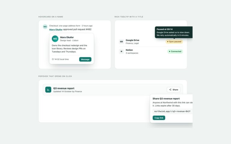
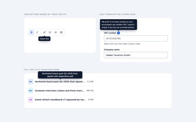
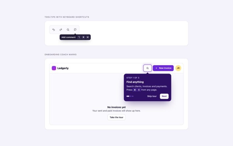
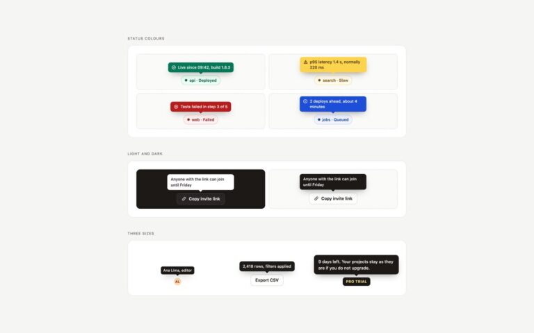
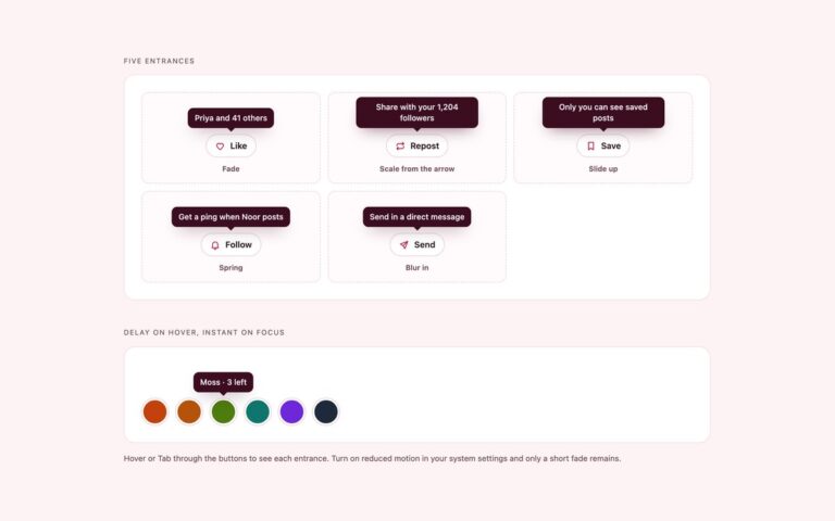
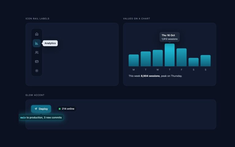
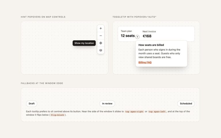
The tooltips most interfaces need, each with an arrow that points at its trigger. Four directions shows Duplicate, Move, Export and Archive buttons with tooltips above, to the right, below and to the left. Definitions inside text puts dotted-underline terms such as rolling reserve and chargebacks in a paragraph about payouts, each a real button whose tooltip explains the word and lines up with its start. Explaining a disabled action pairs Save draft with a Publish button that uses aria-disabled instead of disabled, so it can still be focused and hovered, and its tooltip says why it cannot be used; the reason also appears as visible text on the card. Each tooltip sits in a wrapper next to its trigger, and CSS shows it on hover and on keyboard focus. A short script adds what CSS cannot do: Esc hides the tooltip without moving focus, a tap opens it on touch screens, only one is open at a time, and top and bottom tooltips are nudged sideways to stay inside the window while the arrow keeps pointing at the trigger. The Bootstrap version uses Bootstrap’s own Tooltip plugin.
What’s included
Top, right, bottom and left placements with CSS arrows
Definition tooltips on words inside a paragraph
A focusable aria-disabled button that explains why it is disabled
Shows on hover and keyboard focus, hides with Esc
Stays open while the pointer moves onto the tooltip
Bootstrap version built on the Bootstrap Tooltip plugin
Accessibility
Each trigger is a native button linked to its tooltip with aria-describedby, and the tooltip has role="tooltip". Tooltips open on keyboard focus as well as hover, Esc dismisses them without moving focus, and an invisible bridge keeps them open while the pointer moves onto them, as WCAG 1.4.13 asks. The disabled reason is also visible text, and every button shows a 2px focus outline. The fade is removed under prefers-reduced-motion.
Customise it
Change --tt-bg, --tt-ink, --tt-gap, --tt-arrow and --tt-max on .tt (plain CSS) or the --color-tt and --color-tt-ink theme colours (Tailwind). In Bootstrap the same values are --bs-tooltip-bg, --bs-tooltip-color, --bs-tooltip-max-width and the arrow variables on .tooltip.tt.