About this set
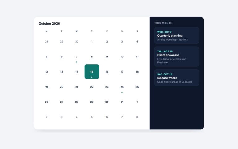
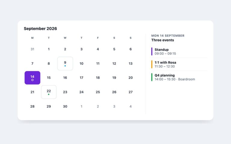
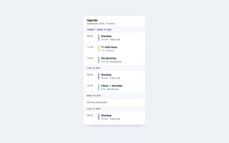
A 290 pixel calendar card for dashboards and sidebars: a month header with previous and next buttons, a small month grid with today filled in violet and a dot under each day that has events, and an Up next list of the following three events with coloured markers. Use it in an admin dashboard, a CRM sidebar or a project tool where the calendar is one widget among many. The month is a real table with a caption and weekday headers carrying the full day names. Today has aria-current=”date”, and today and each day with events also have visually hidden text, so the dots and the fill are not the only signal. The previous and next controls are real buttons with aria-labels and an SVG chevron; they are not wired to anything, so connect them to your own month logic. Out-of-month days are lighter in weight but still meet 4.5:1 contrast. The card is fixed at 290 pixels with max-width: 100%, so it never overflows a narrow column. The Bootstrap version uses .card, .btn and .table, and the Tailwind version builds the same parts from utilities.
What’s included
- Month table with event dots and a filled today
- Previous and next buttons with aria-labels
- "Up next" list with coloured markers
- Hidden text for today and days with events
- Fixed 290px card that shrinks to fit narrow columns
Accessibility
The month is a table with a caption and full weekday headers. Today has aria-current="date" and hidden "today" text, and days with events include hidden "has events" text. The navigation buttons have aria-labels and a 2px violet focus outline, and their hover transition is removed under prefers-reduced-motion.
Customise it
Change --cc-accent and --cc-muted on .ccal in plain CSS and Bootstrap (the buttons use --bs-btn-* variables), or the --color-cc-* theme colours in Tailwind. Width is the 290px on the card.