Open demo

CSS code

HTML
<svg width="0" height="0" style="position:absolute" aria-hidden="true" focusable="false">
  <symbol id="dk-i-rocket" viewBox="0 0 24 24" fill="none" stroke="currentColor" stroke-width="1.8" stroke-linecap="round" stroke-linejoin="round"><path d="M5 15c-1.5 1.3-2 4-2 4s2.7-.5 4-2M14.5 4.5C17.5 3 21 3 21 3s0 3.5-1.5 6.5L13 16l-5-5z"/><path d="m9.5 12.5-3-1L8.5 9h4M11.5 14.5l1 3 2.5-2V11.5"/></symbol>
  <symbol id="dk-i-eye" viewBox="0 0 24 24" fill="none" stroke="currentColor" stroke-width="1.8" stroke-linecap="round" stroke-linejoin="round"><path d="M2.5 12S6 5.5 12 5.5 21.5 12 21.5 12 18 18.5 12 18.5 2.5 12 2.5 12z"/><circle cx="12" cy="12" r="3"/></symbol>
  <symbol id="dk-i-trash" viewBox="0 0 24 24" fill="none" stroke="currentColor" stroke-width="1.8" stroke-linecap="round" stroke-linejoin="round"><path d="M4.5 7h15M10 11v6M14 11v6M6.5 7l1 12a1.5 1.5 0 0 0 1.5 1.4h6a1.5 1.5 0 0 0 1.5-1.4l1-12M9.5 7V4.5h5V7"/></symbol>
  <symbol id="dk-i-plus" viewBox="0 0 24 24" fill="none" stroke="currentColor" stroke-width="1.8" stroke-linecap="round" stroke-linejoin="round"><path d="M12 5v14M5 12h14"/></symbol>
  <symbol id="dk-i-copy" viewBox="0 0 24 24" fill="none" stroke="currentColor" stroke-width="1.8" stroke-linecap="round" stroke-linejoin="round"><rect x="8.5" y="8.5" width="11.5" height="11.5" rx="2"/><path d="M15.5 8.5V6a2 2 0 0 0-2-2H6a2 2 0 0 0-2 2v7.5a2 2 0 0 0 2 2h2.5"/></symbol>
  <symbol id="dk-i-download" viewBox="0 0 24 24" fill="none" stroke="currentColor" stroke-width="1.8" stroke-linecap="round" stroke-linejoin="round"><path d="M12 4v11M7.5 10.5 12 15l4.5-4.5M5 19.5h14"/></symbol>
  <symbol id="dk-i-edit" viewBox="0 0 24 24" fill="none" stroke="currentColor" stroke-width="1.8" stroke-linecap="round" stroke-linejoin="round"><path d="M4 20h4L19 9l-4-4L4 16z"/><path d="m13.5 6.5 4 4"/></symbol>
  <symbol id="dk-i-more" viewBox="0 0 24 24" fill="none" stroke="currentColor" stroke-width="1.8" stroke-linecap="round" stroke-linejoin="round"><path d="M5 12h.01M12 12h.01M19 12h.01" stroke-width="3"/></symbol>
  <symbol id="dk-i-bold" viewBox="0 0 24 24" fill="none" stroke="currentColor" stroke-width="1.8" stroke-linecap="round" stroke-linejoin="round"><path d="M7 5h6a3.5 3.5 0 0 1 0 7H7zM7 12h7a3.5 3.5 0 0 1 0 7H7z"/></symbol>
  <symbol id="dk-i-italic" viewBox="0 0 24 24" fill="none" stroke="currentColor" stroke-width="1.8" stroke-linecap="round" stroke-linejoin="round"><path d="M14 5h-4M14 19h-4M14 5l-4 14M10 5h6M8 19h6"/></symbol>
  <symbol id="dk-i-code" viewBox="0 0 24 24" fill="none" stroke="currentColor" stroke-width="1.8" stroke-linecap="round" stroke-linejoin="round"><path d="m8.5 8-4 4 4 4M15.5 8l4 4-4 4"/></symbol>
  <symbol id="dk-i-link" viewBox="0 0 24 24" fill="none" stroke="currentColor" stroke-width="1.8" stroke-linecap="round" stroke-linejoin="round"><path d="M10 14a4 4 0 0 0 5.7 0l3-3a4 4 0 0 0-5.7-5.7l-1 1"/><path d="M14 10a4 4 0 0 0-5.7 0l-3 3a4 4 0 0 0 5.7 5.7l1-1"/></symbol>
  <symbol id="dk-i-terminal" viewBox="0 0 24 24" fill="none" stroke="currentColor" stroke-width="1.8" stroke-linecap="round" stroke-linejoin="round"><rect x="3" y="4.5" width="18" height="15" rx="2"/><path d="m7 9.5 3 2.5-3 2.5M12.5 15H17"/></symbol>
  <symbol id="dk-i-chart" viewBox="0 0 24 24" fill="none" stroke="currentColor" stroke-width="1.8" stroke-linecap="round" stroke-linejoin="round"><path d="M4 20V4M4 20h16"/><path d="m7.5 15 3.5-4 3 2.5 5-6"/></symbol>
  <symbol id="dk-i-layers" viewBox="0 0 24 24" fill="none" stroke="currentColor" stroke-width="1.8" stroke-linecap="round" stroke-linejoin="round"><path d="m12 3.5 8.5 4.5-8.5 4.5L3.5 8z"/><path d="m3.5 12 8.5 4.5 8.5-4.5M3.5 16l8.5 4.5 8.5-4.5"/></symbol>
</svg>
<section><span class="lbl">Buttons · primary, secondary, ghost and danger</span><div class="dk-row">
<button class="dk-btn dk-btn--primary" type="button"><svg class="dk-ico" aria-hidden="true" focusable="false"><use href="#dk-i-rocket"/></svg>Deploy to production</button>
<button class="dk-btn" type="button"><svg class="dk-ico" aria-hidden="true" focusable="false"><use href="#dk-i-eye"/></svg>Preview build</button>
<button class="dk-btn dk-btn--ghost" type="button">Cancel</button>
<button class="dk-btn dk-btn--danger" type="button"><svg class="dk-ico" aria-hidden="true" focusable="false"><use href="#dk-i-trash"/></svg>Delete project</button>
</div></section>
<section><span class="lbl">Sizes and states · small, default, large, loading, disabled</span><div class="dk-row">
<button class="dk-btn dk-btn--sm" type="button">Invite</button>
<button class="dk-btn dk-btn--primary" type="button">Invite teammates</button>
<button class="dk-btn dk-btn--primary dk-btn--lg" type="button"><svg class="dk-ico" aria-hidden="true" focusable="false"><use href="#dk-i-plus"/></svg>Create project</button>
<button class="dk-btn" type="button" aria-busy="true"><span class="dk-spin" aria-hidden="true"></span>Deploying…</button>
<button class="dk-btn" type="button" disabled>Archived</button>
</div></section>
<div class="cols"><div class="stack">
<section><span class="lbl">Icon buttons · each has an accessible name</span><div class="dk-row">
<button class="dk-btn dk-btn--icon" type="button" aria-label="Copy deployment URL"><svg class="dk-ico" aria-hidden="true" focusable="false"><use href="#dk-i-copy"/></svg></button>
<button class="dk-btn dk-btn--icon" type="button" aria-label="Download build logs"><svg class="dk-ico" aria-hidden="true" focusable="false"><use href="#dk-i-download"/></svg></button>
<button class="dk-btn dk-btn--icon" type="button" aria-label="Rename project"><svg class="dk-ico" aria-hidden="true" focusable="false"><use href="#dk-i-edit"/></svg></button>
<button class="dk-btn dk-btn--icon dk-btn--ghost" type="button" aria-label="More actions"><svg class="dk-ico" aria-hidden="true" focusable="false"><use href="#dk-i-more"/></svg></button>
<button class="dk-btn dk-btn--icon dk-btn--primary dk-btn--round" type="button" aria-label="New project"><svg class="dk-ico" aria-hidden="true" focusable="false"><use href="#dk-i-plus"/></svg></button>
</div></section>
<section><span class="lbl">Toolbar toggles · pressed shows accent</span><div class="dk-toolbar" role="group" aria-label="Text formatting">
<label class="dk-tbtn"><input class="dk-sr" type="checkbox" aria-label="Bold" checked><span><svg class="dk-ico" aria-hidden="true" focusable="false"><use href="#dk-i-bold"/></svg></span></label>
<label class="dk-tbtn"><input class="dk-sr" type="checkbox" aria-label="Italic"><span><svg class="dk-ico" aria-hidden="true" focusable="false"><use href="#dk-i-italic"/></svg></span></label>
<span class="dk-toolbar__sep" aria-hidden="true"></span>
<label class="dk-tbtn"><input class="dk-sr" type="checkbox" aria-label="Inline code" checked><span><svg class="dk-ico" aria-hidden="true" focusable="false"><use href="#dk-i-code"/></svg></span></label>
<label class="dk-tbtn"><input class="dk-sr" type="checkbox" aria-label="Link"><span><svg class="dk-ico" aria-hidden="true" focusable="false"><use href="#dk-i-link"/></svg></span></label>
</div></section>
<section><span class="lbl">Segmented controls</span><div class="dk-row" style="gap:28px;align-items:flex-start">
<fieldset class="dk-seg"><legend>Log view</legend><div class="dk-seg__opts">
<label class="dk-seg__opt"><input class="dk-sr" type="radio" name="logview" value="stream"><span><svg class="dk-ico" aria-hidden="true" focusable="false"><use href="#dk-i-terminal"/></svg>Stream</span></label>
<label class="dk-seg__opt"><input class="dk-sr" type="radio" name="logview" value="table" checked><span><svg class="dk-ico" aria-hidden="true" focusable="false"><use href="#dk-i-layers"/></svg>Table</span></label>
<label class="dk-seg__opt"><input class="dk-sr" type="radio" name="logview" value="chart"><span><svg class="dk-ico" aria-hidden="true" focusable="false"><use href="#dk-i-chart"/></svg>Chart</span></label>
</div></fieldset>
<fieldset class="dk-seg"><legend>Environment</legend><div class="dk-seg__opts">
<label class="dk-seg__opt"><input class="dk-sr" type="radio" name="env" value="production" checked><span>Production</span></label>
<label class="dk-seg__opt"><input class="dk-sr" type="radio" name="env" value="preview"><span>Preview</span></label>
<label class="dk-seg__opt"><input class="dk-sr" type="radio" name="env" value="development"><span>Development</span></label>
</div></fieldset>
</div></section>
</div><section><span class="lbl">Switches · role="switch" on a real checkbox</span><div class="dk-card"><div class="stack" style="gap:20px">
<label class="dk-switch"><span class="dk-switch__text">Preview deployments<small>Build every pull request</small></span><input class="dk-sr" type="checkbox" role="switch" checked><span class="dk-switch__track" aria-hidden="true"></span></label>
<label class="dk-switch"><span class="dk-switch__text">Require approval<small>Production deploys need one reviewer</small></span><input class="dk-sr" type="checkbox" role="switch"><span class="dk-switch__track" aria-hidden="true"></span></label>
<label class="dk-switch"><span class="dk-switch__text">Maintenance mode<small>Locked by your organisation owner</small></span><input class="dk-sr" type="checkbox" role="switch" disabled><span class="dk-switch__track" aria-hidden="true"></span></label>
</div></div></section></div>
CSS
/* ── Dark UI kit tokens (uiCookies) — identical in every set ──────────────────────────────
   Dark first. Elevation is a lighter surface, not a shadow: surface-0 is the page, 1 cards and
   panels, 2 controls, menus and dialogs, 3 hover, selected rows and tooltips.
   Every colour is a light-dark() pair, so flipping color-scheme turns the whole kit light:
   data-theme="dark" | "light" | "system" on any wrapper (system follows prefers-color-scheme),
   or a checked .theme-pick radio inside a [data-theme] element (:has()).
   Contrast, dark | light, on the worst surface (surface-3): text-1 12.2 | 15.0, text-2 6.6 | 7.3,
   text-3 4.8 | 5.4, accent 5.4 | 5.1, success 7.7 | 5.0, warning 8.4 | 5.2, danger 6.8 | 5.0;
   edge (control boundaries) 3.3 | 3.1 and focus 7.9 | 5.9 against every surface. */
:root{color-scheme:dark}
[data-theme="dark"]{color-scheme:dark}
[data-theme="light"]{color-scheme:light}
[data-theme="system"]{color-scheme:light dark}
[data-theme]:has(.theme-pick[value="dark"]:checked){color-scheme:dark}
[data-theme]:has(.theme-pick[value="light"]:checked){color-scheme:light}
[data-theme]:has(.theme-pick[value="system"]:checked){color-scheme:light dark}
:root{
  --surface-0:light-dark(#eef1f5,#0b0d12);   /* page */
  --surface-1:light-dark(#ffffff,#151821);   /* cards, panels, navbar, sidebar */
  --surface-2:light-dark(#f6f7f9,#1d212c);   /* controls, menus, dialogs, toasts */
  --surface-3:light-dark(#e6e9ef,#262b38);   /* hover, selected rows, tooltips */
  --text-1:light-dark(#12151c,#eceef3);      /* primary text */
  --text-2:light-dark(#434a5a,#aab1bf);      /* secondary text */
  --text-3:light-dark(#555d6e,#8f96a8);      /* captions, placeholders, axis labels */
  --border:light-dark(#dde1e8,#2a2f3c);      /* decorative 1px dividers and card edges */
  --edge:light-dark(#7c8496,#737b90);        /* control boundaries: fields, boxes, tracks */
  --accent:light-dark(#4452d0,#8b97ff);      /* the one vivid colour: links, selected, primary */
  --accent-soft:light-dark(#e6e8ff,#232a4d); /* selected backgrounds; accent text keeps 5.2 | 5.3 on it */
  --on-accent:light-dark(#ffffff,#0b0d12);   /* text on accent fills, 6.2 | 7.4 */
  --success:light-dark(#11713f,#5fd4a0);     /* desaturated for dark, so they do not vibrate */
  --warning:light-dark(#875500,#f0c060);
  --danger:light-dark(#bb2532,#ff9790);
  --focus:light-dark(#3b48c4,#b5bdff);       /* 2px focus ring */
  --highlight:light-dark(rgb(255 255 255 / 0),rgb(255 255 255 / .045)); /* 1px top light on dark surfaces */
  --shadow-color:light-dark(rgb(16 24 40 / .16),rgb(0 0 0 / .55));     /* overlays only */
  --radius:12px;--radius-sm:8px;
  --mono:ui-monospace,"SF Mono","Cascadia Code",Menlo,Consolas,monospace;
}
/* No light-dark() (Chrome < 123, Safari < 17.5, Firefox < 120): the same values, chosen by attribute */
@supports not (color:light-dark(#fff,#000)){
  :root,[data-theme="dark"]{--surface-0:#0b0d12;--surface-1:#151821;--surface-2:#1d212c;--surface-3:#262b38;--text-1:#eceef3;--text-2:#aab1bf;--text-3:#8f96a8;--border:#2a2f3c;--edge:#737b90;--accent:#8b97ff;--accent-soft:#232a4d;--on-accent:#0b0d12;--success:#5fd4a0;--warning:#f0c060;--danger:#ff9790;--focus:#b5bdff;--highlight:rgb(255 255 255 / .045);--shadow-color:rgb(0 0 0 / .55)}
  [data-theme="light"]{--surface-0:#eef1f5;--surface-1:#ffffff;--surface-2:#f6f7f9;--surface-3:#e6e9ef;--text-1:#12151c;--text-2:#434a5a;--text-3:#555d6e;--border:#dde1e8;--edge:#7c8496;--accent:#4452d0;--accent-soft:#e6e8ff;--on-accent:#ffffff;--success:#11713f;--warning:#875500;--danger:#bb2532;--focus:#3b48c4;--highlight:rgb(255 255 255 / 0);--shadow-color:rgb(16 24 40 / .16)}
  @media (prefers-color-scheme:light){[data-theme="system"]{--surface-0:#eef1f5;--surface-1:#ffffff;--surface-2:#f6f7f9;--surface-3:#e6e9ef;--text-1:#12151c;--text-2:#434a5a;--text-3:#555d6e;--border:#dde1e8;--edge:#7c8496;--accent:#4452d0;--accent-soft:#e6e8ff;--on-accent:#ffffff;--success:#11713f;--warning:#875500;--danger:#bb2532;--focus:#3b48c4;--highlight:rgb(255 255 255 / 0);--shadow-color:rgb(16 24 40 / .16)}}
}
@media (prefers-contrast:more){:root{--border:var(--edge);--text-3:var(--text-2)}}
[data-theme]{background:var(--surface-0);color:var(--text-1)}
/* Components */
:where([class^="dk-"],[class*=" dk-"]),:where([class^="dk-"],[class*=" dk-"])::before,:where([class^="dk-"],[class*=" dk-"])::after{box-sizing:border-box}
.dk-sr{position:absolute;width:1px;height:1px;padding:0;margin:-1px;overflow:hidden;clip:rect(0,0,0,0);white-space:nowrap;border:0}
.dk-ico{width:18px;height:18px;flex:none}
.dk-kbd{display:inline-grid;place-items:center;min-width:1.45rem;height:1.35rem;padding:0 .35rem;border:1px solid var(--border);border-bottom-width:2px;
  border-radius:5px;background:var(--surface-2);color:var(--text-2);font:500 .72rem/1 var(--mono)}
.dk-link{color:var(--accent);font-weight:600;text-decoration:underline;text-decoration-color:color-mix(in srgb,var(--accent) 45%,transparent);text-underline-offset:3px}
.dk-link:hover{text-decoration-color:currentColor}
.dk-link:focus-visible{outline:2px solid var(--focus);outline-offset:2px;border-radius:3px}
/* Card: surface-1 with a 1px border and a 1px top highlight (dark only); no shadow */
.dk-card{padding:20px;border:1px solid var(--border);border-radius:var(--radius);background:var(--surface-1);color:var(--text-1);box-shadow:inset 0 1px 0 var(--highlight)}
.dk-card h2,.dk-card h3,.dk-card p{margin:0}
.dk-card__title{font-size:1rem;font-weight:650;letter-spacing:-.01em}
.dk-card__sub{margin-top:2px;font-size:.85rem;color:var(--text-2)}
/* Buttons: one recipe, variants only swap four custom properties */
.dk-btn{--b-bg:var(--surface-2);--b-fg:var(--text-1);--b-bd:var(--border);--b-hover:var(--surface-3);
  display:inline-flex;align-items:center;justify-content:center;gap:.5rem;min-height:38px;padding:.5rem 1rem;
  border:1px solid var(--b-bd);border-radius:var(--radius-sm);background:var(--b-bg);color:var(--b-fg);
  font-family:inherit;font-size:.875rem;font-weight:600;line-height:1.2;text-decoration:none;white-space:nowrap;cursor:pointer;
  box-shadow:inset 0 1px 0 var(--highlight);transition:background-color .15s,border-color .15s,color .15s}
.dk-btn:hover{background:var(--b-hover)}
.dk-btn:focus-visible{outline:2px solid var(--focus);outline-offset:2px}
.dk-btn--primary{--b-bg:var(--accent);--b-fg:var(--on-accent);--b-bd:var(--accent);--b-hover:color-mix(in srgb,var(--accent) 86%,var(--text-1))}
.dk-btn--ghost{--b-bg:transparent;--b-bd:transparent;--b-fg:var(--text-2);box-shadow:none}
.dk-btn--ghost:hover{color:var(--text-1)}
.dk-btn--danger{--b-fg:var(--danger);--b-bd:color-mix(in srgb,var(--danger) 40%,var(--border))}
.dk-btn--sm{min-height:32px;padding:.35rem .75rem;font-size:.8rem}
.dk-btn--lg{min-height:46px;padding:.7rem 1.35rem;font-size:.95rem}
.dk-btn--block{width:100%}
.dk-btn:disabled{opacity:.5;cursor:not-allowed}
.dk-btn[aria-busy="true"]{cursor:progress}
.dk-btn:disabled:hover{background:var(--b-bg)}
.dk-btn--icon{width:38px;padding:0}
.dk-btn--icon.dk-btn--sm{width:32px}
.dk-btn--icon.dk-btn--lg{width:46px}
.dk-btn--round{border-radius:999px}
.dk-spin{width:15px;height:15px;border:2px solid currentColor;border-right-color:transparent;border-radius:50%;animation:dk-spin .75s linear infinite}
@keyframes dk-spin{to{transform:rotate(1turn)}}
@media (prefers-reduced-motion:reduce){.dk-btn{transition:none}.dk-spin{animation-duration:2.4s}}
/* Switch: a checkbox with role="switch" and a drawn track. On = accent track, knob moves right */
.dk-switch{display:flex;align-items:center;gap:1rem;cursor:pointer}
.dk-switch__text{flex:1;min-width:0;font-size:.9rem;font-weight:600;line-height:1.35}
.dk-switch__text small{display:block;margin-top:2px;font-size:.8rem;font-weight:400;color:var(--text-2)}
.dk-switch__track{position:relative;flex:none;width:40px;height:22px;border:1px solid var(--edge);border-radius:999px;background:var(--surface-3);transition:background-color .18s,border-color .18s}
.dk-switch__track::before{content:"";position:absolute;top:2px;left:2px;width:16px;height:16px;border-radius:50%;background:var(--text-2);transition:transform .18s,background-color .18s}
.dk-switch input:checked+.dk-switch__track{background:var(--accent);border-color:var(--accent)}
.dk-switch input:checked+.dk-switch__track::before{transform:translateX(18px);background:var(--on-accent)}
.dk-switch input:focus-visible+.dk-switch__track{outline:2px solid var(--focus);outline-offset:2px}
.dk-switch input:disabled+.dk-switch__track{opacity:.5}
.dk-switch:has(input:disabled){cursor:not-allowed}
@media (prefers-reduced-motion:reduce){.dk-switch__track,.dk-switch__track::before{transition:none}}
/* Segmented control: radios in a fieldset. Selected = accent-soft fill, accent text and edge */
.dk-seg{min-width:0;margin:0;padding:0;border:0}
.dk-seg legend{margin-bottom:8px;padding:0;font-size:.8rem;font-weight:600;color:var(--text-2)}
.dk-seg__opts{display:inline-flex;flex-wrap:wrap;gap:2px;padding:3px;border:1px solid var(--border);border-radius:var(--radius-sm);background:var(--surface-0)}
.dk-seg__opt{position:relative}
.dk-seg__opt span{display:inline-flex;align-items:center;gap:.4rem;min-height:30px;padding:.3rem .8rem;border:1px solid transparent;border-radius:6px;
  color:var(--text-2);font-size:.82rem;font-weight:600;cursor:pointer;transition:background-color .15s,color .15s}
.dk-seg__opt span:hover{color:var(--text-1);background:var(--surface-2)}
.dk-seg__opt input:checked+span{background:var(--accent-soft);border-color:color-mix(in srgb,var(--accent) 55%,transparent);color:var(--accent)}
.dk-seg__opt input:focus-visible+span{outline:2px solid var(--focus);outline-offset:1px}
@media (prefers-reduced-motion:reduce){.dk-seg__opt span{transition:none}}
/* Toolbar toggles: checkboxes styled as icon buttons. Pressed = accent-soft fill and accent icon */
.dk-toolbar{display:inline-flex;flex-wrap:wrap;gap:2px;padding:3px;border:1px solid var(--border);border-radius:var(--radius-sm);background:var(--surface-1)}
.dk-toolbar__sep{width:1px;margin:4px 3px;background:var(--border)}
.dk-tbtn{position:relative;display:inline-flex}
.dk-tbtn span{display:grid;place-items:center;width:34px;height:32px;border:1px solid transparent;border-radius:6px;color:var(--text-2);cursor:pointer;transition:background-color .15s,color .15s}
.dk-tbtn span:hover{background:var(--surface-3);color:var(--text-1)}
.dk-tbtn input:checked+span{background:var(--accent-soft);border-color:color-mix(in srgb,var(--accent) 55%,transparent);color:var(--accent)}
.dk-tbtn input:focus-visible+span{outline:2px solid var(--focus);outline-offset:1px}
@media (prefers-reduced-motion:reduce){.dk-tbtn span{transition:none}}

Bootstrap 5 code

Requires: Bootstrap 5.3.8 CSS

HTML
<svg width="0" height="0" style="position:absolute" aria-hidden="true" focusable="false">
  <symbol id="dk-i-rocket" viewBox="0 0 24 24" fill="none" stroke="currentColor" stroke-width="1.8" stroke-linecap="round" stroke-linejoin="round"><path d="M5 15c-1.5 1.3-2 4-2 4s2.7-.5 4-2M14.5 4.5C17.5 3 21 3 21 3s0 3.5-1.5 6.5L13 16l-5-5z"/><path d="m9.5 12.5-3-1L8.5 9h4M11.5 14.5l1 3 2.5-2V11.5"/></symbol>
  <symbol id="dk-i-eye" viewBox="0 0 24 24" fill="none" stroke="currentColor" stroke-width="1.8" stroke-linecap="round" stroke-linejoin="round"><path d="M2.5 12S6 5.5 12 5.5 21.5 12 21.5 12 18 18.5 12 18.5 2.5 12 2.5 12z"/><circle cx="12" cy="12" r="3"/></symbol>
  <symbol id="dk-i-trash" viewBox="0 0 24 24" fill="none" stroke="currentColor" stroke-width="1.8" stroke-linecap="round" stroke-linejoin="round"><path d="M4.5 7h15M10 11v6M14 11v6M6.5 7l1 12a1.5 1.5 0 0 0 1.5 1.4h6a1.5 1.5 0 0 0 1.5-1.4l1-12M9.5 7V4.5h5V7"/></symbol>
  <symbol id="dk-i-plus" viewBox="0 0 24 24" fill="none" stroke="currentColor" stroke-width="1.8" stroke-linecap="round" stroke-linejoin="round"><path d="M12 5v14M5 12h14"/></symbol>
  <symbol id="dk-i-copy" viewBox="0 0 24 24" fill="none" stroke="currentColor" stroke-width="1.8" stroke-linecap="round" stroke-linejoin="round"><rect x="8.5" y="8.5" width="11.5" height="11.5" rx="2"/><path d="M15.5 8.5V6a2 2 0 0 0-2-2H6a2 2 0 0 0-2 2v7.5a2 2 0 0 0 2 2h2.5"/></symbol>
  <symbol id="dk-i-download" viewBox="0 0 24 24" fill="none" stroke="currentColor" stroke-width="1.8" stroke-linecap="round" stroke-linejoin="round"><path d="M12 4v11M7.5 10.5 12 15l4.5-4.5M5 19.5h14"/></symbol>
  <symbol id="dk-i-edit" viewBox="0 0 24 24" fill="none" stroke="currentColor" stroke-width="1.8" stroke-linecap="round" stroke-linejoin="round"><path d="M4 20h4L19 9l-4-4L4 16z"/><path d="m13.5 6.5 4 4"/></symbol>
  <symbol id="dk-i-more" viewBox="0 0 24 24" fill="none" stroke="currentColor" stroke-width="1.8" stroke-linecap="round" stroke-linejoin="round"><path d="M5 12h.01M12 12h.01M19 12h.01" stroke-width="3"/></symbol>
  <symbol id="dk-i-bold" viewBox="0 0 24 24" fill="none" stroke="currentColor" stroke-width="1.8" stroke-linecap="round" stroke-linejoin="round"><path d="M7 5h6a3.5 3.5 0 0 1 0 7H7zM7 12h7a3.5 3.5 0 0 1 0 7H7z"/></symbol>
  <symbol id="dk-i-italic" viewBox="0 0 24 24" fill="none" stroke="currentColor" stroke-width="1.8" stroke-linecap="round" stroke-linejoin="round"><path d="M14 5h-4M14 19h-4M14 5l-4 14M10 5h6M8 19h6"/></symbol>
  <symbol id="dk-i-code" viewBox="0 0 24 24" fill="none" stroke="currentColor" stroke-width="1.8" stroke-linecap="round" stroke-linejoin="round"><path d="m8.5 8-4 4 4 4M15.5 8l4 4-4 4"/></symbol>
  <symbol id="dk-i-link" viewBox="0 0 24 24" fill="none" stroke="currentColor" stroke-width="1.8" stroke-linecap="round" stroke-linejoin="round"><path d="M10 14a4 4 0 0 0 5.7 0l3-3a4 4 0 0 0-5.7-5.7l-1 1"/><path d="M14 10a4 4 0 0 0-5.7 0l-3 3a4 4 0 0 0 5.7 5.7l1-1"/></symbol>
  <symbol id="dk-i-terminal" viewBox="0 0 24 24" fill="none" stroke="currentColor" stroke-width="1.8" stroke-linecap="round" stroke-linejoin="round"><rect x="3" y="4.5" width="18" height="15" rx="2"/><path d="m7 9.5 3 2.5-3 2.5M12.5 15H17"/></symbol>
  <symbol id="dk-i-chart" viewBox="0 0 24 24" fill="none" stroke="currentColor" stroke-width="1.8" stroke-linecap="round" stroke-linejoin="round"><path d="M4 20V4M4 20h16"/><path d="m7.5 15 3.5-4 3 2.5 5-6"/></symbol>
  <symbol id="dk-i-layers" viewBox="0 0 24 24" fill="none" stroke="currentColor" stroke-width="1.8" stroke-linecap="round" stroke-linejoin="round"><path d="m12 3.5 8.5 4.5-8.5 4.5L3.5 8z"/><path d="m3.5 12 8.5 4.5 8.5-4.5M3.5 16l8.5 4.5 8.5-4.5"/></symbol>
</svg>
<section><span class="lbl">Buttons · primary, secondary, ghost and danger</span><div class="d-flex flex-wrap align-items-center gap-3">
<button class="btn btn-dk btn-dk-primary" type="button"><svg class="dk-ico" aria-hidden="true" focusable="false"><use href="#dk-i-rocket"/></svg>Deploy to production</button>
<button class="btn btn-dk" type="button"><svg class="dk-ico" aria-hidden="true" focusable="false"><use href="#dk-i-eye"/></svg>Preview build</button>
<button class="btn btn-dk btn-dk-ghost" type="button">Cancel</button>
<button class="btn btn-dk btn-dk-danger" type="button"><svg class="dk-ico" aria-hidden="true" focusable="false"><use href="#dk-i-trash"/></svg>Delete project</button>
</div></section>
<section><span class="lbl">Sizes and states · small, default, large, loading, disabled</span><div class="d-flex flex-wrap align-items-center gap-3">
<button class="btn btn-dk btn-sm" type="button">Invite</button>
<button class="btn btn-dk btn-dk-primary" type="button">Invite teammates</button>
<button class="btn btn-dk btn-dk-primary btn-lg" type="button"><svg class="dk-ico" aria-hidden="true" focusable="false"><use href="#dk-i-plus"/></svg>Create project</button>
<button class="btn btn-dk" type="button" aria-busy="true"><span class="spinner-border spinner-border-sm" aria-hidden="true"></span>Deploying…</button>
<button class="btn btn-dk" type="button" disabled>Archived</button>
</div></section>
<div class="cols"><div class="stack">
<section><span class="lbl">Icon buttons · each has an accessible name</span><div class="d-flex flex-wrap align-items-center gap-3">
<button class="btn btn-dk btn-dk-icon" type="button" aria-label="Copy deployment URL"><svg class="dk-ico" aria-hidden="true" focusable="false"><use href="#dk-i-copy"/></svg></button>
<button class="btn btn-dk btn-dk-icon" type="button" aria-label="Download build logs"><svg class="dk-ico" aria-hidden="true" focusable="false"><use href="#dk-i-download"/></svg></button>
<button class="btn btn-dk btn-dk-icon" type="button" aria-label="Rename project"><svg class="dk-ico" aria-hidden="true" focusable="false"><use href="#dk-i-edit"/></svg></button>
<button class="btn btn-dk btn-dk-icon btn-dk-ghost" type="button" aria-label="More actions"><svg class="dk-ico" aria-hidden="true" focusable="false"><use href="#dk-i-more"/></svg></button>
<button class="btn btn-dk btn-dk-icon btn-dk-primary btn-dk-round" type="button" aria-label="New project"><svg class="dk-ico" aria-hidden="true" focusable="false"><use href="#dk-i-plus"/></svg></button>
</div></section>
<section><span class="lbl">Toolbar toggles · pressed shows accent</span><div class="dk-toolbar" role="group" aria-label="Text formatting">
<input class="btn-check" type="checkbox" id="tool-bold" autocomplete="off" aria-label="Bold" checked><label class="btn" for="tool-bold"><svg class="dk-ico" aria-hidden="true" focusable="false"><use href="#dk-i-bold"/></svg></label>
<input class="btn-check" type="checkbox" id="tool-italic" autocomplete="off" aria-label="Italic"><label class="btn" for="tool-italic"><svg class="dk-ico" aria-hidden="true" focusable="false"><use href="#dk-i-italic"/></svg></label>
<span class="dk-toolbar__sep" aria-hidden="true"></span>
<input class="btn-check" type="checkbox" id="tool-code" autocomplete="off" aria-label="Inline code" checked><label class="btn" for="tool-code"><svg class="dk-ico" aria-hidden="true" focusable="false"><use href="#dk-i-code"/></svg></label>
<input class="btn-check" type="checkbox" id="tool-link" autocomplete="off" aria-label="Link"><label class="btn" for="tool-link"><svg class="dk-ico" aria-hidden="true" focusable="false"><use href="#dk-i-link"/></svg></label>
</div></section>
<section><span class="lbl">Segmented controls</span><div class="d-flex flex-wrap align-items-start" style="gap:28px">
<fieldset class="dk-seg"><legend>Log view</legend><div class="btn-group">
<input class="btn-check" type="radio" name="logview" id="logview-stream" value="stream" autocomplete="off"><label class="btn" for="logview-stream"><svg class="dk-ico" aria-hidden="true" focusable="false"><use href="#dk-i-terminal"/></svg>Stream</label>
<input class="btn-check" type="radio" name="logview" id="logview-table" value="table" autocomplete="off" checked><label class="btn" for="logview-table"><svg class="dk-ico" aria-hidden="true" focusable="false"><use href="#dk-i-layers"/></svg>Table</label>
<input class="btn-check" type="radio" name="logview" id="logview-chart" value="chart" autocomplete="off"><label class="btn" for="logview-chart"><svg class="dk-ico" aria-hidden="true" focusable="false"><use href="#dk-i-chart"/></svg>Chart</label>
</div></fieldset>
<fieldset class="dk-seg"><legend>Environment</legend><div class="btn-group">
<input class="btn-check" type="radio" name="env" id="env-production" value="production" autocomplete="off" checked><label class="btn" for="env-production">Production</label>
<input class="btn-check" type="radio" name="env" id="env-preview" value="preview" autocomplete="off"><label class="btn" for="env-preview">Preview</label>
<input class="btn-check" type="radio" name="env" id="env-development" value="development" autocomplete="off"><label class="btn" for="env-development">Development</label>
</div></fieldset>
</div></section>
</div><section><span class="lbl">Switches · role="switch" on a real checkbox</span><div class="card dk-card"><div class="card-body d-flex flex-column" style="gap:20px">
<div class="form-check form-switch dk-switch"><input class="form-check-input" type="checkbox" role="switch" id="sw-0" checked><label class="form-check-label" for="sw-0">Preview deployments<small>Build every pull request</small></label></div>
<div class="form-check form-switch dk-switch"><input class="form-check-input" type="checkbox" role="switch" id="sw-1"><label class="form-check-label" for="sw-1">Require approval<small>Production deploys need one reviewer</small></label></div>
<div class="form-check form-switch dk-switch"><input class="form-check-input" type="checkbox" role="switch" id="sw-2" disabled><label class="form-check-label" for="sw-2">Maintenance mode<small>Locked by your organisation owner</small></label></div>
</div></div></section></div>
CSS
/* ── Dark UI kit tokens (uiCookies) — identical in every set ──────────────────────────────
   Dark first. Elevation is a lighter surface, not a shadow: surface-0 is the page, 1 cards and
   panels, 2 controls, menus and dialogs, 3 hover, selected rows and tooltips.
   Every colour is a light-dark() pair, so flipping color-scheme turns the whole kit light:
   data-theme="dark" | "light" | "system" on any wrapper (system follows prefers-color-scheme),
   or a checked .theme-pick radio inside a [data-theme] element (:has()).
   Contrast, dark | light, on the worst surface (surface-3): text-1 12.2 | 15.0, text-2 6.6 | 7.3,
   text-3 4.8 | 5.4, accent 5.4 | 5.1, success 7.7 | 5.0, warning 8.4 | 5.2, danger 6.8 | 5.0;
   edge (control boundaries) 3.3 | 3.1 and focus 7.9 | 5.9 against every surface. */
:root{color-scheme:dark}
[data-theme="dark"]{color-scheme:dark}
[data-theme="light"]{color-scheme:light}
[data-theme="system"]{color-scheme:light dark}
[data-theme]:has(.theme-pick[value="dark"]:checked){color-scheme:dark}
[data-theme]:has(.theme-pick[value="light"]:checked){color-scheme:light}
[data-theme]:has(.theme-pick[value="system"]:checked){color-scheme:light dark}
:root{
  --surface-0:light-dark(#eef1f5,#0b0d12);   /* page */
  --surface-1:light-dark(#ffffff,#151821);   /* cards, panels, navbar, sidebar */
  --surface-2:light-dark(#f6f7f9,#1d212c);   /* controls, menus, dialogs, toasts */
  --surface-3:light-dark(#e6e9ef,#262b38);   /* hover, selected rows, tooltips */
  --text-1:light-dark(#12151c,#eceef3);      /* primary text */
  --text-2:light-dark(#434a5a,#aab1bf);      /* secondary text */
  --text-3:light-dark(#555d6e,#8f96a8);      /* captions, placeholders, axis labels */
  --border:light-dark(#dde1e8,#2a2f3c);      /* decorative 1px dividers and card edges */
  --edge:light-dark(#7c8496,#737b90);        /* control boundaries: fields, boxes, tracks */
  --accent:light-dark(#4452d0,#8b97ff);      /* the one vivid colour: links, selected, primary */
  --accent-soft:light-dark(#e6e8ff,#232a4d); /* selected backgrounds; accent text keeps 5.2 | 5.3 on it */
  --on-accent:light-dark(#ffffff,#0b0d12);   /* text on accent fills, 6.2 | 7.4 */
  --success:light-dark(#11713f,#5fd4a0);     /* desaturated for dark, so they do not vibrate */
  --warning:light-dark(#875500,#f0c060);
  --danger:light-dark(#bb2532,#ff9790);
  --focus:light-dark(#3b48c4,#b5bdff);       /* 2px focus ring */
  --highlight:light-dark(rgb(255 255 255 / 0),rgb(255 255 255 / .045)); /* 1px top light on dark surfaces */
  --shadow-color:light-dark(rgb(16 24 40 / .16),rgb(0 0 0 / .55));     /* overlays only */
  --radius:12px;--radius-sm:8px;
  --mono:ui-monospace,"SF Mono","Cascadia Code",Menlo,Consolas,monospace;
}
/* No light-dark() (Chrome < 123, Safari < 17.5, Firefox < 120): the same values, chosen by attribute */
@supports not (color:light-dark(#fff,#000)){
  :root,[data-theme="dark"]{--surface-0:#0b0d12;--surface-1:#151821;--surface-2:#1d212c;--surface-3:#262b38;--text-1:#eceef3;--text-2:#aab1bf;--text-3:#8f96a8;--border:#2a2f3c;--edge:#737b90;--accent:#8b97ff;--accent-soft:#232a4d;--on-accent:#0b0d12;--success:#5fd4a0;--warning:#f0c060;--danger:#ff9790;--focus:#b5bdff;--highlight:rgb(255 255 255 / .045);--shadow-color:rgb(0 0 0 / .55)}
  [data-theme="light"]{--surface-0:#eef1f5;--surface-1:#ffffff;--surface-2:#f6f7f9;--surface-3:#e6e9ef;--text-1:#12151c;--text-2:#434a5a;--text-3:#555d6e;--border:#dde1e8;--edge:#7c8496;--accent:#4452d0;--accent-soft:#e6e8ff;--on-accent:#ffffff;--success:#11713f;--warning:#875500;--danger:#bb2532;--focus:#3b48c4;--highlight:rgb(255 255 255 / 0);--shadow-color:rgb(16 24 40 / .16)}
  @media (prefers-color-scheme:light){[data-theme="system"]{--surface-0:#eef1f5;--surface-1:#ffffff;--surface-2:#f6f7f9;--surface-3:#e6e9ef;--text-1:#12151c;--text-2:#434a5a;--text-3:#555d6e;--border:#dde1e8;--edge:#7c8496;--accent:#4452d0;--accent-soft:#e6e8ff;--on-accent:#ffffff;--success:#11713f;--warning:#875500;--danger:#bb2532;--focus:#3b48c4;--highlight:rgb(255 255 255 / 0);--shadow-color:rgb(16 24 40 / .16)}}
}
@media (prefers-contrast:more){:root{--border:var(--edge);--text-3:var(--text-2)}}
[data-theme]{background:var(--surface-0);color:var(--text-1)}
/* Bootstrap's own variables mapped onto the kit tokens (identical in every Bootstrap set).
   data-bs-theme="dark" on <html> gives Bootstrap's dark defaults; the tokens then win. */
:root,[data-bs-theme],[data-theme]{
  --bs-body-bg:var(--surface-0);--bs-body-color:var(--text-1);--bs-emphasis-color:var(--text-1);
  --bs-heading-color:var(--text-1);--bs-secondary-color:var(--text-2);--bs-tertiary-color:var(--text-3);
  --bs-secondary-bg:var(--surface-2);--bs-tertiary-bg:var(--surface-3);
  --bs-border-color:var(--border);--bs-border-color-translucent:var(--border);
  --bs-border-radius:var(--radius-sm);--bs-border-radius-lg:var(--radius);--bs-border-radius-sm:6px;
  --bs-link-color:var(--accent);--bs-link-hover-color:var(--accent);
  --bs-focus-ring-color:var(--focus);--bs-code-color:var(--accent);
  --bs-font-monospace:var(--mono);
  --bs-success-text-emphasis:var(--success);--bs-warning-text-emphasis:var(--warning);--bs-danger-text-emphasis:var(--danger)}
/* Bootstrap draws the checkbox tick and select chevron as SVG images, which cannot read CSS
   variables, so each theme gets its own copy */
:root,[data-theme="dark"]{--dk-check-img:url("data:image/svg+xml,%3csvg xmlns='http://www.w3.org/2000/svg' viewBox='0 0 20 20'%3e%3cpath fill='none' stroke='%230b0d12' stroke-linecap='round' stroke-linejoin='round' stroke-width='3' d='m6 10 3 3 6-6'/%3e%3c/svg%3e");--dk-select-img:url("data:image/svg+xml,%3csvg xmlns='http://www.w3.org/2000/svg' viewBox='0 0 16 16'%3e%3cpath fill='none' stroke='%23aab1bf' stroke-linecap='round' stroke-linejoin='round' stroke-width='2' d='m2 5 6 6 6-6'/%3e%3c/svg%3e")}
[data-theme="light"]{--dk-check-img:url("data:image/svg+xml,%3csvg xmlns='http://www.w3.org/2000/svg' viewBox='0 0 20 20'%3e%3cpath fill='none' stroke='%23ffffff' stroke-linecap='round' stroke-linejoin='round' stroke-width='3' d='m6 10 3 3 6-6'/%3e%3c/svg%3e");--dk-select-img:url("data:image/svg+xml,%3csvg xmlns='http://www.w3.org/2000/svg' viewBox='0 0 16 16'%3e%3cpath fill='none' stroke='%23434a5a' stroke-linecap='round' stroke-linejoin='round' stroke-width='2' d='m2 5 6 6 6-6'/%3e%3c/svg%3e")}
@media (prefers-color-scheme:light){[data-theme="system"]{--dk-check-img:url("data:image/svg+xml,%3csvg xmlns='http://www.w3.org/2000/svg' viewBox='0 0 20 20'%3e%3cpath fill='none' stroke='%23ffffff' stroke-linecap='round' stroke-linejoin='round' stroke-width='3' d='m6 10 3 3 6-6'/%3e%3c/svg%3e");--dk-select-img:url("data:image/svg+xml,%3csvg xmlns='http://www.w3.org/2000/svg' viewBox='0 0 16 16'%3e%3cpath fill='none' stroke='%23434a5a' stroke-linecap='round' stroke-linejoin='round' stroke-width='2' d='m2 5 6 6 6-6'/%3e%3c/svg%3e")}}
[data-theme]:has(.theme-pick[value="dark"]:checked){--dk-check-img:url("data:image/svg+xml,%3csvg xmlns='http://www.w3.org/2000/svg' viewBox='0 0 20 20'%3e%3cpath fill='none' stroke='%230b0d12' stroke-linecap='round' stroke-linejoin='round' stroke-width='3' d='m6 10 3 3 6-6'/%3e%3c/svg%3e");--dk-select-img:url("data:image/svg+xml,%3csvg xmlns='http://www.w3.org/2000/svg' viewBox='0 0 16 16'%3e%3cpath fill='none' stroke='%23aab1bf' stroke-linecap='round' stroke-linejoin='round' stroke-width='2' d='m2 5 6 6 6-6'/%3e%3c/svg%3e")}
[data-theme]:has(.theme-pick[value="light"]:checked){--dk-check-img:url("data:image/svg+xml,%3csvg xmlns='http://www.w3.org/2000/svg' viewBox='0 0 20 20'%3e%3cpath fill='none' stroke='%23ffffff' stroke-linecap='round' stroke-linejoin='round' stroke-width='3' d='m6 10 3 3 6-6'/%3e%3c/svg%3e");--dk-select-img:url("data:image/svg+xml,%3csvg xmlns='http://www.w3.org/2000/svg' viewBox='0 0 16 16'%3e%3cpath fill='none' stroke='%23434a5a' stroke-linecap='round' stroke-linejoin='round' stroke-width='2' d='m2 5 6 6 6-6'/%3e%3c/svg%3e")}
@media (prefers-color-scheme:light){[data-theme]:has(.theme-pick[value="system"]:checked){--dk-check-img:url("data:image/svg+xml,%3csvg xmlns='http://www.w3.org/2000/svg' viewBox='0 0 20 20'%3e%3cpath fill='none' stroke='%23ffffff' stroke-linecap='round' stroke-linejoin='round' stroke-width='3' d='m6 10 3 3 6-6'/%3e%3c/svg%3e");--dk-select-img:url("data:image/svg+xml,%3csvg xmlns='http://www.w3.org/2000/svg' viewBox='0 0 16 16'%3e%3cpath fill='none' stroke='%23434a5a' stroke-linecap='round' stroke-linejoin='round' stroke-width='2' d='m2 5 6 6 6-6'/%3e%3c/svg%3e")}}
@media (prefers-color-scheme:dark){[data-theme]:has(.theme-pick[value="system"]:checked){--dk-check-img:url("data:image/svg+xml,%3csvg xmlns='http://www.w3.org/2000/svg' viewBox='0 0 20 20'%3e%3cpath fill='none' stroke='%230b0d12' stroke-linecap='round' stroke-linejoin='round' stroke-width='3' d='m6 10 3 3 6-6'/%3e%3c/svg%3e");--dk-select-img:url("data:image/svg+xml,%3csvg xmlns='http://www.w3.org/2000/svg' viewBox='0 0 16 16'%3e%3cpath fill='none' stroke='%23aab1bf' stroke-linecap='round' stroke-linejoin='round' stroke-width='2' d='m2 5 6 6 6-6'/%3e%3c/svg%3e")}}
a{color:var(--accent)}
a:hover{color:var(--accent)}
/* Components */
.dk-ico{width:18px;height:18px;flex:none}
.dk-kbd{display:inline-grid;place-items:center;min-width:1.45rem;height:1.35rem;padding:0 .35rem;border:1px solid var(--border);border-bottom-width:2px;
  border-radius:5px;background:var(--surface-2);color:var(--text-2);font:500 .72rem/1 var(--mono)}
.dk-link{color:var(--accent);font-weight:600;text-decoration-color:color-mix(in srgb,var(--accent) 45%,transparent);text-underline-offset:3px}
.dk-link:hover{color:var(--accent);text-decoration-color:currentColor}
.dk-link:focus-visible{outline:2px solid var(--focus);outline-offset:2px;border-radius:3px;box-shadow:none}
/* .card through --bs-card-* */
.card.dk-card{--bs-card-bg:var(--surface-1);--bs-card-color:var(--text-1);--bs-card-border-color:var(--border);--bs-card-border-radius:var(--radius);
  --bs-card-inner-border-radius:calc(var(--radius) - 1px);--bs-card-spacer-x:20px;--bs-card-spacer-y:20px;--bs-card-cap-bg:transparent;--bs-card-title-color:var(--text-1);
  --bs-card-subtitle-color:var(--text-2);box-shadow:inset 0 1px 0 var(--highlight)}
.dk-card h2,.dk-card h3,.dk-card p{margin:0}
.dk-card .card-title{font-size:1rem;font-weight:650;letter-spacing:-.01em;margin:0}
.dk-card .card-subtitle{margin-top:2px;font-size:.85rem}
/* .btn variants through --bs-btn-* */
.btn-dk{--bs-btn-padding-x:1rem;--bs-btn-padding-y:.5rem;--bs-btn-font-size:.875rem;--bs-btn-font-weight:600;--bs-btn-line-height:1.2;--bs-btn-border-radius:var(--radius-sm);
  --bs-btn-bg:var(--surface-2);--bs-btn-color:var(--text-1);--bs-btn-border-color:var(--border);
  --bs-btn-hover-bg:var(--surface-3);--bs-btn-hover-color:var(--text-1);--bs-btn-hover-border-color:var(--border);
  --bs-btn-active-bg:var(--surface-3);--bs-btn-active-color:var(--text-1);--bs-btn-active-border-color:var(--border);
  --bs-btn-disabled-bg:var(--surface-2);--bs-btn-disabled-color:var(--text-1);--bs-btn-disabled-border-color:var(--border);--bs-btn-disabled-opacity:.5;
  --bs-btn-focus-box-shadow:inset 0 1px 0 var(--highlight);
  display:inline-flex;align-items:center;justify-content:center;gap:.5rem;min-height:38px;white-space:nowrap;box-shadow:inset 0 1px 0 var(--highlight)}
.btn-dk:focus-visible,.btn-check:focus-visible+.btn-dk{outline:2px solid var(--focus);outline-offset:2px}
.btn-dk-primary{--bs-btn-bg:var(--accent);--bs-btn-color:var(--on-accent);--bs-btn-border-color:var(--accent);
  --bs-btn-hover-bg:color-mix(in srgb,var(--accent) 86%,var(--text-1));--bs-btn-hover-color:var(--on-accent);--bs-btn-hover-border-color:var(--accent);
  --bs-btn-active-bg:color-mix(in srgb,var(--accent) 86%,var(--text-1));--bs-btn-active-color:var(--on-accent);--bs-btn-active-border-color:var(--accent);
  --bs-btn-disabled-bg:var(--accent);--bs-btn-disabled-color:var(--on-accent);--bs-btn-disabled-border-color:var(--accent)}
.btn-dk-ghost{--bs-btn-bg:transparent;--bs-btn-border-color:transparent;--bs-btn-color:var(--text-2);--bs-btn-hover-border-color:transparent;--bs-btn-active-border-color:transparent;box-shadow:none}
.btn-dk-danger{--bs-btn-color:var(--danger);--bs-btn-border-color:color-mix(in srgb,var(--danger) 40%,var(--border));--bs-btn-hover-color:var(--danger);
  --bs-btn-hover-border-color:color-mix(in srgb,var(--danger) 40%,var(--border));--bs-btn-active-color:var(--danger)}
.btn-dk.btn-sm{--bs-btn-padding-x:.75rem;--bs-btn-padding-y:.35rem;--bs-btn-font-size:.8rem;min-height:32px}
.btn-dk.btn-lg{--bs-btn-padding-x:1.35rem;--bs-btn-padding-y:.7rem;--bs-btn-font-size:.95rem;--bs-btn-border-radius:var(--radius-sm);min-height:46px}
.btn-dk-icon{--bs-btn-padding-x:0;--bs-btn-padding-y:0;width:38px}
.btn-dk-icon.btn-sm{width:32px}.btn-dk-icon.btn-lg{width:46px}
.btn-dk.btn-dk-round{--bs-btn-border-radius:999px}
@media (prefers-reduced-motion:reduce){.btn-dk{transition:none}}
/* .form-switch: the knob is a radial-gradient of a token colour, so it follows the theme */
.dk-switch{display:flex;align-items:center;gap:1rem;min-height:0;margin:0;padding:0}
.dk-switch .form-check-label{flex:1;min-width:0;font-size:.9rem;font-weight:600;line-height:1.35;cursor:pointer}
.dk-switch .form-check-label small{display:block;margin-top:2px;font-size:.8rem;font-weight:400;color:var(--text-2)}
.dk-switch .form-check-input{--dk-knob:var(--text-2);order:2;flex:none;float:none;width:40px;height:22px;margin:0;border:1px solid var(--edge);border-radius:999px;
  background-color:var(--surface-3);background-image:radial-gradient(circle,var(--dk-knob) 0 7.5px,transparent 8px);background-size:20px 20px;
  background-position:left center;cursor:pointer;transition:background-position .18s,background-color .18s,border-color .18s}
.dk-switch .form-check-input:focus{border-color:var(--edge);box-shadow:none}
.dk-switch .form-check-input:checked{--dk-knob:var(--on-accent);background-color:var(--accent);border-color:var(--accent);background-position:right center}
.dk-switch .form-check-input:focus-visible{outline:2px solid var(--focus);outline-offset:2px}
.dk-switch .form-check-input:disabled{opacity:.5}
@media (prefers-reduced-motion:reduce){.dk-switch .form-check-input{transition:none}}
/* Segmented control: a .btn-group of .btn-check radios */
.dk-seg{min-width:0;margin:0;padding:0;border:0}
.dk-seg legend{float:none;width:auto;margin-bottom:8px;padding:0;font-size:.8rem;font-weight:600;color:var(--text-2)}
.dk-seg .btn-group{flex-wrap:wrap;gap:2px;padding:3px;border:1px solid var(--border);border-radius:var(--radius-sm);background:var(--surface-0)}
.dk-seg .btn{--bs-btn-padding-x:.8rem;--bs-btn-padding-y:.3rem;--bs-btn-font-size:.82rem;--bs-btn-font-weight:600;--bs-btn-color:var(--text-2);--bs-btn-border-color:transparent;
  --bs-btn-hover-color:var(--text-1);--bs-btn-hover-bg:var(--surface-2);--bs-btn-hover-border-color:transparent;
  --bs-btn-active-color:var(--accent);--bs-btn-active-bg:var(--accent-soft);--bs-btn-active-border-color:color-mix(in srgb,var(--accent) 55%,transparent);
  display:inline-flex;align-items:center;gap:.4rem;min-height:30px;flex:none;border-radius:6px!important;margin:0!important}
.dk-seg .btn-check:focus-visible+.btn{outline:2px solid var(--focus);outline-offset:1px;box-shadow:none}
/* Toolbar toggles: .btn-check checkboxes with icon .btn labels */
.dk-toolbar{display:inline-flex;flex-wrap:wrap;gap:2px;padding:3px;border:1px solid var(--border);border-radius:var(--radius-sm);background:var(--surface-1)}
.dk-toolbar__sep{width:1px;margin:4px 3px;background:var(--border)}
.dk-toolbar .btn{--bs-btn-padding-x:0;--bs-btn-padding-y:0;--bs-btn-color:var(--text-2);--bs-btn-border-color:transparent;--bs-btn-hover-bg:var(--surface-3);--bs-btn-hover-color:var(--text-1);
  --bs-btn-hover-border-color:transparent;--bs-btn-active-bg:var(--accent-soft);--bs-btn-active-color:var(--accent);--bs-btn-active-border-color:color-mix(in srgb,var(--accent) 55%,transparent);
  display:grid;place-items:center;width:34px;height:32px;border-radius:6px}
.dk-toolbar .btn-check:focus-visible+.btn{outline:2px solid var(--focus);outline-offset:1px;box-shadow:none}
.dk-switch .form-check-input:disabled~.form-check-label{opacity:1;cursor:not-allowed}

Tailwind 4 code

Requires: Tailwind CSS 4

HTML
<svg width="0" height="0" style="position:absolute" aria-hidden="true" focusable="false">
  <symbol id="dk-i-rocket" viewBox="0 0 24 24" fill="none" stroke="currentColor" stroke-width="1.8" stroke-linecap="round" stroke-linejoin="round"><path d="M5 15c-1.5 1.3-2 4-2 4s2.7-.5 4-2M14.5 4.5C17.5 3 21 3 21 3s0 3.5-1.5 6.5L13 16l-5-5z"/><path d="m9.5 12.5-3-1L8.5 9h4M11.5 14.5l1 3 2.5-2V11.5"/></symbol>
  <symbol id="dk-i-eye" viewBox="0 0 24 24" fill="none" stroke="currentColor" stroke-width="1.8" stroke-linecap="round" stroke-linejoin="round"><path d="M2.5 12S6 5.5 12 5.5 21.5 12 21.5 12 18 18.5 12 18.5 2.5 12 2.5 12z"/><circle cx="12" cy="12" r="3"/></symbol>
  <symbol id="dk-i-trash" viewBox="0 0 24 24" fill="none" stroke="currentColor" stroke-width="1.8" stroke-linecap="round" stroke-linejoin="round"><path d="M4.5 7h15M10 11v6M14 11v6M6.5 7l1 12a1.5 1.5 0 0 0 1.5 1.4h6a1.5 1.5 0 0 0 1.5-1.4l1-12M9.5 7V4.5h5V7"/></symbol>
  <symbol id="dk-i-plus" viewBox="0 0 24 24" fill="none" stroke="currentColor" stroke-width="1.8" stroke-linecap="round" stroke-linejoin="round"><path d="M12 5v14M5 12h14"/></symbol>
  <symbol id="dk-i-copy" viewBox="0 0 24 24" fill="none" stroke="currentColor" stroke-width="1.8" stroke-linecap="round" stroke-linejoin="round"><rect x="8.5" y="8.5" width="11.5" height="11.5" rx="2"/><path d="M15.5 8.5V6a2 2 0 0 0-2-2H6a2 2 0 0 0-2 2v7.5a2 2 0 0 0 2 2h2.5"/></symbol>
  <symbol id="dk-i-download" viewBox="0 0 24 24" fill="none" stroke="currentColor" stroke-width="1.8" stroke-linecap="round" stroke-linejoin="round"><path d="M12 4v11M7.5 10.5 12 15l4.5-4.5M5 19.5h14"/></symbol>
  <symbol id="dk-i-edit" viewBox="0 0 24 24" fill="none" stroke="currentColor" stroke-width="1.8" stroke-linecap="round" stroke-linejoin="round"><path d="M4 20h4L19 9l-4-4L4 16z"/><path d="m13.5 6.5 4 4"/></symbol>
  <symbol id="dk-i-more" viewBox="0 0 24 24" fill="none" stroke="currentColor" stroke-width="1.8" stroke-linecap="round" stroke-linejoin="round"><path d="M5 12h.01M12 12h.01M19 12h.01" stroke-width="3"/></symbol>
  <symbol id="dk-i-bold" viewBox="0 0 24 24" fill="none" stroke="currentColor" stroke-width="1.8" stroke-linecap="round" stroke-linejoin="round"><path d="M7 5h6a3.5 3.5 0 0 1 0 7H7zM7 12h7a3.5 3.5 0 0 1 0 7H7z"/></symbol>
  <symbol id="dk-i-italic" viewBox="0 0 24 24" fill="none" stroke="currentColor" stroke-width="1.8" stroke-linecap="round" stroke-linejoin="round"><path d="M14 5h-4M14 19h-4M14 5l-4 14M10 5h6M8 19h6"/></symbol>
  <symbol id="dk-i-code" viewBox="0 0 24 24" fill="none" stroke="currentColor" stroke-width="1.8" stroke-linecap="round" stroke-linejoin="round"><path d="m8.5 8-4 4 4 4M15.5 8l4 4-4 4"/></symbol>
  <symbol id="dk-i-link" viewBox="0 0 24 24" fill="none" stroke="currentColor" stroke-width="1.8" stroke-linecap="round" stroke-linejoin="round"><path d="M10 14a4 4 0 0 0 5.7 0l3-3a4 4 0 0 0-5.7-5.7l-1 1"/><path d="M14 10a4 4 0 0 0-5.7 0l-3 3a4 4 0 0 0 5.7 5.7l1-1"/></symbol>
  <symbol id="dk-i-terminal" viewBox="0 0 24 24" fill="none" stroke="currentColor" stroke-width="1.8" stroke-linecap="round" stroke-linejoin="round"><rect x="3" y="4.5" width="18" height="15" rx="2"/><path d="m7 9.5 3 2.5-3 2.5M12.5 15H17"/></symbol>
  <symbol id="dk-i-chart" viewBox="0 0 24 24" fill="none" stroke="currentColor" stroke-width="1.8" stroke-linecap="round" stroke-linejoin="round"><path d="M4 20V4M4 20h16"/><path d="m7.5 15 3.5-4 3 2.5 5-6"/></symbol>
  <symbol id="dk-i-layers" viewBox="0 0 24 24" fill="none" stroke="currentColor" stroke-width="1.8" stroke-linecap="round" stroke-linejoin="round"><path d="m12 3.5 8.5 4.5-8.5 4.5L3.5 8z"/><path d="m3.5 12 8.5 4.5 8.5-4.5M3.5 16l8.5 4.5 8.5-4.5"/></symbol>
</svg>
<section><span class="mb-3.5 block text-[.72rem] font-semibold tracking-[.12em] text-ink-3 uppercase">Buttons · primary, secondary, ghost and danger</span><div class="flex flex-wrap items-center gap-3">
<button class="inline-flex cursor-pointer items-center justify-center gap-2 rounded-ui-sm border font-semibold leading-[1.2] whitespace-nowrap no-underline transition-colors duration-150 motion-reduce:transition-none disabled:cursor-not-allowed disabled:opacity-50 focus-visible:outline-2 focus-visible:outline-offset-2 focus-visible:outline-focus border-accent bg-accent text-on-accent inset-shadow-hl hover:bg-[color-mix(in_srgb,var(--accent)_86%,var(--text-1))] min-h-[38px] px-4 py-2 text-[.875rem]" type="button"><svg class="size-[18px] shrink-0" aria-hidden="true" focusable="false"><use href="#dk-i-rocket"/></svg>Deploy to production</button>
<button class="inline-flex cursor-pointer items-center justify-center gap-2 rounded-ui-sm border font-semibold leading-[1.2] whitespace-nowrap no-underline transition-colors duration-150 motion-reduce:transition-none disabled:cursor-not-allowed disabled:opacity-50 focus-visible:outline-2 focus-visible:outline-offset-2 focus-visible:outline-focus border-line bg-surface-2 text-ink-1 inset-shadow-hl hover:bg-surface-3 min-h-[38px] px-4 py-2 text-[.875rem]" type="button"><svg class="size-[18px] shrink-0" aria-hidden="true" focusable="false"><use href="#dk-i-eye"/></svg>Preview build</button>
<button class="inline-flex cursor-pointer items-center justify-center gap-2 rounded-ui-sm border font-semibold leading-[1.2] whitespace-nowrap no-underline transition-colors duration-150 motion-reduce:transition-none disabled:cursor-not-allowed disabled:opacity-50 focus-visible:outline-2 focus-visible:outline-offset-2 focus-visible:outline-focus border-transparent bg-transparent text-ink-2 hover:bg-surface-3 hover:text-ink-1 min-h-[38px] px-4 py-2 text-[.875rem]" type="button">Cancel</button>
<button class="inline-flex cursor-pointer items-center justify-center gap-2 rounded-ui-sm border font-semibold leading-[1.2] whitespace-nowrap no-underline transition-colors duration-150 motion-reduce:transition-none disabled:cursor-not-allowed disabled:opacity-50 focus-visible:outline-2 focus-visible:outline-offset-2 focus-visible:outline-focus border-[color-mix(in_srgb,var(--danger)_40%,var(--border))] bg-surface-2 text-danger inset-shadow-hl hover:bg-surface-3 min-h-[38px] px-4 py-2 text-[.875rem]" type="button"><svg class="size-[18px] shrink-0" aria-hidden="true" focusable="false"><use href="#dk-i-trash"/></svg>Delete project</button>
</div></section>
<section><span class="mb-3.5 block text-[.72rem] font-semibold tracking-[.12em] text-ink-3 uppercase">Sizes and states · small, default, large, loading, disabled</span><div class="flex flex-wrap items-center gap-3">
<button class="inline-flex cursor-pointer items-center justify-center gap-2 rounded-ui-sm border font-semibold leading-[1.2] whitespace-nowrap no-underline transition-colors duration-150 motion-reduce:transition-none disabled:cursor-not-allowed disabled:opacity-50 focus-visible:outline-2 focus-visible:outline-offset-2 focus-visible:outline-focus border-line bg-surface-2 text-ink-1 inset-shadow-hl hover:bg-surface-3 min-h-8 px-3 py-[.35rem] text-[.8rem]" type="button">Invite</button>
<button class="inline-flex cursor-pointer items-center justify-center gap-2 rounded-ui-sm border font-semibold leading-[1.2] whitespace-nowrap no-underline transition-colors duration-150 motion-reduce:transition-none disabled:cursor-not-allowed disabled:opacity-50 focus-visible:outline-2 focus-visible:outline-offset-2 focus-visible:outline-focus border-accent bg-accent text-on-accent inset-shadow-hl hover:bg-[color-mix(in_srgb,var(--accent)_86%,var(--text-1))] min-h-[38px] px-4 py-2 text-[.875rem]" type="button">Invite teammates</button>
<button class="inline-flex cursor-pointer items-center justify-center gap-2 rounded-ui-sm border font-semibold leading-[1.2] whitespace-nowrap no-underline transition-colors duration-150 motion-reduce:transition-none disabled:cursor-not-allowed disabled:opacity-50 focus-visible:outline-2 focus-visible:outline-offset-2 focus-visible:outline-focus border-accent bg-accent text-on-accent inset-shadow-hl hover:bg-[color-mix(in_srgb,var(--accent)_86%,var(--text-1))] min-h-[46px] px-[1.35rem] py-[.7rem] text-[.95rem]" type="button"><svg class="size-[18px] shrink-0" aria-hidden="true" focusable="false"><use href="#dk-i-plus"/></svg>Create project</button>
<button class="inline-flex cursor-pointer items-center justify-center gap-2 rounded-ui-sm border font-semibold leading-[1.2] whitespace-nowrap no-underline transition-colors duration-150 motion-reduce:transition-none disabled:cursor-not-allowed disabled:opacity-50 focus-visible:outline-2 focus-visible:outline-offset-2 focus-visible:outline-focus border-line bg-surface-2 text-ink-1 inset-shadow-hl hover:bg-surface-3 min-h-[38px] px-4 py-2 text-[.875rem] cursor-progress" type="button" aria-busy="true"><span class="size-[15px] animate-spin rounded-full border-2 border-current border-r-transparent motion-reduce:[animation-duration:2.4s]" aria-hidden="true"></span>Deploying…</button>
<button class="inline-flex cursor-pointer items-center justify-center gap-2 rounded-ui-sm border font-semibold leading-[1.2] whitespace-nowrap no-underline transition-colors duration-150 motion-reduce:transition-none disabled:cursor-not-allowed disabled:opacity-50 focus-visible:outline-2 focus-visible:outline-offset-2 focus-visible:outline-focus border-line bg-surface-2 text-ink-1 inset-shadow-hl hover:bg-surface-3 min-h-[38px] px-4 py-2 text-[.875rem] disabled:hover:bg-surface-2" type="button" disabled>Archived</button>
</div></section>
<div class="grid gap-11 md:grid-cols-2"><div class="flex flex-col gap-9">
<section><span class="mb-3.5 block text-[.72rem] font-semibold tracking-[.12em] text-ink-3 uppercase">Icon buttons · each has an accessible name</span><div class="flex flex-wrap items-center gap-3">
<button class="inline-flex cursor-pointer items-center justify-center gap-2 rounded-ui-sm border font-semibold leading-[1.2] whitespace-nowrap no-underline transition-colors duration-150 motion-reduce:transition-none disabled:cursor-not-allowed disabled:opacity-50 focus-visible:outline-2 focus-visible:outline-offset-2 focus-visible:outline-focus border-line bg-surface-2 text-ink-1 inset-shadow-hl hover:bg-surface-3 size-[38px] p-0" type="button" aria-label="Copy deployment URL"><svg class="size-[18px] shrink-0" aria-hidden="true" focusable="false"><use href="#dk-i-copy"/></svg></button>
<button class="inline-flex cursor-pointer items-center justify-center gap-2 rounded-ui-sm border font-semibold leading-[1.2] whitespace-nowrap no-underline transition-colors duration-150 motion-reduce:transition-none disabled:cursor-not-allowed disabled:opacity-50 focus-visible:outline-2 focus-visible:outline-offset-2 focus-visible:outline-focus border-line bg-surface-2 text-ink-1 inset-shadow-hl hover:bg-surface-3 size-[38px] p-0" type="button" aria-label="Download build logs"><svg class="size-[18px] shrink-0" aria-hidden="true" focusable="false"><use href="#dk-i-download"/></svg></button>
<button class="inline-flex cursor-pointer items-center justify-center gap-2 rounded-ui-sm border font-semibold leading-[1.2] whitespace-nowrap no-underline transition-colors duration-150 motion-reduce:transition-none disabled:cursor-not-allowed disabled:opacity-50 focus-visible:outline-2 focus-visible:outline-offset-2 focus-visible:outline-focus border-line bg-surface-2 text-ink-1 inset-shadow-hl hover:bg-surface-3 size-[38px] p-0" type="button" aria-label="Rename project"><svg class="size-[18px] shrink-0" aria-hidden="true" focusable="false"><use href="#dk-i-edit"/></svg></button>
<button class="inline-flex cursor-pointer items-center justify-center gap-2 rounded-ui-sm border font-semibold leading-[1.2] whitespace-nowrap no-underline transition-colors duration-150 motion-reduce:transition-none disabled:cursor-not-allowed disabled:opacity-50 focus-visible:outline-2 focus-visible:outline-offset-2 focus-visible:outline-focus border-transparent bg-transparent text-ink-2 hover:bg-surface-3 hover:text-ink-1 size-[38px] p-0" type="button" aria-label="More actions"><svg class="size-[18px] shrink-0" aria-hidden="true" focusable="false"><use href="#dk-i-more"/></svg></button>
<button class="inline-flex cursor-pointer items-center justify-center gap-2 rounded-full border font-semibold leading-[1.2] whitespace-nowrap no-underline transition-colors duration-150 motion-reduce:transition-none disabled:cursor-not-allowed disabled:opacity-50 focus-visible:outline-2 focus-visible:outline-offset-2 focus-visible:outline-focus border-accent bg-accent text-on-accent inset-shadow-hl hover:bg-[color-mix(in_srgb,var(--accent)_86%,var(--text-1))] size-[38px] p-0" type="button" aria-label="New project"><svg class="size-[18px] shrink-0" aria-hidden="true" focusable="false"><use href="#dk-i-plus"/></svg></button>
</div></section>
<section><span class="mb-3.5 block text-[.72rem] font-semibold tracking-[.12em] text-ink-3 uppercase">Toolbar toggles · pressed shows accent</span><div class="inline-flex flex-wrap gap-0.5 rounded-ui-sm border border-line bg-surface-1 p-[3px]" role="group" aria-label="Text formatting">
<label class="relative inline-flex"><input class="peer sr-only" type="checkbox" aria-label="Bold" checked><span class="grid h-8 w-[34px] cursor-pointer place-items-center rounded-md border border-transparent text-ink-2 transition-colors duration-150 hover:bg-surface-3 hover:text-ink-1 motion-reduce:transition-none peer-checked:border-[color-mix(in_srgb,var(--accent)_55%,transparent)] peer-checked:bg-accent-soft peer-checked:text-accent peer-focus-visible:outline-2 peer-focus-visible:outline-offset-1 peer-focus-visible:outline-focus"><svg class="size-[18px] shrink-0" aria-hidden="true" focusable="false"><use href="#dk-i-bold"/></svg></span></label>
<label class="relative inline-flex"><input class="peer sr-only" type="checkbox" aria-label="Italic"><span class="grid h-8 w-[34px] cursor-pointer place-items-center rounded-md border border-transparent text-ink-2 transition-colors duration-150 hover:bg-surface-3 hover:text-ink-1 motion-reduce:transition-none peer-checked:border-[color-mix(in_srgb,var(--accent)_55%,transparent)] peer-checked:bg-accent-soft peer-checked:text-accent peer-focus-visible:outline-2 peer-focus-visible:outline-offset-1 peer-focus-visible:outline-focus"><svg class="size-[18px] shrink-0" aria-hidden="true" focusable="false"><use href="#dk-i-italic"/></svg></span></label>
<span class="mx-[3px] my-1 w-px bg-line" aria-hidden="true"></span>
<label class="relative inline-flex"><input class="peer sr-only" type="checkbox" aria-label="Inline code" checked><span class="grid h-8 w-[34px] cursor-pointer place-items-center rounded-md border border-transparent text-ink-2 transition-colors duration-150 hover:bg-surface-3 hover:text-ink-1 motion-reduce:transition-none peer-checked:border-[color-mix(in_srgb,var(--accent)_55%,transparent)] peer-checked:bg-accent-soft peer-checked:text-accent peer-focus-visible:outline-2 peer-focus-visible:outline-offset-1 peer-focus-visible:outline-focus"><svg class="size-[18px] shrink-0" aria-hidden="true" focusable="false"><use href="#dk-i-code"/></svg></span></label>
<label class="relative inline-flex"><input class="peer sr-only" type="checkbox" aria-label="Link"><span class="grid h-8 w-[34px] cursor-pointer place-items-center rounded-md border border-transparent text-ink-2 transition-colors duration-150 hover:bg-surface-3 hover:text-ink-1 motion-reduce:transition-none peer-checked:border-[color-mix(in_srgb,var(--accent)_55%,transparent)] peer-checked:bg-accent-soft peer-checked:text-accent peer-focus-visible:outline-2 peer-focus-visible:outline-offset-1 peer-focus-visible:outline-focus"><svg class="size-[18px] shrink-0" aria-hidden="true" focusable="false"><use href="#dk-i-link"/></svg></span></label>
</div></section>
<section><span class="mb-3.5 block text-[.72rem] font-semibold tracking-[.12em] text-ink-3 uppercase">Segmented controls</span><div class="flex flex-wrap items-start gap-7">
<fieldset class="m-0 min-w-0 border-0 p-0"><legend class="mb-2 p-0 text-[.8rem] font-semibold text-ink-2">Log view</legend><div class="inline-flex flex-wrap gap-0.5 rounded-ui-sm border border-line bg-surface-0 p-[3px]"><label class="relative"><input class="peer sr-only" type="radio" name="logview" value="stream"><span class="inline-flex min-h-[30px] cursor-pointer items-center gap-[.4rem] rounded-md border border-transparent px-[.8rem] py-[.3rem] text-[.82rem] font-semibold text-ink-2 transition-colors duration-150 hover:bg-surface-2 hover:text-ink-1 motion-reduce:transition-none peer-checked:border-[color-mix(in_srgb,var(--accent)_55%,transparent)] peer-checked:bg-accent-soft peer-checked:text-accent peer-focus-visible:outline-2 peer-focus-visible:outline-offset-1 peer-focus-visible:outline-focus"><svg class="size-[18px] shrink-0" aria-hidden="true" focusable="false"><use href="#dk-i-terminal"/></svg>Stream</span></label><label class="relative"><input class="peer sr-only" type="radio" name="logview" value="table" checked><span class="inline-flex min-h-[30px] cursor-pointer items-center gap-[.4rem] rounded-md border border-transparent px-[.8rem] py-[.3rem] text-[.82rem] font-semibold text-ink-2 transition-colors duration-150 hover:bg-surface-2 hover:text-ink-1 motion-reduce:transition-none peer-checked:border-[color-mix(in_srgb,var(--accent)_55%,transparent)] peer-checked:bg-accent-soft peer-checked:text-accent peer-focus-visible:outline-2 peer-focus-visible:outline-offset-1 peer-focus-visible:outline-focus"><svg class="size-[18px] shrink-0" aria-hidden="true" focusable="false"><use href="#dk-i-layers"/></svg>Table</span></label><label class="relative"><input class="peer sr-only" type="radio" name="logview" value="chart"><span class="inline-flex min-h-[30px] cursor-pointer items-center gap-[.4rem] rounded-md border border-transparent px-[.8rem] py-[.3rem] text-[.82rem] font-semibold text-ink-2 transition-colors duration-150 hover:bg-surface-2 hover:text-ink-1 motion-reduce:transition-none peer-checked:border-[color-mix(in_srgb,var(--accent)_55%,transparent)] peer-checked:bg-accent-soft peer-checked:text-accent peer-focus-visible:outline-2 peer-focus-visible:outline-offset-1 peer-focus-visible:outline-focus"><svg class="size-[18px] shrink-0" aria-hidden="true" focusable="false"><use href="#dk-i-chart"/></svg>Chart</span></label></div></fieldset>
<fieldset class="m-0 min-w-0 border-0 p-0"><legend class="mb-2 p-0 text-[.8rem] font-semibold text-ink-2">Environment</legend><div class="inline-flex flex-wrap gap-0.5 rounded-ui-sm border border-line bg-surface-0 p-[3px]"><label class="relative"><input class="peer sr-only" type="radio" name="env" value="production" checked><span class="inline-flex min-h-[30px] cursor-pointer items-center gap-[.4rem] rounded-md border border-transparent px-[.8rem] py-[.3rem] text-[.82rem] font-semibold text-ink-2 transition-colors duration-150 hover:bg-surface-2 hover:text-ink-1 motion-reduce:transition-none peer-checked:border-[color-mix(in_srgb,var(--accent)_55%,transparent)] peer-checked:bg-accent-soft peer-checked:text-accent peer-focus-visible:outline-2 peer-focus-visible:outline-offset-1 peer-focus-visible:outline-focus">Production</span></label><label class="relative"><input class="peer sr-only" type="radio" name="env" value="preview"><span class="inline-flex min-h-[30px] cursor-pointer items-center gap-[.4rem] rounded-md border border-transparent px-[.8rem] py-[.3rem] text-[.82rem] font-semibold text-ink-2 transition-colors duration-150 hover:bg-surface-2 hover:text-ink-1 motion-reduce:transition-none peer-checked:border-[color-mix(in_srgb,var(--accent)_55%,transparent)] peer-checked:bg-accent-soft peer-checked:text-accent peer-focus-visible:outline-2 peer-focus-visible:outline-offset-1 peer-focus-visible:outline-focus">Preview</span></label><label class="relative"><input class="peer sr-only" type="radio" name="env" value="development"><span class="inline-flex min-h-[30px] cursor-pointer items-center gap-[.4rem] rounded-md border border-transparent px-[.8rem] py-[.3rem] text-[.82rem] font-semibold text-ink-2 transition-colors duration-150 hover:bg-surface-2 hover:text-ink-1 motion-reduce:transition-none peer-checked:border-[color-mix(in_srgb,var(--accent)_55%,transparent)] peer-checked:bg-accent-soft peer-checked:text-accent peer-focus-visible:outline-2 peer-focus-visible:outline-offset-1 peer-focus-visible:outline-focus">Development</span></label></div></fieldset>
</div></section>
</div><section><span class="mb-3.5 block text-[.72rem] font-semibold tracking-[.12em] text-ink-3 uppercase">Switches · role="switch" on a real checkbox</span><div class="rounded-ui border border-line bg-surface-1 text-ink-1 inset-shadow-hl p-5"><div class="flex flex-col gap-5">
<label class="flex cursor-pointer items-center gap-4 has-disabled:cursor-not-allowed"><span class="min-w-0 flex-1 text-[.9rem] leading-[1.35] font-semibold">Preview deployments<small class="mt-0.5 block text-[.8rem] font-normal text-ink-2">Build every pull request</small></span><input class="peer sr-only" type="checkbox" role="switch" checked><span class="relative h-[22px] w-10 flex-none rounded-full border border-edge bg-surface-3 transition-colors duration-[180ms] before:absolute before:top-[2px] before:left-[2px] before:size-4 before:rounded-full before:bg-ink-2 before:transition-[translate,background-color] before:duration-[180ms] before:content-[''] peer-checked:border-accent peer-checked:bg-accent peer-checked:before:translate-x-[18px] peer-checked:before:bg-on-accent peer-disabled:opacity-50 motion-reduce:transition-none motion-reduce:before:transition-none peer-focus-visible:outline-2 peer-focus-visible:outline-offset-2 peer-focus-visible:outline-focus" aria-hidden="true"></span></label>
<label class="flex cursor-pointer items-center gap-4 has-disabled:cursor-not-allowed"><span class="min-w-0 flex-1 text-[.9rem] leading-[1.35] font-semibold">Require approval<small class="mt-0.5 block text-[.8rem] font-normal text-ink-2">Production deploys need one reviewer</small></span><input class="peer sr-only" type="checkbox" role="switch"><span class="relative h-[22px] w-10 flex-none rounded-full border border-edge bg-surface-3 transition-colors duration-[180ms] before:absolute before:top-[2px] before:left-[2px] before:size-4 before:rounded-full before:bg-ink-2 before:transition-[translate,background-color] before:duration-[180ms] before:content-[''] peer-checked:border-accent peer-checked:bg-accent peer-checked:before:translate-x-[18px] peer-checked:before:bg-on-accent peer-disabled:opacity-50 motion-reduce:transition-none motion-reduce:before:transition-none peer-focus-visible:outline-2 peer-focus-visible:outline-offset-2 peer-focus-visible:outline-focus" aria-hidden="true"></span></label>
<label class="flex cursor-pointer items-center gap-4 has-disabled:cursor-not-allowed"><span class="min-w-0 flex-1 text-[.9rem] leading-[1.35] font-semibold">Maintenance mode<small class="mt-0.5 block text-[.8rem] font-normal text-ink-2">Locked by your organisation owner</small></span><input class="peer sr-only" type="checkbox" role="switch" disabled><span class="relative h-[22px] w-10 flex-none rounded-full border border-edge bg-surface-3 transition-colors duration-[180ms] before:absolute before:top-[2px] before:left-[2px] before:size-4 before:rounded-full before:bg-ink-2 before:transition-[translate,background-color] before:duration-[180ms] before:content-[''] peer-checked:border-accent peer-checked:bg-accent peer-checked:before:translate-x-[18px] peer-checked:before:bg-on-accent peer-disabled:opacity-50 motion-reduce:transition-none motion-reduce:before:transition-none peer-focus-visible:outline-2 peer-focus-visible:outline-offset-2 peer-focus-visible:outline-focus" aria-hidden="true"></span></label>
</div></div></section></div>
CSS
/* ── Dark UI kit tokens (uiCookies) — identical in every set ──────────────────────────────
   Dark first. Elevation is a lighter surface, not a shadow: surface-0 is the page, 1 cards and
   panels, 2 controls, menus and dialogs, 3 hover, selected rows and tooltips.
   Every colour is a light-dark() pair, so flipping color-scheme turns the whole kit light:
   data-theme="dark" | "light" | "system" on any wrapper (system follows prefers-color-scheme),
   or a checked .theme-pick radio inside a [data-theme] element (:has()).
   Contrast, dark | light, on the worst surface (surface-3): text-1 12.2 | 15.0, text-2 6.6 | 7.3,
   text-3 4.8 | 5.4, accent 5.4 | 5.1, success 7.7 | 5.0, warning 8.4 | 5.2, danger 6.8 | 5.0;
   edge (control boundaries) 3.3 | 3.1 and focus 7.9 | 5.9 against every surface. */
:root{color-scheme:dark}
[data-theme="dark"]{color-scheme:dark}
[data-theme="light"]{color-scheme:light}
[data-theme="system"]{color-scheme:light dark}
[data-theme]:has(.theme-pick[value="dark"]:checked){color-scheme:dark}
[data-theme]:has(.theme-pick[value="light"]:checked){color-scheme:light}
[data-theme]:has(.theme-pick[value="system"]:checked){color-scheme:light dark}
:root{
  --surface-0:light-dark(#eef1f5,#0b0d12);   /* page */
  --surface-1:light-dark(#ffffff,#151821);   /* cards, panels, navbar, sidebar */
  --surface-2:light-dark(#f6f7f9,#1d212c);   /* controls, menus, dialogs, toasts */
  --surface-3:light-dark(#e6e9ef,#262b38);   /* hover, selected rows, tooltips */
  --text-1:light-dark(#12151c,#eceef3);      /* primary text */
  --text-2:light-dark(#434a5a,#aab1bf);      /* secondary text */
  --text-3:light-dark(#555d6e,#8f96a8);      /* captions, placeholders, axis labels */
  --border:light-dark(#dde1e8,#2a2f3c);      /* decorative 1px dividers and card edges */
  --edge:light-dark(#7c8496,#737b90);        /* control boundaries: fields, boxes, tracks */
  --accent:light-dark(#4452d0,#8b97ff);      /* the one vivid colour: links, selected, primary */
  --accent-soft:light-dark(#e6e8ff,#232a4d); /* selected backgrounds; accent text keeps 5.2 | 5.3 on it */
  --on-accent:light-dark(#ffffff,#0b0d12);   /* text on accent fills, 6.2 | 7.4 */
  --success:light-dark(#11713f,#5fd4a0);     /* desaturated for dark, so they do not vibrate */
  --warning:light-dark(#875500,#f0c060);
  --danger:light-dark(#bb2532,#ff9790);
  --focus:light-dark(#3b48c4,#b5bdff);       /* 2px focus ring */
  --highlight:light-dark(rgb(255 255 255 / 0),rgb(255 255 255 / .045)); /* 1px top light on dark surfaces */
  --shadow-color:light-dark(rgb(16 24 40 / .16),rgb(0 0 0 / .55));     /* overlays only */
  --radius:12px;--radius-sm:8px;
  --mono:ui-monospace,"SF Mono","Cascadia Code",Menlo,Consolas,monospace;
}
/* No light-dark() (Chrome < 123, Safari < 17.5, Firefox < 120): the same values, chosen by attribute */
@supports not (color:light-dark(#fff,#000)){
  :root,[data-theme="dark"]{--surface-0:#0b0d12;--surface-1:#151821;--surface-2:#1d212c;--surface-3:#262b38;--text-1:#eceef3;--text-2:#aab1bf;--text-3:#8f96a8;--border:#2a2f3c;--edge:#737b90;--accent:#8b97ff;--accent-soft:#232a4d;--on-accent:#0b0d12;--success:#5fd4a0;--warning:#f0c060;--danger:#ff9790;--focus:#b5bdff;--highlight:rgb(255 255 255 / .045);--shadow-color:rgb(0 0 0 / .55)}
  [data-theme="light"]{--surface-0:#eef1f5;--surface-1:#ffffff;--surface-2:#f6f7f9;--surface-3:#e6e9ef;--text-1:#12151c;--text-2:#434a5a;--text-3:#555d6e;--border:#dde1e8;--edge:#7c8496;--accent:#4452d0;--accent-soft:#e6e8ff;--on-accent:#ffffff;--success:#11713f;--warning:#875500;--danger:#bb2532;--focus:#3b48c4;--highlight:rgb(255 255 255 / 0);--shadow-color:rgb(16 24 40 / .16)}
  @media (prefers-color-scheme:light){[data-theme="system"]{--surface-0:#eef1f5;--surface-1:#ffffff;--surface-2:#f6f7f9;--surface-3:#e6e9ef;--text-1:#12151c;--text-2:#434a5a;--text-3:#555d6e;--border:#dde1e8;--edge:#7c8496;--accent:#4452d0;--accent-soft:#e6e8ff;--on-accent:#ffffff;--success:#11713f;--warning:#875500;--danger:#bb2532;--focus:#3b48c4;--highlight:rgb(255 255 255 / 0);--shadow-color:rgb(16 24 40 / .16)}}
}
@media (prefers-contrast:more){:root{--border:var(--edge);--text-3:var(--text-2)}}
[data-theme]{background:var(--surface-0);color:var(--text-1)}
/* The tokens above as Tailwind utilities: bg-surface-0…3, text-ink-1…3, border-line, border-edge,
   bg-accent, bg-accent-soft, text-on-accent, text-success|warning|danger, outline-focus, rounded-ui… */
@theme inline {
  --color-surface-0: var(--surface-0); --color-surface-1: var(--surface-1);
  --color-surface-2: var(--surface-2); --color-surface-3: var(--surface-3);
  --color-ink-1: var(--text-1); --color-ink-2: var(--text-2); --color-ink-3: var(--text-3);
  --color-line: var(--border); --color-edge: var(--edge);
  --color-accent: var(--accent); --color-accent-soft: var(--accent-soft); --color-on-accent: var(--on-accent);
  --color-success: var(--success); --color-warning: var(--warning); --color-danger: var(--danger);
  --color-focus: var(--focus); --color-highlight: var(--highlight);
  --radius-ui: var(--radius); --radius-ui-sm: var(--radius-sm);
  --font-mono: var(--mono);
  --shadow-overlay: 0 18px 48px -12px var(--shadow-color);
  --inset-shadow-hl: inset 0 1px 0 var(--highlight);
}

About this set

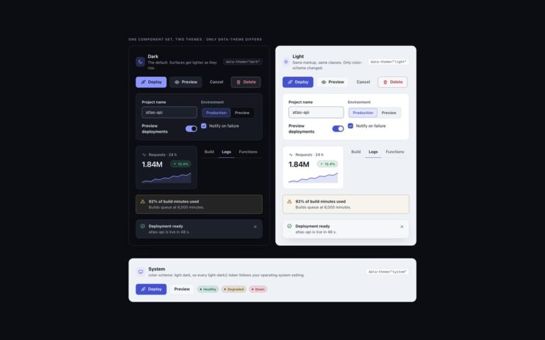
The buttons and toggles of the uiCookies dark UI kit. Buttons come as a primary accent button, a secondary button on the raised surface, a quiet ghost button and a danger button with tinted text, in small, default and large sizes, plus a loading button with a spinner and a disabled state. Icon buttons are square or round and every one has an aria-label. The toolbar toggles are real checkboxes styled as icon buttons for bold, italic, code and link, and the segmented controls are radio groups for a log view and an environment. Switches are checkboxes with role=”switch” in a settings card, with a hint line and a disabled row. Elevation comes from lighter surfaces instead of shadows: buttons sit on surface-2, hover lifts them to surface-3, and a one-pixel top highlight replaces the drop shadow. One recipe drives every button, and a variant only swaps four custom properties. The pressed and selected states use the accent-soft fill with accent text, which was measured at 5.3:1 in dark and 5.2:1 in light, and the switch track has a 3:1 edge on every surface level.

What’s included

  • Primary, secondary, ghost and danger buttons in three sizes
  • Loading and disabled states
  • Icon buttons with accessible names
  • Toolbar toggles and segmented controls on native inputs
  • Switches built on checkboxes with role="switch"
  • Same tokens as the rest of the kit, light theme by flipping color-scheme

Accessibility

Every button has visible text or an aria-label, toolbar toggles are checkboxes with aria-label inside a labelled group, and segmented controls are radio groups in a fieldset with a legend. Text reaches 4.5:1 and control edges 3:1 on every surface level in both themes. Focus is a 2px ring in the --focus colour, and transitions and the spinner slow down or stop under prefers-reduced-motion.

Customise it

Change --accent, --on-accent and --accent-soft in the token block to recolour primary, pressed and selected states, and --radius-sm for the corner. In Bootstrap the tokens feed --bs-btn-* on .btn-dk; in Tailwind use bg-accent, bg-surface-2, border-line and rounded-ui-sm.