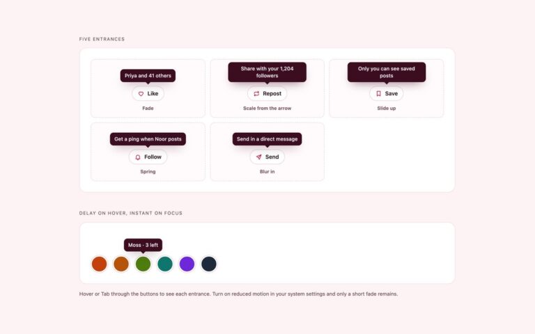
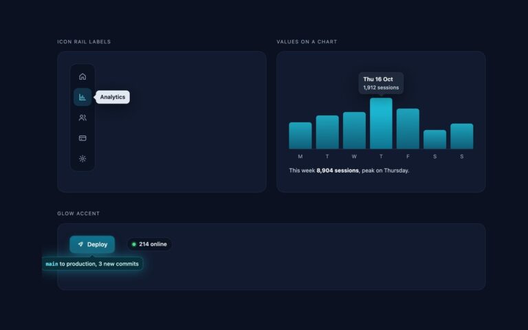
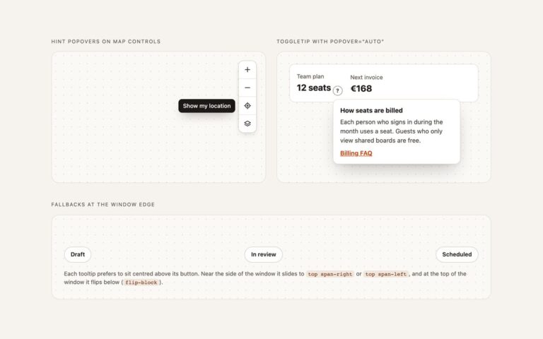
// Tooltip behaviour for WCAG 1.4.13: Esc dismisses without moving focus or the pointer, a tap opens it on touch screens,
// opening one closes the others, and tooltips are nudged sideways to stay inside the window.
(() => {
  const tts = [...document.querySelectorAll('.tt')];
  const fit = t => {
    const tip = t.querySelector(':scope > [role="tooltip"]'); if (!tip) return;
    tip.style.removeProperty('--tt-nudge');
    requestAnimationFrame(() => {
      const r = tip.getBoundingClientRect(), w = document.documentElement.clientWidth;
      const d = r.left < 8 ? 8 - r.left : r.right > w - 8 ? w - 8 - r.right : 0;
      if (d) tip.style.setProperty('--tt-nudge', d + 'px');
    });
  };
  const enter = t => { tts.forEach(o => o !== t && o.classList.remove('is-open')); t.classList.remove('is-dismissed'); fit(t); };
  tts.forEach(t => { t.addEventListener('pointerenter', () => enter(t)); t.addEventListener('focusin', () => enter(t)); if (t.classList.contains('is-open')) fit(t); });
  document.addEventListener('pointerdown', e => {
    const t = e.target.closest('.tt');
    if (!t) tts.forEach(o => o.classList.remove('is-open'));
    else if (e.pointerType === 'touch') t.classList.add('is-open');
  });
  document.addEventListener('keydown', e => {
    if (e.key !== 'Escape') return;
    tts.filter(t => t.matches(':hover, :focus-within, .is-open')).forEach(t => { t.classList.remove('is-open'); t.classList.add('is-dismissed'); });
  });
})();
@theme {
  --color-tt: #1c1917;
  --color-tt-ink: #fafaf9;
  --color-tt-success: #047857;
  --color-tt-warning: #fcd34d;
  --color-tt-warning-ink: #422006;
  --color-tt-danger: #b91c1c;
  --color-tt-info: #1d4ed8;
  --color-tt-light-ink: #292524;
}
/* tt-open: a tooltip inside a .tt wrapper that is hovered, holds focus or was opened by tap, and was not dismissed with Esc. */
@custom-variant tt-open (&:is(:where(.tt):is(:hover, :focus-within, .is-open):not(.is-dismissed) > *));
JavaScript
// Tooltip behaviour for WCAG 1.4.13: Esc dismisses without moving focus or the pointer, a tap opens it on touch screens,
// opening one closes the others, and tooltips are nudged sideways to stay inside the window.
(() => {
  const tts = [...document.querySelectorAll('.tt')];
  const fit = t => {
    const tip = t.querySelector(':scope > [role="tooltip"]'); if (!tip) return;
    tip.style.removeProperty('--tt-nudge');
    requestAnimationFrame(() => {
      const r = tip.getBoundingClientRect(), w = document.documentElement.clientWidth;
      const d = r.left < 8 ? 8 - r.left : r.right > w - 8 ? w - 8 - r.right : 0;
      if (d) tip.style.setProperty('--tt-nudge', d + 'px');
    });
  };
  const enter = t => { tts.forEach(o => o !== t && o.classList.remove('is-open')); t.classList.remove('is-dismissed'); fit(t); };
  tts.forEach(t => { t.addEventListener('pointerenter', () => enter(t)); t.addEventListener('focusin', () => enter(t)); if (t.classList.contains('is-open')) fit(t); });
  document.addEventListener('pointerdown', e => {
    const t = e.target.closest('.tt');
    if (!t) tts.forEach(o => o.classList.remove('is-open'));
    else if (e.pointerType === 'touch') t.classList.add('is-open');
  });
  document.addEventListener('keydown', e => {
    if (e.key !== 'Escape') return;
    tts.filter(t => t.matches(':hover, :focus-within, .is-open')).forEach(t => { t.classList.remove('is-open'); t.classList.add('is-dismissed'); });
  });
})();
About this set
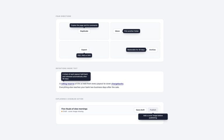
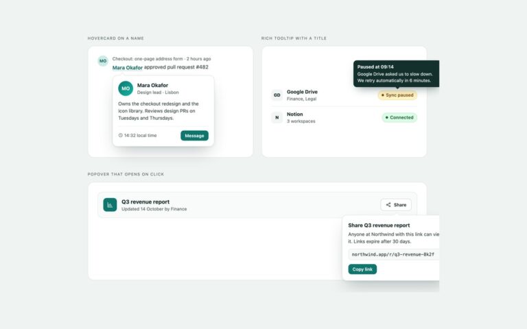
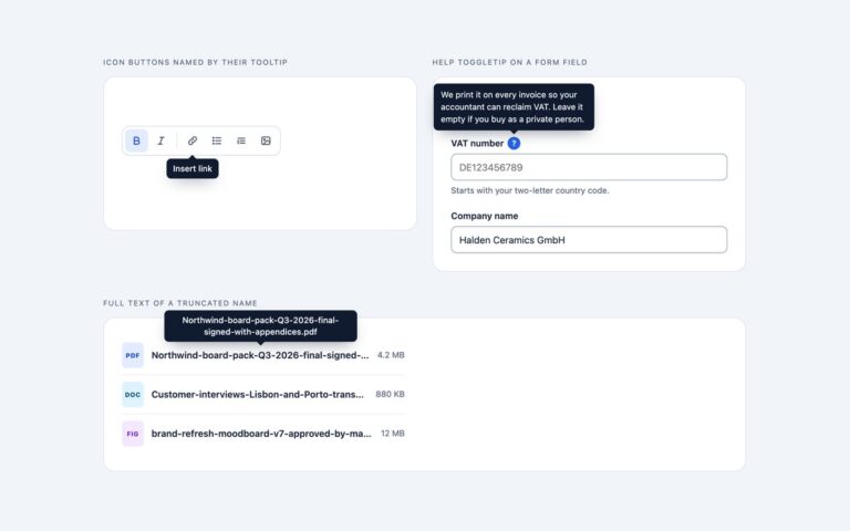
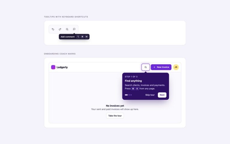
One tooltip in the colours and sizes a design system needs. Status colours shows four service badges from a deploy dashboard, api Deployed, search Slow, web Failed and jobs Queued, each with a tooltip in success green, warning amber, danger red or info blue, an icon that matches, and a specific detail such as the p95 latency or the failed build step. Light and dark shows the same Copy invite link tooltip as a white tooltip on a dark panel and a near-black one on a light panel; the white one is outlined with filter: drop-shadow, which follows the arrow as well as the bubble. Three sizes puts a small tooltip on an avatar, a medium one on an Export CSV button and a large two-line one on a Pro trial badge. Every theme only changes two custom properties, –tt-bg and –tt-ink, and the arrow takes its colour from the same variable, so adding a brand colour is one line. All colour pairs meet 4.5:1 contrast, including dark text on the amber warning. The Bootstrap version passes each theme as a custom class to Bootstrap Tooltip.
What’s included
Success, warning, danger and info colours with icons
Light tooltip outlined with filter: drop-shadow, including the arrow
Small, medium and large sizes
Each theme changes only --tt-bg and --tt-ink
All text and background pairs reach 4.5:1
Bootstrap themes through customClass
Accessibility
Every badge and button is linked to its tooltip with aria-describedby, and the colour is never the only signal: each status says its state in words on the badge and in the tooltip. Tooltips open on hover and keyboard focus, Esc hides them and they stay open under the pointer. Focus outlines are visible, and the fade is removed under prefers-reduced-motion.
Customise it
Add a class that sets --tt-bg and --tt-ink, for example .tt-brand{--tt-bg:#7c3aed;--tt-ink:#fff}, and sizes through padding and font-size on .tt-sm and .tt-lg. In Bootstrap set --bs-tooltip-bg and --bs-tooltip-color on a .tooltip.tt-* class, and in Tailwind add a --color-tt-* theme colour.