/* ── Dark UI kit tokens (uiCookies) — identical in every set ──────────────────────────────
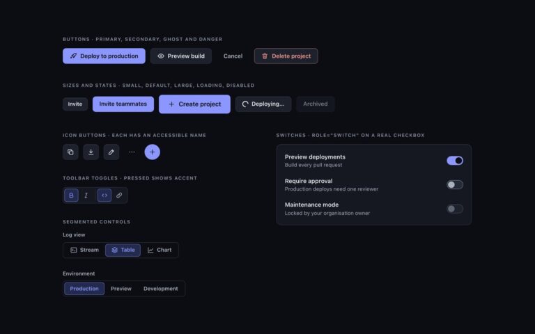
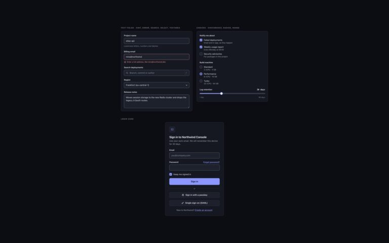
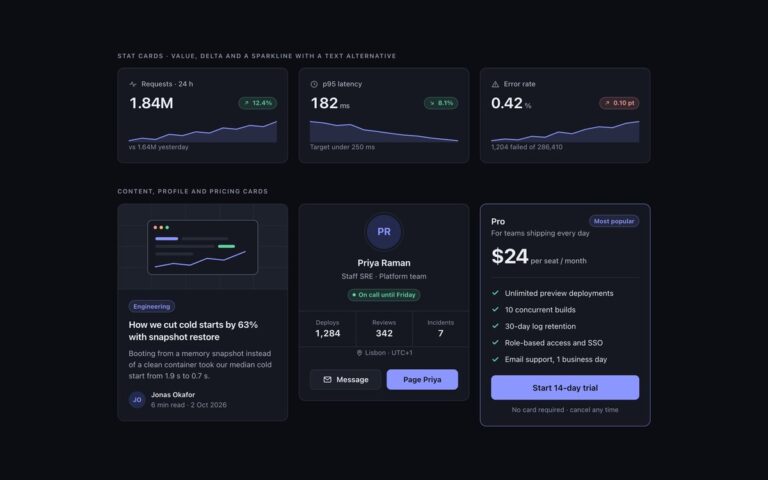
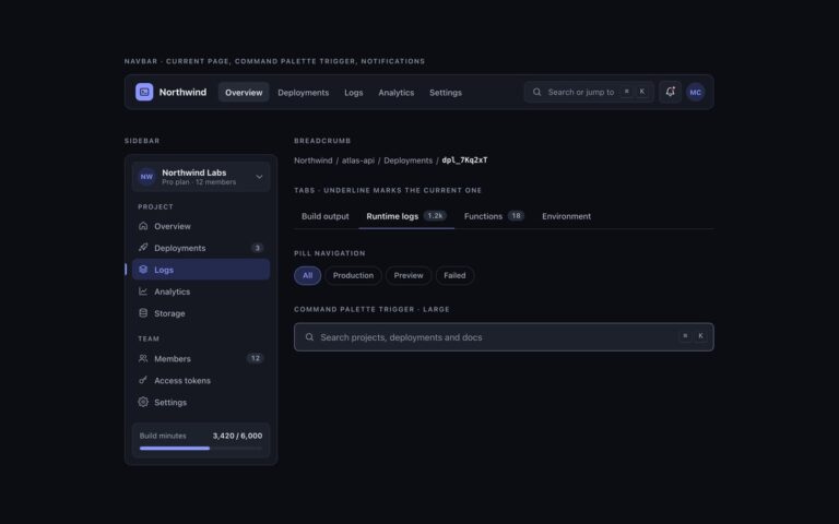
Dark first. Elevation is a lighter surface, not a shadow: surface-0 is the page, 1 cards and
panels, 2 controls, menus and dialogs, 3 hover, selected rows and tooltips.
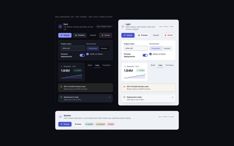
Every colour is a light-dark() pair, so flipping color-scheme turns the whole kit light:
data-theme="dark" | "light" | "system" on any wrapper (system follows prefers-color-scheme),
or a checked .theme-pick radio inside a [data-theme] element (:has()).
Contrast, dark | light, on the worst surface (surface-3): text-1 12.2 | 15.0, text-2 6.6 | 7.3,
text-3 4.8 | 5.4, accent 5.4 | 5.1, success 7.7 | 5.0, warning 8.4 | 5.2, danger 6.8 | 5.0;
edge (control boundaries) 3.3 | 3.1 and focus 7.9 | 5.9 against every surface. */
:root{color-scheme:dark}
[data-theme="dark"]{color-scheme:dark}
[data-theme="light"]{color-scheme:light}
[data-theme="system"]{color-scheme:light dark}
[data-theme]:has(.theme-pick[value="dark"]:checked){color-scheme:dark}
[data-theme]:has(.theme-pick[value="light"]:checked){color-scheme:light}
[data-theme]:has(.theme-pick[value="system"]:checked){color-scheme:light dark}
:root{
--surface-0:light-dark(#eef1f5,#0b0d12); /* page */
--surface-1:light-dark(#ffffff,#151821); /* cards, panels, navbar, sidebar */
--surface-2:light-dark(#f6f7f9,#1d212c); /* controls, menus, dialogs, toasts */
--surface-3:light-dark(#e6e9ef,#262b38); /* hover, selected rows, tooltips */
--text-1:light-dark(#12151c,#eceef3); /* primary text */
--text-2:light-dark(#434a5a,#aab1bf); /* secondary text */
--text-3:light-dark(#555d6e,#8f96a8); /* captions, placeholders, axis labels */
--border:light-dark(#dde1e8,#2a2f3c); /* decorative 1px dividers and card edges */
--edge:light-dark(#7c8496,#737b90); /* control boundaries: fields, boxes, tracks */
--accent:light-dark(#4452d0,#8b97ff); /* the one vivid colour: links, selected, primary */
--accent-soft:light-dark(#e6e8ff,#232a4d); /* selected backgrounds; accent text keeps 5.2 | 5.3 on it */
--on-accent:light-dark(#ffffff,#0b0d12); /* text on accent fills, 6.2 | 7.4 */
--success:light-dark(#11713f,#5fd4a0); /* desaturated for dark, so they do not vibrate */
--warning:light-dark(#875500,#f0c060);
--danger:light-dark(#bb2532,#ff9790);
--focus:light-dark(#3b48c4,#b5bdff); /* 2px focus ring */
--highlight:light-dark(rgb(255 255 255 / 0),rgb(255 255 255 / .045)); /* 1px top light on dark surfaces */
--shadow-color:light-dark(rgb(16 24 40 / .16),rgb(0 0 0 / .55)); /* overlays only */
--radius:12px;--radius-sm:8px;
--mono:ui-monospace,"SF Mono","Cascadia Code",Menlo,Consolas,monospace;
}
/* No light-dark() (Chrome < 123, Safari < 17.5, Firefox < 120): the same values, chosen by attribute */
@supports not (color:light-dark(#fff,#000)){
:root,[data-theme="dark"]{--surface-0:#0b0d12;--surface-1:#151821;--surface-2:#1d212c;--surface-3:#262b38;--text-1:#eceef3;--text-2:#aab1bf;--text-3:#8f96a8;--border:#2a2f3c;--edge:#737b90;--accent:#8b97ff;--accent-soft:#232a4d;--on-accent:#0b0d12;--success:#5fd4a0;--warning:#f0c060;--danger:#ff9790;--focus:#b5bdff;--highlight:rgb(255 255 255 / .045);--shadow-color:rgb(0 0 0 / .55)}
[data-theme="light"]{--surface-0:#eef1f5;--surface-1:#ffffff;--surface-2:#f6f7f9;--surface-3:#e6e9ef;--text-1:#12151c;--text-2:#434a5a;--text-3:#555d6e;--border:#dde1e8;--edge:#7c8496;--accent:#4452d0;--accent-soft:#e6e8ff;--on-accent:#ffffff;--success:#11713f;--warning:#875500;--danger:#bb2532;--focus:#3b48c4;--highlight:rgb(255 255 255 / 0);--shadow-color:rgb(16 24 40 / .16)}
@media (prefers-color-scheme:light){[data-theme="system"]{--surface-0:#eef1f5;--surface-1:#ffffff;--surface-2:#f6f7f9;--surface-3:#e6e9ef;--text-1:#12151c;--text-2:#434a5a;--text-3:#555d6e;--border:#dde1e8;--edge:#7c8496;--accent:#4452d0;--accent-soft:#e6e8ff;--on-accent:#ffffff;--success:#11713f;--warning:#875500;--danger:#bb2532;--focus:#3b48c4;--highlight:rgb(255 255 255 / 0);--shadow-color:rgb(16 24 40 / .16)}}
}
@media (prefers-contrast:more){:root{--border:var(--edge);--text-3:var(--text-2)}}
[data-theme]{background:var(--surface-0);color:var(--text-1)}
/* The tokens above as Tailwind utilities: bg-surface-0…3, text-ink-1…3, border-line, border-edge,
bg-accent, bg-accent-soft, text-on-accent, text-success|warning|danger, outline-focus, rounded-ui… */
@theme inline {
--color-surface-0: var(--surface-0); --color-surface-1: var(--surface-1);
--color-surface-2: var(--surface-2); --color-surface-3: var(--surface-3);
--color-ink-1: var(--text-1); --color-ink-2: var(--text-2); --color-ink-3: var(--text-3);
--color-line: var(--border); --color-edge: var(--edge);
--color-accent: var(--accent); --color-accent-soft: var(--accent-soft); --color-on-accent: var(--on-accent);
--color-success: var(--success); --color-warning: var(--warning); --color-danger: var(--danger);
--color-focus: var(--focus); --color-highlight: var(--highlight);
--radius-ui: var(--radius); --radius-ui-sm: var(--radius-sm);
--font-mono: var(--mono);
--shadow-overlay: 0 18px 48px -12px var(--shadow-color);
--inset-shadow-hl: inset 0 1px 0 var(--highlight);
}
/* <dialog> sizing when opened with showModal(), and its backdrop */
@utility dialog-dk {
&:modal { position: fixed; inset: 0; margin: auto; max-width: min(440px, calc(100vw - 32px)); height: fit-content; }
&::backdrop { background: rgb(5 6 10 / .66); }
}
JavaScript
// Dialog: opens as a real modal (focus trap, Escape, ::backdrop). Toasts: dismiss. Tooltips and menus: Escape closes them.
document.querySelectorAll('[data-dialog-open]').forEach(btn => btn.addEventListener('click', () => {
  const d = document.getElementById(btn.dataset.dialogOpen); if (!d) return;
  if (d.open) d.close(); d.showModal();
}));
document.querySelectorAll('[data-toast-dismiss]').forEach(btn => btn.addEventListener('click', () => btn.closest('[data-toast]')?.remove()));
document.addEventListener('keydown', e => {
  if (e.key !== 'Escape') return;
  document.querySelectorAll('[data-tip]').forEach(w => w.setAttribute('data-dismissed', ''));
  document.querySelectorAll('details[data-menu][open]').forEach(d => { d.open = false; d.querySelector('summary').focus(); });
});
document.querySelectorAll('[data-tip]').forEach(w => ['mouseleave', 'focusout'].forEach(ev => w.addEventListener(ev, () => { w.removeAttribute('data-dismissed'); w.removeAttribute('data-open'); })));
document.addEventListener('click', e => document.querySelectorAll('details[data-menu][open]').forEach(d => { if (!d.contains(e.target)) d.open = false; }));
About this set
Overlays and feedback for the uiCookies dark UI kit. The dialog is a native dialog element for deleting an environment, shown inline on the page and opened as a real modal with showModal(), which brings focus trapping, Escape to close and a dimmed backdrop. Three toasts in a status region report a ready deployment, a failed build and a sent invite, each with a coloured icon and a dismiss button. Four inline alerts cover info, success, warning and danger with a hint of the semantic colour in the fill and the full colour on the icon and edge. Tooltips appear on hover and keyboard focus and hide again with Escape. The dropdown is a details element with icons, keyboard hints and a danger item, and the command menu combines a search field with grouped commands, shortcut keys and a footer of key hints. Overlays are the one place the kit uses shadows, and even there the panel is lifted to surface-2 first so it separates from the page by tone as well. About a dozen lines of vanilla JavaScript open the dialog, dismiss toasts and close tooltips and menus with Escape.
What’s included
Native dialog opened with showModal()
Success, error and info toasts in a status region
Info, success, warning and danger alerts
Tooltips on hover and focus that Escape dismisses
Dropdown menu and command menu with keyboard hints
Accessibility
The dialog has aria-labelledby and aria-describedby and uses the browser's modal focus handling; toasts sit in a role="status" list and each close button names the toast it dismisses. Tooltips are linked with aria-describedby and close with Escape, the danger alert uses role="alert", menu items are real buttons with visible focus, and the tooltip transition stops under prefers-reduced-motion.
Customise it
Change --surface-2 and --shadow-color for overlay panels, --surface-3 for tooltips and menu hover, and --success, --warning, --danger and --accent for feedback colours. In Bootstrap the tokens feed .modal-content, .toast, .alert, .tooltip and .dropdown-menu variables.